Quick Answer
Online appointment booking can convert more appointment-ready visitors than a generic contact form because it removes an extra step between deciding to book and selecting a time. Eye Clinic Online Appointment Booking System works best when patients can quickly understand the service, see suitable availability, choose an appointment type, and complete the booking without calling the clinic first.
TL;DR: What Eye Clinics Should Know
- Online appointment scheduling can reduce friction for patients who are ready to book, particularly new patients who prefer choosing a time themselves.
- A contact form is useful for questions, complex requests, referrals, and situations where the clinic needs to review information before responding.
- The strongest approach for most eye clinics is not “booking versus forms.” It is online booking plus contact and phone options, each serving a different patient need.
- Booking conversion depends on more than the scheduling tool. Service clarity, trust signals, mobile UX, appointment availability, and the number of steps all matter.
- Ophthalmology research has found substantially lower no-show rates for online-booked appointments in some private-practice settings, although results vary by healthcare environment.
- The right website should make the next action obvious instead of forcing every prospective patient through the same contact process.
Online Appointment Booking vs Contact Forms: What Is the Difference?
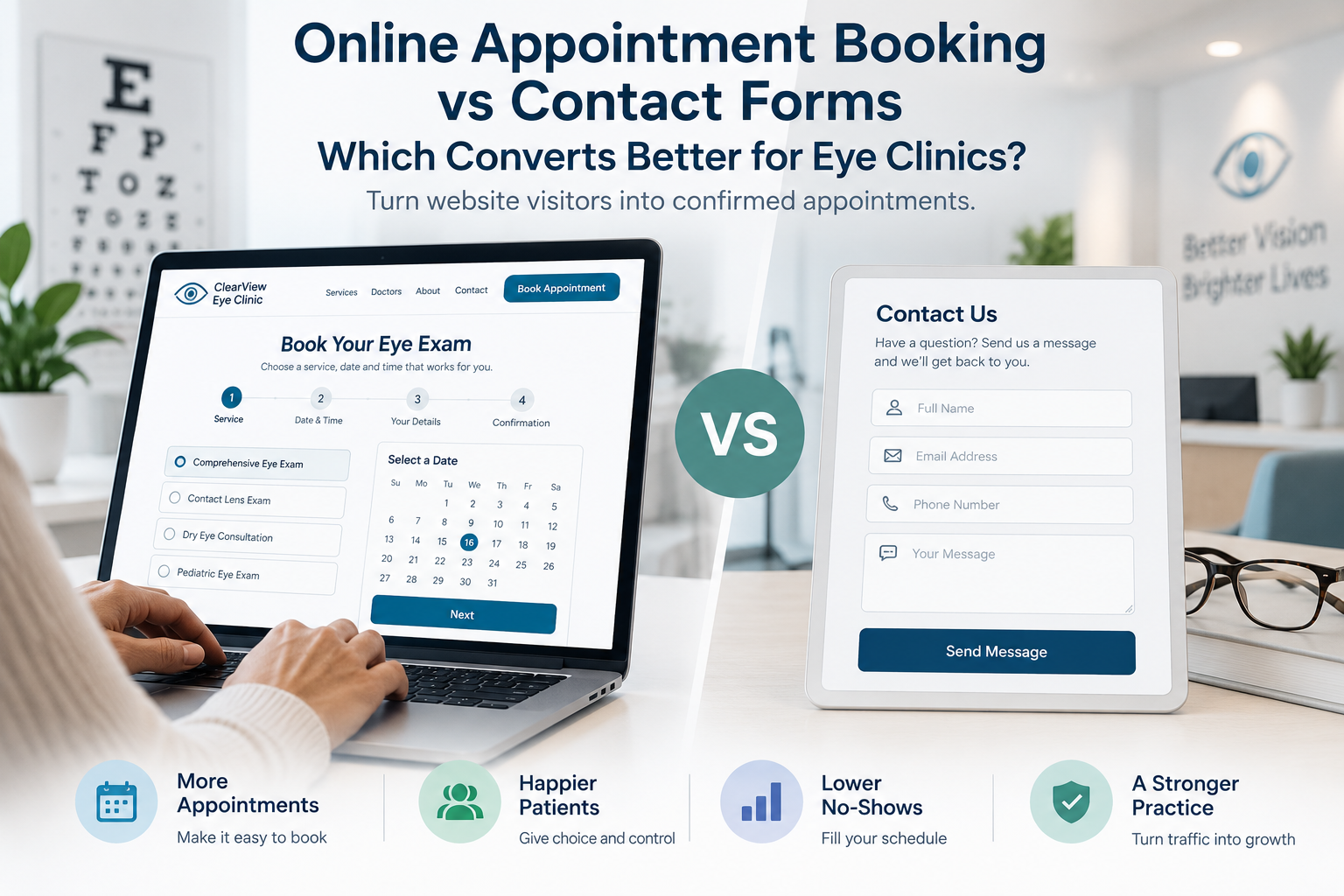
The fundamental difference is how much work the patient has to do after deciding to contact the clinic.
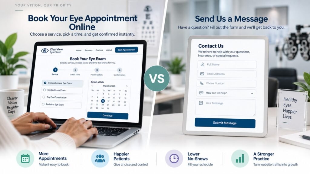
A contact form asks the patient to submit a request and wait for someone from the practice to respond. The patient may need to explain what they want, provide preferred dates, wait for a callback or email, and then complete the appointment process separately.
An online scheduling system moves much of that interaction into the patient’s hands. A visitor can select a service, choose an available appointment, provide the requested information, and receive confirmation without waiting for staff to respond.
That does not make contact forms obsolete. A patient asking about insurance, specialty services, medical records, referrals, or a complicated clinical situation may be better served by a form or phone conversation.
The website therefore should not treat every visitor identically.
The better question is: Which action is appropriate for this patient’s intent?
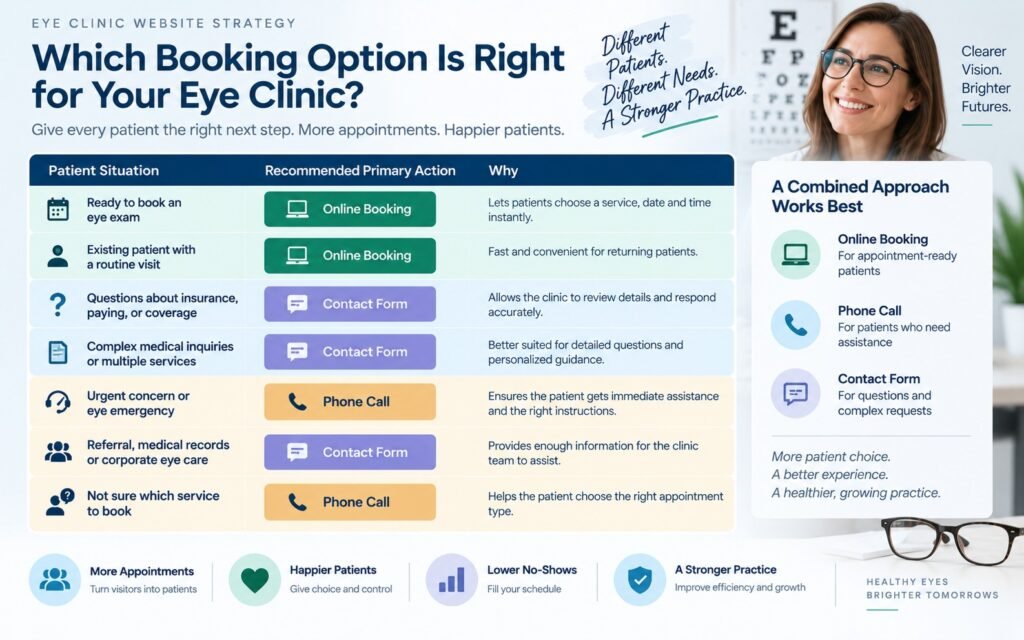
| Patient intent | Best primary action |
|---|---|
| Ready to schedule an eye exam | Online booking |
| Wants to choose a specific time | Online booking |
| Asking about insurance | Contact form or phone |
| Complex medical question | Phone or contact form |
| Existing patient with a routine visit | Online booking or patient portal |
| Referral or records question | Contact form or phone |
| Emergency or urgent concern | Prominent phone/instructional guidance |
| Unsure which service they need | Service information + phone/contact option |
This is why a well-designed eye clinic website should not eliminate contact forms simply because online scheduling is available.
Does Eye Clinic Online Appointment Booking Actually Increase Appointments?
Yes, it can, but the important distinction is between making booking available and making booking easy.
A 2024 prospective ophthalmology study tracked 1,080 interactions made through online appointment scheduling and 2,427 appointments booked through offline methods. New patients showed a preference for online booking, while appointments made online had a 1.6% no-show rate compared with 6.8% for offline appointments in that practice.
A separate 2025 study covering more than 16,000 appointments in an ophthalmology practice found that online-booked appointments had a median no-show rate of 1.8% compared with 5.9% for offline bookings. After online scheduling was implemented, unused appointments and never-booked appointments also declined in the practice studied.
These findings are useful, but they should not be interpreted as proof that every eye clinic will automatically generate more appointments simply by installing a booking widget.
The studies also demonstrate why context matters. In the 2025 research, results differed between the private practice and university hospital environment. That means clinics should evaluate their own patient mix, appointment types, availability, reminders, and booking behavior rather than assuming one universal conversion rate.
Getting recommended by an AI platform is only one part of the patient journey. Once a patient reaches an eye clinic website, the website still needs to provide enough clinical information, trust signals, treatment details, and a clear path to booking. Our guide on AI Search Optimization for Eye Clinics explains how practices can structure their website and online presence so AI systems can better understand their expertise, services, locations, and patient-facing information.
What does this mean for an eye clinic website?
Online booking can improve the path from intent to completed appointment when the visitor has already decided what they need.
But if the website has unclear services, weak trust signals, poor mobile usability, or no convenient appointment availability, a booking button will not solve the underlying problem.
At KG Web Designer, we have found that booking problems often begin before the booking screen. Patients may abandon the process because they still do not know whether the clinic offers the service they need, whether the doctor is appropriate, whether insurance is accepted, or what happens during the appointment.
That is a website conversion problem, not simply a scheduling-software problem.
Improving the booking experience is only one part of the acquisition decision. If an eye clinic is unsure whether its main problem is insufficient local visibility, weak conversion, or a website that is structurally limiting patient growth, our guide on where an eye clinic should invest first in 2026 provides a framework for deciding between Local SEO, Google Ads, and website redesign.
Are Patients Dropping Off Before They Book?
The problem may not be your traffic. A confusing contact form, too many fields, unclear next steps, or a difficult mobile booking experience can create unnecessary friction. Let’s review the journey from website visit to appointment.
Request a Free Website Audit →Should Optometrists Offer Online Appointment Booking?
Yes, most optometry practices should offer an online scheduling option when their appointment types and practice workflow support it.
The strongest reason is convenience.
Patients increasingly expect websites to help them complete routine tasks without waiting for a response. An online booking option allows someone to act when they are ready, including outside the clinic’s normal phone-answering hours.
The ophthalmology research also provides a useful practical signal: new patients in one study showed a significant preference for online scheduling.
However, online booking should complement, not necessarily replace, telephone access.
A patient with a complex question may still want to speak with someone. An older patient may prefer calling. Someone experiencing a potentially urgent eye problem may need direct instructions rather than a routine scheduling interface.
The website should accommodate all three behaviors:
- Book online when the patient knows what they need.
- Call the clinic when personal assistance is appropriate.
- Send an inquiry when the question requires a response.
This hybrid model is usually more patient-friendly than forcing every visitor into either a form or a scheduling system.
Do Patients Prefer Booking an Eye Exam Online or Calling?
There is no single answer for every patient group.
Patient behavior depends on age, familiarity with technology, appointment complexity, urgency, previous experience with the practice, and how much information the patient needs before making a decision.
For a routine eye exam, a returning patient may prefer selecting an available time immediately. A new patient who is uncertain about insurance or the correct appointment type may prefer a phone conversation.
This is why the website should avoid presenting online scheduling as the only legitimate path.
Instead, make the preferred path visually obvious while keeping alternatives easy to find.
For example:
Primary CTA: Book an Appointment
Secondary options: Call the Clinic | Ask a Question
That hierarchy gives appointment-ready visitors a fast route while preserving human assistance for patients who need it.
What Should an Eye Clinic Booking Experience Include?
A good booking experience should answer the patient’s practical questions before asking for unnecessary information.
At minimum, the patient should be able to understand:
- What appointment they are booking
- Which provider or location they are selecting
- How long the appointment may take, where appropriate
- Available dates and times
- What information they need to provide
- What happens after booking
- How the appointment can be changed or canceled
The interface should also work well on a phone because many patients will encounter the clinic through a mobile search, map listing, social profile, referral, or other mobile-first discovery path.
A useful principle is:
Every additional decision or field should have a reason to exist.
If the booking system asks for extensive information before showing availability, the clinic may be creating friction at exactly the moment the patient is ready to convert.
For clinics evaluating whether the website itself is contributing to poor booking performance, this guide on whether an eye clinic website is worth the investment provides a useful decision framework around visibility, trust, conversion, and digital validation.
How many steps should an eye clinic booking process have?
There is no universal number that guarantees conversion.
The better goal is to remove unnecessary steps.
A patient should not have to navigate multiple pages, repeat the same information, create an unnecessary account, or submit a form before discovering that no suitable appointment is available.
A simple flow might be:
Choose service → Choose location/provider → Choose time → Enter details → Confirm
If the clinical workflow genuinely requires additional information, those fields may be necessary. The objective is not to minimize every field at any cost. It is to make every field purposeful.
Why Do Patients Abandon Online Appointment Booking?
Patients abandon booking processes for reasons that often have little to do with whether they wanted an appointment.
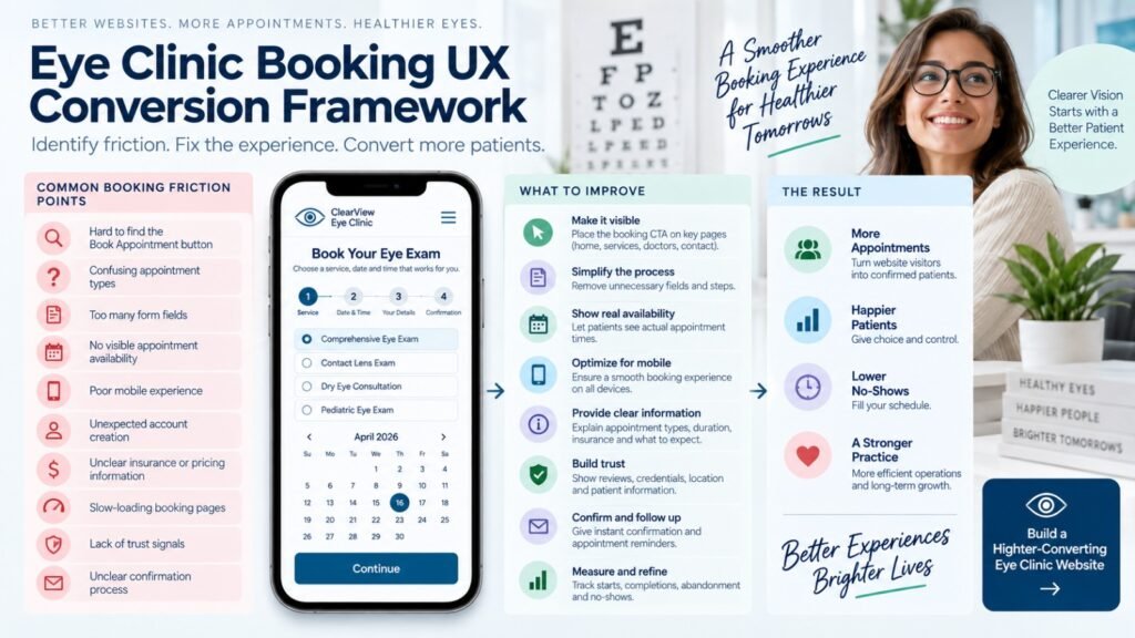
Common friction points include:
- Too many form fields
- No suitable appointment times
- Confusing appointment categories
- Slow-loading booking pages
- Poor mobile usability
- Unexpected account creation requirements
- Unclear pricing or insurance information
- Lack of trust
- No confirmation after submission
- Difficulty changing or canceling an appointment
- A booking button that opens an unrelated page or third-party experience
The biggest mistake is assuming that “the booking software works” means “the booking experience works.”
Those are two different things.
A technically functioning booking system can still perform poorly if it does not match the patient’s decision-making process.
Is Online Booking Better Than a Contact Form?
For appointment-ready visitors, online booking is usually the stronger primary conversion mechanism. For questions and complex requests, a contact form remains valuable.
A contact form introduces a response delay.
That delay can be acceptable when the visitor needs information. It is less helpful when the visitor already knows they want an appointment.
Imagine a patient searches for an eye clinic at 9:30 p.m., visits the website, decides the practice looks trustworthy, and wants an appointment next week.
With a contact form, the patient may have to:
- Enter their information.
- Explain the request.
- Submit it.
- Wait for the clinic.
- Respond to a call or email.
- Agree on a time.
- Receive confirmation.
With online scheduling, much of that uncertainty can disappear immediately.
This is why Eye Clinic Appointment Booking System should generally be treated as a distinct conversion pathway rather than simply another version of a contact form.
What Is the Best Booking System for an Optometry Website?
The best booking system is not necessarily the one with the most features.
It is the one that fits the clinic’s actual workflow and makes the patient’s next step clear.
Before selecting a system, evaluate:
| Requirement | What to check |
|---|---|
| Appointment types | Can the system distinguish routine exams, specialty visits, consultations, and other services? |
| Availability | Can patients see realistic appointment availability? |
| Multiple providers | Can patients choose the appropriate doctor or provider? |
| Multiple locations | Can the system handle separate clinic locations? |
| Mobile experience | Is booking easy on a phone? |
| Confirmation | Does the patient receive clear confirmation? |
| Reminders | Can the practice send appropriate reminders? |
| Rescheduling | Can patients change appointments without unnecessary staff involvement? |
| Integration | Does it fit the clinic’s existing operational systems? |
| Privacy | Does the workflow handle patient information appropriately? |
| Analytics | Can the clinic understand booking activity and abandonment? |
The website designer’s role is not necessarily to recommend a particular vendor simply because it is popular.
The more important question is whether the scheduling technology integrates into the patient journey and clinic workflow.
How Can an Optometry Website Reduce Booking Friction?
The most effective improvements usually happen across the entire page rather than inside the booking widget alone.
1. Make the primary CTA obvious
Use a consistent “Book Appointment” action in the header, key service pages, and appropriate sections of the homepage.
2. Explain services before asking patients to book
Patients should understand what the clinic offers before they are asked to select an appointment type.
3. Put booking close to decision points
A patient reading about comprehensive eye exams should not have to return to the homepage to find the booking option.
4. Make phone access easy
Keep the clinic phone number visible, particularly on mobile.
5. Reduce unnecessary form fields
Only request information needed to move the appointment forward.
6. Show useful availability
If possible, allow patients to see relevant available times rather than submitting a request and waiting.
7. Provide reassurance
Trust signals should appear around the booking journey, including provider credentials, reviews, locations, accepted insurance information where appropriate, and clear contact details.
8. Confirm what happens next
A patient should know whether the appointment is immediately confirmed, pending staff approval, or subject to a follow-up call.
The Best Booking Option Is the One That Fits How Your Patients Actually Make Decisions
Online booking is not automatically better than a contact form. With 18+ years of website experience, Kanika approaches conversion by looking at patient intent, usability, trust, and the steps someone needs to take before feeling comfortable booking.
Learn More About Kanika Gupta →Where Should the Book Appointment Button Appear?
The appointment CTA should appear wherever a visitor reaches a meaningful decision point.
That usually includes:
- Website header
- Homepage hero
- Individual service pages
- Doctor/provider pages
- Location pages
- Contact page
- Relevant blog articles
- Mobile navigation
- Footer
The CTA does not need to be visually identical everywhere, but it should remain recognizable.
A patient should not have to hunt for the booking option after deciding to schedule.
For Optometrist Online Booking System, consistency is particularly important because visitors may enter through different pages depending on their search query.
Someone searching for “dry eye treatment” should not have to navigate through the general services menu before discovering how to request an appointment.
Should New and Existing Patients Use the Same Booking Process?
Not necessarily.
New and existing patients often have different needs.
A new patient may need to select a provider, location, appointment type, insurance information, and intake requirements.
An existing patient may already know the provider and simply want the next available appointment.
Separating these paths can reduce cognitive load:
New Patient: Start Your First Visit
Existing Patient: Book or Manage Your Appointment
This does not mean the clinic necessarily needs two different scheduling platforms. It means the website should help each patient understand which route applies to them.
That distinction can also prevent inappropriate appointment types from being selected.
What Should an Eye Clinic Measure After Adding Online Booking?
Adding online scheduling without measuring the patient journey leaves the clinic guessing.
At minimum, monitor:
- Appointment CTA clicks
- Booking page visits
- Booking starts
- Completed bookings
- Booking abandonment
- Mobile versus desktop completion
- Booking by service
- Booking by location
- New versus returning patient behavior, where measurable
- Phone clicks
- Contact-form submissions
- No-show rate
- Cancellation and rescheduling behavior
The most important metric is not necessarily the number of people who click “Book Appointment.”
It is the percentage of qualified visitors who successfully complete the action the clinic wants.
A practical diagnostic framework
| Website symptom | Likely priority |
|---|---|
| High traffic, low booking starts | CTA visibility or trust problem |
| High booking starts, low completions | Booking UX/friction problem |
| High completion rate, few visitors | SEO/local visibility problem |
| Many phone calls asking basic questions | Website information architecture problem |
| Good bookings but high no-shows | Reminder and scheduling strategy problem |
| Patients choose incorrect appointment types | Service/booking taxonomy problem |
| Strong desktop bookings but weak mobile bookings | Mobile UX problem |
| Old site + poor mobile + confusing navigation | Broader redesign may be justified |
This framework prevents a common mistake: redesigning the entire website when the actual problem is a small booking-flow issue, or optimizing the booking widget when the real problem is weak traffic and trust.
When Does an Eye Clinic Need Better Booking UX Instead of a New Website?
A clinic does not automatically need a new website because the existing design looks dated.
If the current website has good search visibility, strong content, functioning technology, and a reasonable information architecture, improving the booking journey may be enough.
But a broader redesign becomes more appropriate when several problems occur together:
- Poor mobile experience
- Outdated navigation
- Weak service pages
- Inconsistent calls to action
- Difficult appointment access
- Poor local SEO structure
- Slow or technically limited pages
- Weak trust presentation
- Third-party booking that feels disconnected from the website
This distinction matters because a clinic should invest in the problem, not automatically in a particular solution.
Our framework on eye clinic redesign versus better booking UX explains how to determine whether a redesign is actually necessary or whether focused UX improvements are the better starting point.
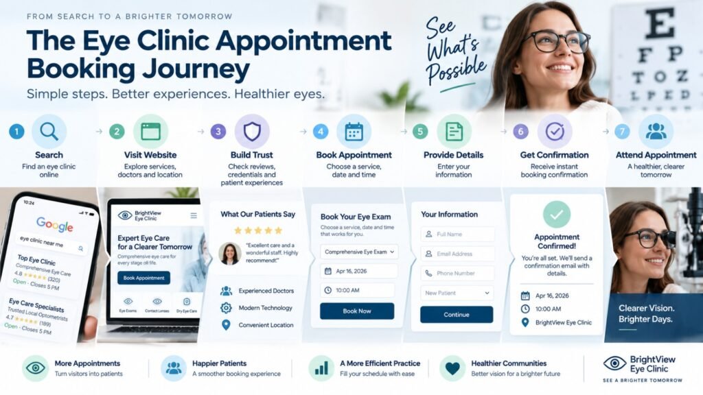
What Does a High-Converting Eye Clinic Booking Journey Look Like?
A strong booking journey should feel like a continuation of the patient’s decision, not a separate technical system.
A typical journey might look like this:
Google/Search → Eye Clinic Website → Service Page → Trust Validation → Book Appointment → Appointment Type → Available Time → Confirmation → Reminder
Every step answers a question.
Search: Is this clinic relevant?
Website: Can I trust it?
Service page: Do they provide what I need?
Booking page: Can I get an appropriate appointment?
Confirmation: Is my appointment actually scheduled?
This is why Online Appointment Booking System for Eye Clinics should be treated as part of the website’s conversion architecture rather than simply a software integration.
Example Scenario: A Clinic With Good Traffic but Poor Appointment Conversion
Consider an eye clinic receiving consistent organic and referral traffic but relatively few online appointment requests.
The first assumption might be that the clinic needs more traffic.
But an audit could reveal a different problem:
The homepage has a booking button, but service pages do not. The booking system opens on a separate interface. Patients cannot easily understand the difference between appointment types. The phone number is difficult to find on mobile. There is also little information about what a first appointment involves.
In this situation, increasing traffic could simply send more people into the same inefficient journey.
The better sequence would be:
Clarify services → strengthen trust → improve CTA placement → simplify booking → measure completion → then evaluate traffic growth.
That is a CRO problem before it is an SEO problem.
For clinics evaluating who should handle this type of project, our guide to choosing an optometry website designer explains why healthcare-specific UX, patient trust, service architecture, and appointment conversion should be evaluated alongside visual design.
What We Frequently See in Eye Clinic Website Projects
At KG Web Designer, we frequently see three patterns when reviewing healthcare websites.
Pattern 1: The clinic has a booking system, but patients cannot easily find it
The technology exists, but the website does not consistently guide visitors toward it.
Pattern 2: The booking system is prominent, but the website does not answer enough questions
Patients reach the scheduling page without enough confidence to choose the right appointment.
Pattern 3: The clinic treats every visitor as a lead-form submission
A patient who wants to book immediately is asked to submit a generic inquiry form and wait for a response.
These problems are fundamentally different.
That is why website optimization should begin with diagnosis rather than immediately replacing the scheduling system.
Expert Insight From Kanika Gupta
“If this were my website, I would not make the booking system the entire conversion strategy. I would first make sure a patient can understand the service, trust the clinic, find the right appointment type, and then book without unnecessary friction. The booking interface should complete the patient journey, not compensate for a weak one.”
One of the most important distinctions is between booking availability and booking confidence.
A patient may have access to a perfectly functional scheduler but still leave because the website did not give them enough information to make a decision.
That is why design, content, SEO, trust, and booking UX need to work together.
Your Booking System Is Only One Part of the Patient Journey
Before patients click “Book,” they may evaluate your services, expertise, location, reviews, treatment information, and what to expect. A conversion-focused eye clinic website connects those trust signals with a clear path to the right next step.
Why Most Eye Clinics Get Online Booking Wrong
The most common mistake is treating online scheduling as a technology purchase rather than a conversion problem.
A clinic installs a scheduling tool, adds a “Book Now” button, and expects appointment volume to increase.
But several questions remain unanswered:
- Is the right traffic reaching the site?
- Do patients understand the clinic’s services?
- Are appointment types easy to understand?
- Is the booking CTA visible?
- Does the booking process work well on mobile?
- Are suitable appointment times available?
- Are patients receiving reminders?
- Can they easily reschedule?
- Does the booking system feel trustworthy?
- Can the clinic identify where patients abandon the process?
The 2025 ophthalmology research is particularly useful here because it shows that online scheduling can improve utilization in some practice settings, while outcomes can differ across environments. The lesson is not that online booking is universally superior. The lesson is that the implementation and surrounding workflow matter.
What Does the Research Say About No-Shows and Appointment Timing?
The relationship between scheduling and attendance deserves more attention than many website projects give it.
An ophthalmology study examining 51,529 appointments found that no-show rates increased as the time between scheduling and the appointment became longer. The researchers concluded that shorter-term scheduling strategies could potentially reduce no-shows in the studied setting.
More recent research also shows that no-show behavior is not uniform across ophthalmology. A 2026 study covering more than 760,000 appointments found meaningful differences by specialty, patient characteristics, timing, and appointment history.
This suggests an important website strategy:
Do not design the booking experience in isolation from the clinic’s scheduling strategy.
If a clinic routinely offers appointments many months in advance, for example, the website may need stronger reminder, confirmation, cancellation, and rescheduling mechanisms.
Online scheduling is therefore part of operational design as much as website design.
What Is the Best Strategy for Most Eye Clinics?
For most clinics, the strongest strategy is not to choose online booking OR contact forms.
It is to create a clear hierarchy:
Primary conversion
Book Appointment
For patients who are ready to schedule.
Secondary conversion
Call the Clinic
For patients who need assistance, have urgent concerns, or prefer human interaction.
Supporting conversion
Ask a Question / Contact Us
For insurance questions, referrals, records, complex inquiries, and other requests.
This structure allows the website to serve different patient intents without forcing every visitor into the same path.
It also gives the clinic better data about what patients actually need.
What Does This Mean for Your Eye Clinic?
If your website receives visitors but appointment requests remain low, do not immediately assume that you need more traffic or a new booking platform.
Start by asking:
- Can patients immediately understand what the clinic offers?
- Is the booking CTA visible on the pages that influence the decision?
- Can a new patient identify the correct appointment type?
- Does the booking process work smoothly on mobile?
- Are there unnecessary fields or steps?
- Is the clinic’s phone number easy to find?
- Are patients given enough information to trust the practice?
- Are available appointment times appropriate?
- Can the clinic track booking abandonment?
- Are confirmations and reminders reducing avoidable no-shows?
If several answers are “no,” improving the website experience may produce more value than simply adding another scheduling tool.
For clinics evaluating professional website support, optometrist and eye clinic website design services can be approached as a broader patient-journey and conversion project rather than a visual redesign alone.
A Practical 30-Day Booking Optimization Plan
An eye clinic does not necessarily need to rebuild everything at once.
Week 1: Diagnose
Review analytics, booking clicks, phone clicks, contact submissions, mobile behavior, and the existing booking process.
Week 2: Fix information gaps
Improve service descriptions, appointment explanations, provider information, location details, insurance information, and trust signals.
Week 3: Improve booking UX
Review CTA placement, mobile usability, appointment categories, form fields, availability visibility, confirmation, and rescheduling.
Week 4: Measure
Compare booking starts, completed appointments, abandonment, phone activity, and other meaningful conversion signals.
The objective is to determine where patients are being lost before investing in larger changes.
Online Booking or Contact Form? Let’s Look at What Makes Sense for Your Clinic.
We can review your current patient journey, booking process, mobile experience, and calls to action to identify where patients may be hesitating — and whether changing the booking method is actually the right solution.
Book Your Free 30-Minute Call →Practical website feedback · No obligation
Final Thoughts
For Vision Care Website, Online Appointment Booking System can be a stronger conversion mechanism than a generic contact form when the patient is ready to schedule and the booking experience is simple, trustworthy, and connected to the clinic’s actual workflow.
But the scheduling tool is only one part of the equation.
The highest-converting eye clinic websites make the entire journey easier: patients find the clinic, understand its services, establish trust, identify the right appointment, choose a convenient time, and receive clear confirmation.
The evidence from ophthalmology practices supports the value of online scheduling in appropriate settings, including lower no-show rates and improved appointment utilization in some studies. At the same time, the research shows that outcomes vary by environment and implementation.
That is why the strategic answer is not to eliminate contact forms or phone calls.
It is to give each patient the right next step.
If your eye clinic website is generating traffic but not enough appointment activity, the next question should be where patients are leaving the journey, not simply whether you need a new booking button.
KG Web Designer helps eye clinics evaluate website structure, patient journeys, booking UX, mobile experience, trust signals, and conversion opportunities as one connected system.
Request an Eye Clinic Website Consultation
FAQs
Should an optometrist website have both online booking and a contact form?
Yes. The two tools serve different intents. Online scheduling is better for appointment-ready visitors, while a contact form is useful for questions, referrals, insurance inquiries, records, and requests that require staff involvement. Keeping both options available gives patients more control without making the website’s primary conversion path unclear.
Can online booking replace phone scheduling?
Usually, it should not. Some patients prefer calling, and certain clinical or administrative questions are better handled by staff. A strong website makes online scheduling easy while keeping the clinic’s phone number visible and accessible. The goal is to reduce unnecessary calls, not prevent patients from speaking with the practice.
Does online booking work for new eye clinic patients?
Yes, provided the booking process clearly explains appointment types and gives new patients enough information to choose appropriately. New patients may need additional instructions about insurance, forms, arrival times, records, or what to expect. The website should provide that information before or alongside the scheduling experience.
Why are patients abandoning my online appointment form?
Possible causes include too many fields, confusing appointment types, poor mobile usability, limited availability, slow loading, unclear instructions, or lack of trust. Tracking where patients start and abandon the process can help identify the problem. A booking system can be technically functional while still creating significant conversion friction.
Should the Book Appointment button be on every page?
It should appear on most pages where a patient could reasonably decide to schedule, particularly service, provider, location, and high-intent informational pages. The CTA should remain consistent enough to be recognizable without overwhelming pages where the visitor’s primary intent is educational.
Is a contact form better for complex eye-care inquiries?
Often, yes. A contact form can be more appropriate when the clinic needs information before determining the right next step. However, urgent or clinically sensitive concerns may require direct phone instructions rather than waiting for a form response. The website should clearly distinguish routine booking from situations requiring direct assistance.
How should an eye clinic measure whether its booking system is working?
Track the complete funnel rather than only total bookings. Useful measurements include booking CTA clicks, booking starts, completed appointments, abandonment, mobile completion, phone clicks, appointment type selection, cancellations, rescheduling, and no-shows. Comparing these measures over time gives the clinic a clearer picture of whether the booking journey is improving.