Quick Answer
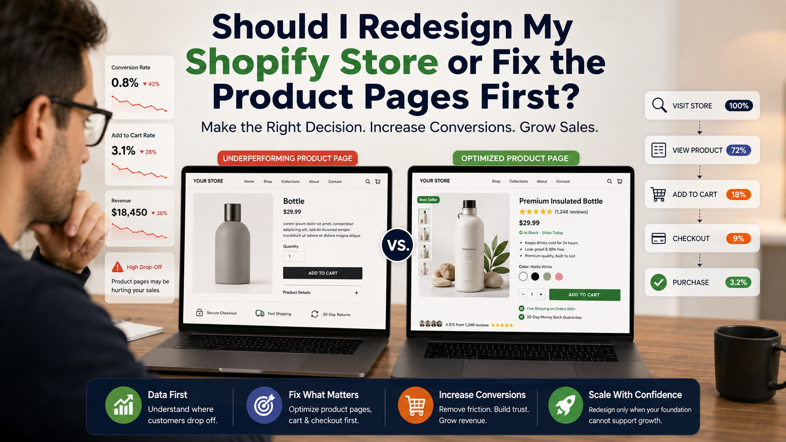
Most Shopify brands should fix their product pages, mobile buying journey, cart, and checkout before committing to a full Shopify Store Redesign. If traffic is healthy but product pages fail to answer buying questions, build trust, or move shoppers toward checkout, targeted optimization is usually the better first step. A redesign makes more sense when the underlying theme, architecture, navigation, performance, or brand positioning prevents those improvements from being implemented properly.
TL;DR: What Should You Fix First?
- A visually dated Shopify store does not automatically need a complete redesign.
- Product pages should be audited before changing the entire storefront because they are where shoppers evaluate products, pricing, trust, and purchase risk.
- Baymard currently reports an average ecommerce cart abandonment rate of about 70%, showing how much revenue can disappear after a shopper has already demonstrated buying intent.
- Shopify’s current UX guidance emphasizes product discovery, product-page clarity, mobile usability, speed, cart experience, and checkout as connected parts of ecommerce performance.
- A full redesign is justified when the existing theme, information architecture, mobile experience, or technical limitations prevent meaningful conversion improvements.
- The safest approach is to diagnose revenue friction first, fix what can be fixed, and rebuild only when the existing foundation is genuinely limiting growth.
Should You Redesign or Fix the Existing Store?
The right decision depends on where shoppers are dropping out, not how old the theme looks.
| What you are seeing | Most likely priority | Why |
|---|---|---|
| Traffic is low | SEO/content/acquisition | A redesign alone will not create demand |
| Product views are strong but add-to-cart is weak | Product page optimization | The buying decision is breaking before the cart |
| Add-to-cart is healthy but purchases are weak | Cart/checkout optimization | Purchase friction is likely occurring later |
| Mobile conversion is significantly weaker | Mobile UX/CRO | The mobile buying journey needs investigation |
| Store looks dated but performs well | Targeted visual improvements | Appearance alone does not justify rebuilding |
| Navigation is confusing | UX/architecture work | Product discovery is being interrupted |
| Theme prevents important UX changes | Redesign | The platform foundation may be limiting growth |
| Multiple apps create performance issues | Technical audit/redesign | Technical debt may be affecting usability |
| Brand positioning has changed substantially | Strategic redesign | The existing experience may no longer represent the business |
Shopify itself describes ecommerce UX as the complete interaction between discovery, product pages, navigation, speed, cart, checkout, and mobile experience. That is important because changing the homepage while leaving the actual buying journey untouched rarely solves the underlying commercial problem.
Why Does a Store That Looks Outdated Not Necessarily Need a Redesign?
A dated visual style is a design problem, but weak revenue performance can come from an entirely different part of the customer journey.
I frequently see ecommerce owners make the same assumption: “The website looks old, therefore the website is the reason sales are weak.” That conclusion is too simplistic.
A Shopify store can have an older-looking visual system and still have:
- strong organic traffic
- effective product pages
- healthy add-to-cart behavior
- good repeat-purchase performance
- clear navigation
- reliable checkout
- strong customer reviews
- good mobile usability
Conversely, a beautifully redesigned store can still struggle if product information is weak, shipping costs appear too late, reviews are difficult to find, product variants are confusing, or the checkout creates unnecessary hesitation.
Shopify’s own 2026 product-page guidance emphasizes descriptive product information, identifiable imagery, pricing, variants, availability, reviews, and clear add-to-cart functionality.
A beautiful ecommerce interface cannot compensate for a weak buying decision.
This is why I would diagnose the funnel before approving a redesign budget.
What Is Holding Your Online Store Back?
A website can look professional and still lose customers at critical moments. Before investing in a redesign, identify where your current ecommerce experience is creating friction.
- Product Page Experience
- Mobile Shopping UX
- Trust & Credibility
- Conversion Flow
- Checkout Friction
- Customer Journey
Get a Clearer View of Your Store
Book a quick 30-minute call to discuss your website, conversion challenges, and the improvements that could make the biggest difference.
Book Your Free Strategy Call →What Are the Symptoms That Tell You Product Pages Need Attention?
The clearest warning signs are usually expressed in operational language rather than design language.
You may hear your team saying:
- “People are visiting, but they aren’t adding products to the cart.”
- “Our ads are getting clicks, but sales aren’t following.”
- “Customers keep asking questions that are already supposed to be answered on the product page.”
- “Mobile traffic is high, but mobile sales are disappointing.”
- “People reach the cart but don’t finish.”
- “Our competitors seem to sell the same type of product more easily.”
- “We keep adding apps to improve conversions, but the store feels slower.”
- “The homepage looks better now, but revenue hasn’t really changed.”
Those are not automatically redesign problems.
They are diagnostic signals.
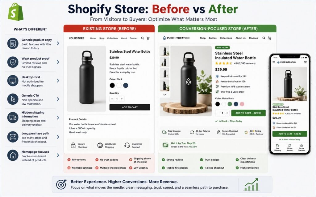
For example, if product-page views are strong but add-to-cart rates are weak, I would investigate product messaging, imagery, pricing presentation, reviews, variants, shipping information, guarantees, availability, and CTA placement before touching the entire theme.
That is where product page conversion becomes commercially important. The product page is not merely an information page. It is often the point where a shopper decides whether the product is worth the money and whether the business can be trusted.
How I Diagnose a Shopify Store Before Recommending a Redesign
My first step is to separate a conversion problem from a foundation problem.
At KG Web Designer, I would inspect the store in this order:
1. Traffic quality
I want to know whether visitors are actually relevant buyers.
High traffic from poorly matched advertising, informational searches, or broad social audiences can create the illusion of a website problem.
2. Product-page engagement
I would examine:
- product-page entry points
- engagement
- scroll behavior
- add-to-cart rate
- variant interaction
- image interaction
- product-page exits
3. Mobile behavior
Mobile needs to be treated as a primary buying environment, not a smaller desktop version.
Navigation, product images, sticky purchase controls, variant selection, pricing visibility, reviews, and checkout access all need to work comfortably with a thumb.
4. Cart behavior
If customers add products but leave before purchasing, I would investigate the cart before rebuilding the homepage.
Baymard’s ongoing research places average cart abandonment at roughly 70%, making the post-add-to-cart stage one of the biggest potential revenue leaks in ecommerce.
5. Checkout
I would examine where shoppers abandon the checkout process and whether unnecessary steps, unclear costs, payment friction, or lack of confidence are contributing.
Shopify’s current checkout guidance specifically recommends measuring the funnel by stage rather than relying only on the overall conversion rate.
6. Technical foundation
Only after understanding the customer journey would I ask whether the theme, apps, integrations, architecture, or performance prevent the required improvements.
That distinction can save a business from spending thousands of dollars rebuilding something that could have been fixed.
What Does a Shopify Store Redesign Actually Fix?
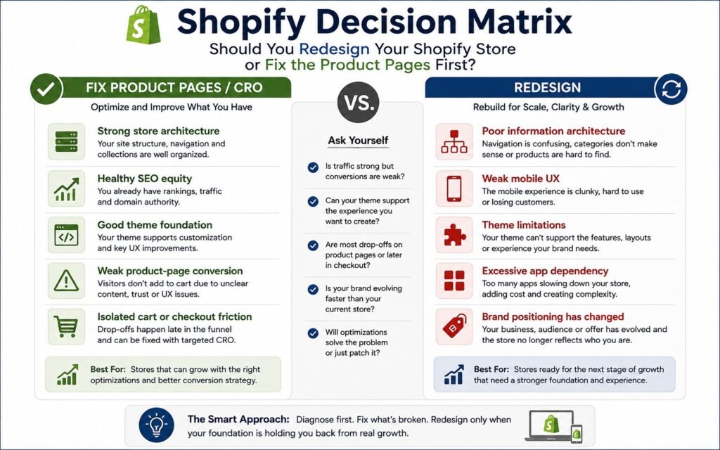
A Shopify Store Redesign is justified when the problem exists at the structural level rather than being isolated to individual pages.
Typical redesign triggers include:
- The theme prevents meaningful UX improvements.
You cannot create the product layouts, navigation, filtering, merchandising, or purchase controls the business actually needs. - The store architecture has become difficult to navigate.
Customers cannot easily move from category discovery to relevant products. - The brand has materially evolved.
The current store communicates an older positioning, lower-quality perception, or completely different market proposition. - Mobile UX is fundamentally weak.
Important interactions require too much scrolling, tapping, zooming, or backtracking. - The store has accumulated excessive technical debt.
Too many apps, scripts, customizations, and workarounds can make optimization increasingly difficult. - The product catalog has outgrown the original structure.
What worked for 20 products may not work for hundreds. - The customer journey needs to be redesigned rather than cosmetically improved.
In that situation, changing colors and typography is treating the symptom rather than the problem.
Shopify stores can absolutely be optimized without being completely rebuilt. The question is whether the existing foundation gives you enough control to make the improvements your customers need.
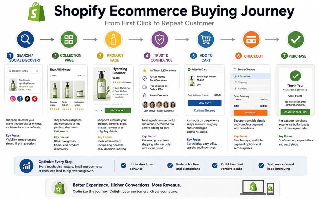
What Should You Fix Before Rebuilding the Entire Store?
If your current Shopify store is structurally sound, I would normally prioritize the pages closest to revenue.
Product pages
Improve:
- product positioning
- benefit-led copy
- imagery
- product demonstrations
- reviews
- specifications
- comparison information
- shipping clarity
- returns information
- guarantees
- FAQs
- variants
- availability
- purchase CTAs
Shopify specifically recommends clear product names, identifiable imagery, pricing, variants, availability, informative descriptions, reviews, and other confidence-building elements on effective product pages.
Collection pages
A shopper should be able to understand:
- what products belong in the collection
- how products differ
- how to filter
- how to sort
- what matters when choosing
- which product is appropriate for them
Cart
The cart should reinforce confidence rather than introduce uncertainty.
Shipping costs, estimated delivery, returns, payment options, discounts, and the next step should be understandable.
Checkout
Reduce unnecessary friction while maintaining the information customers need to complete the transaction confidently.
Mobile
Test the entire purchase journey on real mobile devices.
Not just the homepage.
What Is the Difference Between CRO and a Full Redesign?
CRO improves the existing buying system; redesign changes the system when the existing foundation cannot support the required improvements.
That distinction is central to good ecommerce strategy.
| Situation | Best approach |
|---|---|
| Weak product descriptions | Product-page optimization |
| Weak reviews or trust signals | CRO |
| Confusing CTA hierarchy | CRO |
| Poor mobile spacing | UX optimization |
| Weak collection navigation | UX/architecture improvement |
| Slow third-party app stack | Technical optimization |
| Theme cannot support required layouts | Redesign |
| Entire brand positioning has changed | Redesign |
| Store architecture has become unmanageable | Redesign |
| Checkout is creating measurable friction | Checkout optimization first |
CRO should come before redesign when the underlying store can still support the required customer journey.
That is why ecommerce conversion optimization should not be treated as a final-stage activity after a redesign. It should influence the decision about whether a redesign is necessary in the first place.
That decision becomes even more important when the store is receiving meaningful traffic but growth has stalled. Before choosing between another round of CRO, increased acquisition, or a complete rebuild, premium brands should identify which part of the growth system is actually limiting profitable revenue. Our guide, Paid Ads, CRO or Website Redesign: Where Should a Premium eCommerce Brand Invest First?, provides a broader framework for deciding when to optimize the existing store, increase qualified traffic, or move toward a structural redesign.
Is Your Ecommerce Website Turning Visitors Into Buyers?
If shoppers are visiting your store but leaving without purchasing, your website may be creating unnecessary friction. Let’s identify the gaps in your product pages, user experience, trust signals, and conversion flow.
Get your top 3 ecommerce conversion opportunities identified.
Why Do Shopify Stores Often Get This Decision Wrong?
The biggest mistake is equating visual dissatisfaction with commercial underperformance.
Founders see a competitor with a cleaner website and assume their store needs to look similar. Then the redesign begins without first identifying whether the actual problem is acquisition, product positioning, trust, mobile usability, merchandising, cart friction, or checkout.
Another common mistake is buying apps instead of fixing the experience.
Apps can add useful functionality, but stacking solutions on top of a weak customer journey does not automatically create a better store.
Three ecommerce observations I repeatedly see
First, product pages are often underdeveloped compared with homepages.
Brands spend significant time creating an impressive homepage while leaving product pages with thin descriptions, weak proof, and generic imagery. Yet that is where the customer is making the purchase decision.
Second, mobile problems are often interaction problems rather than purely speed problems.
A page can technically load quickly and still feel difficult to shop because important information is buried, buttons are awkward, or variant selection is frustrating.
Third, trust is frequently treated as a footer element.
Returns, delivery, reviews, guarantees, payment information, and customer support should appear at the moments when shoppers naturally question purchase risk.
What Does Our Ecommerce Review Data Tell Us?
Our 2026 review of 40 mid-market ecommerce stores found a consistent pattern: the stronger stores were not simply the ones with the most sophisticated visual design.
They consistently prioritized trust, mobile usability, product clarity, navigation, checkout simplicity, and the broader customer journey.
The review evaluated stores across fashion, beauty, wellness, home goods, and DTC electronics using 35 conversion, UX, trust, mobile-commerce, checkout, retention, and AI-readiness criteria.
Original observation from KG Web Designer: Across these reviews, businesses frequently invested disproportionate attention in homepage presentation while under-investing in product pages, category navigation, and checkout. The commercial opportunity was often not “make the website prettier,” but “remove the specific friction preventing an interested shopper from buying.”
That is an important distinction for any Shopify owner deciding where to spend their next website budget.
Example Scenario
Imagine a DTC skincare brand receiving 80,000 monthly visitors.
The homepage looks dated, so the founder assumes a redesign is necessary.
However, the analytics show that product pages receive strong traffic, add-to-cart rates are reasonable, but mobile shoppers abandon heavily after entering the cart.
In that situation, I would not start by redesigning the homepage.
I would investigate:
- Mobile cart usability.
- Shipping-cost visibility.
- Delivery expectations.
- Returns messaging.
- Payment options.
- Checkout friction.
- Trust signals.
- Unexpected costs.
If those issues can be solved within the existing theme, the business may be able to recover revenue without undertaking a full rebuild.
What Does the Right Action Plan Look Like?
The most practical sequence is measure, diagnose, fix, then rebuild only if necessary.
First: Measure
Review:
- traffic sources
- product-page performance
- add-to-cart rate
- checkout initiation
- purchase conversion
- mobile versus desktop
- cart abandonment
- top landing pages
- revenue by device
- revenue by product
Second: Diagnose
Identify the largest commercially meaningful drop-off.
Do not optimize everything at once.
If the biggest leak is product-page confidence, fix product pages.
If the biggest leak is checkout, start there.
If organic traffic is declining because of structural issues, SEO needs to be part of the diagnosis.
Third: Fix
Prioritize improvements closest to revenue.
This could involve:
- product page restructuring
- improved imagery
- stronger reviews
- clearer benefits
- better mobile CTA placement
- collection navigation
- cart improvements
- checkout simplification
- app reduction
- performance improvements
Fourth: Rebuild only if necessary
A redesign becomes appropriate when the existing system prevents the improvements you now know are required.
That is a much stronger reason to redesign than simply saying, “The theme is five years old.”
If This Were My Shopify Store, What Would I Do?
If this were my website, I would not approve a redesign until I had seen the numbers behind the buying journey.
I would first identify where qualified shoppers stop moving forward.
If product pages are the problem, I would fix product pages.
If mobile is the problem, I would fix mobile.
If checkout is the problem, I would fix checkout.
If the theme and architecture prevent those changes, then I would redesign.
That judgment is important because a redesign is not inherently a conversion strategy. It is a delivery mechanism for a better strategy.
At KG Web Designer, I prefer to establish the commercial problem first and then determine whether the answer requires CRO, UX changes, technical work, or a complete rebuild.

Build an Ecommerce Website Designed to Sell — Not Just Impress
With 18+ years of experience and 500+ websites delivered, I create custom ecommerce websites for businesses in the US, UK, and Australia. From user experience to conversion flow, every element is built with growth in mind.
What Should You Avoid Before Spending on a Redesign?
Avoid these five mistakes:
1. Redesigning because competitors look better
Your competitor’s visual style does not prove that your store’s conversion problem is visual.
2. Changing the homepage first
The homepage may not be where the biggest revenue leak exists.
3. Adding another app for every conversion problem
More functionality can create more scripts, complexity, and maintenance requirements.
4. Ignoring mobile behavior
A desktop-first store can hide major problems that become obvious when customers shop on smaller screens.
5. Migrating without protecting SEO
If URLs, metadata, internal links, structured data, redirects, and indexation are mishandled, a redesign can create an organic traffic problem that did not previously exist.
How Does a Better Product Experience Increase Revenue?
The commercial objective is not simply a higher conversion rate.
The objective is more profitable revenue from the traffic you already have.
Consider a simplified example:
10,000 qualified visitors × 1% conversion = 100 orders
10,000 qualified visitors × 2% conversion = 200 orders
The traffic has not changed.
The potential order volume has doubled.
That is why online store sales should be evaluated alongside traffic, not independently from it.
Shopify’s current UX guidance makes the same broader point: ecommerce UX spans discovery, product information, mobile usability, speed, cart, and checkout rather than one isolated page.
What Does This Mean for Your Business?
The biggest opportunity may already be sitting inside your existing traffic.
If customers are arriving but hesitating, your first objective should be understanding why.
If your product pages answer questions clearly, build confidence, work well on mobile, and move shoppers naturally toward purchase, a redesign may add less value than expected.
If the existing theme cannot support the experience your customers now require, then rebuilding becomes a strategic investment rather than a cosmetic expense.
The right decision protects three things simultaneously:
- existing search equity
- existing customer behavior
- future conversion potential
That is ultimately what separates a strategic ecommerce redesign from an expensive visual refresh.
Example From Our Experience
Problem: During our broader review of 40 mid-market ecommerce stores, we repeatedly encountered stores that had invested heavily in brand presentation while leaving product pages, mobile UX, navigation, and checkout less developed.
Solution: We evaluated stores against a structured set of conversion, UX, trust, mobile-commerce, checkout, retention, and AI-readiness criteria rather than judging them by visual appearance alone.
Outcome: The strongest patterns were clear: better stores consistently reduced decision friction, communicated product value faster, established trust earlier, and made purchasing easier. The practical lesson was that conversion architecture mattered more than simply making the storefront look newer.
That observation is also consistent with our separate analysis of leading ecommerce websites, where product pages, mobile experience, checkout, navigation, and trust were treated as interconnected parts of the buying system.
For a deeper look at what high-performing stores are doing differently, our analysis of 40 ecommerce stores and the patterns behind stronger-performing brands provides additional context.
Not Sure What Your Ecommerce Website Really Needs?
Let’s look at your store, identify the biggest opportunities for improvement, and discuss what it would take to turn more visitors into customers. No hard sell — just practical recommendations and clear next steps.
When Does Professional Ecommerce Help Make Sense?
Professional help makes sense when you cannot confidently identify whether the problem is traffic, product positioning, UX, technology, or the buying journey.
That is especially true when a store has meaningful revenue at stake and a redesign could affect URLs, SEO, analytics, integrations, customer accounts, product data, or checkout behavior.
KG Web Designer approaches ecommerce work around the commercial objective first: understand the business, evaluate the existing experience, identify the friction, then decide whether optimization or rebuilding is justified.
If the diagnosis points toward a more strategic ecommerce project, you can review the scope of ecommerce website design services and the conversion, mobile, product, cart, checkout, and SEO elements that can be incorporated into the build.
A good ecommerce project should not begin with “Which theme should we use?”
It should begin with “Where are we losing customers, and what needs to change?”
What Can You Learn From Other High-Converting Ecommerce Stores?
Looking at successful ecommerce brands is useful when you study the underlying decisions rather than copying their aesthetics.
Our review of leading ecommerce websites found recurring patterns around product storytelling, navigation, mobile usability, trust, checkout, accessibility, and purchase confidence.
If you want to compare those patterns with your own store, our analysis of 15 of the best ecommerce website designs in 2026 breaks down what brands across fashion, beauty, electronics, home, and DTC are doing differently.
The lesson is not that every successful brand needs a custom visual system.
The lesson is that successful stores make it easier for customers to understand, evaluate, trust, and buy.
How Can You Protect ROI If You Decide to Redesign?
A redesign should preserve what already works while deliberately improving what does not.
That means creating an inventory of existing URLs, high-performing pages, organic landing pages, product data, analytics, internal links, metadata, structured data, redirects, and important customer journeys before development begins.
It also means separating design changes from business assumptions.
If your current product page converts better than the proposed new layout, the new design should not automatically win because it looks more modern.
Our separate analysis of custom ecommerce design versus Shopify templates makes the same broader point: the decision should be evaluated around conversion, scalability, performance, differentiation, and long-term business value rather than upfront appearance alone.
Expert Insight from Kanika Gupta
Kanika Gupta, Founder, KG Web Designer
My strongest recommendation is simple: do not let the phrase “redesign” become the diagnosis.
A redesign is an answer to a diagnosed problem, not the problem itself.
I have seen businesses spend significant time changing layouts, colors, typography, imagery, and themes when the actual commercial issue was much narrower. The better approach is to identify the point where customer confidence or momentum breaks, then invest at that point first.
If the existing Shopify foundation can support the necessary improvements, I would rather preserve the working parts and improve the revenue path.
If it cannot, then rebuilding is justified.
That is the difference between redesigning a website and redesigning a buying experience.
Final Thoughts
The best Shopify Store Redesign is not necessarily the most visually impressive one. It is the one that solves a clearly identified business problem without sacrificing the search visibility, customer behavior, data, and revenue systems that already work.
If product pages are weak, fix them.
If mobile UX is weak, fix it.
If checkout is leaking customers, fix checkout.
If the theme, architecture, or technical foundation prevents those improvements, then rebuild.
The decision should come from evidence rather than frustration with how the current store looks.
If you want an expert assessment of whether your store needs targeted conversion work or a complete redesign, you can request a website strategy review through KG Web Designer’s contact page or schedule a 30-minute strategy session.
Looking for a Website Built Around Your Healthcare Business?
Different healthcare businesses need different digital experiences. Explore our specialised website design solutions built to communicate your services clearly, build patient confidence, and make enquiries easier.
Discuss Your Website Requirements →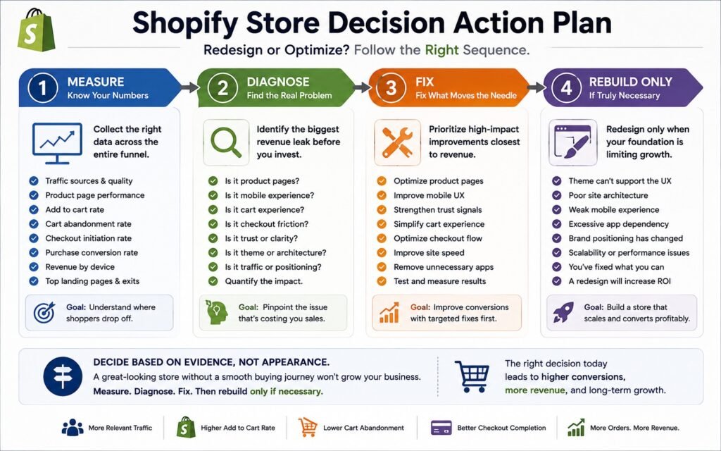
FAQs
Should I redesign my Shopify store or optimize product pages first?
Start with product pages if your store has healthy traffic but weak add-to-cart behavior. Product pages are where shoppers evaluate product value, imagery, pricing, reviews, variants, shipping, and purchase risk. A redesign becomes more appropriate when the existing theme or architecture prevents you from fixing these issues properly.
How do I know if my Shopify store needs a redesign?
Your store likely needs a redesign when several structural problems exist at the same time, such as weak navigation, poor mobile UX, outdated brand positioning, difficult product discovery, technical limitations, excessive app dependency, or an architecture that prevents meaningful conversion improvements. If the problems are isolated, targeted optimization is usually the better starting point.
Can better product pages increase Shopify sales?
Yes, better product pages can improve the buying decision by making products easier to understand and reducing uncertainty. Strong product pages typically combine clear benefits, useful specifications, quality imagery, reviews, pricing, availability, shipping information, returns, and obvious purchase actions. The objective is to answer important questions before the shopper feels the need to leave the page.
What is the difference between Shopify CRO and a redesign?
Shopify CRO focuses on improving the performance of the existing customer journey through testing, UX changes, product-page improvements, cart optimization, checkout improvements, and trust-building. A redesign changes the underlying interface and potentially the architecture. CRO should generally be considered first when the existing foundation can support the required improvements.
How much does a Shopify store redesign cost?
The cost depends heavily on catalog size, theme customization, UX strategy, integrations, migration requirements, content, SEO preservation, and custom functionality. A simple visual refresh is very different from rebuilding a large Shopify store with complex product structures, international requirements, integrations, and conversion strategy. The scope should therefore be defined after the existing store is audited.
Can I improve conversion without rebuilding my Shopify store?
Yes. Many stores can improve performance through product-page restructuring, better mobile UX, stronger trust signals, improved collection navigation, clearer CTAs, cart improvements, performance work, and checkout optimization. A rebuild is not necessary unless the existing theme or technical foundation prevents those improvements.
Should I fix checkout before redesigning my Shopify store?
If analytics show significant drop-off between cart and purchase, investigate checkout before redesigning the storefront. Baymard’s ongoing research shows that cart abandonment remains extremely high across ecommerce, while Shopify recommends measuring checkout performance by individual funnel stages rather than relying only on overall conversion rate.