Quick Answer
An underperforming eye clinic website design needs more than a visual refresh. We would rebuild the patient journey around specialty clarity, doctor credibility, treatment information, accessible mobile UX, location context, and appointment intent. The goal is to remove uncertainty between a patient’s Google search and their decision to contact the clinic.
TL;DR: What We Would Change First
- The first screen should explain the clinic’s specialty, location, credibility, and next step without making patients search for basic information.
- Treatment pages should help patients evaluate care, not exist merely to target SEO keywords.
- Doctor credentials should appear where clinical decisions happen instead of being isolated inside biography pages.
- Appointment funnels should explain what happens next, not simply place more “Book Now” buttons throughout the website.
- Accessibility deserves particular attention because eye-care audiences can include people with low vision and older adults with changing visual abilities.
- A redesign should protect valuable search visibility while improving the journey from search query to treatment information to specialist to appointment.
Live Teardown: What Did We Find on Real Eye-Care Websites?
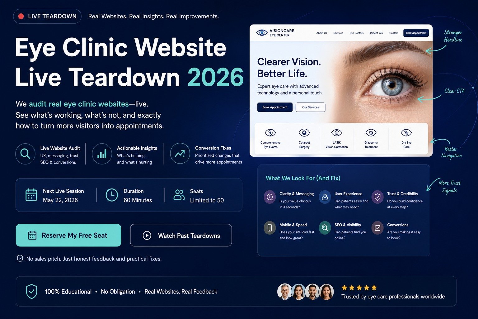
Our research shows that established eye-care websites already use several useful conversion patterns, but no clinic should be copied blindly. We reviewed publicly accessible elements from eye-care organizations serving New York, London, and Sydney and compared those patterns against the patient journey we would design.
Importantly, we are not claiming that any of these websites has a conversion problem. Their analytics, booking completion rates, lead quality, and patient acquisition data are private. A public teardown can evaluate visible UX and content decisions, but it cannot legitimately declare that a design element is “losing 37% of patients” without supporting analytics.
Real Website Teardown Snapshot
| Website Pattern We Reviewed | What Is Publicly Visible | What Works | What We Would Test or Develop Further |
|---|---|---|---|
| Manhattan Eye, New York | Prominent online booking, LASIK/SMILE and cataract positioning, same-day appointment messaging, affiliations and multiple languages | Strong action visibility and specialty positioning | Whether different treatment intents need more contextual appointment pathways |
| Moorfields Private, London | Extensive patient information, consultants, treatments, locations and practical appointment guidance | Strong information depth and patient preparation | How private-patient journeys can be shortened without losing necessary information |
| Sydney eye-care market | Clinics commonly need to balance practitioner credibility, treatment marketing and Australian health advertising requirements | Clinical authority can be made highly visible | Testimonials, outcome claims and promotional language require particular regulatory care in Australia |
| Our proposed redesign | Patient-intent routing rather than an organization-first structure | Reduces the amount of interpretation required from the patient | Test progression from treatment → doctor → location → appointment |
For example, Manhattan Eye currently makes “Book Online” highly visible and describes itself as a boutique ophthalmology and LASIK practice focused on laser vision and cataract surgery. It also publishes same-day appointment information, affiliations and languages spoken.
That does not prove those elements increase conversions. It does show the kind of information a prospective patient can use when deciding whether a clinic is relevant.
Standalone Teardown Principle
A live website teardown should separate three things: what is publicly observable, what we infer may create friction, and what we would validate through analytics or testing.

Are Patients Leaving Your Eye Clinic Website Without Booking?
If your website isn’t converting visitors into appointments, the problem is usually trust, clarity, and booking flow. Discover how a conversion-focused optometrist website can increase patient enquiries.
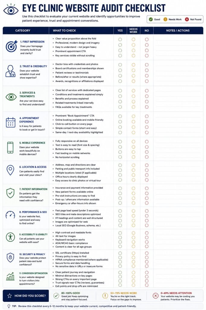
What Would We Audit Before Starting an eye clinic website redesign?
We would audit the patient’s complete decision journey before opening a design tool. A redesign should diagnose where uncertainty develops rather than assume that an outdated appearance is the primary problem.
Our audit would examine four layers.
1. Acquisition
We would identify:
- Which pages receive organic traffic
- Which treatments attract high-intent visitors
- Whether paid traffic reaches relevant landing pages
- Which location pages generate discovery
- Existing rankings that must be protected
- Whether search intent matches page content
2. Patient Understanding
We would ask:
- Can patients immediately understand what the clinic specializes in?
- Can they navigate by condition as well as treatment?
- Is medical terminology explained?
- Can they determine which specialist is relevant?
- Can they identify the appropriate location?
3. Trust
We would examine:
- Doctor credentials
- Relevant professional registration
- Hospital or academic affiliations
- Clinical experience
- Technology claims
- Treatment explanations
- Patient information
- Regulatory-sensitive marketing claims
4. Conversion
Finally, we would investigate:
- Appointment CTA visibility
- CTA wording
- Form complexity
- Mobile usability
- Location selection
- Response expectations
- Telephone pathways
- Third-party booking interfaces
- Appropriate analytics and tracking
This determines the scope of the required eye clinic website design services. Some clinics need a complete rebuild. Others may achieve more by restructuring several high-value treatment pages, improving doctor profiles, simplifying appointment journeys, and repairing mobile UX.
What Is the First Problem We Would Fix in an Eye Clinic Website Design Teardown?
We would fix unclear positioning above the fold first because patients should not have to investigate a clinic before understanding whether it is relevant to their needs.
A common clinic homepage formula looks something like:
Better Vision. Better Life.
followed by:
Advanced Eye Care You Can Trust.
The language sounds positive, but it communicates very little.
Is this an optometry practice?
A cataract surgery center?
A retina specialist?
A LASIK clinic?
A multi-specialty ophthalmology group?
A patient should not need to scroll to discover the answer.
What the First Screen Should Answer
Within the opening experience, we would try to establish:
- What kind of clinic is this?
- What does it specialize in?
- Where does it provide care?
- Why is it credible?
- What should I do next?
That is the first major difference between a brand-first homepage and a patient-decision homepage.
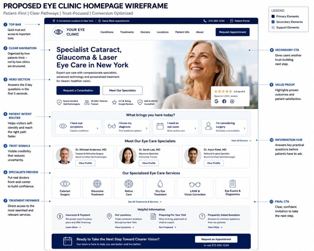
Proposed Redesign Wireframe: The First Screen
Instead of discussing the redesign only in abstract UX terminology, this is the structure we would prototype.
+------------------------------------------------------------------+
| LOGO   Conditions   Treatments   Doctors   Locations   Patient Info |
|                                             [Request Appointment] |
+------------------------------------------------------------------+

| SPECIALIST EYE CARE IN [CITY]                                    |
|                                                                  |
| Cataract, glaucoma and vision-care consultations with            |
| experienced eye-care specialists.                               |
|                                                                  |
| [Request a Consultation]     [Meet Our Specialists]              |
|                                                                  |
| Verified Credential | Relevant Affiliation | Clinic Location     |

+------------------------------------------------------------------+

| WHAT BRINGS YOU HERE?                                            |
|                                                                  |
| [I have symptoms]       [I know my diagnosis]                    |
| [I need an eye exam]    [I'm considering treatment]              |

+------------------------------------------------------------------+
This is not intended to be the finished visual design. It is a conversion wireframe showing the hierarchy we would validate before colors, typography, photography, animation, or decorative elements are introduced.
The key shift is from:
“Here is our clinic.”
to:
“Here is how we can help you understand your next step.”
Are Patients Leaving Your Eye Clinic Website Without Booking?
If your website isn’t converting visitors into appointments, the problem is usually trust, clarity, and booking flow. Discover how a conversion-focused optometrist website can increase patient enquiries.
Expert Insight from Kanika Gupta
“When someone shows me an eye clinic website and asks whether it needs redesigning, I usually don’t start with colors, fonts, or whether the homepage looks old. I open it as if I’m a patient. Can I tell what this clinic actually specializes in? Can I find the right doctor? Do I know which location I need? And if I’m ready to enquire, do I understand what happens next? It’s surprising how often excellent clinics make those basic questions difficult to answer.”
Kanika Gupta, Founder, KG Web Designer
That is particularly relevant to optometrist website design because a routine examination, contact-lens appointment, urgent concern, myopia-management enquiry, and specialist referral do not necessarily represent the same patient intent.
The website architecture should recognize those differences instead of funneling every visitor toward the same generic contact page.
What Would We Annotate on the Real Manhattan Eye Homepage?
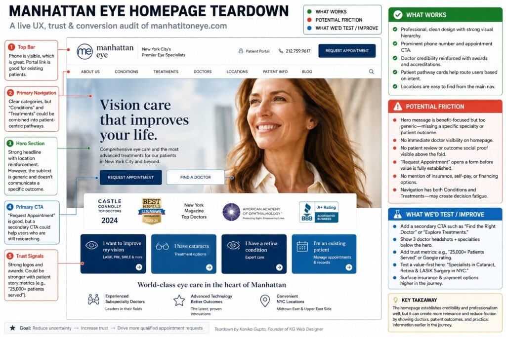
The first thing we would annotate is the visibility of its booking pathway and specialty positioning.
The current Manhattan Eye homepage displays “Book Online” prominently, identifies the practice as an ophthalmology and LASIK practice, emphasizes laser vision and cataract surgery, mentions same-day appointments and walk-ins, lists several languages, and presents professional affiliations.
What Works
1. Booking visibility
The patient does not need to hunt for the primary action.
2. Specialty clarity
LASIK and cataract care are surfaced rather than hidden under a broad “Services” label.
3. Practical differentiation
Same-day appointment information addresses a real logistical consideration.
4. Clinician trust
Affiliations are connected to the physician rather than presented only as decorative logos.
What We Would Test
We would examine whether a visitor researching cataracts should receive exactly the same booking experience as someone considering LASIK or seeking general eye care.
We would also evaluate whether each high-intent treatment pathway provides enough decision information before presenting the appointment request.
Again, this is the distinction between a legitimate teardown and speculation:
We can observe that a CTA is prominent. We cannot claim that it converts well without analytics.
Why Is Accessibility a Core Conversion Requirement for an Eye Clinic?
Accessibility is unusually relevant to eye-care websites because the audience itself may include people with low vision or age-related changes in visual ability.
The W3C’s current WCAG 2.2 standard includes Success Criterion 2.5.8, which establishes a minimum target size of 24 by 24 CSS pixels, subject to specified exceptions. The broader standard addresses accessibility for people with disabilities, including visual disabilities.
For a clinic redesign, however, we would not treat 24 × 24 pixels as a design recommendation to make every control that small.
Meeting a technical minimum and creating a comfortable interface are different goals.
What We Would Audit
- Text size
- Line spacing
- Contrast
- Button size
- Spacing between interactive controls
- Keyboard navigation
- Visible focus states
- Form labels
- Error messages
- Alternative text
- Zoom behavior
- Mobile menus
- Appointment widgets
- Third-party scheduling interfaces
A clinic could have a beautiful homepage and still create substantial usability friction if the appointment button is difficult to distinguish, the form uses tiny fields, or a third-party booking widget becomes difficult to operate at increased zoom.
Standalone Fact
Accessibility should be evaluated across the complete appointment journey, including third-party booking interfaces, not only the clinic’s marketing pages.
Turn Patient Trust Into More Appointments
Patients don’t just compare clinics — they compare clarity, professionalism, and ease of booking. A well-designed eye clinic website builds confidence before they even call.
What We Consistently Notice on Eye Clinic Websites
Across clinic-focused website reviews, one recurring issue we notice is a mismatch between clinical expertise and digital presentation.
A practice may have highly qualified doctors, sophisticated diagnostic technology, several treatment options, and years of clinical experience. Yet its homepage reduces all of that differentiation to phrases such as “advanced care,” “personalized treatment,” and “state-of-the-art technology.”
Those phrases are difficult for patients to evaluate.
Our redesign would move evidence closer to the point of uncertainty:
| Patient Uncertainty | Evidence We Would Surface |
|---|---|
| “Does this clinic treat my condition?” | Relevant treatment/condition pathway |
| “Who would I see?” | Named specialist |
| “Is this doctor qualified?” | Verified credentials and relevant affiliations |
| “Where is treatment available?” | Location attached to service |
| “What happens at the consultation?” | Clear consultation process |
| “How do I proceed?” | Contextual appointment action |
This is one of the most important differences between making a clinic website look more trustworthy and actually giving patients information they can use to establish trust.
That distinction becomes even more important for established practices that already receive patients through referrals. A referral creates initial confidence, but the website can still influence whether the patient follows through. Our guide on whether investing in a better eye clinic website is worth it examines that referral-to-booking journey and the factors that should be considered before deciding whether a redesign is financially justified.
Are Patients Leaving Your Eye Clinic Website Without Booking?
If your website isn’t converting visitors into appointments, the problem is usually trust, clarity, and booking flow. Discover how a conversion-focused optometrist website can increase patient enquiries.
How Do Healthcare Marketing Rules Change the Redesign?
A healthcare website cannot apply ordinary ecommerce conversion tactics without considering the regulatory context of the clinic’s market.
For US practices subject to HIPAA, HHS maintains specific guidance on online tracking technologies. Importantly, the current HHS page also notes that a federal court in June 2024 vacated part of its earlier tracking-technology guidance relating to certain unauthenticated public webpages. That is precisely why clinics should avoid simplistic claims such as “Google Analytics is always a HIPAA violation” and instead review their actual data flows, technologies, regulatory status, and professional compliance advice.
Australia creates different considerations. Ahpra’s advertising guidance states that advertising regulated health services must not be false or misleading, use prohibited testimonials, create unreasonable expectations of beneficial treatment, or encourage indiscriminate or unnecessary use of regulated health services. Ahpra also explains that the testimonial restriction concerns positive statements about clinical aspects such as symptoms, diagnosis, treatment, or outcomes.
For England, the Care Quality Commission registers providers to carry on regulated activities and requires relevant locations to be identified as part of registration. The precise regulatory obligations depend on the services and provider involved.
The conversion lesson is important:
Trust elements cannot simply be copied from a US competitor and deployed unchanged on a UK or Australian clinic website.
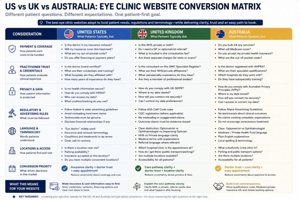
How Should Clinic Website Strategy Differ Across the US, UK and Australia?
International clinic websites need market-specific patient information because payment pathways, practitioner trust signals, terminology, privacy obligations, and healthcare regulation differ by country.
| Conversion Consideration | United States | United Kingdom | Australia |
|---|---|---|---|
| Common payment question | Insurance, network status, self-pay and financing | NHS versus private pathway where relevant | Medicare, private health insurance and self-pay |
| Practitioner trust | Relevant professional credentials, licensing and affiliations | Professional registration and relevant hospital/clinical affiliations | Practitioner registration and relevant specialist credentials |
| Privacy layer | HIPAA may apply depending on entity status and information involved | UK GDPR and applicable healthcare/privacy obligations | Australian privacy requirements may apply |
| Healthcare regulation | Federal and state requirements vary | CQC registration can apply to regulated activities in England | National Law advertising requirements apply to regulated health-service advertising |
| Terminology | Ophthalmologist, optometrist, eye doctor | Ophthalmologist, optometrist, dispensing optician | Ophthalmologist, optometrist |
| Website priority | Insurance + clinician + appointment clarity | Care pathway + clinician + location clarity | Practitioner + cost/payment + compliant marketing |
This is why international healthcare website strategy requires more than changing currencies or replacing “ZIP code” with “postcode.”
The patient’s expectations change with the healthcare system.
What This Patient Journey Looks Like in Practice
Consider a 62-year-old prospective cataract patient in New York who arrives from Google after researching cataract surgery.
Underperforming Journey
The homepage says:
Advanced Vision. Personalized Care.
The patient then has to:
- Find cataracts inside a large Services menu.
- Determine which doctor performs cataract surgery.
- Open another page to find the location.
- Search for insurance information.
- Return to the treatment page.
- Click a generic “Contact Us” button.
- Submit a form without knowing what happens next.
Nothing is obviously broken.
That is exactly the problem.
The journey contains small uncertainties at almost every stage.
Our Redesigned Journey
The cataract landing page would connect:
Cataract concern → Treatment explanation → Relevant specialist → Verified credentials → Consultation process → Location → Practical information → Request consultation
The clinical expertise has not changed.
The website has simply stopped making the patient assemble the evidence themselves.
Business Impact
If analytics later show that patients frequently reach cataract pages but rarely progress toward doctor profiles or consultation actions, we now have a measurable conversion hypothesis.
We can test the journey rather than declaring that a new color palette “increased trust.”
Turn Patient Trust Into More Appointments
Patients don’t just compare clinics — they compare clarity, professionalism, and ease of booking. A well-designed eye clinic website builds confidence before they even call.
Rebuilding the Treatment, Doctor and Appointment Journey
What Would We Change on the Treatment Pages?
Treatment pages should work as decision-support pages, not expanded service descriptions.
A patient researching cataract surgery, glaucoma management, dry-eye treatment, retinal care, or laser vision correction is rarely asking only, “What is this treatment?” They are also trying to determine whether the clinic is relevant, which specialist they would see, what happens during the consultation, where care is available, and what they should do next.
That changes how we would structure the page.
Instead of:
Treatment name → Generic explanation → Benefits → Contact us
we would create:
Patient concern → Treatment explanation → Suitability context → Specialist → Clinical evidence → Consultation process → Location → Practical information → Next step
The difference may appear subtle from an SEO perspective, but it is significant from the patient’s perspective.
Anatomy of the Treatment Page We Would Build
A major treatment page would contain the following layers.
1. Direct Answer Above the Fold
The opening should explain the treatment and the clinic’s relevance without forcing the patient through a long introduction.
For example:
Cataract Surgery in [Location]
Cataract surgery replaces the eye’s cloudy natural lens with an artificial lens. At [Clinic], consultations are provided by [relevant specialist], with treatment options discussed after an individual clinical assessment.
[Request a Cataract Consultation]
[Meet the Cataract Specialist]
Notice what this avoids.
There is no:
“Imagine seeing the world with crystal-clear vision again…”
The patient came for information, not advertising prose.
2. Who This Page Is For
We would then help visitors understand why someone might seek an assessment.
This might cover:
- A diagnosed cataract
- Progressive difficulty with vision
- Glare or difficulty with night vision
- Referral from another practitioner
- A patient exploring surgical options
This section should educate without attempting to diagnose the visitor.
3. Treatment Options
Where multiple treatment approaches exist, the page should explain them in understandable language and avoid implying that every visitor is suitable for the same procedure.
4. The Relevant Specialist
The clinician should appear inside the decision journey, not merely in a separate Doctors directory.
5. What Happens at the Consultation
This is often where practical information becomes as important as marketing.
6. Technology, When It Actually Matters
Rather than:
We use state-of-the-art technology.
we would explain:
- What the equipment is
- What it is used for
- Where in the patient journey it appears
- Why the information matters to the patient
7. Practical Information
Depending on the clinic and market:
- Location
- Referral requirements
- Insurance/private payment information
- Consultation preparation
- Typical next steps
- Transport considerations after certain examinations
- Contact options
8. Treatment-Specific FAQs
The questions should reflect genuine patient uncertainty rather than exist purely to occupy more SERP space.
9. Contextual CTA
Request a Cataract Consultation is clearer than Contact Us.
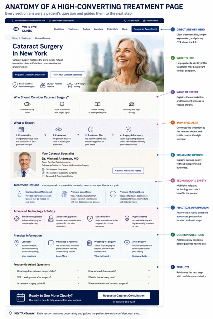
Proposed Treatment Page Wireframe
+----------------------------------------------------------------+
| CATARACT SURGERY IN [LOCATION]                                 |
|                                                                |
| Clear treatment summary + relevant specialist                  |
|                                                                |
| [Request Cataract Consultation]  [Meet Your Specialist]        |
+----------------------------------------------------------------+

| ARE CATARACTS AFFECTING YOUR VISION?                           |
| Symptoms / diagnosis context / when patients seek assessment   |
+----------------------------------------------------------------+

| YOUR CATARACT CONSULTATION                                     |
| Assessment → Tests → Discussion → Treatment Recommendation     |
+----------------------------------------------------------------+

| YOUR SPECIALIST                                                |
| [Photo] Dr. [Name]                                             |
| Credentials | Specialty | Location                             |
| [View Full Profile]                                            |
+----------------------------------------------------------------+

| TREATMENT OPTIONS                                              |
| Clear comparison without promising individual outcomes         |
+----------------------------------------------------------------+

| TECHNOLOGY & DIAGNOSTICS                                       |
| What we use → why it matters                                   |
+----------------------------------------------------------------+

| PRACTICAL PATIENT INFORMATION                                  |
| Location | Payment/Insurance | Preparation | What Happens Next |
+----------------------------------------------------------------+

| COMMON QUESTIONS                                               |
+----------------------------------------------------------------+

| READY TO DISCUSS YOUR OPTIONS?                                 |
| [Request a Cataract Consultation]                              |
+----------------------------------------------------------------+
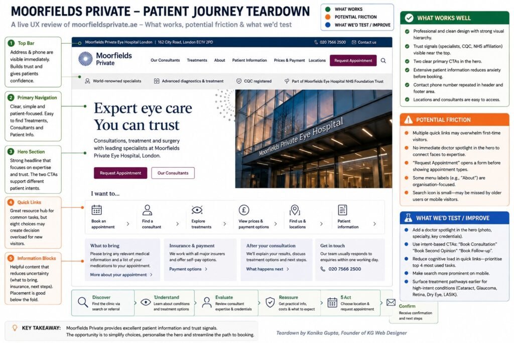
What Does Moorfields Teach Us About Patient Information?
Moorfields provides a useful example of why practical information deserves a place inside the conversion journey.
Its private outpatient information explains what patients should bring to an appointment, including relevant medical information. It also discusses insurance/payment arrangements, diagnostic testing and the possibility of pupil dilation. Patients are warned that dilation can affect vision and that they should not drive until their vision returns to normal.
This type of information is not decorative content.
It answers:
“What will actually happen when I go there?”
For a patient who is uncertain about booking, that question can matter as much as another paragraph describing the clinic’s technology.
What Works
Moorfields provides considerable depth around the patient experience.
Potential Friction We Would Investigate
A large specialist organization necessarily has extensive information architecture. We would therefore investigate whether different patient types can reach the right practical information without unnecessary navigation.
What We Would Test
We would examine pathways such as:
Treatment → Consultant → Location → Appointment Information
and measure whether users repeatedly move backwards through the navigation before finding what they need.
We would not claim that such friction currently exists without behavioral data.
Expert Insight From Kanika Gupta
Kanika Gupta, Founder, KG Web Designer
“One trend we repeatedly observe is that AI search engines reward clarity over promotion. Clinics often invest significant resources into visual design while underinvesting in expertise communication. AI systems are not impressed by claims. They respond to evidence. Physician credentials, treatment authority, educational content, patient trust signals, and structured information consistently outperform marketing language when it comes to earning citations.”
How Would We Redesign Doctor Profiles?
Doctor profiles are frequently treated as biography pages.
We would treat them as clinical decision pages.
The first screen should answer:
Is this the appropriate specialist for the problem I am researching?
Only after answering that should the page ask the patient to read a detailed career history.
Doctor Profile Hierarchy
Above the Fold
Dr. [Full Name]
[Verified professional credentials]
Specialist in:
Cataract Surgery | Glaucoma | [Relevant Areas]
Consults at:
[Location A] | [Location B]
[Request an Appointment With Dr. X]
Clinical Expertise
- Conditions treated
- Procedures performed
- Specialist interests
Professional Evidence
- Education
- Specialist training
- Professional registration
- Board/specialist certification where relevant
- Hospital affiliations
- Academic appointments
- Research/publications where appropriate
Patient Information
- Locations
- Languages
- Consultation information
- Related treatments
- Relevant FAQs
Next Step
Request a Consultation
This hierarchy makes credentials easier to evaluate because they are connected to the patient’s actual problem.
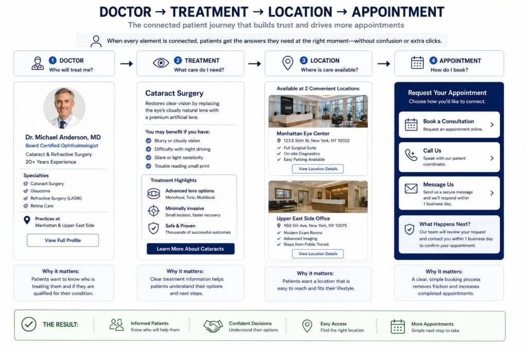
The Entity Relationship Search Engines and Patients Should Understand
A well-structured clinic website should establish clear relationships between four important entities:
Doctor ↔ Treatment ↔ Location ↔ Appointment
Consider a cataract patient.
They should be able to understand:
Dr. Smith
↓
provides
↓
Cataract Consultation / Surgery
↓
at
↓
Manhattan Clinic
↓
with
↓
Request Cataract Consultation
Those relationships should be reflected not only visually but also through navigation, internal linking, page content, breadcrumbs, and appropriate structured data.
This is where UX, SEO, and AI-search architecture begin supporting the same objective.
Structured Data We Would Review
Structured data does not make a weak clinic website authoritative. It can, however, help search systems understand information and relationships already represented accurately on the website.
Depending on the actual page and organization, relevant Schema.org types can include:
MedicalClinicPhysicianMedicalWebPageMedicalConditionMedicalProcedureBreadcrumbListFAQPage
A simplified clinic example might look like this:
<script type="application/ld+json">
{
  "@context": "https://schema.org",
  "@type": "MedicalClinic",
  "name": "Example Eye Clinic",
  "medicalSpecialty": [
    "Ophthalmology",
    "Optometry"
  ],
  "availableService": {
    "@type": "MedicalProcedure",
    "name": "Cataract Surgery"
  }
}
</script>
The implementation should match the clinic’s actual services and visible website content.
Structured data should never be used to invent specialties, doctors, ratings, credentials, locations, or services that users cannot verify on the website.
How Would We Connect Treatment Pages and Doctor Profiles?
This is one of the structural improvements I would prioritize.
Many clinic websites have both pages, but they behave like separate sections.
The treatment page says:
Our experienced surgeons provide cataract treatment.
The doctor page says:
Dr. X specializes in cataract surgery.
Yet neither meaningfully connects to the other.
We would create contextual relationships.
From Treatment Page
Your Cataract Specialist
Meet Dr. [Name], [verified credentials], whose clinical interests include cataract treatment and [relevant specialty].
View Dr. [Name]’s Profile
From Doctor Profile
Clinical Areas
Cataract Care
Glaucoma
[Other Relevant Service]Explore Cataract Treatment
This gives patients two ways to evaluate care:
Treatment-first:
“I know what procedure I’m researching.”
Doctor-first:
“I’ve been referred to this clinician.”
That distinction becomes particularly important for multi-specialty practices.
Industry Observation: The Doctor Page Is Often Too Far From the Conversion Moment
A recurring structural problem is that doctor credentials are available but not presented when patients are making treatment decisions.
A patient reading about cataract surgery may see:
Our experienced team provides advanced cataract treatment.
Then they have to leave the page, open “Our Team,” find the correct doctor, read the biography, navigate back to cataracts, and finally find the appointment form.
We would reduce that movement.
Treatment → Relevant Doctor → Evidence → Appointment
The objective is not fewer clicks at all costs.
The objective is fewer unnecessary decisions.
Turn Patient Trust Into More Appointments
Patients don’t just compare clinics — they compare clarity, professionalism, and ease of booking. A well-designed eye clinic website builds confidence before they even call.
How Would We Redesign the Appointment Funnel?
We would stop treating the appointment form as a universal destination.
A patient requesting a routine eye examination and a patient considering cataract surgery may have very different needs.
Routine Care Journey
Eye Examination → Location → Appointment → Confirmation
Specialist Journey
Condition/Treatment → Specialist → Preferred Location → Request Consultation → Clinic Follow-Up
Surgical Consideration Journey
Treatment Information → Specialist → Consultation Process → Request Assessment → Clinic Follow-Up
The underlying booking technology might still be shared.
What changes is the context surrounding the action.
What Should Patients Know Before They Submit the Form?
Depending on the clinic, service, and region, we would answer relevant questions such as:
- Is this form for new patients?
- Do I need a referral?
- Can I request a particular specialist?
- Which clinic should I select?
- What information will I need?
- Will I be booking directly or requesting an appointment?
- When should I expect a response?
- What happens after submission?
- What should I do if my eye problem is urgent?
Moorfields Private, for example, tells prospective patients that webform enquiries are usually answered within one working day.
That is a small but useful piece of conversion information.
Compare:
Submit
with:
Send Your Appointment Request
Our new-patient team usually responds within one working day.
The second gives the patient a clearer mental model of what happens next.
Turn Patient Trust Into More Appointments
Patients don’t just compare clinics — they compare clarity, professionalism, and ease of booking. A well-designed eye clinic website builds confidence before they even call.
Appointment Form: What We Would Remove
Every field should have a reason to exist.
We would question fields such as:
- Full postal address before it is operationally necessary
- Multiple free-text boxes asking overlapping questions
- Marketing-source questions before appointment submission
- Detailed medical information that the clinic does not need at the initial enquiry stage
- Mandatory fields that could be collected later
- Repeated information already captured by another system
This does not mean every clinic should use a three-field form.
Healthcare intake can legitimately require information that an ordinary lead-generation form does not.
The principle is:
Collect what the clinic genuinely needs at that stage, and understand where that information is being transmitted and stored.
Is Your Website Making Patients Work Too Hard?
If prospective patients are already reaching your treatment pages but appointment enquiries remain inconsistent, the problem may not be traffic.
The friction could be between the treatment page, doctor profile, location information, and booking journey.
At KG Web Designer, we review those connections before recommending whether a clinic needs targeted UX improvements or a complete redesign.
Book a 30-Minute Website Strategy Call with Kanika Gupta
Available across US, UK, and Australian time zones. Fully remote. No commitment required.
How Would We Improve the Mobile Patient Journey?
We would design the mobile journey independently rather than assuming that responsive CSS automatically produces good mobile UX.
On a small screen, even modest complexity becomes more noticeable.
We would review:
- Navigation depth
- Sticky appointment access
- Telephone access
- Typography
- Line length
- Contrast
- Tap targets
- Spacing between controls
- Form labels
- Autofill behavior
- Keyboard interaction
- Error handling
- Location selection
- Maps
- Doctor profiles
- Tables
- Pop-ups
- Cookie interfaces
- Third-party appointment tools
For eye-care audiences, we would also test the interface at increased browser zoom and larger text settings.
A page can technically be “responsive” and still be uncomfortable for someone who enlarges the interface substantially to read it
What Would We Do With the Homepage on Mobile?
Desktop often has enough space to display:
Conditions | Treatments | Doctors | Locations | Patient Information | Appointment
Trying to preserve that same hierarchy inside a mobile hamburger menu can produce a long, complicated navigation tree.
We would prioritize the most common patient actions.
A simplified mobile header could contain:
Logo
Call
Appointments
Menu
Inside the menu:
Find Care
Conditions
Treatments
Find a Specialist
Doctors
Visit Us
Locations
Patient Information
This uses patient language rather than reproducing the website’s desktop sitemap.
How Would We Protect Existing SEO During the Redesign?
We would inventory the existing search footprint before changing page structure.
This includes:
- Indexed URLs
- Organic landing pages
- Treatment pages generating traffic
- Condition pages
- Doctor profiles
- Location pages
- Backlinks
- Titles and headings
- Internal links
- Structured data
- Existing redirects
- Images receiving search visibility
- Local-search pages
Then each existing URL would be assigned an action:
| Existing Page | Redesign Decision |
|---|---|
| Valuable + still relevant | Preserve URL and improve |
| Valuable + overlapping | Consolidate carefully |
| Weak + no strategic purpose | Remove or redirect appropriately |
| Changed URL | Create deliberate redirect |
| High-value backlink destination | Preserve or map carefully |
| Doctor/location page | Evaluate local and entity value before changing |
The important point is timing.
SEO migration planning should happen before development, not after the new website has already been built.
Why Should Eye Clinics Avoid Rebuilding Every URL?
Because a redesign is not an excuse to reset the website’s accumulated search history.
A URL may look untidy to a designer but still have:
- Rankings
- External links
- historical relevance
- local visibility
- internal-link equity
- user bookmarks
If the page’s purpose remains the same, keeping the existing URL may be preferable.
Similarly, combining two pages because their visual layouts look similar can create problems if they satisfy different search intents.
This is why we would map:
Keyword intent → Existing URL → Proposed URL → Patient purpose → Conversion action
before finalizing the new sitemap.
Ready to Get More Patient Bookings From Your Website?
If your current website is not converting visitors into appointments, it’s time to fix the experience. I help optometrists and eye clinics build websites that drive real patient enquiries.
When Does an Eye Clinic Need a Full Redesign?
Not every clinic needs to rebuild everything.
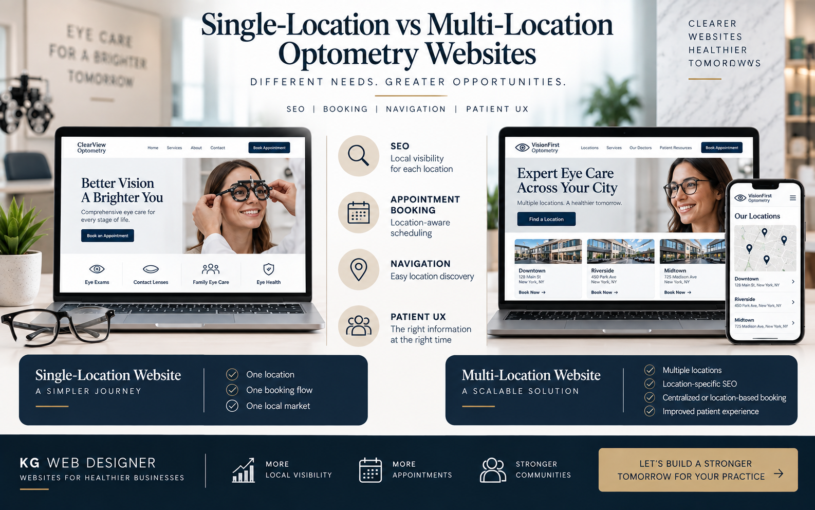
A single-location optometry practice may need a much simpler architecture than a multi-location ophthalmology group with numerous specialists, treatments, diagnostic services, and surgical pathways.
Our guide to website features for independent optometrists versus multi-location practices explains how those requirements differ and why website scope should follow operational complexity rather than competitor design trends.
This matters during a teardown because recommending an enterprise-style website to a small practice can create unnecessary navigation, maintenance, and cost.
What Would We Measure After These Changes?
We would not call the redesign successful simply because stakeholders prefer the new appearance.
We would establish measurable questions.
Homepage
Question: Are more visitors reaching relevant treatment pathways?
Possible measurement:
Homepage → Treatment engagement
Treatment Pages
Question: Are patients progressing toward clinicians and appointments?
Possible measurements:
Treatment → Doctor
Treatment → Appointment
Doctor Profiles
Question: Are specialist pages contributing to patient decisions?
Possible measurements:
Doctor → Treatment
Doctor → Appointment
Appointment Funnel
Question: Are people beginning but failing to complete the journey?
Possible measurements:
CTA → Form Start → Form Completion
Mobile
Question: Is there a meaningful difference between desktop and mobile progression?
Possible measurement:
Journey completion by device type
Where privacy or healthcare regulation limits tracking, measurement needs to be designed accordingly.
We would rather collect fewer meaningful, appropriately implemented signals than create an invasive analytics setup merely because the software makes it possible.
Example From Our Experience
During healthcare-focused website reviews, we often find that the information needed to establish trust already exists.
The problem is where it appears.
A doctor’s credentials may be on the biography page.
The treatment information may be somewhere else.
The clinic location is in the footer.
Insurance information lives under Patient Resources.
The appointment form asks the visitor to choose a doctor they have never been introduced to.
Individually, nothing is missing.
Collectively, the patient has to assemble the journey.
Our redesign approach is to connect those pieces:
Patient Problem → Treatment → Doctor → Evidence → Location → Appointment
What Would Change?
Not necessarily the clinic’s underlying medical information.
We would change its sequence, relationship, and visibility.
What Outcome Would We Claim?
None before measurement.
After launch, we would evaluate whether those changes improve relevant progression and qualified appointment activity.
That keeps the case evidence credible instead of attaching an invented conversion percentage to a hypothetical redesign.
Move Beyond “make the website look better”
At this stage, we have moved beyond “make the website look better.”
The redesigned architecture now connects:
Search Intent
↓
Condition / Treatment
↓
Relevant Specialist
↓
Clinical Evidence
↓
Location & Practical Information
↓
Appointment
That is the core patient journey we would build before focusing on decorative polish.
Global Conversion, AI Search, Measurement and Final Redesign Strategy
How Should the Redesign Change for US, UK and Australian Eye Clinics?
An international high-converting eye clinic website cannot simply use the same patient journey in every country.
The underlying conversion principles remain consistent: patients need clarity, clinical credibility, practical information, and a straightforward next step. But the questions creating uncertainty can differ significantly by market.
A patient in New York may want to understand insurance coverage and whether a physician is in-network. A private patient in London may need clarity about NHS versus private pathways. An Australian patient may be considering Medicare, private health insurance, practitioner credentials, and treatment costs.
The website should acknowledge these differences rather than applying one generic healthcare template internationally.
US vs. UK vs. Australia: Eye Clinic Website Conversion Matrix
| Conversion Consideration | United States | United Kingdom | Australia |
|---|---|---|---|
| Common payment question | Insurance, network participation, self-pay and financing | NHS versus private pathway where relevant | Medicare, private health insurance and self-pay |
| Practitioner trust | Licensing, relevant credentials and professional/hospital affiliations | Professional registration and relevant clinical/hospital affiliations | Practitioner registration and relevant specialist credentials |
| Privacy | HIPAA may apply depending on entity status and information involved | UK GDPR and applicable data-protection requirements | Australian privacy requirements may apply |
| Regulatory context | Federal and state requirements vary | CQC requirements may apply to regulated activities in England | National Law requirements apply to advertising regulated health services |
| Common terminology | Ophthalmologist, optometrist, eye doctor | Ophthalmologist, optometrist, dispensing optician | Ophthalmologist, optometrist |
| Conversion priority | Insurance + clinician + appointment clarity | Care pathway + clinician + location clarity | Practitioner + payment/cost + location clarity |
The important point is not that every clinic must publish all of this information. The website should identify which questions actually influence its patients’ decisions.
What Should US Eye Clinics Consider?
For a US clinic, insurance and payment uncertainty can become part of the digital patient journey.
Where appropriate, we would make it easier to understand:
- Insurance plans or networks the clinic participates in
- Whether coverage should be verified before treatment
- Self-pay information
- Financing options where genuinely available
- Referral requirements
- Relevant locations
- Who patients can contact with billing questions
We would avoid claims such as:
“Your treatment is covered.”
unless the clinic can legitimately determine that for the individual patient.
The website’s job is to explain the process rather than make promises it cannot substantiate.
Turn Patient Trust Into More Appointments
Patients don’t just compare clinics — they compare clarity, professionalism, and ease of booking. A well-designed eye clinic website builds confidence before they even call.
What About HIPAA and Website Tracking?
This deserves particular care.
HHS maintains guidance addressing HIPAA and online tracking technologies. The regulatory position should not be reduced to simplistic statements such as “Google Analytics is always prohibited on healthcare websites.”
The clinic’s status, the information involved, the webpage or technology involved, what information is transmitted, and the relationships between parties can all matter. HHS’s current guidance also reflects litigation affecting part of its earlier interpretation concerning certain unauthenticated webpages.
For the redesign, we would therefore review questions such as:
- What information does the appointment form collect?
- Where is it transmitted?
- Where is it stored?
- Which analytics technologies are installed?
- Which advertising pixels are present?
- Does the scheduling platform receive patient information?
- Are call-tracking tools involved?
- Which third-party vendors receive data?
- Are unnecessary tracking technologies present on sensitive patient journeys?
A designer should not substitute for the clinic’s legal or compliance advisers. The design and development process should, however, make these questions visible before launch rather than discovering them afterwards.
What Should UK Eye Clinics Consider?
For UK clinics, particularly practices combining private services with clinicians who may also work within the NHS, the care pathway itself can become an important conversion question.
A private patient may need to understand:
- Whether the clinic is private
- Whether a GP or optometrist referral is required
- Which consultant treats the condition
- Which location provides the service
- How consultations are arranged
- What is included in fees
- Whether diagnostic tests incur additional charges
- What happens after the consultation
Moorfields Private demonstrates the value of publishing detailed practical information around consultations, payments and patient preparation.
For providers in England, CQC registration requirements can also apply when regulated activities are being carried on. The CQC explains that providers carrying on regulated activities must be appropriately registered.
The website should accurately reflect the clinic’s actual regulatory and organizational position rather than displaying healthcare logos merely as visual trust badges.
What Should Australian Eye Clinics Consider?
Australian clinics need to pay particular attention to how healthcare services are advertised.
Ahpra’s advertising guidance explains that advertising for regulated health services must comply with the National Law and includes restrictions concerning misleading advertising, testimonials about clinical aspects, unreasonable expectations of beneficial treatment, and advertising that encourages unnecessary or indiscriminate use of regulated health services.
That affects ordinary conversion-design decisions.
For example, an ecommerce-style redesign might suggest:
“Thousands of patients love their life-changing results.”
A healthcare website should not automatically adopt that type of social-proof language.
Instead, we would prioritize verifiable evidence:
Practitioner → Credentials → Clinical Area → Consultation Process → Location → Appropriate Next Step
That can build trust without depending on aggressive outcome marketing.
Why Does Localization Matter Beyond Compliance?
Localization is also about patient comprehension.
The same word can carry different expectations across healthcare systems.
An American visitor may commonly encounter “eye doctor.” A UK visitor may distinguish between an optometrist, dispensing optician, and ophthalmologist. A surgical practice may need to explain when a consultant ophthalmologist becomes involved.
Therefore, international ophthalmology website development should not simply swap spellings or currencies.
We would localize:
- Clinical terminology
- Appointment terminology
- Referral information
- Insurance/payment language
- Practitioner credentials
- Location information
- Emergency/urgent-care instructions
- Privacy information
- Advertising claims
- Calls to action
The objective is to make the clinic feel locally understandable rather than merely internationally accessible.
How Should the Redesigned Website Prepare for AI Search?
The website should make its expertise and entity relationships explicit rather than create artificial copy for ChatGPT, Google AI experiences, Gemini, or Perplexity.
Consider the statement:
“We offer comprehensive eye-care solutions using advanced technology.”
It provides very little extractable information.
Compare it with:
“Dr. [Name], a consultant ophthalmologist specializing in cataract care, provides cataract consultations at the clinic’s [Location] practice.”
The second statement establishes relationships:
Person → Profession → Specialty → Service → Location
That is useful to patients and easier for search systems to interpret.
AI-Ready Information Architecture
We would establish clear relationships between:
Clinic
↓
has
↓
Locations
Clinic
↓
provides
↓
Treatments
Doctor
↓
specializes in
↓
Conditions / Treatments
Doctor
↓
practices at
↓
Location
Treatment
↓
leads to
↓
Consultation / Appointment
These relationships should be reflected in visible content, internal linking, breadcrumbs, and appropriate structured data.
Turn Patient Trust Into More Appointments
Patients don’t just compare clinics — they compare clarity, professionalism, and ease of booking. A well-designed eye clinic website builds confidence before they even call.
What Structured Data Would We Review?
Depending on the clinic and individual page, relevant Schema.org types may include:
MedicalClinicPhysicianMedicalWebPageMedicalConditionMedicalProcedureBreadcrumbListFAQPage
For example:
<script type="application/ld+json">
{
  "@context": "https://schema.org",
  "@type": "MedicalClinic",
  "name": "Example Eye Clinic",
  "medicalSpecialty": [
    "Ophthalmology",
    "Optometry"
  ],
  "availableService": {
    "@type": "MedicalProcedure",
    "name": "Cataract Surgery"
  }
}
</script>
This is intentionally simplified.
Actual implementation should reflect information genuinely present on the clinic’s website and the appropriate Schema.org properties for the organization and page.
Structured data should not be used to manufacture ratings, credentials, specialties, physicians, services, or locations that users cannot verify.
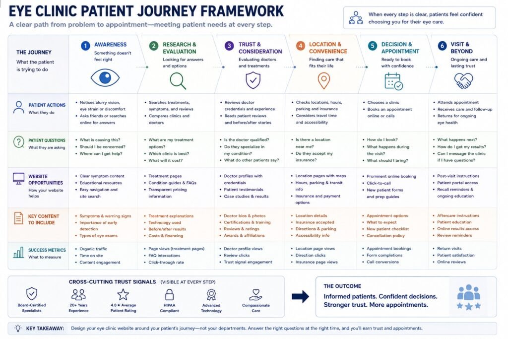
What Is the Complete Eye Clinic Patient Journey Framework?
After combining the homepage, treatment architecture, clinician profiles, locations, practical information and appointment funnel, we arrive at a six-stage framework.
| Stage | Patient’s Question | Website’s Job | Example Content |
|---|---|---|---|
| 1. Discover | “Does this clinic deal with my problem?” | Establish relevance | Condition/treatment landing page |
| 2. Understand | “What are my options?” | Explain clearly | Treatment information |
| 3. Evaluate | “Who would treat me?” | Establish clinical authority | Doctor profile + credentials |
| 4. Reassure | “What will happen?” | Remove practical uncertainty | Consultation, location and payment information |
| 5. Act | “How do I proceed?” | Make the next step clear | Contextual appointment CTA |
| 6. Confirm | “What happens now?” | Set expectations | Confirmation + response information |
This gives us something far more useful than:
“Make the website modern.”
We can audit every major page against the stage it is supposed to support.
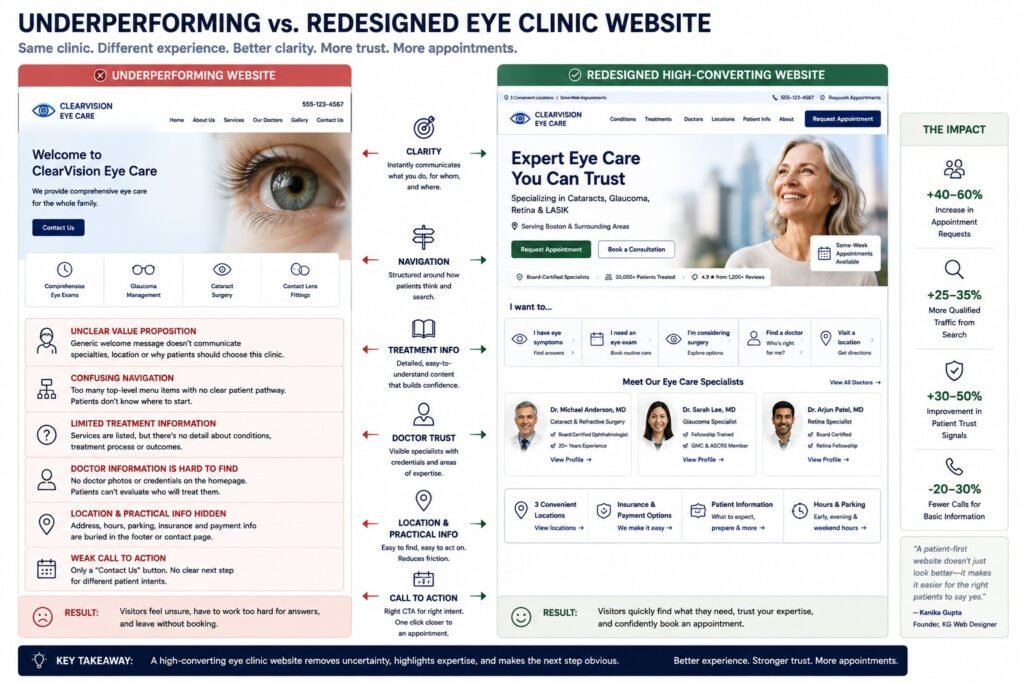
Before vs. After: What Would Actually Change?
| Underperforming Structure | Our Proposed Redesign |
|---|---|
| “Welcome to our clinic” hero | Specialty + location + patient next step |
| Generic services menu | Condition and treatment pathways |
| Thin SEO treatment pages | Patient decision-support pages |
| Doctor biographies isolated from services | Doctors connected directly to relevant treatments |
| “State-of-the-art technology” | Named technology explained in clinical context |
| Generic “Contact Us” CTA | Treatment-specific consultation CTA |
| One appointment route for everyone | Contextual patient pathways |
| Location buried in footer | Location integrated throughout decision journey |
| Insurance/payment information difficult to find | Practical information surfaced at relevant moments |
| Desktop compressed onto mobile | Mobile journey deliberately prioritized |
| Accessibility checked at launch | Accessibility considered during UX design |
| Tracking added indiscriminately | Privacy-conscious measurement planning |
| SEO migration handled after development | Search assets mapped before redesign |
| Generic schema | Accurate entity-based structured data |
| Success measured by appearance | Success evaluated through patient progression |
This is the “before and after” that matters.
Not rounded cards versus square cards.
Not blue versus green.
Not whether the hero photograph fills the screen.
The meaningful difference is how much work the patient has to do before making a confident decision.
Why Most Clinics Get This Wrong
The website is often built department by department.
The designer creates the homepage.
An SEO writer produces treatment pages.
The doctors supply biographies.
A booking provider embeds a scheduler.
A marketing agency installs analytics.
Someone else manages local SEO.
Compliance is reviewed near launch.
Each individual task may be completed competently.
But nobody owns the entire patient journey.
That produces a website where all the information exists but does not necessarily connect.
The treatment page says the clinic has specialists.
The specialist is buried under “Meet Our Team.”
The doctor profile does not link back to the treatment.
The treatment exists at only one location, but the page does not say which.
The booking form then asks:
Select your preferred doctor.
The patient has been asked to make a decision the website never helped them make.
That is a structural conversion problem.
What This Means for Your Eye Clinic
Before deciding that your clinic needs more traffic, review what qualified visitors experience after they arrive.
Ask:
- Can patients identify your specialties immediately?
- Can they navigate by their condition?
- Are treatment pages genuinely useful?
- Are relevant specialists visible on treatment pages?
- Are credentials easy to verify?
- Can patients determine which location provides a service?
- Are payment or insurance questions addressed where appropriate?
- Does the appointment CTA match the patient’s intent?
- Does the patient know what happens after submitting?
- Is mobile navigation straightforward?
- Have accessibility barriers been tested?
- Have third-party booking tools been reviewed?
- Are existing organic rankings protected?
- Is measurement appropriate for the clinic’s privacy obligations?
If several answers are “no,” the problem may not be a lack of traffic.
The website may be introducing uncertainty between interest and action.
When Is a Complete Redesign Actually Necessary?
Not every problem justifies rebuilding the entire website.
We would recommend a more substantial redesign when issues are structural, such as:
- The CMS prevents meaningful UX improvements.
- Mobile usability is fundamentally poor.
- Services have outgrown the navigation.
- Multiple locations have been added without a scalable architecture.
- Doctors, treatments and locations cannot be connected logically.
- Treatment content is fragmented or duplicated.
- Appointment technology is poorly integrated.
- Accessibility issues are widespread.
- Site performance is constrained by the implementation.
- Organic landing pages cannot be managed properly.
- The current design no longer supports the clinic’s positioning.
If the foundation remains sound, a phased improvement program may be more commercially sensible.
That distinction matters because the purpose of an audit should be to identify the right solution, not automatically justify the largest redesign project.
What Would We Fix First If the Budget Were Limited?
We would prioritize based on patient impact.
Priority 1: Homepage Positioning
Clarify specialty, location, credibility and next step.
Priority 2: Appointment Journey
Remove uncertainty around requesting care.
Priority 3: Highest-Value Treatment Pages
Improve pages already attracting qualified search demand.
Priority 4: Doctor Profiles
Connect specialists directly to patient needs.
Priority 5: Mobile and Accessibility
Remove interaction barriers.
Priority 6: Location Architecture
Particularly important for multi-location practices.
Priority 7: Supporting Content
Build condition pages, patient resources and FAQs around genuine questions.
Priority 8: Measurement
Establish an appropriate baseline and test future improvements.
A phased approach can turn redesign into a sequence of measurable business decisions rather than one large aesthetic project.
Turn Patient Trust Into More Appointments
Patients don’t just compare clinics — they compare clarity, professionalism, and ease of booking. A well-designed eye clinic website builds confidence before they even call.
What Can You Learn From Leading Eye Clinic Websites?
Competitor research is useful when you study patterns rather than copy layouts.
We analyzed this more broadly in our guide to 12 optometry website design examples across the US, UK and Australia, including how different practices handle trust, navigation, services, and patient journeys.
When evaluating competitors, ask:
- How quickly do I understand their specialty?
- How do they present doctors?
- How are treatments organized?
- Where does booking begin?
- How are locations connected?
- What patient questions do they answer?
- What changes on mobile?
- Which elements genuinely reduce uncertainty?
Then determine what makes sense for your patients.
Competitor analysis should generate questions, not templates.
What Would We Measure After Launch?
We would establish a baseline before launch wherever reliable and appropriate measurement is available.
Then we would monitor meaningful patient-journey behavior.
| Website Area | Question We Want Answered | Possible Signal |
|---|---|---|
| Homepage | Are visitors finding relevant care? | Homepage → treatment progression |
| Treatment page | Does the content support evaluation? | Treatment → doctor/appointment |
| Doctor profile | Does clinical authority contribute to action? | Doctor → appointment |
| Location | Can patients identify where care is available? | Location → appointment |
| Form | Where does friction appear? | Start → completion |
| Mobile | Is the journey disproportionately difficult? | Device-level progression |
| Organic search | Did the migration preserve discovery? | Relevant landing-page visibility |
We would then compare actual behavior against our hypotheses.
For example:
Hypothesis: Connecting the relevant cataract specialist directly to the cataract treatment page will increase progression from treatment information toward specialist evaluation or consultation actions.
That is measurable.
Claim: “Showing doctors on treatment pages increases conversions by 42%.”
Without real supporting data, that is not.
The first approach creates a legitimate optimization program. The second creates an impressive-looking statistic.
Final Thoughts: Redesign the Patient Decision Journey, Not Just the Website
The biggest lesson from this teardown is that an underperforming clinic website rarely needs more decoration.
It needs better connections.
Search → Condition → Treatment → Doctor → Evidence → Location → Appointment
Each connection should answer the next question the patient is likely to have.
The strongest eye clinic website design strategy therefore brings together patient UX, clinical authority, accessibility, search architecture, appropriate structured data, mobile usability, privacy awareness, and conversion strategy.
A redesign should not attempt to make patients feel trust through aesthetics alone.
It should give them reasons to trust.
And it should make those reasons easy to find at precisely the moment they matter.
Ready to Find the Friction in Your Eye Clinic Website?
If your clinic already receives search traffic, referrals, paid visitors, or direct enquiries but your website is not producing enough qualified appointment activity, the first question should not automatically be:
“How do we get more traffic?”
It may be:
“What happens to patients after they arrive?”
KG Web Designer helps clinics evaluate homepage positioning, treatment architecture, doctor presentation, mobile UX, accessibility, appointment journeys, search risks, and conversion friction before determining whether targeted improvements or a complete redesign make sense.
Ready to Get More Patient Bookings From Your Website?
If your current website is not converting visitors into appointments, it’s time to fix the experience. I help optometrists and eye clinics build websites that drive real patient enquiries.
Available across US, UK, and Australian time zones. Fully remote. No commitment required.
Frequently Asked Questions
What makes an eye clinic website underperform?
An eye clinic website may underperform when prospective patients struggle to understand the clinic’s specialty, identify an appropriate doctor, evaluate treatment information, determine where care is available, or understand how to request an appointment. Mobile usability, accessibility, slow performance, unclear navigation, weak content, and booking friction can compound the problem.
What should an eye clinic homepage include?
An eye clinic homepage should clearly communicate the clinic’s specialty, location, major patient pathways, relevant clinical credibility, and next step. It should then guide visitors toward conditions, treatments, specialists, locations, and practical patient information without overwhelming them.
Should treatment pages include doctor information?
Where appropriate, yes. Connecting relevant specialists to treatment pages helps patients understand who provides the care and allows professional credentials to appear in the context where they matter. The doctor’s full profile can then provide deeper information about qualifications, clinical interests, affiliations, and locations.
How can an eye clinic improve appointment conversions?
Start by reducing uncertainty before the form. Explain the treatment, relevant clinician, location, consultation process, payment or insurance information where appropriate, and what happens after an appointment request. Contextual calls to action can also be clearer than sending every visitor to a generic contact form.
Why is accessibility especially important for eye clinic websites?
Eye-care audiences may include people with low vision and older adults experiencing changing visual abilities. Typography, contrast, target size, keyboard accessibility, focus states, form labels, zoom behavior, and third-party booking interfaces therefore deserve particular attention.
Can redesigning an eye clinic website hurt SEO?
Yes. Changing valuable URLs, page content, internal links, structured data, navigation, or location architecture without a migration plan can affect organic visibility. Existing search assets should be audited and mapped before development begins.
What structured data can an eye clinic website use?
Depending on the organization and individual page, relevant Schema.org types may include MedicalClinic, Physician, MedicalWebPage, MedicalCondition, MedicalProcedure, BreadcrumbList, and FAQPage. Structured data should accurately describe information that users can verify on the website.
Do US, UK and Australian eye clinic websites need different strategies?
The fundamental UX principles are similar, but patient expectations and regulatory environments differ. US clinics may need greater insurance clarity, UK clinics may need to explain private versus NHS pathways where relevant, and Australian clinics need to consider National Law requirements governing advertising of regulated health services. Terminology, payment information, privacy, practitioner credentials, and appointment pathways should therefore be localized.