Quick Answer
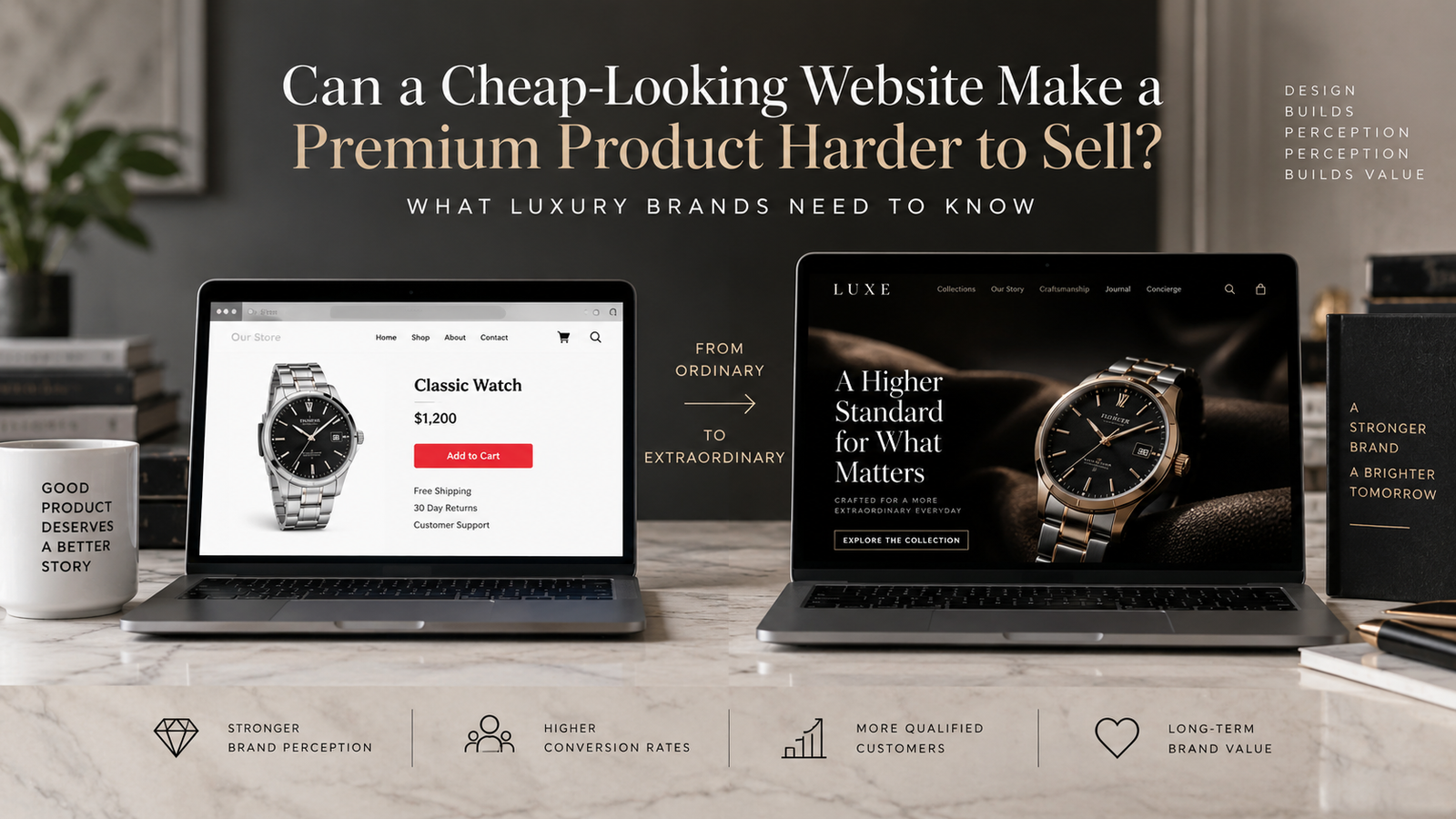
Yes. A cheap-looking website can make a premium product harder to sell because buyers often use the digital experience to judge credibility, quality, craftsmanship, service, and purchase risk. Luxury Brand Website therefore needs to do more than look beautiful. It must make the product’s value believable, answer important buying questions, reduce uncertainty, and create an experience that feels consistent with the price customers are being asked to pay.
TL;DR: What Premium Brands Need to Understand
- A premium product can lose perceived value when its website looks generic, inconsistent, outdated, or difficult to use.
- Luxury buyers evaluate the surrounding experience, not only the physical product, particularly when they cannot inspect it in person.
- Product pages are critical because customers need enough information to understand craftsmanship, materials, quality, authenticity, service, and value.
- Luxury design should reduce friction without removing the exclusivity and personality that distinguish the brand.
- A beautiful homepage cannot compensate for weak product information, poor mobile UX, unclear shipping, weak trust signals, or a difficult checkout.
- The right redesign starts with identifying where qualified buyers lose confidence, rather than simply making the website look more expensive.
Why Can a Cheap-Looking Website Make an Expensive Product Harder to Sell?
A cheap-looking website can make an expensive product harder to sell because it creates a mismatch between the product’s promised value and the customer’s digital experience.
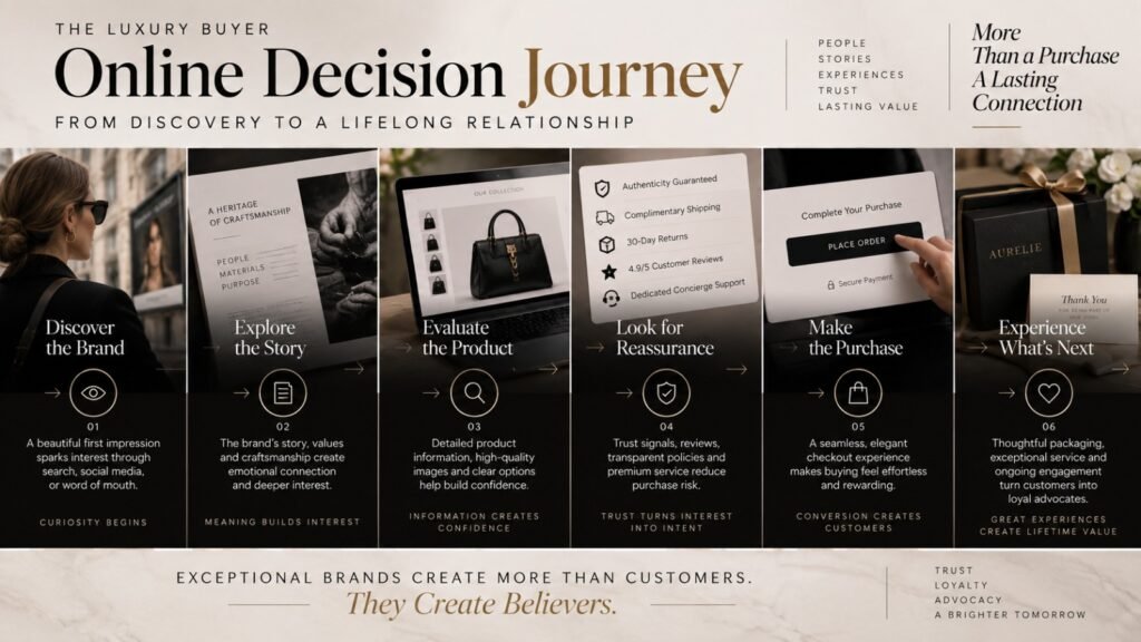
Consider what happens when someone discovers a $2,500 watch, $3,000 handbag, $8,000 piece of furniture, or premium jewelry collection online. The customer cannot necessarily touch the materials, inspect the craftsmanship, speak to a salesperson, or experience the packaging. The website becomes part of the evidence they use to decide whether the brand deserves their trust.
Stanford’s Web Credibility Project found through research involving more than 4,500 people that visual design, usability, information quality, transparency, and professionalism can influence perceptions of website credibility. Stanford specifically notes that people can quickly evaluate a site through visual design, including layout, typography, images, and consistency.
For a premium brand, this creates a simple commercial equation:
Product quality + brand reputation + digital experience = perceived purchase confidence.
If one element feels significantly weaker than the others, the customer may hesitate.
That hesitation does not necessarily mean the customer consciously thinks, “This website is cheap.”
Instead, they may wonder:
- Is this company established?
- Is the product really worth this price?
- Will the quality match what I see online?
- Is this an authentic product?
- Will customer service be good?
- What happens if I need to return it?
- Why does the brand feel less premium online than it does in advertising?
Those questions are commercially important because premium purchases often involve more consideration and perceived risk than routine ecommerce purchases.
The perception gap premium brands should watch
A brand can spend heavily on:
- Product development
- Packaging
- Photography
- Influencer campaigns
- Retail interiors
- Advertising
- Public relations
Then send the customer to a website that feels like an inexpensive template.
The customer experiences all of those investments through one digital interface.
That is why website quality is not merely a branding issue.
It can become a value-communication issue.
What Does Research Tell Us About Luxury Ecommerce UX?
Research shows that luxury ecommerce requires careful attention to usability as well as visual presentation.
Baymard currently maintains a dedicated Luxury Goods UX research area based on large-scale usability testing and benchmarking. Its research covers luxury brands including Chanel, Gucci, Louis Vuitton, Jimmy Choo, TAG Heuer, Tiffany, Cartier, and Van Cleef & Arpels. Baymard reports more than 400 luxury-specific UX guidelines, more than 3,500 UX performance scores, and more than 2,500 best-practice examples in its luxury research.
That matters because it challenges a common assumption:
Luxury ecommerce is not simply ordinary ecommerce with better photography.
The category has its own usability challenges.
Baymard’s luxury benchmark has identified weaknesses involving areas such as on-site search, product lists and filtering, mobile ecommerce, and customer accounts, even among established luxury brands.
Its broader product-page research is equally relevant. Baymard describes the product page as a central point in purchase decisions and reports that many ecommerce sites still have substantial usability issues on product pages. Its latest published benchmark update found that only 48% of leading US and European desktop ecommerce sites had a decent or good overall product-page UX performance, with mobile performance lower at 38%.
The implication for premium brands is straightforward:
Luxury website design must make the experience feel exclusive without making the customer work unnecessarily hard.
What Makes a Website Feel Luxurious Without Becoming Difficult to Use?
A website feels luxurious when every important element appears deliberate, consistent, and appropriate to the brand’s positioning.
Luxury is not created by adding a black background, serif typography, slow animations, or oversized photography.
Those are visual techniques.
The perception of luxury comes from how the entire system behaves.
A premium website typically demonstrates:
- Strong visual control
Typography, spacing, imagery, buttons, motion, and composition feel intentional. - Distinctive positioning
The customer can understand why this brand exists and what differentiates it. - Exceptional product presentation
The product receives enough visual and informational attention to support the price. - Useful detail
The customer can investigate materials, craftsmanship, dimensions, fit, provenance, care, availability, and other relevant details. - Consistent trust signals
Authenticity, service, guarantees, policies, credentials, press, reviews, or other appropriate evidence are easy to find. - Controlled interaction
The site feels refined without forcing customers through unnecessarily complicated navigation. - Premium service visibility
Concierge support, personal shopping, appointments, customer service, gifting, or other high-value services are communicated appropriately.
The strongest luxury experiences therefore combine emotion with information.
Emotion creates desire.
Information creates confidence.
Confidence makes the purchase easier.
How Does Luxury Brand Website Design Affect Perceived Product Value?
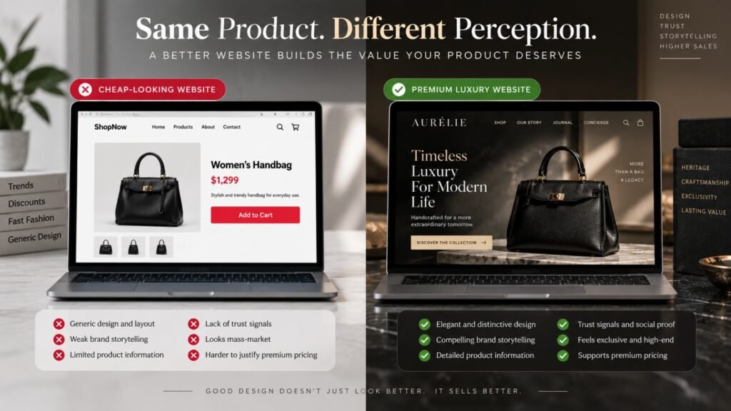
Luxury Brand Website affects perceived product value by establishing a visual and informational context around the product.
A customer does not evaluate a product in isolation.
They see the photography, typography, layout, descriptions, reviews, delivery information, payment options, customer service, and checkout experience surrounding it.
Suppose two companies sell products of similar quality for $2,000.
Brand A has excellent photography, detailed product information, strong editorial storytelling, clear delivery expectations, visible customer support, and an elegant mobile experience.
Brand B has inconsistent imagery, generic copy, poor spacing, unclear policies, and a checkout that feels dated.
Even if the physical products are equally good, the second brand has created additional reasons for the buyer to hesitate.
This is where Stanford’s research is particularly useful. Its credibility guidelines emphasize professional design, usability, usefulness, verifiable information, evidence of a real organization, and recently maintained content as credibility factors.
For luxury brands, that means premium perception is partly created by consistency between promise and proof.
If the brand says “handcrafted,” show the craftsmanship.
If the product is limited, explain the nature of the limitation.
If materials are exceptional, explain them.
If the company offers white-glove service, make that service visible.
The website should not ask the customer to simply believe the marketing.
It should give them reasons to believe it.
Your Store Is Getting Traffic. Where Are You Losing the Sale?
Product pages, navigation, mobile UX, trust signals, cart flow, and checkout friction can quietly reduce conversions. Get a focused review of your ecommerce website and identify the areas that may be costing you revenue.
Request Your Ecommerce Website Audit →What Should a Luxury Product Page Include?
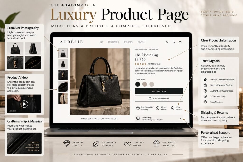
A luxury product page should provide enough information for a serious buyer to evaluate the product without undermining the emotional experience.
Baymard’s luxury research specifically evaluates product-page elements including image galleries, product videos, buy sections, shipping and returns, product variations, product descriptions, specifications, reviews, FAQs, cross-sells, and mobile product-page behavior.
That is a useful framework because high-value products frequently require more explanation than a standard product listing.
A premium product page should consider:
- High-resolution product photography
- Multiple viewing angles
- Detail or macro photography
- Zoom functionality where useful
- Product video when it adds meaningful information
- Materials and craftsmanship
- Dimensions
- Fit or sizing information
- Available variants
- Personalization options
- Authenticity information
- Certifications where relevant
- Care instructions
- Warranty information
- Availability
- Delivery expectations
- International shipping information where applicable
- Return and exchange terms
- Customer service access
- Appropriate reviews or editorial proof
- Related products
- Clear purchase or inquiry action
The key is not to add every possible element.
The key is to identify what the buyer needs to believe before purchasing.
A $5,000 designer sofa may need detailed dimensions and material information.
A luxury watch may need movement, case, water-resistance, warranty, and authentication information.
A high-end skincare product may need ingredients, usage, testing, formulation, and suitability information.
A luxury fashion item may require fabric, fit, sizing, model measurements, care, and styling context.
The product category determines the proof.
Why Is Product Storytelling So Important for Premium Products?
Product storytelling is important because premium pricing requires context.
A customer may understand what a product does but still not understand why it deserves a substantially higher price than alternatives.
That is where storytelling becomes commercially useful.
A luxury brand might need to communicate:
- Where the product originated
- Why a material was selected
- Who designed it
- How it was produced
- What makes the craftsmanship distinctive
- What inspired the collection
- What makes the item difficult to replicate
- What ownership experience the customer can expect
This does not mean writing long paragraphs for the sake of storytelling.
It means connecting facts to meaning.
“Hand-finished leather” is a fact.
Explaining how the finishing process affects texture, character, durability, or individuality gives the fact commercial meaning.
This distinction is especially important online because digital shoppers may encounter the product without the salesperson who would normally provide that context in a physical store.
McKinsey’s luxury research has also highlighted the scale of digital influence on luxury purchasing. Its research has found that digital touchpoints influence a large share of luxury purchases, meaning the website can influence decisions even when the eventual transaction happens offline.
For luxury brands with boutiques, this means the website is not simply an ecommerce store.
It can be the first showroom.
What Are the Biggest Signs That a Luxury Website Is Making the Brand Look Cheaper?
The strongest warning signs are inconsistencies between the price of the product and the quality of the digital experience.
| Website problem | Customer interpretation | Commercial consequence |
|---|---|---|
| Generic template | “This brand is not distinctive.” | Lower differentiation |
| Weak photography | “The product may not be exceptional.” | Lower perceived value |
| Thin descriptions | “Why does this cost so much?” | Price resistance |
| Crowded layout | “The brand lacks confidence.” | Weaker premium perception |
| Poor mobile experience | “This feels unfinished.” | Lost mobile opportunities |
| Hidden shipping information | “There may be a surprise later.” | Purchase hesitation |
| Unclear returns | “What happens if I change my mind?” | Higher perceived risk |
| Slow pages | “The experience feels dated.” | Increased friction |
| Aggressive discounts | “Price is the main selling point.” | Weaker exclusivity |
| Generic copy | “This could be any competitor.” | Lower authority |
| Difficult checkout | “I don’t want to deal with this.” | Cart abandonment |
| Inconsistent typography | “Details have been overlooked.” | Reduced credibility |
No individual problem automatically kills conversion.
The issue is accumulation.
A slightly dated font may not matter.
A dated font combined with poor photography, generic copy, weak product information, unclear returns, and a frustrating mobile checkout can fundamentally change the customer’s perception.
What Do Customers Expect When Buying High-Value Products Online?
Customers buying high-value products generally need confidence in both the product and the transaction.
That confidence comes from multiple forms of evidence rather than one design element.
A luxury buyer may want to know:
Product: What exactly am I buying?
Value: Why is it worth this price?
Authenticity: How do I know it is genuine?
Quality: What materials and processes support the claim?
Service: Who helps me if I have a question?
Delivery: When and how will it arrive?
Returns: What happens if it does not meet expectations?
Security: Is the purchase process trustworthy?
Reputation: Does this company have credible evidence behind it?
Experience: Will the post-purchase experience match the brand promise?
Google’s ecommerce guidance reinforces the importance of making product information machine-readable and accessible. Product structured data can help Google understand information such as price, availability, reviews, shipping, and returns, with eligible information potentially appearing across Search, Google Images, and Google Lens.
That creates a useful alignment between UX and search.
The information customers need can also be information search engines need to understand.
Our analysis of 15 ecommerce website designs and what leading brands are doing differently goes deeper into product discovery, trust, mobile experience, and conversion architecture.
What Should Premium Brands Fix First?
The first priority should be the point where qualified customers lose confidence.
Do not automatically start with the homepage.
A better sequence is:
1. Fix positioning
Clarify:
- Who is this product for?
- Why is it different?
- Why does it command its price?
- What should customers remember?
- What competitive alternative are you replacing?
2. Fix product communication
Review:
- Product photography
- Descriptions
- Specifications
- Materials
- Craftsmanship
- Product comparisons
- FAQs
- Availability
- Shipping
- Returns
3. Fix trust
Make important evidence visible:
- Authenticity
- Certifications
- Guarantees
- Reviews
- Press
- Founder or designer information
- Customer service
- Secure purchasing information
- Physical presence where appropriate
4. Fix mobile UX
Test the complete journey on a phone:
Landing page → category → product → details → cart → checkout.
Do not stop after checking whether the homepage “looks responsive.”
5. Fix technical performance
Luxury imagery can be visually impressive but technically expensive.
Large images, video, animation, third-party scripts, personalization tools, and poorly implemented effects can all create performance problems.
Premium design should feel fast as well as beautiful.
6. Fix conversion architecture
Every important page should make the next step obvious.
That does not always mean “Buy Now.”
Depending on the business model, the appropriate action might be:
- Purchase
- Book an appointment
- Request personalization
- Speak with a concierge
- Find a store
- Schedule a consultation
- Join a waitlist
- Request availability
The conversion action should match the customer’s level of intent.
18+ Years of Designing Websites That Support Real Business Growth
Ecommerce design is not just about making a store look better. It is about understanding how customers browse, compare, build trust, and make purchase decisions — then designing every stage of the experience around those behaviours.
If Your Website Gets Traffic but Premium Products Do Not Sell, What Should You Check?
If qualified traffic is arriving but products are not converting, investigate the customer journey before assuming you need more traffic.
A useful diagnostic framework is:
Traffic quality → Landing experience → Product discovery → Product evaluation → Trust → Cart → Checkout → Purchase.
At each stage, ask what information or reassurance the buyer is missing.
For example, if customers reach product pages but rarely add items to the cart, investigate product presentation, pricing context, trust, availability, specifications, and perceived value.
If customers add products to the cart but abandon checkout, investigate delivery costs, returns, payment methods, form complexity, account requirements, and technical errors.
Baymard’s checkout research shows how significant checkout UX can be. Its current benchmark reports that 65% of the ecommerce sites it evaluates have mediocre or worse checkout performance, and its research identifies checkout design and flow as recurring causes of abandonment.
This matters for luxury brands because checkout is where the customer’s emotional perception of the brand meets the practical mechanics of payment.
A beautiful product journey followed by an awkward checkout creates a damaging contrast.
What Should Luxury Brands Avoid When Trying to Look More Premium?
The biggest mistake is confusing visual expense with perceived value.
Adding expensive-looking design elements does not automatically make a brand premium.
Avoid:
- Copying another luxury brand’s visual identity.
- Using minimalism as an excuse to remove useful information.
- Making navigation difficult to create artificial exclusivity.
- Using animations that slow down the experience.
- Hiding important delivery or return information.
- Replacing specific product facts with vague brand language.
- Using constant discounts to compensate for weak positioning.
- Prioritizing desktop presentation while neglecting mobile.
- Using stock photography where original imagery is necessary.
- Making the homepage impressive while product pages remain ordinary.
The goal is not to make the customer think, “What a fancy website.”
The goal is to make the customer think:
“This brand understands what it is selling, and I understand why this product is worth the price.”
That is a much stronger commercial outcome.
For fashion-led premium brands, our fashion ecommerce website design guide examines how product presentation, mobile UX, international shopping, trust, and purchasing infrastructure interact.
What Does a Premium Brand Website Audit Need to Measure?
A premium website audit should evaluate commercial performance, not just aesthetics.
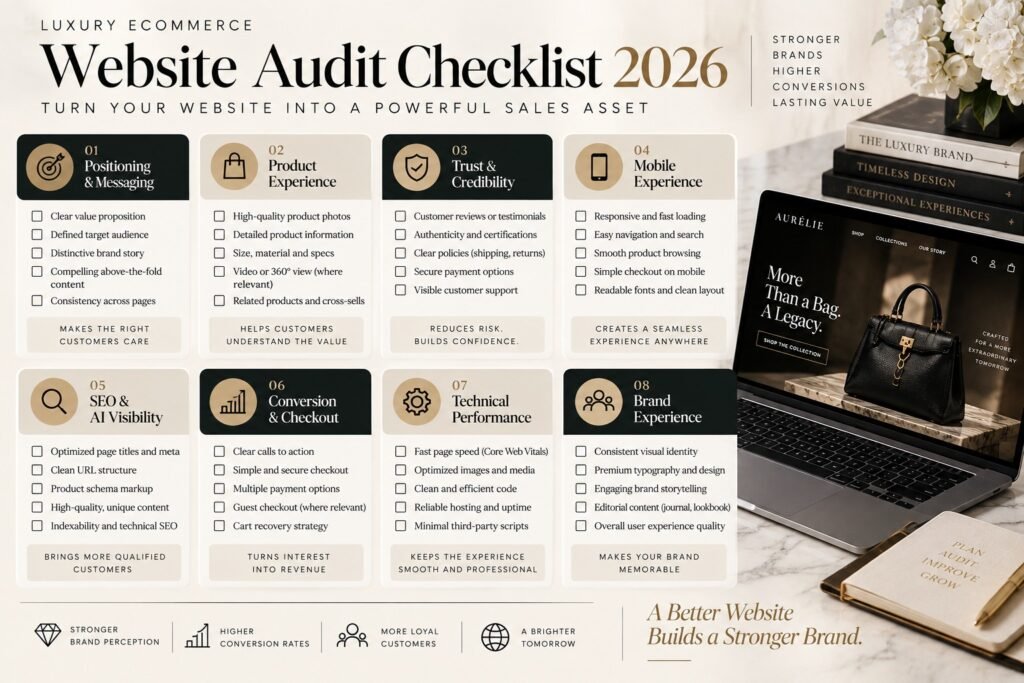
At KG Web Designer, we recommend assessing the website across six areas:
| Audit area | What to examine | Business question |
|---|---|---|
| Positioning | Messaging, differentiation, value proposition | Why should customers choose this brand? |
| Brand | Visual consistency, imagery, typography | Does the digital experience match the brand promise? |
| Product | PDP content, photography, specifications | Can customers understand the value? |
| UX | Navigation, search, mobile, filters | Can customers find and evaluate products easily? |
| Trust | Reviews, authenticity, service, policies | What reduces purchase risk? |
| Conversion | Cart, checkout, CTAs, analytics | Where are qualified buyers dropping out? |
This approach prevents the audit from becoming a subjective discussion about whether a homepage “looks premium.”
A serious audit should identify specific problems, explain why they matter, prioritize them by business impact, and distinguish between quick improvements and structural changes.
A simple internal scoring model
Score each category from 1 to 5:
- Positioning clarity
- Premium visual consistency
- Product presentation
- Product information
- Brand storytelling
- Mobile UX
- Search and navigation
- Trust
- Shipping transparency
- Returns clarity
- Checkout
- Page performance
- SEO fundamentals
- Content authority
- Conversion pathways
A low score does not automatically mean “redesign everything.”
It tells you where to investigate.
How Should Luxury Ecommerce Website Design Balance Exclusivity and Conversion?
The correct balance is to remove friction while preserving personality.
Website Design for Luxury Brands should never force the customer to struggle simply because the brand wants to appear exclusive.
A customer should be able to:
- Find the right category
- Search for products
- Compare relevant options
- Understand product differences
- View product details
- Understand delivery
- Understand returns
- Select variants
- Purchase confidently
- Get support
At the same time, the experience can remain distinctive through art direction, editorial content, typography, motion, storytelling, photography, interaction design, and service.
This is exactly where Baymard’s luxury research is valuable. Its current research covers navigation, search, filtering, product pages, checkout, accounts, design, interaction, and loyalty rather than treating luxury UX as a purely visual discipline.
The principle is simple:
Make the brand experience distinctive. Make the buying mechanics intuitive.
Example Scenario: A Premium Product With a Low-Trust Digital Experience
Imagine a luxury furniture company selling handcrafted dining tables for $6,000.
The product is exceptional.
The craftsmanship is real.
The photography on social media is excellent.
The company has happy customers.
But the website has:
- A generic homepage
- Limited product photography
- No detailed material information
- No dimensions visible until late in the journey
- Minimal information about craftsmanship
- Weak mobile navigation
- Unclear delivery timelines
- A difficult inquiry form
- No clear explanation of installation or after-sales support
The company concludes that it needs more advertising.
But the first question should be:
What happens after the advertising works?
If a qualified customer clicks the advertisement and immediately encounters uncertainty, more traffic simply creates more opportunities to lose the same customer.
A better experience might move the journey toward:
Advertisement → Brand story → Craftsmanship → Product details → Materials → Dimensions → Delivery → Service → Purchase or consultation
The product did not become better.
The website made the existing value easier to understand.
Your Online Store Should Do More Than Showcase Products
A conversion-focused ecommerce website helps shoppers discover the right products, understand their value, trust your brand, and move confidently toward checkout. Build a store where design, UX, product presentation, and conversion strategy work together.
Explore Ecommerce Website Design Services →Example From Our Experience: What Ecommerce Website Reviews Actually Reveal
Our 2026 ecommerce research provides a useful real-world benchmark for this issue. KG Web Designer reviewed 40 ecommerce stores across categories including fashion, beauty, wellness, home goods, and DTC products, evaluating customer journeys rather than simply ranking visual appearance.
Problem: Businesses frequently invested heavily in homepage presentation while leaving product discovery, product pages, mobile UX, trust, and checkout less developed.
Solution: We assessed the wider conversion system, including navigation, information architecture, product presentation, mobile behavior, trust signals, and purchasing pathways.
Outcome: The review reinforced a pattern we repeatedly see: a polished homepage does not guarantee a polished buying experience. Some of the highest-value opportunities exist on pages and interactions that receive less internal design attention.
This is an observational finding from our review, not an industry-wide statistic.
That distinction matters.
We should not claim that every luxury brand has the same weaknesses. But the finding is commercially relevant because premium products typically require customers to process more information and manage more perceived risk before purchasing.
Likewise, our guide on choosing an ecommerce website design company explains why businesses should evaluate conversion expertise, platform knowledge, UX, scalability, and strategic thinking rather than choosing a designer based only on how attractive a portfolio looks.
The common thread is that visual design is only one layer of the commercial experience.
How Can Premium Brands Use SEO and AI Search Without Making the Website Feel Less Luxurious?
Premium brands can improve search visibility without turning the website into an obvious SEO project.
Google’s current guidance says the foundational SEO practices that apply to traditional Search also apply to AI features such as AI Overviews and AI Mode. Google explicitly says there are no additional technical requirements specifically for AI Overviews or AI Mode. Instead, sites should focus on being indexable and providing helpful, reliable, people-first content.
Google’s newer guidance also emphasizes unique, valuable, non-commodity content and specifically highlights first-hand experience and unique viewpoints as useful characteristics of content that can perform well in generative search experiences.
For a luxury brand, this means the SEO strategy should not force awkward keyword-heavy copy onto product pages.
Instead, build useful content around genuine expertise:
- Materials
- Craftsmanship
- Product care
- Design philosophy
- Sourcing
- Product comparisons
- Styling
- Buying guidance
- Authenticity
- Heritage
- Founder expertise
- Industry knowledge
The result can support both human buyers and search systems.
Search-ready luxury ecommerce also needs strong product data
Google recommends using product structured data and Merchant Center product data to help products become eligible for richer appearances across Google surfaces. Product structured data can communicate price, availability, reviews, shipping, and returns.
That means a premium brand should treat technical SEO as part of the ecommerce infrastructure.
The objective is not to make the website “look SEO optimized.”
The objective is to make the underlying information understandable to both customers and search engines.
Why Most Businesses Get This Wrong
Most businesses get this wrong because they start with the visible problem.
The website looks old, so they want a new design.
The competitor’s website looks sophisticated, so they want a similar aesthetic.
Conversion is weak, so they want more traffic.
Product sales are down, so they add discounts.
Each response may be understandable.
None necessarily addresses the underlying problem.
One common mistake we see is treating luxury design as a mood-board exercise.
A brand collects examples from Chanel, Gucci, Apple, or another admired company and asks a designer to create something “similar but more premium.”
That approach ignores positioning.
Another mistake is believing that less information automatically creates luxury.
It does not.
Luxury requires selectivity, not absence.
Remove clutter.
Keep essential evidence.
Present it elegantly.
A third mistake is redesigning the homepage while leaving the product experience unchanged.
For ecommerce brands, the product page and checkout often have a much more direct relationship with revenue than the visual polish of the homepage.
The correct question is therefore not:
“How can we make this website look more luxurious?”
It is:
“Where does the current experience fail to communicate the value we already have?”
What This Means For Your Business
The financial implication is that your website can either reinforce the price you have worked hard to establish or quietly undermine it.
If customers understand your value faster, you create a stronger foundation for conversion.
If customers trust your brand more quickly, they have fewer reasons to delay.
If product information is clearer, customer questions can decrease.
If mobile UX improves, more of your existing traffic can move through the journey.
If checkout becomes easier, fewer customers encounter unnecessary friction at the point of purchase.
If your storytelling is stronger, premium pricing can become easier to understand.
This does not mean a website redesign automatically produces higher sales.
No responsible designer should promise that.
Sales also depend on product quality, pricing, demand, traffic quality, competition, reputation, customer service, distribution, and many other factors.
The website’s job is to make sure it is not undermining the strengths of the business.
That is a more realistic and commercially useful definition of conversion-focused design.
When Does a Luxury Brand Actually Need a Redesign?
A luxury brand should consider a redesign when the existing website prevents meaningful improvement or creates measurable friction across important parts of the customer journey.
Age alone is not a sufficient reason.
A website can be several years old and still perform well.
A relatively new website can also be commercially weak.
Consider a redesign when you see several of these conditions:
- Strong qualified traffic but weak conversion
- High mobile abandonment
- Product pages that fail to communicate value
- Brand positioning that has changed
- New product categories that do not fit the existing architecture
- Poor search visibility
- Difficult navigation
- Weak product discovery
- Outdated checkout
- Poor international ecommerce support
- Inconsistent brand presentation
- Customer questions that reveal missing information
- Website experience that feels substantially below the physical brand experience
- Analytics showing significant drop-off at specific stages
Before committing to a rebuild, separate optimization problems from architecture problems.
If the foundation is sound, targeted improvements may be more efficient.
If the foundation prevents meaningful progress, rebuilding can make more sense.
The decision should be evidence-led.
For premium ecommerce brands, the redesign decision should also be considered alongside acquisition and conversion investment. Before committing to a major website project, it is worth determining whether the real constraint is insufficient qualified traffic, weak conversion, or structural website problems. Our guide on Paid Ads, CRO or Website Redesign: Where Should a Premium eCommerce Brand Invest First? explains how to diagnose that bottleneck and decide where the next growth investment is most likely to create commercial value.
What Should a Premium Brand Expect From a Professional Web Designer?
A professional designer should be able to explain the commercial reasoning behind design decisions.
They should not simply present three visual concepts and ask which one you like.
For a premium ecommerce project, the designer should be able to discuss:
- Brand positioning
- Buyer psychology
- Information architecture
- Product UX
- Mobile UX
- Conversion strategy
- Content structure
- Technical performance
- SEO
- Ecommerce platform limitations
- International customer journeys
- Analytics
- Migration risks
- Testing
- Post-launch optimization
At KG Web Designer, we approach premium ecommerce projects by looking at the relationship between brand perception, UX, product communication, search visibility, and conversion.
That is particularly important when the website represents a substantial investment in brand equity.
The right question to ask a prospective designer is not:
“Can you make my website look luxurious?”
Ask:
“Can you show me how your design decisions will help my customers understand, trust, and act on the value of my products?”
That question produces a much more useful conversation.
Expert Insight from Kanika Gupta
“I would never start a premium website project by asking what makes a website look luxurious. I would start by asking what makes the buyer hesitate. Once we understand that hesitation, the design has a job to do. Sometimes that job is better photography. Sometimes it is better product information. Sometimes it is trust. Sometimes it is mobile UX or checkout. The luxury comes from how deliberately the entire experience works together.”
That is the judgment I believe separates a premium website from a website that simply uses premium visual cues.
A customer should not have to be convinced that the website is sophisticated.
They should feel that sophistication through the experience.
Final Thoughts
A premium product does not automatically create a premium digital experience.
The website has to communicate the value that already exists in the product, brand, craftsmanship, service, and customer experience.
That is why Luxury Brand Website should never be reduced to fonts, colors, animation, or beautiful photography.
The real test is what happens when a serious customer starts asking questions.
Why is this product worth the price?
What makes it different?
Can I trust the brand?
Is it authentic?
What is the craftsmanship?
How will it arrive?
What happens if something goes wrong?
Will the experience after purchase match what I have been promised?
A strong website answers those questions without making the brand feel ordinary.
A weak website leaves the customer to answer them alone.
For premium brands, that difference can matter enormously.
The goal is not to create a website that merely looks expensive.
The goal is to create a digital experience that makes the value behind the price believable.
If your current website is attracting qualified visitors but failing to communicate the quality of your products, the next step may not be more advertising. A structured website and conversion audit can show whether the problem is positioning, product presentation, trust, mobile UX, technical performance, or the purchase journey.
KG Web Designer works with growing brands that need more than an attractive ecommerce interface. The focus is on connecting brand strategy, UX, product storytelling, SEO-ready architecture, and conversion thinking so the website supports the commercial value of the business.
If your website no longer reflects the quality of your products, request a website strategy discussion with KG Web Designer.
Start a website strategy discussion
Not Sure What Your Ecommerce Website Needs to Convert Better?
In a focused 30-minute call, we can discuss your products, customers, current website, and growth goals — and identify where better design, UX, or conversion strategy could make the biggest difference.
Book Your Free 30-Minute Strategy Call →No obligation · Just practical clarity on your next steps
Frequently Asked Questions
Can a premium brand have a simple website?
Yes. Simplicity can work extremely well for premium brands when it is intentional. The important distinction is between simplicity and lack of substance. A clean website can still provide detailed product information, strong proof, excellent photography, clear service information, and an easy purchasing journey without appearing cluttered.
Should luxury brands use discounts and promotional banners?
Usually with caution. Frequent discounts can change the customer’s interpretation of the brand and make price feel more important than craftsmanship or differentiation. If promotions are part of the commercial model, they should be integrated carefully so that they do not overwhelm the core premium positioning or make the original price feel artificial.
Does a luxury website need video?
Not necessarily. Video can be valuable when it demonstrates craftsmanship, product movement, materials, fit, scale, or the brand experience. It becomes counterproductive when it exists only as decoration, slows the page, or makes important information harder to access. Every visual element should have a clear customer or brand purpose.
Should luxury brands show customer reviews?
Reviews can be useful when they fit the category and brand positioning. The presentation matters. A premium brand may choose editorial testimonials, verified customer reviews, expert commentary, press recognition, or carefully structured social proof rather than relying on large blocks of generic ratings.
Is a luxury website supposed to be difficult to navigate?
No. Exclusivity and friction are not the same thing. Customers should be able to discover products, search, understand categories, investigate product details, and complete a purchase without unnecessary effort. The experience can remain distinctive through art direction, storytelling, interaction, and service rather than deliberately confusing navigation.
How much product information is too much for a luxury product?
There is no universal word count. The correct amount depends on what customers need to evaluate the product confidently. The information should be structured so that essential details are easy to scan while deeper information is available for customers who want it. Premium design is about hierarchy, not hiding useful information.
Should a luxury brand redesign its website every few years?
No. A redesign should respond to a business or customer problem rather than an arbitrary calendar. If the website still supports positioning, product discovery, conversion, search, mobile UX, and brand experience, optimization may be more appropriate. Redesign becomes more compelling when the existing architecture prevents meaningful improvement.