Quick Answer
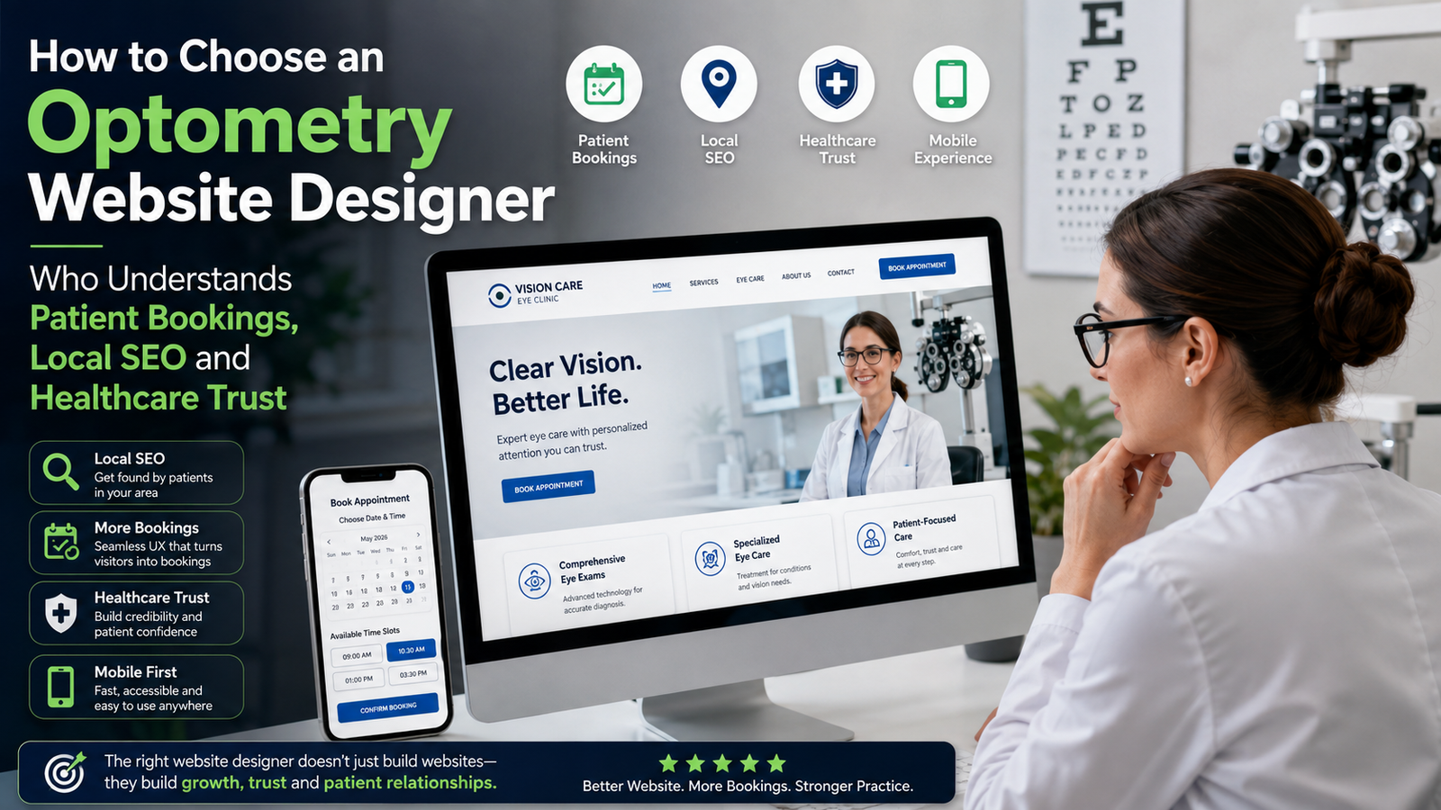
The right optometry website designer should understand more than visual design. They should know how patients find an eye clinic, evaluate clinical credibility, compare services, use mobile booking systems, and decide whether they trust a practice enough to schedule. The strongest choice is a designer who can connect local SEO, healthcare trust, patient UX, service architecture, and appointment conversion into one measurable website strategy.
TL;DR: What should you look for?
- An optometry website should be designed around the patient decision journey, not simply the clinic’s services.
- Online appointment booking needs to remain visible and easy to use throughout the mobile experience.
- Doctor credentials, services, reviews, insurance information, location details, and clinical explanations should support the booking decision.
- Local SEO requires more than adding a city name to the homepage.
- A good agency should diagnose the existing website before recommending a complete redesign.
- The right website strategy should improve discoverability, trust, booking confidence, and long-term patient acquisition.
What separates an optometry specialist from a general web designer?
The biggest difference is whether the designer understands the commercial and clinical context behind an eye-care website.
A general web designer may create an attractive homepage, add a booking button, list services, and make the site responsive. An experienced optometry website designer should instead ask what happens between a patient searching for an eye exam and actually confirming an appointment.
That distinction matters because patients are not evaluating an optometry website like they evaluate a restaurant or ecommerce store. They are making a healthcare decision involving expertise, convenience, location, cost, insurance, credentials, and personal trust.
Google also provides businesses with the ability to add appointment links directly to their Business Profile, making the relationship between local search visibility and booking accessibility particularly important.
What should an optometry website agency understand?
Look for evidence that the agency understands:
- Patient search behavior
- “Optometrist near me”
- “Eye exam near me”
- “Contact lens exam”
- “Pediatric eye exam”
- Service-specific searches
- Healthcare trust
- Doctor credentials
- Professional memberships
- Clinic photographs
- Reviews
- Clear service explanations
- Insurance and payment information
- Appointment conversion
- Visible booking CTAs
- Mobile-friendly scheduling
- Short booking paths
- Clear appointment expectations
- Click-to-call functionality
- Local search
- Location-specific service pages
- Google Business Profile alignment
- Consistent clinic information
- Relevant local content
- Structured website architecture
- Healthcare UX
- Readable typography
- Accessible navigation
- Clear medical terminology
- Low-friction interactions
- Privacy-conscious forms and booking integrations
The agency does not need to be a healthcare marketing company exclusively. But it should be able to demonstrate that it understands why an optometry practice requires a different website strategy from a generic professional-services business.
If you operate several optometry locations, the designer also needs to understand how those locations interact within one website. A strong multi-location optometry website design strategy should connect location pages, services, providers, reviews, local search signals, and appointment booking without creating a confusing experience for patients or unnecessary duplication for search engines. This becomes an important question to ask before selecting a website partner.

Give Patients More Reasons to Choose Your Eye Clinic
Your website is often the first step in a patient’s decision. Make that experience count with clear services, stronger trust signals, and a simpler path from browsing to booking.
What should you inspect before hiring an optometry website designer?
Before choosing an optometry website designer, inspect the agency’s process rather than simply its portfolio.
A polished portfolio tells you that someone can produce attractive layouts. It does not necessarily tell you whether the agency understands patient acquisition, appointment friction, local search, or healthcare trust.
At KG Web Designer, I would start by asking five questions.
1. Do they diagnose the existing website?
A serious agency should be able to explain what is currently preventing the website from performing better.
If the answer is simply “the design looks outdated,” the diagnosis is probably too shallow.
2. Do they understand the booking journey?
The booking button is only one part of the conversion path.
The patient first needs to understand:
- What the clinic offers
- Whether the clinic treats their particular need
- Who provides the care
- Where the clinic is located
- Whether the clinic accepts their insurance or payment method
- What happens during the appointment
- How quickly they can schedule
Only then does the booking CTA become meaningful.
3. Do they understand local search?
A local optometry website should be structured around the services and locations patients actually search for.
Google’s documentation confirms that local business structured data can communicate information such as business hours and other business details to Google.
4. Can they explain conversion problems?
A good agency should be able to identify where patients hesitate.
For example, a clinic may have strong organic traffic but weak appointment volume because the website hides doctor credentials, provides insufficient service information, or makes the booking path difficult on mobile.
5. Do they measure business outcomes?
Ask whether the agency talks only about:
- Page views
- Traffic
- Rankings
- Design awards
Or whether it also considers:
- Appointment intent
- Booking-page visits
- Click-to-call activity
- Service-page engagement
- Qualified enquiries
- Patient journey friction
The latter indicates a more commercially mature approach.
A portfolio should show more than attractive homepage designs. Look for evidence that the designer can improve service architecture, booking UX, trust signals, mobile usability, and Local SEO as part of a broader patient journey. Our before-and-after optometry website redesign strategy shows how these structural changes can transform an underperforming clinic website rather than simply giving it a newer visual style.
How do you know whether your website has a patient-conversion problem?
The fastest diagnostic is to compare what patients need to know with what the website makes easy to find.
If visitors can find the clinic but cannot quickly understand its services, credentials, location, insurance information, or booking process, the problem is likely conversion architecture rather than traffic alone.
If the website has weak visibility for service and location searches, the problem may be SEO architecture.
If patients repeatedly call the front desk with questions that should have been answered online, the website is creating unnecessary friction for both patients and staff.
Referrals can create the initial patient interest, but they do not necessarily eliminate the need for a strong digital experience. Many referred patients still look up the practice before booking, which is why it is worth considering whether your current site is helping referred patients validate the recommendation. Our guide on whether an eye clinic website is worth the investment explores how a website can support trust, credibility, and appointment decisions even when referrals remain the primary acquisition channel.
Real symptoms clinic owners often describe
These statements are useful warning signs:
“Our website looks good, but we don’t get many online bookings.”
“People find us on Google, but they still call to ask basic questions.”
“Our booking system works, but hardly anyone uses it.”
“We rank for our clinic name, but not for the services we want to grow.”
“Patients say they didn’t know we offered that service.”
“Most people seem to visit from their phones.”
These symptoms should lead to diagnosis, not automatically to a full redesign.
Before hiring an optometry website designer, it is worth understanding where patients are actually dropping out of the journey. Weak doctor credibility, generic treatment information, hidden appointment options, poor mobile usability, and unclear booking paths can all create conversion friction even when a clinic is receiving search traffic. Our analysis of why patients leave eye clinic websites without booking breaks down these recurring problems and the website changes that can address them.
What should an optometry website designer inspect first?
I would inspect the patient journey before changing the visual design.
That means looking at the website from the perspective of someone who has never heard of the clinic and has just searched for an eye-care service.
The first screen should establish three things quickly: what the clinic does, why the patient should trust it, and what they should do next.
My first-pass optometry audit would examine:
1. Homepage positioning
Can a first-time visitor immediately understand the clinic’s primary services and location?
2. Service architecture
Are eye exams, contact lenses, pediatric care, specialty services, eyewear, and other relevant offerings clearly separated where appropriate?
3. Doctor credibility
Can patients quickly find qualifications, specialties, professional memberships, experience, and appropriate professional photography?
4. Booking visibility
Does the appointment action remain accessible when a patient scrolls through a long service page?
5. Mobile experience
Can a patient navigate, call, find the address, read service information, and start booking comfortably on a phone?
6. Local SEO structure
Does the website provide useful location and service context rather than relying on one generic homepage?
7. Trust architecture
Are reviews, credentials, clinic photographs, insurance information, FAQs, and service explanations positioned where patients need reassurance?
A designer should also understand that an optometry website does not have a single conversion path. Some patients are ready to select an appointment immediately, while others need to ask about insurance, referrals, records, services, or clinical concerns before contacting the practice. That is why it is useful to evaluate online appointment booking vs. contact forms for eye clinics as part of the website strategy rather than treating booking as a simple technical integration.
Three specific KG Web Designer observations
At KG Web Designer, three patterns are particularly important when evaluating optometry websites.
First, booking CTAs are often treated as a homepage element rather than a journey element. In our published optometry audit example, appointment buttons disappearing as users moved through the website was identified as a conversion issue.
Second, clinical credibility can be technically present but strategically invisible. Our audit example found doctor credentials difficult to find, which matters because patients may need reassurance before they commit to an appointment.
Third, service pages frequently under-answer patient questions. In the same audit, treatment pages provided insufficient answers, creating a confidence gap even though visitors were already reaching the website through Google Search, Google Maps, and referrals.
These are not problems that another color palette solves.
If you are trying to decide which investment should come first, our detailed guide on Local SEO, Google Ads or Website Redesign for Eye Clinics breaks the decision down by business problem: insufficient qualified visibility, weak website conversion, or a strong foundation that simply needs more demand. It is particularly useful before committing budget to a redesign or paid acquisition campaign.
Expert Insight from Kanika Gupta
Kanika Gupta, Founder, KG Web Designer: “If this were my website, I would not start by asking whether the homepage looks modern. I would start by following one patient from Google Search to the booking confirmation and identify every point where they could hesitate, leave, or call the front desk instead.”
That is the type of diagnosis I believe should happen before a redesign is approved.
What Is Your Clinic Website Communicating Before Patients Call?
Trust is built before the first appointment. Your website should make your expertise clear, reduce patient uncertainty, and guide visitors naturally toward booking. Find out where your current website may be losing potential patients.
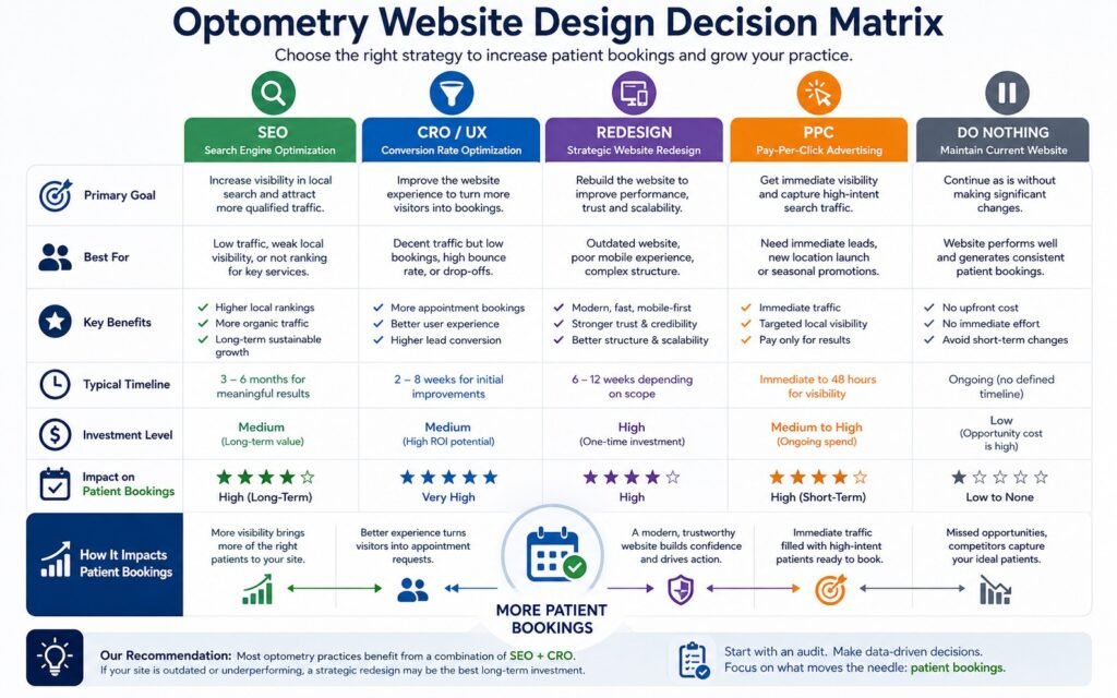
Should you prioritize SEO, redesign, CRO, PPC, or nothing?
The right investment depends on where the patient journey is breaking.
| Current problem | Best first move | Why |
|---|---|---|
| Patients cannot find the clinic for relevant searches | SEO | Improve search visibility and service/location relevance |
| Traffic exists but appointments are weak | CRO / UX | Diagnose booking and trust friction |
| Website architecture is outdated | Strategic redesign | Rebuild the journey and information structure |
| Website works but visibility is limited | SEO + content | Build service and local search authority |
| Strong website but immediate demand is needed | PPC | Capture high-intent searches while SEO develops |
| Website performs adequately | Do nothing major | Measure before spending on redesign |
A website project should not be sold as a redesign simply because the existing website is several years old.
The better question is: what business problem are you trying to solve?
What does a strong optometry website need to convert more patients?
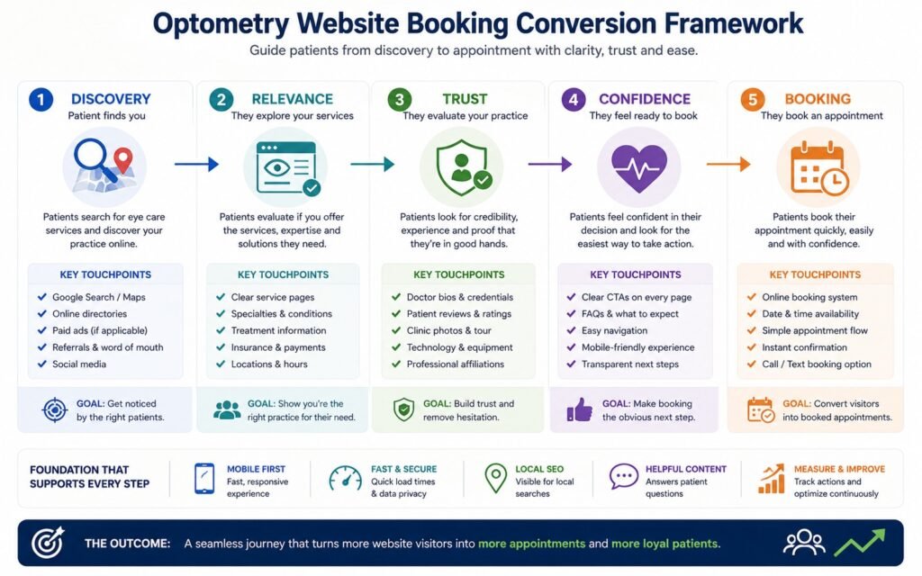
A strong website connects discovery, reassurance, and booking instead of treating them as separate marketing activities.
The most important elements include:
1. Clear service architecture
Patients should not have to search through a generic services page to determine whether the clinic provides the care they need.
2. Strong clinician profiles
Doctor pages should communicate relevant expertise without becoming lengthy biographies.
3. Visible appointment pathways
Booking should be available at the moments when patient intent is highest.
4. Local relevance
Location, clinic details, service areas, and locally relevant service content should be easy for both patients and search engines to understand.
5. Reviews and credibility
Reviews should support the decision rather than being hidden on a separate testimonials page.
6. Mobile-first UX
A patient searching from a phone should be able to call, navigate, understand services, and begin booking without excessive scrolling or confusing menus.
7. Useful patient information
Insurance, appointment expectations, clinic location, parking, accessibility, payment information, and FAQs can remove questions that otherwise become conversion barriers.
8. Appropriate privacy and security
If the website collects health-related information, the booking and form architecture needs appropriate privacy and security consideration. For U.S. practices, HIPAA considerations become particularly important when websites collect or transmit protected health information.
What does the patient actually need before booking?
Patients need enough information to move from interest to confidence.
That means the website should answer:
- Do you provide the service I need?
- Is this clinic near me?
- Who will examine me?
- Can I trust the clinicians?
- What will happen during the appointment?
- Can I book online?
- Can I call instead?
- Do you accept my insurance?
- What should I bring?
- What should I expect?
This is where eye clinic website bookings become a website architecture issue rather than simply a button-placement issue.
The booking CTA should be supported by the information immediately preceding it.
For example, a patient reading about children’s eye exams may need reassurance about the examination process, clinician experience, appointment duration, and what parents should expect before they are ready to schedule.
Why do some optometry websites get traffic but not appointments?
Traffic does not automatically equal commercial value.
A website can attract visitors through branded search, informational queries, referrals, or local discovery while still failing to convert those visitors into appointments.
The more useful metric is the relationship between relevant traffic and patient action.
This is also why optometrist website leads should not be evaluated purely by the number of website visitors.
A clinic receiving 10,000 low-intent visits may have a weaker commercial website than a practice receiving 2,000 highly relevant visitors who consistently reach service pages and appointment pathways.
At KG Web Designer, I would therefore examine where visitors come from, what pages they enter, what services they investigate, and where they encounter friction before recommending more traffic.
How should patient booking UX be evaluated?
Patient booking UX should be evaluated as a complete journey from the first click through appointment confirmation, not as an isolated scheduling widget.
A booking system can technically work while still creating friction.
Look for:
- A clear appointment CTA
- Minimal unnecessary steps
- Mobile-friendly controls
- Clear service selection
- Easy location selection for multi-location practices
- Appropriate appointment information
- Clear confirmation
- Easy return to the main website
- Accessible alternatives such as phone booking
- Privacy-conscious handling of patient information
Google Business Profile also supports appointment links, which means your local search presence and booking infrastructure can work together rather than functioning as disconnected systems.
Why does local SEO matter when choosing an optometry website designer?
Local SEO matters because many optometry decisions begin with geographic intent.
A patient is rarely searching for an abstract healthcare brand. They are more likely to search for a provider in a particular location or for a specific eye-care service near them.
That means the website needs to communicate both service relevance and geographic relevance.
A capable local SEO optometrist strategy may involve:
- Service-specific pages
- Location information
- Google Business Profile alignment
- Consistent business information
- Relevant local content
- Internal linking
- Appropriate structured data
- Strong mobile performance
- Clear clinician and practice information
The exact SEO strategy depends on the clinic’s market, competition, locations, and services.
What should you ask an agency about local SEO?
Ask:
- Which searches are we trying to win?
- Which services deserve dedicated pages?
- How will location intent be handled?
- How will Google Business Profile support the website?
- How will existing rankings be protected during redesign?
- How will performance be measured?
If the answer is simply “we’ll add keywords,” the strategy is not sufficiently developed.
Mid-Article CTA: Is your optometry website losing bookings?
If your clinic is already receiving search traffic but appointment volume is inconsistent, a full redesign may not be the first answer.
A focused Optometry Website Audit can identify booking friction, weak trust signals, service-page gaps, mobile UX problems, local SEO weaknesses, and other points where prospective patients may stop progressing.
The goal is to identify what needs fixing before you spend on a complete rebuild.
Request an Optometry Website Audit
Does Your Website Give Patients a Reason to Choose Your Clinic?
Before booking an appointment, patients are looking for reassurance. Your website should communicate your expertise, explain your services clearly, and make the next step feel simple and comfortable.
What should an optometry website audit actually include?
An effective audit should evaluate the website as a patient acquisition system.
At KG Web Designer, the audit framework should look beyond aesthetics and review:
Patient journey
- Discovery
- Homepage entry
- Service exploration
- Clinician validation
- Trust evaluation
- Booking
- Confirmation
Conversion
- CTA visibility
- Booking friction
- Mobile usability
- Phone conversion opportunities
- Service-page structure
- Form usability
Trust
- Clinician credentials
- Reviews
- Professional affiliations
- Clinic photographs
- Service explanations
- Insurance information
- Policies and expectations
Search
- Local intent
- Service-page coverage
- Internal linking
- Metadata
- Structured content
- Business information
- Google Business Profile alignment
Technical experience
- Mobile performance
- Core Web Vitals
- Accessibility
- Navigation
- Page speed
- Broken journeys
- Third-party booking integrations
The result should not simply be a list of errors. It should tell the practice what to fix first, why it matters, and what business outcome the change is intended to support.
Why do most optometry practices get website redesigns wrong?
Most practices get redesigns wrong because they begin with appearance instead of patient behavior.
A new logo, better photography, modern typography, and attractive animations can make a website look substantially better while leaving the underlying conversion problems untouched.
The more expensive mistake is rebuilding the entire website without first identifying which elements already work.
A better approach is to distinguish between:
- Visual problems
- Architecture problems
- SEO problems
- Trust problems
- Booking problems
- Technical problems
A website may have one category of problem or several.
The agency’s job is to determine which ones actually affect growth.
Example Scenario: A clinic that looks professional but underperforms
Imagine an independent optometry practice with a polished website, strong reviews, and several years of search visibility.
The homepage looks modern, but the service pages are thin. Doctor credentials are difficult to find, appointment options are inconsistent across pages, and mobile users have to navigate through several screens before reaching the booking system.
The practice owner concludes that the clinic needs more advertising.
A better diagnosis would be to first examine whether existing demand is being converted efficiently.
If patients are already discovering the clinic but leaving before booking, increasing traffic can simply increase the number of people encountering the same friction.
That is why eye clinic conversion should be evaluated alongside acquisition.
Example From Our Experience: An anonymized optometry website audit
Problem: An eye clinic was already receiving visitors through Google Search, Google Maps, and referrals, but appointment bookings were inconsistent.
What the audit found: The website had several confidence gaps. Doctor credentials were difficult to find, service pages did not answer enough patient questions, appointment buttons disappeared during the user journey, and reviews were separated from the pages where patients needed reassurance.
Recommended direction: Rather than immediately recommending a complete redesign, the audit focused on improving homepage messaging, appointment visibility, treatment content, doctor profiles, mobile navigation, technical performance, and structured information.
Business implication: The important lesson was not that every optometry clinic needs the same redesign. It was that the website needed to communicate clinical expertise more effectively throughout the patient journey.
This is the distinction I would want a prospective agency to understand before hiring them.
What should you avoid when choosing an optometry website agency?
Avoid agencies that make the decision primarily on visual style or a low initial quote.
Also be cautious when an agency:
- Cannot explain the patient journey
- Treats every healthcare website the same
- Has no process for protecting existing SEO
- Talks about traffic without conversion
- Treats booking as an afterthought
- Cannot explain mobile UX decisions
- Provides no audit or diagnostic phase
- Uses generic healthcare copy
- Cannot explain how trust signals support conversion
- Promises specific rankings or booking numbers without evidence
You are not simply buying pages.
You are investing in the digital system through which prospective patients evaluate your practice.
How should you compare agencies before making a decision?
The strongest comparison is based on diagnostic depth, not portfolio aesthetics.
| Evaluation factor | General web designer | Strong optometry-focused approach |
|---|---|---|
| Homepage | Visual presentation | Patient decision starting point |
| Services | Service list | Search and patient-intent architecture |
| Doctor profiles | About information | Clinical credibility |
| Booking | Added CTA | Conversion journey |
| SEO | Keywords | Local and service intent |
| Mobile | Responsive layout | Mobile patient journey |
| Trust | Testimonials section | Trust throughout decision path |
| Analytics | Traffic | Patient actions and friction |
| Strategy | Redesign | Diagnose, prioritize, then rebuild |
A strong agency should be comfortable telling you that you do not need a complete redesign yet if the existing website can be improved strategically.
That willingness to recommend less work when it is the right business decision is itself a useful trust signal.
What Is Your Website Saying About Your Business?
Your website should make it easier for the right people to trust you, understand your value, and take the next step. If visitors are leaving without enquiring, there may be gaps in your messaging, structure, or user experience.
Author Insight
Kanika Gupta, Founder, KG Web Designer
My strongest recommendation is simple: do not hire an agency because it can make an optometry website look modern. Hire the agency that can explain why a patient would choose your clinic, what might stop that patient from booking, and which website changes will reduce that friction.
That diagnostic ability is more valuable than another collection of attractive homepage designs.
What does this mean for your practice?
Your website should function as part of your patient acquisition system, not simply as an online brochure.
If prospective patients cannot quickly understand your services, validate your clinicians, find relevant local information, and confidently start an appointment, the website may be losing opportunities even when traffic looks healthy.
The goal is not to maximize every metric.
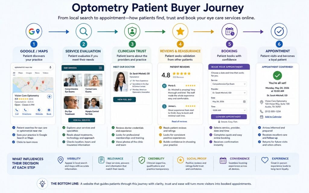
The goal is to make the path from search → trust → service evaluation → booking as clear as possible.
That is where patient trust becomes a conversion asset rather than simply a branding concept.
A modern optometry website design strategy should therefore connect:
- Local discovery
- Service relevance
- Clinical credibility
- Patient education
- Mobile UX
- Booking accessibility
- Conversion measurement
For U.S. practices, privacy and health-data considerations also need to be incorporated into any booking or form architecture that handles protected health information.
What should you fix first, second, and third?
The order matters because not every website problem has equal commercial value.
First: Diagnose
Determine whether the biggest constraint is visibility, trust, UX, booking, architecture, or technical performance.
Second: Fix the highest-friction journey
If patients are reaching the website but failing to book, prioritize the pages and interactions closest to the appointment decision.
Third: Build long-term visibility
Once the foundation works, strengthen service pages, local search architecture, useful content, internal linking, and technical SEO.
Fourth: Redesign only when necessary
A redesign makes sense when the existing architecture, CMS, mobile experience, positioning, or technical foundation prevents meaningful improvement.
This approach reduces unnecessary spending because the website is improved according to business priority rather than design fashion.
How can an optometry website designer prove they understand healthcare trust?
They should be able to explain how credibility is communicated before the patient reaches the booking system.
Healthcare trust is not created by putting a “Trusted Care” headline above a stock photograph.
It comes from evidence.
That can include:
- Real clinician profiles
- Qualifications
- Relevant professional memberships
- Clear service explanations
- Authentic clinic photography
- Reviews
- Transparent policies
- Insurance information
- Accessibility
- Privacy and security
- Clear appointment expectations
The designer should also understand that different patient groups may need different reassurance.
A parent researching pediatric eye care may care about a clinician’s experience with children. A contact-lens patient may care more about the available services and convenience. An older patient may prioritize accessibility, readability, location, parking, and easy phone contact.
The website architecture should accommodate these different decision needs.
Mobile experience should be evaluated as part of the patient booking journey, not simply as a responsive-design requirement. Small issues such as difficult navigation, tiny tap targets, slow treatment pages, or booking buttons that disappear on mobile can create hesitation at exactly the point when a patient is ready to act. Our guide on how mobile UX impacts patient trust and bookings examines these problems in greater detail.
When does professional help make sense?
Professional help makes sense when the website problem is affecting patient acquisition but you cannot confidently identify the root cause.
It is especially worth an audit when:
- Search traffic exists but bookings are weak
- The website is several years old
- Mobile users struggle with navigation
- Service pages are thin or generic
- Local visibility has plateaued
- Patients repeatedly ask questions already answered poorly online
- The booking journey uses multiple disconnected systems
- You are considering a complete redesign
- You are investing in SEO or PPC without understanding conversion performance
The best starting point is not necessarily “build me a new website.”
It is:
“Show me what is preventing this website from turning relevant visitors into patients.”
That question changes the quality of the project.
How can you tell whether the agency understands the patient journey?
Ask the agency to explain your website from the perspective of three hypothetical patients.
For example:
Patient 1: Searches for an eye exam near the clinic.
Patient 2: Searches specifically for pediatric eye care.
Patient 3: Finds the clinic through Google Maps and wants to book immediately.
A capable agency should be able to explain where each patient lands, what information they see, what trust signals they encounter, and how they reach the booking action.
If the proposed strategy starts and ends with the homepage, the agency may be thinking about the website as a design project rather than a patient acquisition system.
Internal Resource: What if your website already gets traffic?
If your practice already receives visitors but enquiries are inconsistent, the issue may be conversion rather than visibility. Our framework on the AI Overview traffic and citation framework explains why traffic alone is not sufficient when the website fails to turn attention into meaningful action.
The same principle applies to optometry: before increasing acquisition, determine whether the existing patient journey gives visitors enough reason and opportunity to book.
How should you evaluate an optometry website redesign before approving it?
A redesign should be approved only when it solves identifiable business problems.
For example, a redesign may be justified if the current site has:
- Poor mobile UX
- Confusing navigation
- Weak service architecture
- Outdated technology
- Difficult content management
- Poor booking integration
- Weak local SEO foundations
- Inconsistent branding
- Limited accessibility
- Structural limitations that prevent CRO improvements
But if the current site has strong architecture and search equity, targeted improvements may be safer and more commercially sensible.
This is why I recommend separating diagnosis from implementation.
First determine what is wrong.
Then decide whether optimization or redesign is the appropriate solution.
What should your final agency selection criteria look like?
Choose the agency that demonstrates the strongest understanding of your patients, not simply the agency with the most attractive mockup.
Your final checklist should include:
- Patient journey: Can they explain how patients discover, evaluate, trust, and book?
- Local SEO: Can they explain how your practice will compete for relevant local searches?
- Healthcare trust: Can they show how clinical credibility will be communicated?
- Booking UX: Can they identify and reduce appointment friction?
- Mobile UX: Can they demonstrate a mobile-first patient journey?
- Content: Can they turn services into useful patient-facing information?
- Measurement: Can they connect website activity to commercial actions?
- Strategy: Can they diagnose before recommending a rebuild?
- Experience: Can they demonstrate relevant optometry or healthcare observations?
- Communication: Can they explain technical decisions in business terms?
A specialist approach does not mean blindly following an optometry template.
It means understanding the industry well enough to know what should be standardized and what should be customized.
Before Patients Book, They Need to Feel Confident
Your clinic website is often the first experience a potential patient has with your practice. Make that experience reassuring, informative, and easy to act on.
Free 30-minute strategy call · No obligation
Final Thoughts
Choosing an optometry website designer should be treated as a patient acquisition decision, not simply a creative services purchase.
The right partner should understand how local search, healthcare credibility, service architecture, mobile UX, patient education, and appointment booking work together.
At KG Web Designer, the approach I recommend is simple: diagnose first, prioritize the highest-value problems, improve the patient journey, and redesign only when the existing foundation prevents meaningful progress.
If your practice is unsure whether the problem is SEO, trust, UX, booking friction, or the website itself, an audit gives you a clearer starting point than immediately commissioning a redesign.
Ready to identify what is holding your optometry website back?
A focused Optometry Website Audit can examine your patient journey, booking experience, local SEO foundations, trust signals, service architecture, mobile UX, and conversion friction before you invest in a larger website project.
Frequently Asked Questions
How do I choose the right website designer for my optometry practice?
Choose an agency that understands patient acquisition rather than only visual design. Ask how they approach local SEO, service architecture, clinician credibility, mobile booking, healthcare trust, analytics, and conversion optimization. They should be able to audit your current website and explain which problems should be fixed before recommending a complete redesign.
Should an optometry website prioritize SEO or online booking?
Both matter, but the priority depends on the current problem. If patients cannot find the practice, local SEO may need attention first. If relevant visitors are already arriving but appointments are weak, booking UX, trust signals, service content, and conversion friction should be investigated before simply increasing traffic.
What makes a good optometry website different from a general healthcare website?
An optometry website often needs to support several patient decisions at once, including eye exams, contact lenses, pediatric services, specialty care, eyewear, insurance, and location. The website therefore needs clear service architecture, clinician credibility, local search relevance, patient education, and an easy appointment pathway.
How important is mobile design for an optometry practice?
Mobile design is critical because patients may discover a clinic, compare providers, call the practice, find directions, or begin booking from a phone. A mobile-first website should make those actions easy without forcing users through unnecessary navigation, small controls, long forms, or disconnected booking experiences.
Can a website audit tell me whether I need a redesign?
Yes. An audit should identify whether the main problems come from content, SEO, conversion, UX, architecture, or technical limitations. If the existing foundation can support improvements, optimization may be more appropriate. If the architecture or technology prevents meaningful progress, a strategic redesign may be justified.
How does local SEO help an optometry website?
Local SEO helps the practice become more relevant for searches involving eye-care services and geographic intent. A strong strategy can include service-specific pages, location information, Google Business Profile alignment, internal linking, structured business information, useful local content, and technically sound pages.
What should an optometry website audit check?
An effective audit should review the patient journey, mobile UX, booking flow, service pages, clinician profiles, trust signals, local SEO, technical performance, accessibility, analytics, and conversion opportunities. The output should prioritize problems by business impact rather than simply producing a long technical error list.