Quick Answer
Strong visual hierarchy helps ecommerce brands guide shoppers toward purchasing decisions faster by strategically controlling attention, reducing cognitive overload, and improving buyer trust. Modern ecommerce website design for conversions uses layout structure, spacing, typography, mobile UX, CTA placement, and trust-focused design psychology to reduce hesitation and increase revenue without relying on aggressive sales tactics.
TL;DR
Most ecommerce websites fail to convert because users feel visually overwhelmed before they feel emotionally convinced.
High-performing ecommerce brands use:
- structured visual flow
- intentional whitespace
- hierarchy-driven layouts
- premium product imagery
- strategic CTA placement
- mobile-first UX
- trust-focused scanning patterns
to simplify decision-making and reduce friction throughout the buying journey.
Key Takeaways
Instant Decision Engine
Visual hierarchy shapes cross-border buyer decisions within milliseconds of a page loading.
Cognitive Load Reduction
Clean interface layouts eliminate friction, directly minimizing cart abandonment rates.
Premium Value Realization
Strategic spacing, intentional asymmetry, and typographic scales elevate a brand’s perceived monetary worth.
Global-First Mobile UX
Clean touch-target layouts directly influence mobile conversion rates across competitive international markets.
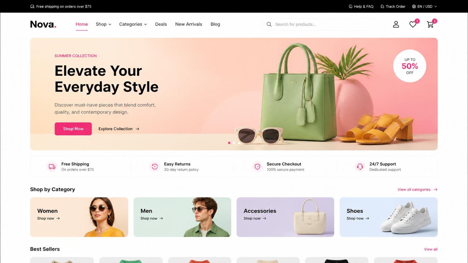
Why Ecommerce Buyers Judge Your Website Before They Read a Single Word
A customer landing on your ecommerce store in New York is making emotional trust decisions before consciously reading a single sentence.
A luxury skincare buyer in London is evaluating sophistication through layout spacing before comparing product ingredients.
A fashion shopper in Sydney decides whether your brand feels premium within seconds of scrolling.
This is why visual hierarchy has become one of the most financially important aspects of modern ecommerce UX.
The strongest ecommerce brands in 2026 no longer compete purely on products or advertising budgets. They compete on how efficiently their websites guide users toward clarity, trust, and confident purchase behavior.
And that process happens visually first.
Not verbally.
Modern buyers do not carefully “read” ecommerce websites anymore. They scan rapidly, filter subconsciously, and emotionally evaluate whether the experience feels:
- trustworthy
- premium
- intuitive
- safe
- professionally structured
before deciding whether to continue browsing.
That means layout design is no longer decorative.
It is behavioral engineering.
If reading this makes you suspect your store’s design is working against you, the fix isn’t always a full rebuild — sometimes targeted changes do the job. Here’s how to tell whether your website needs a redesign or a fresh start.
Ready to Build a High-Converting Ecommerce Website?
👉 Get your top 3 conversion leaks identified.
Why Most Ecommerce Websites Create Cognitive Overload
Most ecommerce websites fail because they attempt to communicate everything simultaneously.
Too many:
- promotional banners
- popups
- navigation layers
- discount blocks
- competing CTAs
- moving animations
force shoppers into cognitive overload immediately.
When the brain processes too many competing visual priorities at once, purchase confidence drops.
This is one of the largest hidden reasons ecommerce conversion rates stagnate despite healthy traffic levels.
Strong visual hierarchy simplifies decisions intentionally. Instead of forcing users to process every message equally, premium ecommerce brands guide attention progressively through:
- spacing
- scale
- contrast
- positioning
- visual sequencing
- emotional prioritization
This is where ecommerce visual hierarchy best practices become directly connected to profitability.
The highest-converting ecommerce stores make users feel oriented, calm, and visually guided from the first scroll onward.
The Psychology Behind Visual Hierarchy in Ecommerce UX
Human attention follows predictable behavioral patterns.
Users instinctively prioritize:
- larger objects first
- high-contrast elements second
- emotional imagery third
- simplified layouts over dense ones
- visually isolated CTAs faster than cluttered actions
This is not simply design theory.
It is conversion psychology.
In my experience designing ecommerce stores for premium international brands, weak hierarchy consistently creates hesitation even when products themselves are excellent.
A visually confusing ecommerce store silently communicates operational confusion.
A strategically structured store communicates confidence.
That distinction matters enormously in competitive international markets where users are subconsciously comparing your brand against world-class ecommerce experiences every day.
This is why visual hierarchy in ecommerce UX directly affects:
- trust formation
- perceived product quality
- browsing efficiency
- emotional comfort
- purchase confidence
before checkout even begins.
If you’d like to see visual hierarchy applied by real brands, our analysis of the 15 Best Ecommerce Website Designs in 2026 showcases outstanding examples from fashion, beauty, electronics, and D2C companies.
The F-Pattern and Z-Pattern: How Ecommerce Users Actually Scan Pages
Eye-tracking behavior consistently shows that ecommerce users scan layouts using predictable visual patterns.
Understanding these patterns allows brands to strategically position:
- products
- CTAs
- pricing
- trust signals
- navigation systems
for maximum conversion efficiency.
| Scanning Pattern | Core Page Deployment | Primary Visual Flow Focus | Optimal CTA Positioning |
|---|---|---|---|
| The F-Pattern | Category pages, multi-grid layouts, long-form PDPs | Top horizontal sweep → secondary sweep → left vertical drop | Top-left filters, upper-grid cards, visible pricing anchors |
| The Z-Pattern | Landing pages, hero sections, promotional campaigns | Top-left identity → top-right utility → diagonal visual sweep → bottom-right action | Bottom-right CTA zone or central focal node |
The highest-performing ecommerce brands intentionally build layout architecture around these natural scanning behaviors.
That reduces friction dramatically because the interface feels instinctively navigable.
Users should never need to “figure out” where to look next.
Strong hierarchy guides attention invisibly.
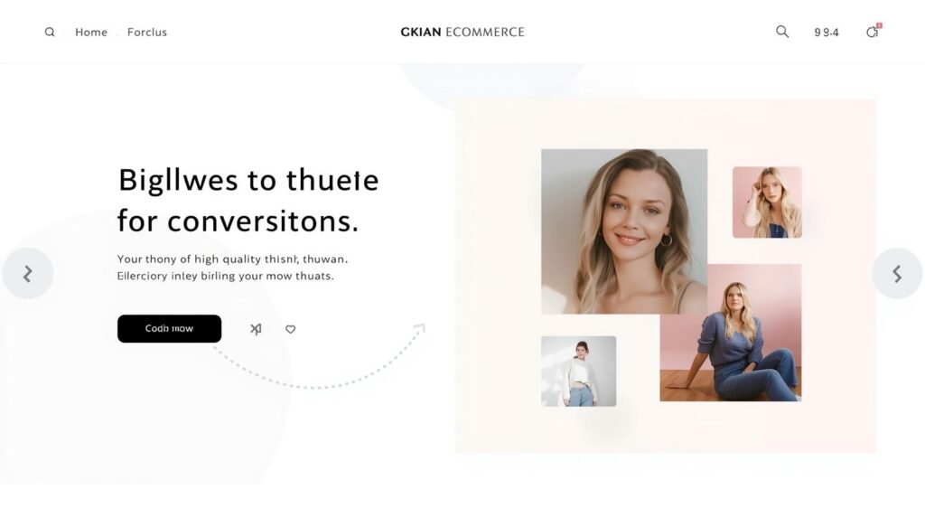
Why Premium Ecommerce Websites Feel Effortless to Browse
Luxury ecommerce experiences rarely feel visually aggressive.
Instead, they feel calm, structured, and emotionally controlled.
This is not accidental.
Premium brands intentionally reduce visual chaos because cognitive simplicity increases perceived sophistication.
Whitespace is far more than empty real estate; it functions as strategic breathing room for the consumer’s eyes. This design restraint becomes critically important for luxury skincare, fashion, jewelry, and lifestyle brands where minimalist composition directly increases perceived product value.
Strong ecommerce layouts prioritize:
- one dominant visual objective per screen
- controlled visual pacing
- intentional negative space
- restrained color systems
- typography clarity
- isolated CTA focus
The result is a browsing experience that feels emotionally premium rather than visually exhausting.
This is where ecommerce layout design for higher sales becomes operationally important.
Premium UX is not about adding more visual stimulation.
It is about reducing unnecessary friction.
The 7 Core Principles of High-Converting Ecommerce Hierarchy
1. Above-the-Fold Clarity
The first screen should immediately answer:
- What is this product?
- Why does it matter?
- Who is it for?
- What should I do next?
Many ecommerce brands waste above-the-fold space with rotating sliders, excessive announcements, or unclear messaging hierarchies.
High-converting stores instead prioritize:
- one dominant message
- one emotional objective
- one primary CTA
- one strong visual anchor
because clarity converts faster than complexity.
2. Strategic CTA Visibility
Buyers should never search for the next action.
Strong ecommerce hierarchy positions:
- Add to Cart buttons
- Shop Now actions
- Checkout triggers
- trust-focused purchase prompts
inside natural visual scanning zones.
This improves:
- conversion readiness
- browsing momentum
- mobile usability
- purchase confidence
while reducing hesitation significantly.
3. Product Imagery Must Control Attention
Product imagery is one of the strongest emotional trust drivers in ecommerce.
Premium brands use:
- oversized imagery
- emotional photography
- consistent framing
- restrained backgrounds
- cinematic composition
to create stronger perceived value.
Luxury ecommerce buyers evaluate image quality before evaluating pricing.
That means weak imagery silently lowers perceived product worth instantly.
4. Typography Must Improve Readability, Not Decoration
Typography heavily affects:
- trust
- scanning speed
- emotional tone
- cognitive effort
Weak typography creates fatigue.
Strong typography creates flow.
Premium ecommerce brands prioritize:
- restrained font combinations
- predictable scaling
- high contrast
- generous line spacing
- readable mobile typography
because readability directly affects conversion behavior.
5. Whitespace Increases Emotional Comfort
Most ecommerce brands underestimate how psychologically stressful cluttered interfaces feel.
Whitespace creates:
- visual focus
- emotional calmness
- hierarchy clarity
- product isolation
- premium perception
without adding more content.
This becomes especially important for high-ticket ecommerce categories where buyers need emotional reassurance before purchasing.
6. Mobile UX Determines Revenue Performance
Most ecommerce traffic now originates from mobile devices.
That means mobile hierarchy directly affects:
- add-to-cart behavior
- bounce rates
- scrolling depth
- checkout completion
- customer retention
Strong mobile UX prioritizes:
- thumb-zone CTAs
- compressed navigation
- touch-friendly interactions
- reduced visual clutter
- simplified checkout structure
This is where guide users to purchase faster online becomes strategically important.
Mobile friction destroys conversions silently.
7. Trust Signals Must Appear Before Skepticism Appears
Many ecommerce websites bury trust too late in the journey.
Premium brands surface reassurance immediately through:
- shipping clarity
- review visibility
- secure payment indicators
- return policies
- social proof
- guarantee messaging
before users begin questioning legitimacy.
Strong hierarchy reduces uncertainty progressively.
That directly improves conversion readiness.

18+ Years. 500+ Websites. Zero Cookie-Cutter Stores.
I design ecommerce websites for founders in the US, UK, and Australia who are serious about revenue — not just a pretty storefront. Custom-built, conversion-focused, and delivered on time.
Why First Impressions Influence Ecommerce Conversions Faster Than Ever
Modern ecommerce buyers make trust decisions almost instantly.
That means:
- spacing
- hierarchy
- product imagery
- typography
- visual restraint
- CTA clarity
all influence revenue before users consciously process information.
The first five seconds determine whether shoppers continue exploring or mentally exit the experience.
Our detailed breakdown on how ecommerce design shapes instant buying decisions explores how visual trust formation now affects ecommerce conversion behavior within milliseconds of page loading.
Why Strong UX Increases Customer Retention Too
Visual hierarchy affects more than first-time conversions.
It directly influences retention.
When ecommerce experiences feel:
- smooth
- intuitive
- emotionally calming
- visually organized
customers are significantly more likely to return.
Strong UX creates emotional comfort.
That comfort increases:
- repeat purchases
- loyalty
- trust
- browsing confidence
- customer lifetime value
Our guide on how premium ecommerce brands design for customer loyalty and repeat purchases explains how conversion-focused UX directly influences long-term retention behavior.
Real Client-Style Insight: When Better Hierarchy Increased Revenue Without More Traffic
A premium skincare ecommerce brand approached us because traffic levels remained healthy, yet conversion growth had plateaued.
The issue was not visibility.
It was visual overload.
Their previous website relied heavily on:
- competing promotional banners
- multiple simultaneous CTAs
- crowded mobile layouts
- inconsistent hierarchy
- buried trust signals
Users felt overwhelmed before they felt emotionally reassured.
We restructured:
- homepage visual sequencing
- CTA hierarchy
- mobile product flow
- whitespace systems
- trust signal positioning
Within weeks:
- bounce rates declined
- mobile engagement improved
- average session duration increased
- conversion rates improved significantly
Traffic remained nearly identical.
But the customer journey became psychologically easier to navigate.
That changed revenue performance substantially.
“Most ecommerce conversion problems are not traffic problems. They are clarity problems. Buyers abandon stores when the interface feels mentally exhausting.”
— Kanika Gupta, KG Web Designer
Why Premium Ecommerce UX Outperforms Aggressive Conversion Tactics
Weak ecommerce brands often depend on:
- countdown timers
- popup overload
- fake urgency
- excessive discounting
- aggressive interruptions
to force purchases.
Premium brands focus on:
- clarity
- confidence
- emotional reassurance
- trust progression
- friction reduction
instead.
This is where high-converting ecommerce website structure becomes financially important.
Strong UX should guide users naturally.
Not pressure them psychologically.
The best ecommerce experiences feel:
- intentional
- trustworthy
- calm
- premium
- frictionless
And those emotional signals influence:
- conversion rates
- customer loyalty
- perceived product value
- long-term profitability
simultaneously.
Why Strategic Ecommerce UX Requires Professional Conversion Expertise
Modern ecommerce UX is no longer about aesthetics alone.
It is about strategically engineering:
- attention flow
- trust positioning
- emotional sequencing
- buyer psychology
- mobile interaction behavior
- hierarchy architecture
to reduce hesitation and increase purchase confidence.
This is why ecommerce UX optimization for conversions directly affects:
- profitability
- conversion efficiency
- customer retention
- revenue scalability
especially for international ecommerce brands competing in:
- New York
- London
- Sydney
- Singapore
- Dubai
where buyer expectations are exceptionally high.
Conclusion: Better Visual Hierarchy Creates Faster Purchase Decisions
The strongest ecommerce brands do not leave user attention to chance.
They guide it intentionally.
That is why modern ecommerce website design for conversions now depends heavily on:
- strategic visual hierarchy
- trust-focused UX
- buyer psychology
- mobile-first layouts
- intentional spacing
- conversion-focused sequencing
before customers ever reach checkout.
The ecommerce brands winning in 2026 understand something many competitors still overlook:
Users do not purchase faster because websites contain more information.
They purchase faster because the right information appears at the exact right moment with the least possible friction.
Is Your Ecommerce Website Guiding Buyers or Overwhelming Them?
Managing cross-border ecommerce growth in New York, London, Sydney, or Singapore requires more than attractive visuals.
It requires frictionless conversion strategy.
We help premium ecommerce brands create:
- low-friction digital storefronts
- conversion-focused UX systems
- trust-driven ecommerce structures
- mobile-first hierarchy strategies
- premium shopping experiences
tailored to modern international buyer behavior.
Available across US, UK, and AU time zones. Fully remote. No commitment required.
Ready to Improve Your Ecommerce Conversions?
You now know what the right investment looks like. The next step is a quick call — no pitch, no pressure. Just clarity on what your store needs and what it’ll cost to build it right.
FAQs
Why is visual hierarchy important in ecommerce?
Visual hierarchy guides users toward important actions faster. Strong hierarchy reduces confusion, improves trust, simplifies navigation, and increases conversions by helping shoppers process information more efficiently.
What makes an ecommerce website high-converting?
High-performing ecommerce websites combine:
- strategic layout structure
- strong product imagery
- trust-focused UX
- mobile optimization
- CTA clarity
- emotional branding
- simplified navigation
These elements improve buyer confidence and conversion performance significantly.
How does mobile UX affect ecommerce conversions?
Most ecommerce browsing now happens on mobile devices. Poor mobile hierarchy creates scrolling fatigue, weak CTA visibility, and checkout frustration. Strong mobile UX improves engagement, add-to-cart behavior, and purchase completion rates significantly.
Why do cluttered ecommerce websites reduce sales?
Cluttered websites overwhelm users cognitively. Too many banners, popups, competing CTAs, and visual distractions increase hesitation while reducing trust. Cleaner hierarchy improves browsing confidence and conversion flow dramatically.
Do you work with ecommerce brands internationally?
Yes. We work fully remotely with ecommerce brands across the US, UK, Australia, Canada, Singapore, and UAE, helping brands improve conversions, premium positioning, UX strategy, customer retention, and ecommerce performance through conversion-focused website design.