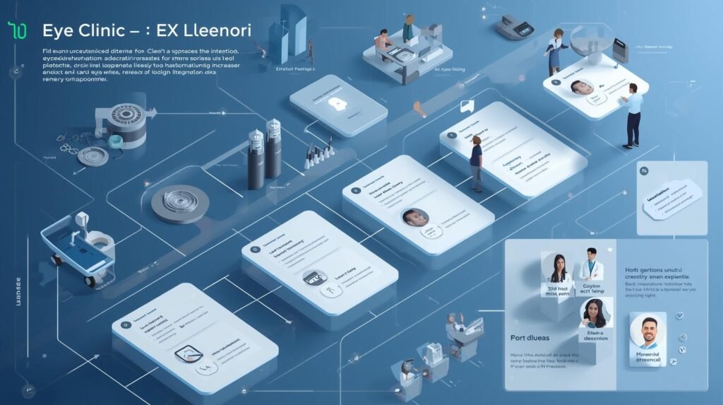
Quick Answer
Optometrists can increase patient bookings by improving website UX rather than simply increasing traffic. A patient-focused website with intuitive navigation, service-specific pages, mobile-first booking, visible trust signals, and a streamlined appointment process helps visitors become confident enough to schedule an eye exam. Better UX also strengthens SEO, Local SEO, and AI search visibility, making it easier for prospective patients to discover and choose your clinic.
Key Takeaways
- Poor UX is the #1 reason eye clinics lose bookings online — not lack of traffic.
- A properly structured Optometrist Website increases appointments without increasing ad spend.
- Compliance (HIPAA, GDPR, accessibility standards) directly affects trust and conversions.
- SEO and UX are interconnected — better experience improves search performance.
- Modern optometry practices require engineered digital systems, not design templates.
How Can Optometrists Increase Patient Bookings With Website UX?
Optometrists increase patient bookings by simplifying appointment flows, creating service-specific landing pages, making compliance visible (HIPAA/GDPR), optimizing for mobile behavior, and reducing decision friction. Structured UX architecture improves both conversion rates and SEO engagement signals simultaneously.
If your Optometrist website receives traffic but appointment bookings remain inconsistent, the problem is rarely marketing.
It’s user experience design.
Across the USA, UK, and increasingly in India’s competitive metro markets, patients expect more from an Eye clinic website than an online brochure. They expect immediate clarity, visible security, and structured booking systems.
US optometry practices must also integrate HIPAA-secure appointment systems. In the UK, GDPR transparency and accessibility standards influence digital credibility. In India, Local SEO and Google Maps ranking determine who appears in top search results.
When websites fail at:
- Clear navigation
- Booking simplicity
- Compliance reassurance
- Mobile usability
Patients leave.
This article explains why bookings leak – and how structured UX architecture increases them sustainably.
Expert Advice from Kanika Gupta
“Many optometrists assume low bookings are caused by poor marketing, but our experience shows that user experience is often the bigger issue. Patients usually arrive with a specific concern, such as blurred vision, dry eyes, or contact lens discomfort. If your website quickly answers their questions, demonstrates your expertise, and makes booking simple, they are far more likely to become patients. Great UX doesn’t just improve conversions—it builds trust before the first appointment.”
— Kanika Gupta, Founder, KG Web Designer
The Real Problem: Why Eye Clinic Websites Underperform
Booking drop-offs are rarely dramatic.
They are silent.
Most eye clinic websites fail for predictable reasons.
1. Confusing Service Structure
Many clinics:
- List all treatments on one page.
- Avoid detailed explanations.
- Use internal terminology instead of patient language.
Patients land unsure whether they need:
- Vision testing
- Pediatric eye exam
- Contact lens consultation
- Urgent care
When clarity is missing, hesitation increases.
Modern optometry practices require structured, service-specific landing pages.
2. Appointment Flow Friction
Clinics we’ve worked with often discover that booking systems fail due to:
- Too many fields
- Requesting insurance before reassurance
- No clear “what happens next”
- Poor mobile design
Patients are making decisions under mild anxiety.
If your booking system increases friction, they leave.
Especially in US optometry practices where HIPAA-secure messaging must be clearly visible, uncertainty kills conversion.
3. Poor Mobile Prioritization
Over 65% of patients search from mobile devices.
Yet many clinic websites:
- Use desktop-heavy layouts
- Place booking below long content
- Have tiny tap targets
- Use unreadable fonts
Mobile UX is not responsive design alone.
It requires behavioral thinking.
4. Trust Signals Are Misplaced
Trust elements are often:
- Buried in the footer
- Hidden on “About Us” page
- Not near booking points
Patients make decisions at the moment of action.
Trust must live there.
A strategically built Optometrist Website Design integrates reassurance exactly where hesitation appears.
Why UX Directly Impacts SEO & AI Rankings
Search engines increasingly evaluate engagement signals.
These include:
- Time on page
- Booking interaction
- Bounce rate
- Scroll behavior
AI-based search summaries prefer:
- Structured headings
- Clear service pages
- Transparent booking systems
That means UX affects ranking.
Poor usability weakens local visibility.
Strong UX increases authority.
While user experience plays a major role in improving bookings, overall website design also directly impacts how patients interact with your clinic online.
You can explore how design influences conversions in detail in this guide on how optometrist websites improve patient appointment conversions.
What Engineered UX Typically Improves
Clinics that restructure booking architecture often see:
• Reduced booking abandonment
• Higher mobile completion rates
• Lower bounce rates on service pages
• Stronger Google Business engagement signals
• More predictable monthly appointment flow
While exact numbers vary by market, structural clarity consistently improves measurable engagement metrics.
Strategic Framework: UX Architecture That Increases Bookings
This is not about cosmetic redesign.
It is about workflow engineering.
1. Clear Service Hierarchy
Each core treatment must have:
- Dedicated landing page
- Clear outcome description
- FAQ snippet
- Visible booking CTA
This supports:
- SEO indexing
- AI search extraction
- Patient understanding
In India, especially in competitive metro markets, structured service pages improve Google Maps conversion.
1. Booking Micro-Flow Optimization
Instead of one long form:
Design:
Step 1 – Select Service
Step 2 – Choose Date
Step 3 – Enter Details
Step 4 – Confirmation Screen
Add:
- Visible HIPAA reassurance (USA)
- GDPR transparency note (UK)
- SMS confirmation clarity
Micro-steps reduce perceived effort.
2. Compliance Visibility Builds Confidence
USA
US optometry practices must visibly communicate:
- HIPAA alignment
- Secure encrypted appointment systems
UK
- GDPR compliance
- Data use transparency
India
- Privacy assurance
- Secure inquiry handling
Patients rarely read privacy pages.
They glance for cues. Visible security messaging improves completion rates. In the United States, healthcare websites operate under stricter scrutiny due to HIPAA exposure. In the UK, GDPR enforcement and accessibility expectations elevate compliance risk. UX design must align with legal frameworks, not just branding goals.
While visible HIPAA messaging reassures patients, true compliance goes far beyond displaying a privacy notice or secure booking badge. It requires encrypted appointment workflows, HIPAA-compliant scheduling platforms, Business Associate Agreements (BAAs) where applicable, and clear communication about how patient information is collected and protected. If you’re evaluating or upgrading your online booking system, read our guide on HIPAA-Compliant Patient Booking: A Strategic Guide for US Optometrists in 2026, where we explain the technical, legal, and UX considerations that help practices improve patient trust while meeting compliance requirements.
3. Accessibility as Conversion Layer
Accessibility standards (WCAG alignment) help:
- Elderly patients
- Visually sensitive users
- Screen reader compatibility
Accessibility improves both compliance and usability. In international markets like the USA and UK, accessibility expectations are rising.
4. Local SEO Alignment
UX supports Local SEO when:
- Location pages are structured
- Google Maps embedded properly
- Service areas clearly defined
For India’s metro clinics, competition is intense.
Better UX increases engagement signals.
Stronger engagement improves ranking stability.
In Indian metro markets like Delhi-NCR, Mumbai, and Bangalore, multiple eye clinics often compete within the same 3–5 km radius. Structured service pages and improved on-site engagement increase Google Maps interaction signals, which directly support Local SEO stability. Optometrists or eye clinics that want to improve online bookings often work with specialists in optometrist website design who understand healthcare UX, patient trust signals, and appointment-driven website structure.
While user experience plays a major role in improving appointment bookings, patients still won’t convert if they can’t quickly understand your clinic’s services. High-performing eye clinic websites combine intuitive UX with clear treatment presentation, doctor credibility, and patient-focused messaging. If you’re looking for practical examples, explore our guide on how top eye clinics showcase services online to increase patient bookings, where we explain how leading practices organize treatment pages, trust signals, and consultation journeys to improve conversions.
Comparison: Traditional vs Engineered UX
| Element | Traditional Clinic Website | Engineered UX System |
| Service Pages | General | Intent-specific |
| Booking Form | Long single page | Step micro-flow |
| HIPAA Note | Hidden | Visible reassurance |
| Mobile UX | Shrunk desktop | Behaviorally designed |
| SEO Impact | Neutral | Strengthened |
| Conversion | Unpredictable | Measurable growth |
Advanced Conversion Strategies for Optometrists
1. Urgency Without Pressure
Emergency eye care must:
- Have dedicated urgent-care page
- Include call-first option
- Avoid long form barriers
Urgency should simplify – not complicate – workflow.
2. Insurance Transparency
Patients often hesitate over:
- Coverage acceptance
- Out-of-network fears
UX should include:
- Insurance list
- Quick clarification CTA
- Clear disclaimers
Transparency reduces abandonment.
3. AI-Readable Content Blocks
Write:
- Short paragraphs
- Clear headings
- Direct answers
- FAQ schema
AI Overview systems favor extraction-ready formatting. Structure supports visibility.
Before vs After UX Optimization
Before:
• Patients browse homepage only
• Booking page abandonment is high
• Insurance questions unanswered
• Emergency requests routed through general forms
After:
• Patients land on service-specific pages
• Micro-step booking increases completion
• Insurance clarity reduces hesitation
• Emergency pathway simplified
UX clarity creates measurable workflow improvements.
Patient Psychology Behind Booking
Patients make booking decisions when three conditions are met:
- Clarity of service
- Confidence in clinic
- Ease of action
If any are missing, hesitation increases.
UX must reduce cognitive load.
That means:
- Fewer decisions
- Cleaner layout
- Predictable next steps
Modern optometry practices require digital empathy.
UX Architecture Framework for Increasing Optometry Patient Bookings
This must be addressed clearly.
Optometry websites are not lifestyle websites.
They involve:
- Medical data sensitivity
- Insurance workflows
- Vision-related accessibility
- Appointment logistics
- Regulatory compliance
Most designers understand layout aesthetics.
Few understand optometric workflow architecture.
Clinics we’ve worked with approach us after:
- Booking drop-offs
- Local SEO stagnation
- HIPAA questions
- Accessibility concerns
We do not build decorative websites.
We engineer systems.
In international markets like the USA and UK, compliance, accessibility, and trust architecture must operate together.
You are not hiring a graphic designer.
You are hiring a structured Optometrist Website Design specialist.
That specialization is why clinics trust our frameworks. For detailed architecture, visit our 👉 optometrist website design services.
For broader regulated industries, explore our 👉 Health & Wellness category.
You can also understand our philosophy as a medical website development specialist on our homepage.
Deep UX Checklist for Immediate Clinic Audit
Booking Architecture
☐ Step-based scheduling
☐ Clear confirmation screen
☐ Visible compliance reassurance
Trust & Psychology
☐ Doctor credentials near service
☐ Real imagery, not stock
☐ Insurance transparency
Compliance (USA / UK / India)
☐ HIPAA-secure system
☐ GDPR-aware forms
☐ WCAG-aligned accessibility
SEO & Visibility
☐ Structured service pages
☐ Location clarity
☐ Google Maps integration
Who This Guide Is Designed For
This article is designed for:
• US optometry practices facing booking drop-offs
• UK eye clinics navigating GDPR and accessibility standards
• Indian metro optometrists competing in dense Local SEO markets
• Multi-location clinics trying to improve appointment consistency
• Practice owners investing in website redesign
If your website generates traffic but not predictable bookings, UX architecture may be the missing layer.
While it’s tempting to use a generic template, most ‘off-the-shelf’ designs fail to account for the specific patient journey an eye clinic requires. If your current site is beautiful but isn’t converting, it’s likely a UX architecture issue. Before you start your next project, review these 9 things eye clinics must check before hiring an optometrist website designer to ensure your partner understands the nuances of vision care UX and patient psychology.
FAQs
Why does my clinic website get traffic but low bookings?
Because UX friction – not marketing – is preventing completion.
Does HIPAA visibility improve bookings?
Yes. Visible security reassurance reduces hesitation in US optometry practices.
How does UX impact Google Maps ranking?
Improved engagement signals strengthen local authority indicators.
Is accessibility required for optometry clinics?
Increasingly yes, especially in the USA and UK where accessibility standards intersect with legal expectations.
Final Perspective
Patient bookings increase when:
- Clarity increases
- Hesitation decreases
- Trust is visible
- Compliance is transparent
- SEO supports discovery
A well-structured Optometrist Website is not a cost.
It is an operational asset.
Conversion growth does not require louder CTAs.
It requires better architecture.
A high-performing Optometrist Website aligns compliance, clarity, and conversion into one unified system. That integration – not design alone – drives sustainable patient acquisition.
Improving UX is only one part of creating a high-performing optometry website. Many clinics continue losing appointment requests because patients leave before completing the booking process, often due to hidden trust signals, confusing navigation, or poor mobile experiences. If you want to understand the most common reasons prospective patients abandon eye clinic websites, read our detailed audit on why patients leave eye clinic websites without booking, where we examine the trust, usability, and conversion issues that reduce appointment enquiries.
📖 Related Reading
Optometry Website Design Trends in 2026
Discover the latest optometry website design trends helping modern vision clinics attract more patients — from mobile-first UX and AI booking to HIPAA compliance and trust-building design.
Read the Full Guide →