Quick Answer
Patients rarely leave an eye clinic website because they don’t need treatment. They leave because the website fails to answer important questions, establish trust, or make booking feel simple. Based on our audit of optometrist websites, clinics lose the most appointments due to weak trust signals, confusing patient journeys, poor mobile experiences, and limited treatment information rather than a lack of traffic. A strategic optometrist website design should remove those barriers before asking patients to book.
TL;DR
- Our audit of optometrist websites revealed that most clinics don’t have a traffic problem-they have a conversion problem.
- Patients leave because websites fail to build confidence quickly, answer treatment questions, and simplify booking.
- The same issues repeatedly appeared across underperforming websites: weak doctor credibility, poor mobile UX, hidden appointment options, thin service pages, and limited AI search readiness.
- Slow pages, confusing navigation, and weak trust signals reduce appointment bookings.
- Modern eye clinic websites should support Google Search, AI search engines, and mobile-first patient journeys.
- Every page should remove friction between a patient’s first visit and confirmed appointment.
- The highest-performing clinics continuously optimize their websites using patient behavior and conversion data.
- A website should function as a patient acquisition system, not simply an online brochure.
Audit Snapshot: Why Patients Leave Before Booking
The following findings come directly from the patterns we identified while reviewing publicly accessible optometrist and eye clinic websites.
| Audit Finding | Effect on Patients | SEO / AI Impact | Business Impact |
|---|---|---|---|
| Weak doctor credibility | Patients hesitate to trust the clinic | Lower E-E-A-T signals | Fewer appointment requests |
| Generic treatment pages | Questions remain unanswered | Weak topical authority | Lower engagement |
| Hidden appointment options | Booking becomes difficult | Reduced user engagement | Higher abandonment |
| Poor mobile usability | Patients leave quickly | Higher bounce signals | Lost mobile bookings |
| Slow website performance | Lower confidence | Reduced Core Web Vitals performance | Lower conversion |
| Missing structured healthcare content | AI platforms understand less about the clinic | Reduced AI discoverability | Lower future visibility |
Introduction
One of the most surprising discoveries from our recent audit of optometrist websites wasn’t poor design.
It was how often patients were forced to make important healthcare decisions without receiving enough reassurance.
Most clinic owners believe patients leave because another practice offers lower prices or has a larger marketing budget.
Our audit suggested something very different.
Again and again, we found websites that successfully attracted visitors through Google Search, referrals, and local SEO but failed to convert those visitors into appointments.
The pattern repeated itself regardless of clinic size.
Patients arrived.
They browsed.
They compared.
Then they left.
Not because they no longer needed eye care.
Because they hadn’t developed enough confidence to book.
Whether you operate an independent optometry practice, a multi-location eye clinic, or a specialist ophthalmology center, the digital decision-making journey has fundamentally changed.
Patients now consult Google AI Overviews, ChatGPT, Gemini, Perplexity, online reviews, insurance directories, and referral websites before they ever contact a clinic.
Your website is no longer simply confirming information.
It is actively influencing whether a patient chooses your clinic over several competitors.
At KG Web Designer, we’ve found that the highest-performing healthcare websites aren’t necessarily the most visually impressive.
They’re the ones that systematically remove uncertainty.
They answer patient questions before they’re asked.
They demonstrate expertise without overwhelming visitors.
And they make booking feel effortless.
That was the biggest lesson from our audit.
And it forms the foundation of everything in this guide.
Fixing these problems requires more than asking a general web agency to make the site look newer. The website partner needs to understand how patients evaluate optometry practices, how clinical credibility is presented, and how search, service content, mobile UX, and booking pathways work together. For clinics ready to address these issues strategically, our guide on how to choose an optometry website designer explains what to look for before hiring.
What Our Website Audit Actually Revealed
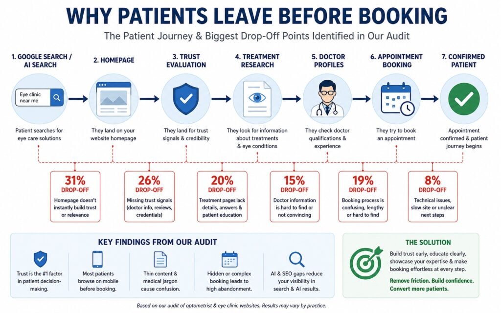
Our previous audit focused on identifying the recurring website problems costing eye clinics appointments.
Instead of evaluating design trends, we evaluated patient decision-making.
Across the websites reviewed, seven recurring problems appeared repeatedly.
1. Trust Was Difficult to Build
Many clinics introduced themselves with generic marketing headlines but provided very little immediate evidence of clinical expertise.
Doctor qualifications, certifications, specialties, and professional memberships were often hidden several pages into the website.
2. Treatment Pages Didn’t Answer Patient Questions
Many service pages described procedures using clinical terminology while failing to explain:
- Who the treatment was for
- Common symptoms
- What patients should expect
- When someone should seek care
Patients frequently left to continue researching elsewhere.
3. Mobile Experiences Created Friction
Our audit repeatedly identified:
- Tiny navigation menus
- Hidden appointment buttons
- Slow-loading pages
- Forms that required excessive typing
Since most patients begin their healthcare search on mobile devices, these issues created immediate abandonment.
See How Leading Eye Clinics Build Patient Trust Online
Understanding why patients leave your website is only one side of the equation. It’s equally valuable to study what successful eye care providers are doing differently. We analyzed 12 leading optometry websites across the United States, United Kingdom, and Australia, evaluating their booking experience, mobile usability, trust signals, accessibility, and content strategy. The review highlights practical ideas you can adapt to improve your own patient journey, whether you’re planning a redesign or simply looking to increase appointment bookings.
4. Booking Was Harder Than It Needed to Be
Many websites required patients to navigate multiple pages before finding appointment options.
Others buried booking buttons beneath promotional banners or lengthy content.
Every unnecessary click created another opportunity for patients to leave.
5. AI Search Readiness Was Limited
Very few clinics had clearly structured healthcare content.
Missing schema, inconsistent service organization, and weak entity relationships reduce how effectively modern AI systems understand healthcare websites.
As AI-assisted healthcare discovery becomes more common, this gap will become increasingly important.
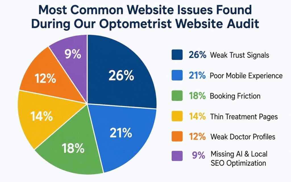
During our audit, weak trust signals were the single most recurring issue. Doctor qualifications, professional memberships, awards, and patient reviews were frequently hidden several clicks away, forcing patients to leave the website to verify credibility elsewhere.
Are Patients Leaving Your Eye Clinic Website Without Booking?
If your website isn’t converting visitors into appointments, the problem is usually trust, clarity, and booking flow. Discover how a conversion-focused optometrist website can increase patient enquiries.

Expert Insight
Kanika Gupta
One lesson became obvious while reviewing these websites.
Patients don’t judge clinics the way healthcare professionals do.
They judge clinics the way people make important life decisions.
Before booking, they’re silently asking themselves questions like:
“Does this clinic specialize in my problem?”
“Will I be treated by an experienced doctor?”
“Can I trust this practice with my eyesight?”
If those questions aren’t answered within the first few minutes, patients usually continue comparing clinics instead of scheduling an appointment.
That is why improving patient confidence should always come before improving visual design.
Why Patients Leave Before Booking
The biggest conversion problem isn’t poor design. It’s growing uncertainty throughout the patient journey.
Patients don’t suddenly decide not to book.
Confidence gradually disappears.
Every unanswered question makes the next decision more difficult.
Every missing trust signal creates another reason to continue searching.
Our audit consistently demonstrated that appointment losses were rarely caused by one major flaw.
Instead, they resulted from multiple smaller problems working together.
This article explains each of those problems in detail and shows how they influence patient behavior.
If your clinic is already attracting relevant visitors but appointments remain inconsistent, our deeper guide on why an optometry website can get traffic without generating bookings explains how to distinguish a traffic problem from a website, trust, UX, or booking-flow problem.
1. The Three-Second Trust Test
The first mistake identified in our audit was weak trust building immediately after visitors landed on the homepage.
Patients typically decide within seconds whether it’s worth exploring further.
That decision has very little to do with animations or visual effects.
Instead, patients quickly look for evidence that they’re in the right place.
The highest-performing clinics immediately answer four questions:
- What eye conditions do you specialize in?
- Who are your doctors?
- Why should patients trust your clinic?
- How can appointments be booked?
Many lower-performing websites answered none of them.
Instead, they relied on broad statements such as:
- “Exceptional Eye Care.”
- “Your Vision Is Our Priority.”
- “Committed to Quality.”
Those headlines could describe almost every clinic.
Specificity builds confidence.
Generic messaging creates uncertainty.
Industry Observation
One recurring pattern from our audit was that clinics frequently promoted marketing slogans before introducing their doctors.
Patients consistently look for expertise before they look for branding.
2. Hidden Doctor Credibility
Our audit found that doctor credibility was one of the most underutilized trust signals across eye clinic websites.
Patients often choose healthcare professionals before they choose healthcare businesses.
Yet many clinics required visitors to search extensively before finding information about:
- Qualifications
- Areas of specialization
- Professional memberships
- Surgical experience where applicable
- Continuing education
- Clinical interests
Whether someone is choosing an optometrist for routine eye care or an ophthalmologist for specialist treatment, visible expertise significantly reduces hesitation.
The stronger the credibility signals, the shorter the decision-making process becomes.
Many of these findings are explored in greater depth in our audit, “7 Optometrist Website Mistakes That Cost Clinics More Patients.” This article builds directly on that research by explaining why those recurring problems prevent patients from completing the booking journey.
3. Patients Don’t Search Using Medical Terminology
The second major finding from our audit was that many treatment pages were written for clinicians instead of patients.
Most patients don’t search for technical terms first.
They search for symptoms, concerns, or everyday questions.
For example:
Patients type:
- “Why is my vision blurry?”
- “Why do my eyes feel dry all the time?”
- “My child keeps squinting.”
- “When should I get an eye exam?”
- “Flashes and floaters, should I worry?”
Many clinic websites answer with:
- Comprehensive refractive assessment
- Ocular surface disease management
- Pediatric ophthalmic evaluation
Although medically accurate, this language often increases uncertainty rather than reducing it.
Patients first need reassurance.
Clinical terminology should support education, not replace it.
What Our Audit Found
One recurring issue was thin service pages.
Many treatment pages contained fewer than 300 words and answered almost none of the questions patients commonly ask before booking.
Missing information included:
- Symptoms
- Causes
- Who should book
- What happens during the appointment
- Treatment options
- Recovery expectations
- FAQs
- Insurance guidance where applicable
Patients often left these websites to continue researching elsewhere.
Unfortunately, many never returned.
Expert Insight From Kanika Gupta
Kanika Gupta, Founder, KG Web Designer
“One trend we repeatedly observe is that AI search engines reward clarity over promotion. Clinics often invest significant resources into visual design while underinvesting in expertise communication. AI systems are not impressed by claims. They respond to evidence. Physician credentials, treatment authority, educational content, patient trust signals, and structured information consistently outperform marketing language when it comes to earning citations.”
Example Scenario
Imagine two clinics offering dry eye treatment.
Clinic A
Dry Eye Treatment
“We provide comprehensive diagnosis and treatment for dry eye syndrome.”
Clinic B
The page explains:
- What dry eye feels like
- Common causes
- When symptoms require professional care
- What tests are performed
- Treatment options
- Expected appointment length
- Frequently asked questions
- Online booking
Both clinics offer identical care.
Only one reduces uncertainty.
That is the clinic most patients trust.
Audit Insight
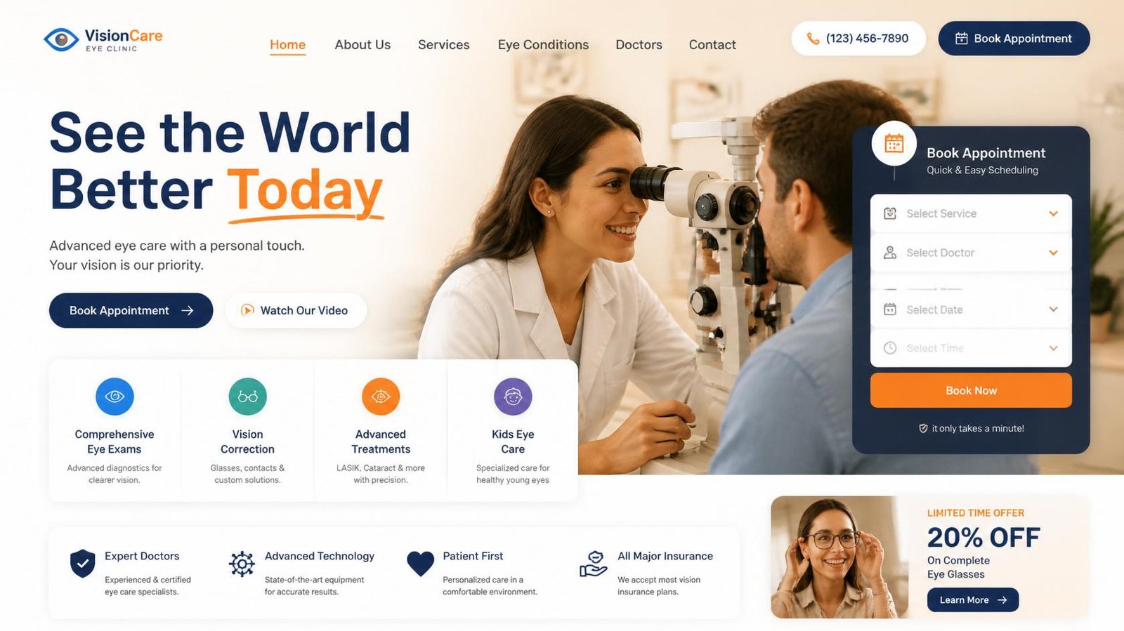
During our review, clinics that placed doctor credentials and booking buttons above the fold consistently provided a stronger patient experience than those requiring visitors to search for essential information.
Many booking problems begin long before patients reach the appointment page. In our experience, practices often use the same website structure regardless of whether they operate one clinic or several locations. That mismatch creates unnecessary friction for visitors. If you’re evaluating whether your website aligns with your practice model, read our guide on Independent Optometrist vs. Multi-Location Practice: The Website Features Each Actually Needs in 2026, where we compare the website features, navigation, and growth strategies that best support each type of eye care practice.
4. The Mobile-First Paradox
Our audit repeatedly showed that clinics were designing for desktop visitors while patients were browsing from smartphones.
Today, the majority of local healthcare searches begin on mobile devices.
Patients may be:
- Searching after receiving a referral
- Looking for urgent appointments
- Comparing clinics while travelling
- Booking during a lunch break
- Searching from outside another healthcare provider
They expect immediate answers.
Instead, many websites created friction through:
- Tiny navigation menus
- Hidden appointment buttons
- Large image sliders
- Slow-loading treatment pages
- Difficult forms
- Poor touch usability
None of these issues seem major individually.
Combined, they significantly reduce patient confidence.
Mobile Audit Checklist
During every healthcare website audit we review:
| Mobile Element | Why It Matters | Priority |
|---|---|---|
| Appointment visibility | Reduces booking friction | High |
| Click-to-call functionality | Encourages immediate enquiries | High |
| Navigation simplicity | Faster information discovery | High |
| Core Web Vitals | Better patient experience | High |
| Image optimization | Faster loading | Medium |
| Form usability | Higher completion rates | High |
Industry Observation
One common issue we repeatedly identified was appointment buttons disappearing after patients scrolled through treatment information.
Patients should never have to search for the next step.
Booking options should remain visible throughout the journey.
What We Observed During the Audit
This issue appeared on many of the websites we reviewed. Patients had to visit multiple pages before finding basic appointment information, increasing the likelihood that they abandoned the booking process.
5. Booking Friction Is Usually Invisible
Another recurring finding from our audit was that clinics unintentionally complicated the appointment process.
Most clinic owners believe online booking either works or doesn’t.
Patient behavior tells a different story.
Small obstacles create measurable hesitation.
Examples include:
- Long appointment request forms
- Mandatory fields that aren’t necessary
- Hidden contact numbers
- Multiple booking pages
- Unclear confirmation messages
- No indication of response times
Patients compare these experiences against other industries.
If booking feels complicated, confidence decreases.
Our Audit Revealed
Many clinics asked patients to navigate three or four pages before finding the appointment form.
Others displayed booking links only in the footer.
Several websites offered online booking but made it difficult to locate.
Every additional click increased abandonment.
6. AI Search Is Changing How Patients Discover Eye Clinics
One of the most important findings from our audit wasn’t visible to patients at all.
Many websites were difficult for AI systems to understand.
Patients increasingly discover clinics through:
- Google AI Overviews
- ChatGPT
- Gemini
- Perplexity
These platforms don’t simply rank websites.
They evaluate expertise.
They connect entities.
They verify credibility.
That requires websites to communicate information clearly.
Turn Patient Trust Into More Appointments
Patients don’t just compare clinics — they compare clarity, professionalism, and ease of booking. A well-designed eye clinic website builds confidence before they even call.
What AI Systems Need to Understand
| Structured Entity | Why It Matters |
|---|---|
| MedicalBusiness | Identifies the healthcare organization |
| Physician | Defines doctor expertise |
| LocalBusiness | Strengthens local relevance |
| FAQPage | Helps answer patient questions |
| Organization | Establishes business identity |
| BreadcrumbList | Improves content relationships |
Why This Matters
When AI systems understand:
- who your doctors are,
- which services you provide,
- where your clinic operates,
- and what conditions you treat,
they’re far more likely to reference your clinic when patients ask healthcare questions.
Modern SEO is no longer only about rankings.
It’s about becoming understandable.
Industry Observation
During our audit, we found that many clinics invested heavily in SEO but very little in structured healthcare content.
As AI search continues growing, websites that clearly communicate expertise will have a significant competitive advantage.
This is also why we recommend reading our guide explaining how ChatGPT, Gemini, Google AI Overviews, and Perplexity recommend healthcare providers, where we explore how structured content and entity optimization influence AI-generated recommendations.
7. Trust Is Built Across the Entire Journey
The final lesson from our audit is that trust isn’t created by one page. It’s created by every interaction.
Patients build confidence gradually.
Each page either increases or decreases that confidence.
High-performing eye clinic websites consistently reinforce trust through:
Clinical Authority
- Doctor biographies
- Qualifications
- Professional memberships
- Clinical experience
Patient Education
- Comprehensive treatment pages
- FAQs
- Educational resources
- Clear expectations
User Experience
- Fast page speed
- Mobile-first design
- Accessible navigation
- Simple appointment booking
Technical Credibility
- Secure website
- Structured schema
- Local SEO optimization
- Consistent business information
Together, these elements create a patient journey that feels reliable from the first search through to appointment confirmation.
Why Most Clinics Focus on the Wrong Problems
One of the biggest takeaways from our audit surprised many clinic owners.
The websites that struggled most weren’t necessarily outdated.
Many looked modern.
Many had professional photography.
Some had invested heavily in redesigns only a few years earlier.
The real problem wasn’t appearance.
It was strategy.
Most redesign projects begin by asking:
- Which colors should we use?
- Should we change the homepage?
- What animations should we add?
Very few begin by asking:
- Where are patients losing confidence?
- Which pages have the highest abandonment?
- What questions remain unanswered?
- Which trust signals are missing?
Those are the questions that improve bookings.
Not visual trends.
Discover Where Patients Lose Confidence
Our Eye Clinic Website Audit goes beyond visual design.
We identify the exact points where patients stop trusting the booking journey and provide a practical roadmap to improve conversions, local SEO, and AI search visibility.
The audit includes:
- Patient journey analysis
- Trust signal review
- Mobile UX assessment
- Booking flow evaluation
- Technical SEO review
- AI search readiness assessment
- Conversion improvement roadmap
Book Your Eye Clinic Website Audit
Example From Our Experience
One of the clearest examples of this came from an eye clinic that had already invested in SEO and digital advertising.
Traffic wasn’t the problem.
Patients were finding the website through Google Search, Google Maps, and referrals from local healthcare providers.
Yet appointment bookings remained inconsistent.
The clinic assumed they needed to invest in more advertising.
After reviewing patient behavior, we discovered a different story.
The same conversion issues appeared that we had already identified during our website audit:
- Doctor credentials were difficult to find.
- Service pages answered very few patient questions.
- Appointment buttons disappeared as users scrolled.
- Mobile users abandoned the booking process more frequently than desktop users.
- Reviews and trust signals were hidden on separate pages instead of supporting the booking journey.
Rather than recommending a complete redesign immediately, we focused on solving those specific problems first.
The improvements included:
- Reorganizing homepage messaging around patient needs.
- Making appointment options visible throughout the website.
- Expanding treatment pages with symptom-based content and FAQs.
- Strengthening doctor profile pages with qualifications, specialties, and professional memberships.
- Improving mobile navigation and booking usability.
- Implementing MedicalBusiness, Physician, LocalBusiness, FAQPage, and Organization schema.
- Improving Core Web Vitals and page speed.
The website looked cleaner after the project.
More importantly, it became easier for patients to trust.
Staff began noticing an increase in enquiries from patients who had already read treatment information, understood the process, and felt comfortable booking before making contact.
The project reinforced the same conclusion we reached during our audit:
Patients don’t leave because clinics lack expertise. They leave because websites fail to communicate that expertise effectively.
Ready to Get More Patient Bookings From Your Website?
If your current website is not converting visitors into appointments, it’s time to fix the experience. I help optometrists and eye clinics build websites that drive real patient enquiries.
What This Means For Your Clinic
Our audit started with one question:
Why are patients leaving before booking?
The answer wasn’t one problem.
It was a collection of small confidence gaps spread throughout the patient journey.
If your clinic website still suffers from the same issues identified in our audit, improving just one page won’t solve the problem.
Patients experience your website as one continuous journey.
That journey should consistently reinforce expertise, clarity, and reassurance from the moment someone discovers your clinic until the appointment is confirmed.
A modern optometrist website design should strengthen:
- Patient trust
- Appointment conversions
- Local SEO
- AI search visibility
- Doctor credibility
- Mobile experience
- Long-term patient acquisition
Every improvement should support those goals.
The Patient Confidence Framework
Based on both our audit findings and healthcare website projects, we recommend improving clinic websites in the following order.
Phase 1 – Build Immediate Trust
Within the first few seconds patients should understand:
- Who you help.
- Which eye conditions you treat.
- Who your doctors are.
- Why patients trust your clinic.
- How appointments can be booked.
Phase 2 – Remove Booking Friction
Next, simplify every interaction.
Focus on:
- Click-to-call functionality.
- Mobile booking.
- Shorter appointment forms.
- Persistent appointment buttons.
- Clear contact information.
- Location and parking details where relevant.
Patients should never wonder what to do next.
Phase 3 – Strengthen Patient Education
Expand every major treatment page by answering:
- Who needs this treatment?
- What symptoms should patients watch for?
- What happens during the appointment?
- What should patients expect afterward?
- When should someone seek urgent care?
Educational content builds trust while strengthening topical authority for Google and AI search.
Phase 4 – Improve Technical Authority
Support both patients and AI systems by improving:
- Core Web Vitals
- Mobile usability
- MedicalBusiness Schema
- Physician Schema
- FAQPage Schema
- LocalBusiness Schema
- Internal linking
- Structured service hierarchy
Technical improvements help search engines understand your clinic while creating a smoother experience for patients.
Phase 5 – Measure, Learn, Improve
The strongest-performing clinics don’t redesign their websites every few years.
They improve continuously.
Track:
- Appointment conversion rates.
- Mobile engagement.
- Booking abandonment.
- Highest-exit pages.
- Local search visibility.
- AI search visibility.
- Patient feedback.
Continuous optimization consistently outperforms occasional redesigns.
Presenting services clearly is only one part of increasing appointment bookings. Once patients begin exploring treatment pages, the overall user experience determines whether they continue toward booking or leave to compare another clinic. Navigation, mobile usability, trust signals, and a simple appointment process all work together to influence patient decisions. If you’d like to explore how these UX improvements translate into more consultations, read our guide on How Optometrists Can Increase Patient Bookings With Website UX, where we explain the design strategies that reduce friction and help turn website visitors into confirmed appointments.
Final Thoughts
Our audit of optometrist websites revealed something important.
Most clinics don’t lose appointments because patients can’t find them.
They lose appointments because confidence disappears before the booking process is complete.
Patients don’t simply evaluate websites.
They evaluate reassurance.
They compare expertise.
They judge credibility.
And they quietly decide whether your clinic feels like the safest choice.
Professional optometrist website design isn’t about creating a modern-looking website.
It’s about creating a website that consistently answers patient questions, strengthens trust, supports Google and AI search visibility, and makes booking the obvious next step.
The clinics that treat their websites as patient acquisition systems-not digital brochures-will be the ones that continue attracting more qualified appointments in 2026 and beyond.
Ready to Find Out Why Patients Aren’t Booking?
If your website receives traffic but appointment enquiries remain lower than expected, the answer is usually hidden in the patient journey.
Our Eye Clinic Website Audit includes:
- Patient journey analysis
- Conversion optimization review
- Mobile UX assessment
- Booking flow evaluation
- Technical SEO audit
- Local SEO review
- AI search readiness assessment
- Trust signal analysis
- Personalized improvement roadmap
Available across the US, UK, Australia, Canada, Singapore, and the UAE. Fully remote. No obligation.
Our Eye Clinic Website Services
Frequently Asked Questions
Why do patients leave eye clinic websites without booking?
Most patients leave because they haven’t developed enough confidence to schedule an appointment. During our audit, the most common causes included weak trust signals, confusing treatment pages, difficult booking processes, poor mobile usability, and limited doctor credibility rather than a lack of website traffic.
What makes an optometrist website convert more visitors into patients?
The highest-converting websites reduce uncertainty throughout the patient journey. They combine strong doctor profiles, educational treatment pages, simple booking, mobile-first design, patient reviews, and clear calls-to-action that make scheduling appointments feel straightforward.
Does every eye clinic need a complete website redesign?
No. Many clinics already have the foundations of a good website. A professional audit often identifies specific improvements that increase appointment bookings without rebuilding the entire website. Understanding patient behavior should always come before redesign decisions.
How important is mobile optimization for eye clinic websites?
Extremely important. Most patients now research clinics on smartphones before making contact. Fast-loading pages, click-to-call buttons, mobile-friendly booking forms, and intuitive navigation significantly improve patient enquiries and reduce abandonment.
How do AI search platforms affect eye clinic websites?
Platforms such as Google AI Overviews, ChatGPT, Gemini, and Perplexity increasingly recommend healthcare providers that publish trustworthy, well-structured information supported by healthcare schema and strong topical authority. AI optimization is becoming an important extension of traditional SEO.
Which schema markup should eye clinic websites implement?
Most clinics should implement MedicalBusiness, Physician, LocalBusiness, Organization, FAQPage, and BreadcrumbList schema. Together, these help search engines and AI systems understand your clinic’s services, doctors, locations, and areas of expertise more accurately.
How often should an eye clinic review its website?
Rather than waiting several years between redesigns, clinics should review website performance quarterly. Monitoring patient behavior, booking completion, Core Web Vitals, local rankings, and AI visibility allows continuous improvements that support long-term patient acquisition.