
Quick Answer
Prospective clients are not evaluating financial advisor website design simply by asking whether a site looks professional. They are looking for evidence that the advisor is credible, qualified, transparent, experienced, and easy to verify before discussing personal finances. A strong website should make credentials, services, fees, disclosures, advisor expertise, proof, security, and the next step easy to understand without relying on exaggerated marketing claims.
TL;DR: What Financial Advisors Should Know Before Redesigning
- Trust and reputation are among the most important factors investors consider when choosing a wealth-management provider.
- Financial advisor websites should make professional identity, credentials, services, fees, disclosures, and advisor experience easy to evaluate.
- Prospects increasingly verify financial information before acting, so websites should support verification rather than simply ask visitors to trust marketing claims.
- Testimonials, endorsements, third-party ratings, and performance information require careful compliance review before publication.
- A polished website cannot compensate for unclear positioning, generic service descriptions, weak advisor profiles, or an uncertain consultation process.
- The best redesign prioritizes the information that reduces buyer hesitation rather than starting with colors, animations, or visual trends.
What Are Clients Actually Checking Before They Contact a Financial Advisor?
Clients are checking whether the advisor appears credible enough to trust with a serious financial conversation. That assessment happens before the prospect ever fills out a consultation form, and it usually comes from several signals working together rather than one badge, testimonial, or design element.
This matters because investors are not simply comparing visual brands. They are evaluating a relationship involving their savings, retirement plans, investments, family finances, business interests, or other significant financial decisions.
Recent U.S. research supports this trust-first behavior. TransUnion’s August 2026 survey of 1,000 U.S. consumers with at least $20,000 in investable assets found that 65% ranked trust and reputation among their top factors when choosing a wealth-management provider, compared with 49% who cited fees and pricing.
That changes the website brief.
The question is not “Does this look like a financial firm?” The better question is “What evidence does a cautious prospect need before they are comfortable giving this firm more of their time, financial information, and attention?”
For a financial firm, the website is therefore part of the trust-building process, not merely a digital brochure.
KG Web Designer is a conversion-focused website design studio specializing in custom websites for clinics, professional services, manufacturers, and growing businesses. For financial firms, that conversion focus means translating expertise and credibility into a digital experience that helps a prospective client make a confident next decision.
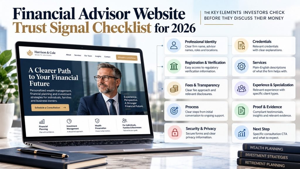
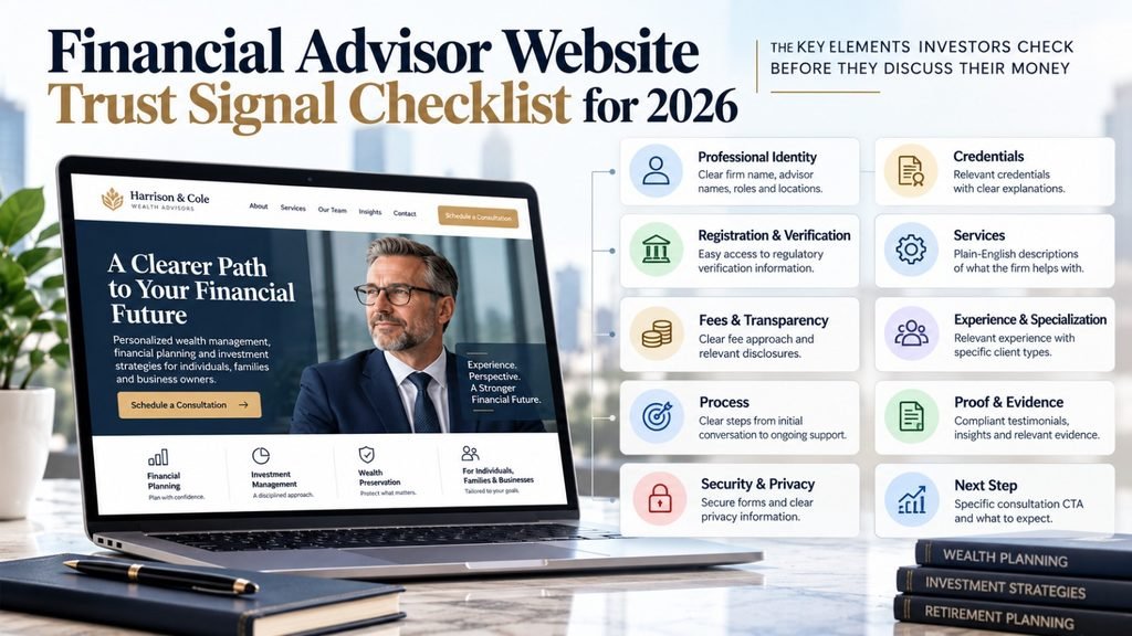
The Financial Advisor Trust Signal Checklist
| Trust signal | What the prospect wants to know | What the website should show |
|---|---|---|
| Professional identity | Who is actually advising me? | Firm identity, advisor names, roles and locations |
| Credentials | Is this person qualified? | Relevant credentials and explanations |
| Registration | Can I verify the professional? | Appropriate regulatory verification paths |
| Services | What can this firm actually help me with? | Plain-English service descriptions |
| Fees | How does the commercial relationship work? | Clear fee approach and relevant disclosures |
| Experience | Have they worked with people like me? | Relevant experience and specialization |
| Process | What happens after I contact them? | Clear client journey |
| Proof | Is there evidence beyond marketing language? | Compliant proof, insights and relevant evidence |
| Security | What happens to information I submit? | Appropriate security, privacy and form practices |
| Next step | What am I agreeing to? | Specific consultation CTA and expectations |
This table reflects a practical buyer journey: identity first, relevance second, evidence third, action last.
Before Clients Discuss Their Money With You, What Does Your Website Give Them to Trust?
Can visitors quickly understand your expertise, experience and professional background?
Is it obvious who you help and what financial needs you specialise in?
Do prospective clients know what happens when they contact your firm?
Does the website provide appropriate evidence that supports confidence?
Does the design feel credible enough for a high-trust financial decision?
Can someone understand how to begin a conversation without unnecessary friction?
If several of these answers are unclear, the website may be creating doubt before a prospective client ever reaches out.
Review My Website →How Can a Financial Advisor Website Make Trust Easier to Verify?
The strongest trust signals are the ones that help a prospect independently understand and verify the firm. A website should not try to manufacture trust through visual authority when it can instead make real evidence easier to find.
1. Make professional identity obvious
A visitor should quickly understand the firm’s name, who leads it, what type of advice it provides, where it operates, and which clients it serves.
Avoid vague positioning such as “comprehensive wealth solutions” if the visitor still cannot determine whether the firm focuses on retirement planning, investment management, financial planning, business-owner planning, estate-related planning, or another specific area.
2. Explain credentials instead of decorating the page with them
Credentials can be powerful trust signals when they are accurate and relevant.
If a professional holds a credential such as CFP®, explain who holds it and what it represents. CFP Board provides a public verification tool that allows consumers to check an individual’s CFP® certification status and background.
The website should therefore treat credentials as evidence, not ornament.
3. Make verification straightforward
Prospects may independently research an advisor before contacting the firm.
The SEC’s Investment Adviser Public Disclosure database allows investors to search for investment adviser firms and individuals, review registration status, access Form ADV information, and view professional background and conduct information. Investor.gov also directs investors to BrokerCheck where appropriate.
FINRA describes BrokerCheck as a free tool for researching the background and experience of financial advisers and firms, including registration, employment history, regulatory actions, licensing information, arbitrations, and complaints.
That creates a simple website principle:
Do not make verification harder than it needs to be.
4. Explain the service relationship
Prospects want to know what actually happens after the first conversation.
Explain the process in practical terms, such as discovery, analysis, recommendations, implementation, ongoing reviews, communication, or other steps that accurately reflect the firm’s real model.
A clear process reduces uncertainty without promising an outcome.
5. Make important commercial information understandable
Form ADV disclosures cover areas such as business practices, fees, conflicts of interest, disciplinary information, and the nature of the advisory relationship. Part 3, the relationship summary, is specifically intended to provide retail investors with a plain-English summary of services, fees and costs, conflicts, standards of conduct, and disciplinary history.
Your website does not need to replace regulatory documents.
It should, however, make it easy for prospects to understand the firm’s service model and find the relevant information.
What Financial Advisor Website Design Elements Actually Increase Trust?
The strongest financial advisor website design choices make important information easier to verify and understand. In our experience, trust improves when visual polish supports clarity rather than trying to create trust by itself.
Industry Observation #1: Explain the relationship before selling the service
The prospect should understand who the firm serves, what problem it solves, and what working together looks like before being pushed toward a consultation.
This reduces the psychological risk of “I am about to enter a sales process and I don’t know what I am signing up for.”
Industry Observation #2: Financial jargon can create distance
Terms such as “holistic wealth architecture,” “multi-generational capital optimization,” or “integrated wealth solutions” may sound sophisticated, but they do not automatically explain the service.
Clear language is not less professional.
For a trust-sensitive industry, clarity can actually demonstrate greater confidence because the firm does not need complicated language to communicate its expertise.
Industry Observation #3: The advisor is often a stronger trust asset than the brand
Prospects want to know who they will actually speak with, what those people specialize in, and why their experience is relevant.
A detailed team page can therefore become a conversion asset when it answers practical questions instead of reading like a corporate biography.
Industry Observation #4: Specific proof beats generic claims
“Trusted by successful families” is a marketing statement.
A clearly explained client type, professional credential, area of specialization, published insight, compliant testimonial, or documented process provides more useful evidence.
CFP Board’s 2025 research found that 93% of surveyed Americans said they verify financial information before acting on it, while 62% said they spend more time verifying financial information now than five years earlier. The same research found that three in four respondents were willing to act on a financial advisor’s guidance without needing to verify it elsewhere.
That creates a valuable website opportunity:
Do not ask visitors to trust you blindly. Give them enough evidence to verify that your firm deserves consideration.
This is also why the psychology behind high-converting B2B websites becomes relevant to financial services. The underlying buyer behavior is similar: prospects need relevance, credibility, evidence, and a sufficiently low-risk next step before moving forward.
How Should a Financial Advisor Website Build Trust Above the Fold?
The first screen should establish relevance and credibility before asking for a meeting. It should tell the visitor who the firm helps, what type of problem it solves, and why the visitor should believe the firm is qualified to help.
A strong above-the-fold structure can include:
- A precise positioning statement.
- The primary client group or financial problem served.
- A short supporting statement about the firm’s approach.
- A credible proof point, credential, or specialization.
- A specific consultation CTA.
- A secondary path for prospects who want to learn before contacting the firm.
Do not overload the hero section with every credential, award, service, disclosure, and marketing claim.
The first screen should reduce enough uncertainty for the prospect to continue.
A Useful Above-the-Fold Formula
Who you help → What you help them with → Why your firm is credible → What they can do next
For example, an advisor serving business owners could structure the message around business-owner financial planning rather than simply saying “Comprehensive Wealth Management.”
That distinction matters commercially because specificity helps qualified prospects recognize themselves.
What Should an Advisor’s About Page Actually Prove?
The About page should prove that the people behind the firm are real, qualified, relevant, and accountable. It should answer questions a prospect may hesitate to ask directly: Who will advise me? What experience do they have? Who do they work best with? What do they believe about financial planning? What can I expect from the relationship?
This is where financial consultant website trust signals become particularly important.
A useful biography connects credentials to client relevance instead of simply listing career milestones.
For example, “25 years in financial services” is weaker than explaining what kinds of clients the advisor has served, which planning problems they specialize in, and what their ongoing client relationship looks like.
If this were my website, I would make the advisor profile one of the strongest pages on the site.
I would show the person’s actual experience, credentials, areas of specialization, approach to client relationships, and a clear explanation of who is and is not a good fit.
That judgment matters because a prospect is not buying a website.
They are deciding whether they want to sit across the table, or across a video call, from the person represented on the screen.
What Should Financial Advisor Website Examples Teach You?
The best financial advisor website examples should be studied for decision-making patterns, not copied for visual style. Look at how the firm explains its audience, services, process, fees, expertise, proof, and next step.
When reviewing competitor sites, ask:
- Can I identify the firm’s ideal client in ten seconds?
- Can I understand the core services without knowing industry jargon?
- Can I find the advisor’s credentials?
- Can I understand how the firm approaches fees and compensation?
- Can I verify the firm’s professional identity?
- Can I see evidence of expertise beyond generic claims?
- Can I understand what happens after contacting the firm?
- Does the site make the advisor feel accessible without making the firm feel careless?
- Does the website distinguish the firm’s actual philosophy from generic financial-industry language?
- Does the website make the next step feel like a conversation rather than a commitment?
The goal is not to imitate another advisor’s website.
The goal is to identify where competitors are reducing uncertainty more effectively.
For firms that combine investment management with broader planning, financial planner website design should follow the same principle: explain the client’s problem, the firm’s process, the people involved, and the practical value of the relationship rather than presenting planning as a collection of abstract services.
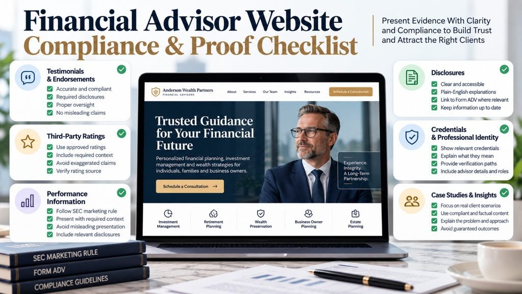
How Should Investment Advisors Handle Testimonials, Reviews, Awards, and Performance Claims?
Investment advisors should treat proof elements as regulated marketing content, not ordinary website decoration. The SEC’s Investment Adviser Marketing Rule places specific conditions on testimonials, endorsements, third-party ratings, and performance information.
For example, advisers using testimonials or endorsements generally need required disclosures and must satisfy applicable oversight and disqualification requirements. Third-party ratings also have specific requirements, and performance information is subject to conditions designed to prevent misleading presentation.
That means a designer should not simply add:
- A five-star review carousel.
- A wall of awards.
- A “best advisor” badge.
- A performance chart.
- A “beat the market” statement.
- A client quote.
because it looks persuasive.
The firm’s compliance process should review these elements before publication.
This becomes even more important because the SEC continues to issue guidance and compliance observations around the marketing rule. Its January 2026 marketing-compliance FAQ includes updated guidance involving performance information and testimonial or endorsement disqualification.
For a website project, the practical rule is simple:
Design should make compliant evidence clearer, not make questionable claims more persuasive.
For firms that can legitimately demonstrate client work, the same principle applies to case studies. Evidence should help a prospect understand the problem, approach, and business relevance rather than simply announce a successful outcome. Our guide to structuring case studies for corporate website conversions explains how evidence can support a buyer’s decision without turning the page into promotional copy.
Can I trust this person with something as important as my financial future?
Your prospective client may never ask this question out loud. But your website still needs to help answer it.
Clients Are Verifying You Before You Ever Speak to Them.
What Should You Avoid When Building a Financial Advisor Website?
The biggest mistake is trying to manufacture trust through appearance instead of making the business easier to understand and verify. A new logo, premium photography, dark blue color palette, and polished animations can make a firm look established, but they cannot answer the prospect’s underlying questions.
Avoid:
- Using stock-market imagery as a substitute for expertise.
- Putting every credential above the fold.
- Hiding the actual services behind vague brand language.
- Making prospects hunt for important commercial information.
- Using generic claims such as “trusted,” “leading,” or “best” without supporting evidence.
- Publishing testimonials or ratings without compliance review.
- Making performance claims sound like promises.
- Asking for unnecessary sensitive financial information through forms.
- Creating a huge resource library with little original insight.
- Making the consultation CTA feel like a commitment to become a client.
- Copying a competitor’s positioning because it appears successful.
- Creating multiple pages solely to target slightly different keyword phrases without adding useful information.
The goal is not to make the site look more expensive.
The goal is to make the decision to contact the firm feel less risky.
What Should You Fix First, Second, and Third?
The best action plan is to fix trust gaps in order of commercial impact, not visual priority. If the site looks outdated but visitors still cannot understand who the firm serves, changing colors and typography is unlikely to solve the underlying problem.
First: Fix credibility and clarity
Clarify:
- Ideal client.
- Core services.
- Advisor identity.
- Credentials.
- Relevant experience.
- Process.
- Fee approach.
- Primary CTA.
- Regulatory and disclosure pathways.
The objective is to answer the prospect’s most important questions before asking for their contact information.
Second: Fix decision-support content
Strengthen:
- Service pages.
- Advisor profiles.
- Process explanations.
- FAQs.
- Educational content.
- Compliant proof.
- Fee explanations.
- Relevant case examples.
- Trust and verification information.
A prospect should be able to conduct meaningful research before deciding whether a conversation is worthwhile.
Third: Fix conversion and digital experience
Improve:
- Mobile navigation.
- Page speed.
- Accessibility.
- Form experience.
- CTA placement.
- Information hierarchy.
- Analytics.
- Search visibility.
- Content discoverability.
J.D. Power’s 2025 U.S. Wealth Management Digital Experience Study evaluated digital experiences across information, tools and capabilities, system performance, and design. Its research covered 5,608 advised and DIY investors and found that top-performing brands differentiated themselves through intuitive design, easy navigation, information-rich content, and consistency across digital channels.
That is an important distinction.
Good digital experience is not just visual polish. It combines useful information with navigation, performance, security, and functionality.
A Practical 30-Day Priority Plan
| Timing | What to review | Primary objective |
|---|---|---|
| Week 1 | Positioning, identity, credentials, services | Establish credibility |
| Week 2 | Advisor profiles, process, proof, FAQs | Reduce uncertainty |
| Week 3 | Mobile UX, CTAs, forms, navigation | Improve qualified inquiries |
| Week 4 | Analytics, SEO, content gaps | Improve acquisition and measurement |
At KG Web Designer, we have found that this sequence is more useful than beginning with a homepage redesign simply because the existing site looks dated.
Kanika Gupta, Founder of KG Web Designer
Editorial note: Financial firms should have firm-specific claims, testimonials, endorsements, performance information, regulatory statements, credential claims, and other regulated marketing content reviewed by the appropriate compliance or legal professional before publication.
Why Do Most Financial Advisory Websites Get This Wrong?
Most firms get trust wrong because they treat it as a visual branding exercise rather than a buyer-verification problem. A new logo, premium photography, dark blue color palette, and polished animations can make a firm look established, but they cannot answer the prospect’s underlying questions.
The successful approach is different.
It connects brand presentation with evidence:
- Who the firm serves.
- Who the advisors are.
- What they actually do.
- How they work.
- How the commercial relationship works.
- What they are qualified to do.
- What evidence can be verified.
- What happens after the first conversation.
One common mistake we notice is that firms explain what they believe about investing but not what the client experience actually looks like.
Another is publishing extensive market commentary while leaving basic service questions unclear.
A third is using a sophisticated brand voice that makes the firm sound interchangeable with dozens of other advisory businesses.
That is where positioning becomes a conversion issue.
If a prospect cannot quickly understand why your firm is particularly relevant to their circumstances, your website has created a traffic problem even if the traffic itself is healthy.
Your Financial Advisor Website Is Often Your First Client Meeting.
Before a prospective client sits across from you, they may already have formed an opinion about your expertise, credibility and suitability from your website. Make that introduction count.
The goal isn’t to make your firm look flashy. It’s to make the right prospective client feel informed enough to start a conversation.
Explore Website Design →What Does This Mean For Your Business?
A trustworthy website can shorten the distance between “I found this firm” and “I am comfortable having a conversation with this advisor.” It does not guarantee that every visitor will become a client, but it can reduce avoidable uncertainty that causes qualified prospects to leave.
For an advisory firm, the commercial opportunity is often not simply more traffic.
It is making existing attention more valuable.
Your website should help a qualified prospect:
- Understand whether the firm is relevant.
- Verify who is behind the advice.
- Understand the service model.
- Evaluate expertise.
- Assess transparency.
- See evidence without being overwhelmed.
- Know what happens next.
- Take a low-friction next step.
If your website does those jobs well, your marketing budget has a stronger foundation.
Search traffic, referrals, LinkedIn visibility, paid campaigns, professional networking, and word-of-mouth recommendations all become more valuable when the destination website reinforces the trust that generated the visit.
Pricing is another area where unnecessary uncertainty can slow a professional-services buying decision. Our guide to professional services pricing transparency looks at how firms can communicate commercial information more clearly without reducing complex services to simplistic packages.
When Does Professional Website Help Make Sense?
Professional help makes sense when the website has become a commercial bottleneck rather than merely a cosmetic problem. If the firm has strong expertise and a credible service model but prospects cannot understand those strengths online, strategy and design can have a meaningful business role.
You are more likely to need professional help when:
- The website no longer reflects the firm’s current positioning.
- The ideal client is unclear.
- Service pages are generic.
- Advisor profiles are thin.
- Important compliance-sensitive information is difficult to communicate.
- The site generates attention but few qualified inquiries.
- Referral prospects visit the website before contacting the firm.
- The firm is adding a new service.
- The firm is entering a higher-value market.
- The website is difficult to maintain.
- The design feels like a generic template rather than the actual firm.
This is where investment advisor website design needs to be treated as a strategic communication problem rather than a collection of visual components.
The right approach should connect positioning, content, UX, conversion, technical performance, and compliance considerations.
At KG Web Designer, our role is not to make an advisor look impressive for its own sake. It is to make the firm’s real expertise easier for the right prospect to understand, verify, and act on.
Referral prospects deserve particular attention because they often arrive with an existing recommendation but still conduct independent research before contacting the firm. Our guide to building a professional services referral website explains how the website can reinforce the trust created by the original referral rather than forcing the prospect to start their evaluation from scratch.
Example Scenario
Imagine a boutique wealth-management firm serving executives and business owners.
Its current website has attractive photography, several investment-related pages, and a prominent “Schedule a Consultation” button.
But a first-time prospect cannot quickly determine:
- Who the firm serves.
- What the advisors specialize in.
- How the planning relationship works.
- How the firm differs from other advisors.
- Where important disclosures can be found.
- What happens after submitting the consultation request.
The redesign should not begin with a new homepage concept.
It should begin by mapping the questions a cautious prospect needs answered.
The revised structure could lead with the firm’s client focus, followed by advisor expertise, service model, process, relevant proof, disclosures, educational resources, and a specific consultation CTA.
The financial impact is straightforward: the firm is giving qualified visitors more reasons to continue evaluating rather than forcing them to leave and search elsewhere.
Example From Our Experience
Problem: One recurring pattern we see in professional-service website audits is a firm with substantial expertise but a website that communicates the business at a much more generic level.
The site may list services and credentials, yet a first-time prospect still cannot tell why this firm is particularly relevant to their situation.
Solution: The first step is usually not a visual redesign.
We clarify the audience, refine the firm’s positioning, restructure the service narrative, strengthen the people and proof sections, and make the next step specific.
We also separate factual claims that can be demonstrated from promotional language that needs evidence or compliance review.
Outcome: The result we look for is a website that makes the firm’s expertise easier to understand and the next conversation easier to start.
We do not attach an invented conversion percentage to this kind of project. Performance should be measured from the firm’s actual analytics, inquiry quality, and business goals.
This distinction is important.
A professional website should not manufacture evidence of expertise. It should make genuine expertise easier to see.
Another recurring problem is generic consultant positioning. When every professional firm claims to be strategic, personalized, experienced, and results-driven, differentiation becomes difficult to see.
Our analysis of why consultant websites feel generic examines how positioning and content can create a more distinctive professional-services presence.
Expert Insight from Kanika Gupta
Kanika Gupta, Founder, KG Web Designer
My strongest recommendation is to stop treating trust as something you can add to a financial website with badges, awards, testimonials, or premium photography.
Trust is created when the website makes the firm easier to understand and easier to verify.
If this were my website, I would make the advisor and the client relationship exceptionally clear.
I would show who the firm is for, what the advisor actually does, how the relationship works, what the prospect can verify independently, and what will happen after the first conversation.
Only after that would I spend significant effort on visual polish.
That order matters because a prospect can forgive a website that is not visually perfect.
It is much harder for a prospect to forgive a website that makes them work to understand who they are trusting with their money.
Final Thoughts
A financial advisory website has one job before it asks for a meeting: make the prospect confident that the firm is worth evaluating further.
That confidence comes from evidence, clarity, transparency, expertise, professional identity, and a clear understanding of the client relationship.
The best financial advisor website design is therefore not the most luxurious-looking site. It is the one that answers the prospect’s hardest questions before the prospect has to ask them.
If your firm’s website is no longer communicating the level of expertise you provide, the right next step is a strategic website review focused on trust, positioning, content, UX, compliance-sensitive proof, and qualified lead generation.
KG Web Designer can help identify what should be fixed first and what does not need to be rebuilt.
Request a Financial Advisor Website Strategy Review

Website Strategist
Would You Trust Your Website Before Trusting It With Your Financial Future?
I’ll help you review your website from a prospective client’s perspective — looking at the signals that establish expertise, reduce uncertainty and make someone feel comfortable starting a financial conversation.
What Questions Do Prospective Financial Advisory Clients Ask Before Booking?
How important are trust signals on a financial advisor website?
Trust signals are foundational because financial advice is a high-stakes service. Current U.S. research points to trust, reputation, transparency, and digital experience as important parts of how investors evaluate wealth-management providers. A website should therefore make credentials, services, process, disclosures, and professional identity easy to evaluate rather than relying on visual authority alone.
Should a financial advisor publish fees on the website?
A firm should communicate its fee approach clearly enough that prospects are not left guessing about how the relationship is priced. The exact presentation depends on the firm’s services and regulatory obligations, but hiding basic commercial information can create unnecessary uncertainty. Form ADV and related disclosures provide important reference points for advisory firms when presenting fees, compensation, conflicts, and other material information.
Should financial advisors use testimonials?
Testimonials and endorsements can be used in some circumstances, but investment advisers need to follow applicable marketing-rule requirements. The SEC requires specific disclosures and oversight in relevant situations, so testimonials should go through the firm’s compliance process before publication rather than being added as ordinary website reviews.
What credentials should a financial advisor website show?
The website should show credentials that are accurate, relevant, and meaningful to the services being offered. Rather than presenting a long list of abbreviations, explain who holds each credential, what it represents, and how that expertise relates to the firm’s clients. Prospects should also be able to verify the professional’s status through appropriate regulatory or professional resources.
Should an advisor redesign the entire website if it looks outdated?
Not necessarily. If the website is generating qualified inquiries and the underlying content, structure, and technical foundation are sound, targeted improvements may be more appropriate. A full redesign makes more sense when positioning, information architecture, mobile experience, content, credibility, or conversion paths have become difficult to fix within the existing structure.
What makes a financial advisor website feel premium?
A premium advisor website feels considered rather than decorative. It combines precise positioning, strong typography, useful content, credible photography, thoughtful advisor profiles, clear service architecture, transparent information, fast performance, and restrained calls to action. The goal is to communicate confidence and competence without using design to exaggerate the firm’s claims.
How can an advisor website generate more qualified leads?
A website generates better leads when it pre-qualifies prospects through clear positioning and gives the right people enough information to take the next step confidently. Service-specific pages, strong advisor profiles, useful educational content, clear CTAs, transparent expectations, and an easy consultation process can all contribute. Measurement should focus on qualified inquiries rather than form volume alone.