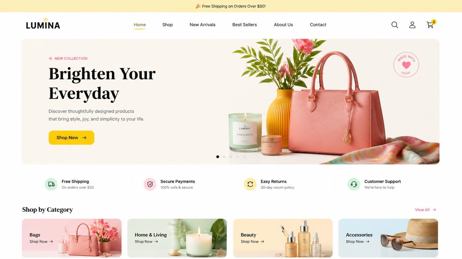
Quick Answer
The best ecommerce website design examples in 2026 do far more than showcase attractive products. They help customers discover products quickly, compare options confidently, trust the brand, and complete purchases with minimal effort. After analyzing leading global ecommerce brands across fashion, beauty, electronics, home, and direct-to-consumer (D2C) industries, one pattern became clear: successful websites are engineered around customer decision-making rather than visual trends alone.
TL;DR
- The world’s best ecommerce websites reduce purchase hesitation by making shopping intuitive and informative.
- Leading brands prioritize product discovery, trust signals, mobile usability, and checkout optimization over visual complexity.
- Cross-border ecommerce now depends on localized shopping experiences, transparent delivery information, and familiar payment options.
- Technical performance, including Core Web Vitals, remains an essential part of modern ecommerce UX.
- The most successful online stores focus on solving customer problems rather than copying design trends.
Buyer Intent
| Buyer Stage | Questions Business Owners Ask | How This Guide Helps |
|---|---|---|
| Consideration | What makes an ecommerce website successful today? | Explains proven design strategies used by leading global brands |
| Consideration | Which website features actually improve sales? | Highlights UX, CRO, and trust-building techniques |
| Decision | Should I redesign my online store? | Shows where redesign investments create the greatest business value |
| Decision | Which agency understands ecommerce growth? | Demonstrates strategic expertise backed by real-world examples |
What We Analyzed
There are countless articles showcasing beautiful ecommerce websites.
Very few explain why they work.
For this guide, we analyzed internationally recognized ecommerce brands across multiple industries, including fashion, beauty, consumer electronics, home furnishings, jewelry, sporting goods, and direct-to-consumer businesses.
Instead of scoring websites based on appearance, we evaluated each one using the same strategic framework we apply during ecommerce website audits at KG Web Designer.
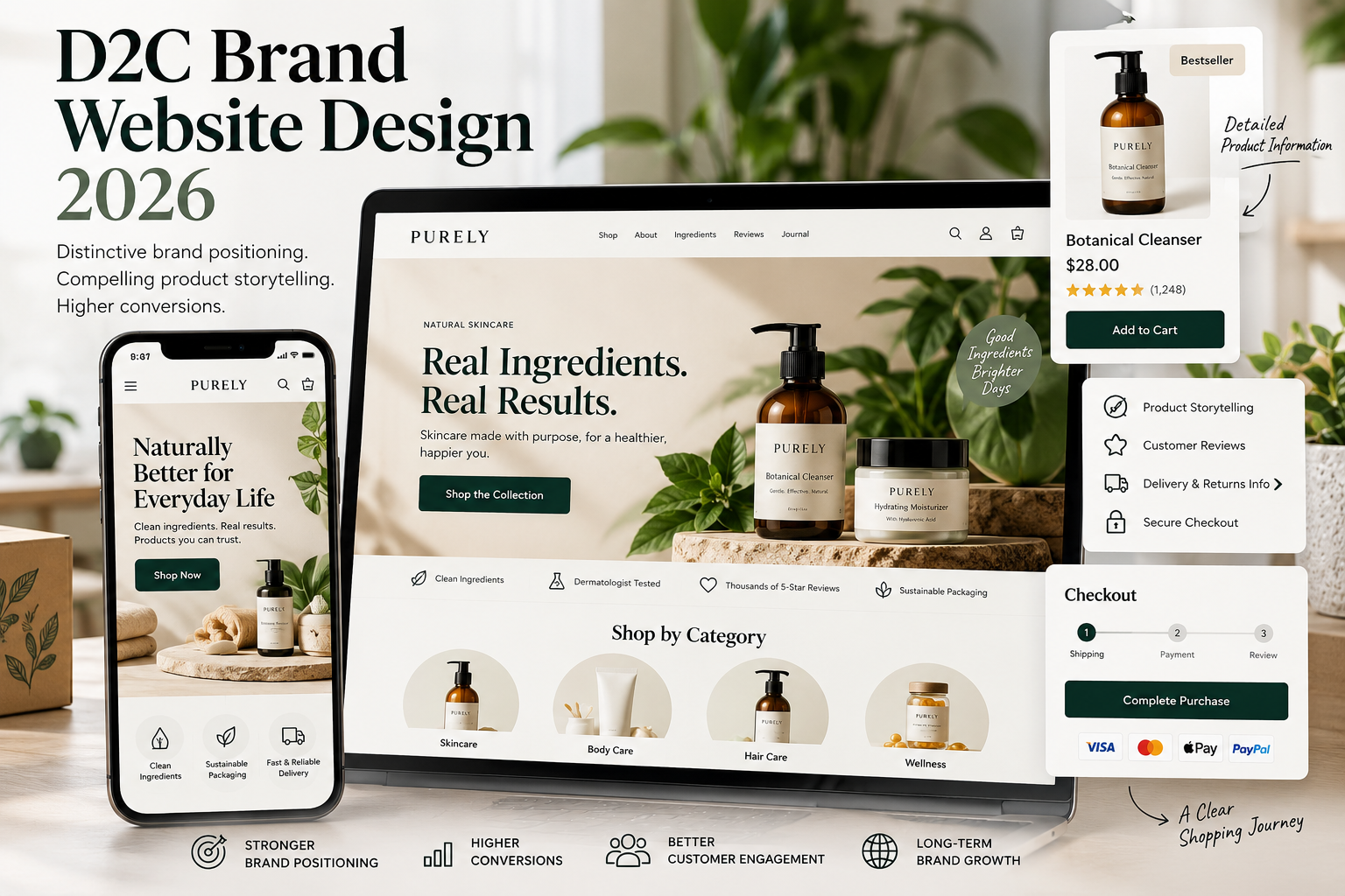
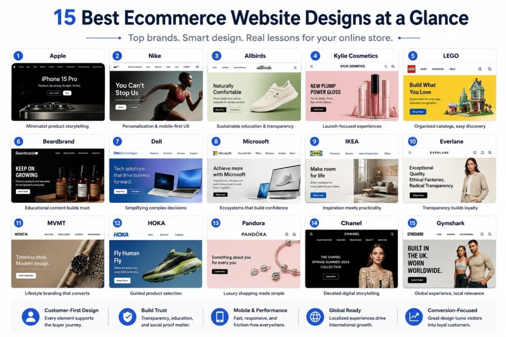
The examples above show that successful ecommerce brands combine product clarity, trust, usability, and a distinctive identity rather than relying on visual appeal alone. For a deeper look at how these elements come together for direct-to-consumer businesses, explore our guide to building a high-performing D2C brand website, including the strategic decisions that shape brand positioning and the customer shopping experience.
| Evaluation Area | Why It Matters |
|---|---|
| Homepage Messaging | Helps visitors immediately understand the brand’s value |
| Navigation & Search | Makes product discovery faster and easier |
| Product Pages | Builds trust before customers purchase |
| Mobile Experience | Supports today’s mobile-first buying behavior |
| Checkout Journey | Reduces buying hurdles before payment |
| Technical Performance | Improves user experience and supports search visibility |
| Trust Signals | Helps customers feel confident before ordering |
| International Shopping Experience | Creates a smoother experience for global buyers |
Our observations are based on publicly accessible ecommerce websites and established usability research from organizations including the Baymard Institute, whose benchmark research evaluates 334 leading ecommerce websites, 700+ UX performance parameters, and insights drawn from more than 200,000 hours of usability research.
Rather than asking “Which website looks the best?”, we asked:
“Which websites make buying feel easiest?”
That distinction changes everything.
While our analysis references published usability research from the Baymard Institute, the strategic observations and recommendations in this guide are based on our independent review of 15 leading ecommerce websites and our experience designing conversion-focused ecommerce websites for international businesses.
Ready to Build a High-Converting Ecommerce Website?
👉 Get your top 3 conversion leaks identified.
Design Strategy Framework
Before reviewing individual brands, it’s helpful to recognize that successful ecommerce websites generally follow one of several strategic approaches.
| Strategy | Brands | Best For |
|---|---|---|
| Minimalist Product Storytelling | Apple, Chanel | Premium products |
| Lifestyle Commerce | Nike, Gymshark, MVMT | Fashion & D2C brands |
| Educational Commerce | Beardbrand, Allbirds | Products requiring customer education |
| Large Catalog Navigation | IKEA, LEGO | Retailers with extensive inventories |
| Guided Product Selection | Dell, Microsoft, HOKA | Technical or configurable products |
| Trust & Transparency | Everlane, Pandora | Premium and luxury brands |
The lesson isn’t to copy these websites.
It’s to understand why each strategy works and determine which approach best matches your customers, products, and business goals.
Why Do the Best Ecommerce Websites Convert Better?
The highest-performing ecommerce websites convert better because they reduce uncertainty throughout the buying journey.
Customers rarely abandon purchases because a website isn’t visually impressive.
They leave because they can’t easily compare products, understand pricing, trust the business, or confidently decide what to buy.
In our experience at KG Web Designer, businesses frequently invest significant time redesigning their homepage while overlooking the pages that influence purchasing decisions the most:
- Category pages
- Product pages
- Search experience
- Product filters
- Cart functionality
- Checkout flow
Across every brand we reviewed, successful ecommerce websites consistently focused on improving:
- Product discovery
- Navigation clarity
- Customer confidence
- Mobile usability
- Technical performance
- Purchase simplicity
- Brand credibility
Beautiful visuals certainly matter.
But making customers feel confident enough to buy matters much more.
For apparel and fashion brands, that decision-support approach needs to extend into the details of the shopping journey. Our apparel ecommerce best practices guide turns these broader ecommerce principles into a practical checklist covering product discovery, fit and sizing, product pages, mobile UX, reviews, shipping, returns, checkout, SEO, and merchandising.
Many of the brands featured in this analysis have one thing in common: they aren’t simply trying to increase conversions. Their websites are strategically designed to increase the value of every customer transaction. If you’d like to understand the UX principles, merchandising strategies, and customer psychology behind this approach, read our guide on How Premium Brands Use Ecommerce Website Design Services to Increase Average Order Value in 2026. It explains how premium ecommerce experiences encourage customers to purchase complete solutions, premium products, and complementary items without relying on constant discounting.
Why Great Websites Are Still Losing Organic Traffic
Even well-designed websites can lose clicks if Google AI Overview answers the user’s question first. Learn how to identify which pages deserve a rewrite—and how to make your content citation-worthy instead of easy to replace.
Read the AI Overview Rewrite Framework →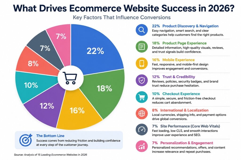
What Do Global Ecommerce Brands Do Differently?
One of the biggest observations from our analysis had nothing to do with visual design.
International ecommerce leaders design for different markets, not just different devices.
Rather than presenting every customer with the same experience, many global brands adapt key parts of the shopping journey based on where visitors are located. Customers may encounter localized currencies, region-specific shipping information, familiar payment options, country selectors, localized promotions, or clearer guidance around taxes and delivery expectations.
These details reduce uncertainty for international shoppers, particularly when purchasing across borders.
For businesses serving customers in the United States, United Kingdom, Australia, Canada, Singapore, or the UAE, localization is no longer an optional enhancement. It’s an important part of building customer trust and encouraging confident purchasing decisions.
The brands featured in this guide demonstrate that global ecommerce success depends on creating experiences that feel familiar to customers, regardless of where they’re shopping from.
Technical Insight
Exceptional ecommerce experiences combine strong visual design with measurable performance.
Modern online stores should continuously monitor Core Web Vitals, including:
- Largest Contentful Paint (LCP) – Measures how quickly the main page content becomes visible.
- Interaction to Next Paint (INP) – Evaluates how responsive a website feels when customers interact with it.
- Cumulative Layout Shift (CLS) – Measures unexpected layout movement while pages load.
Improving these metrics helps create faster, smoother shopping experiences while also supporting long-term search visibility.
One pattern we observed across many of the highest-performing ecommerce websites was the quality of their category and collection pages. Rather than acting as simple product listings, these pages use thoughtful navigation, filtering, merchandising, and content to help shoppers reach buying decisions faster. We explore these strategies in detail in our guide on Collection & Category Page Optimization for Ecommerce, including practical recommendations for improving SEO, user experience, and conversion performance.
Expert Advice from Kanika Gupta
Founder, KG Web Designer
“Businesses often ask how they can make their ecommerce website look more premium. I usually ask a different question: ‘How can we make buying easier?’ The brands that consistently outperform competitors aren’t necessarily the most visually impressive. They’re the ones that remove uncertainty at every step, from product discovery to checkout. When customers don’t have to work to understand your products or trust your business, conversions become a natural outcome.”
Original Observation from Our Ecommerce Website Reviews
Across ecommerce website reviews we’ve conducted, one pattern appears repeatedly.
Businesses often spend months refining homepage banners while leaving category pages, product pages, and checkout experiences almost untouched.
Yet those are the pages where revenue is actually generated.
We’ve found that improving navigation, information architecture, trust signals, and purchase flows often delivers a greater business impact than redesigning the homepage alone.
Strong ecommerce design should not be judged only by how polished a store looks. If a store receives visitors but struggles to turn them into customers, the next step is to identify where the buying journey is breaking down. Our guide on what to audit when a Shopify store gets traffic but no sales walks through the funnel from landing page and product discovery to cart and checkout, helping separate a visual design issue from a deeper conversion problem.
Which Ecommerce Website Design Trends Matter Most in 2026?
The biggest ecommerce trend in 2026 isn’t a new visual style.
It’s designing websites that actively help customers make better purchasing decisions.
Across the brands we analyzed, several consistent patterns emerged:
- AI-assisted product recommendations
- Personalized shopping experiences
- Cleaner navigation structures
- Rich product photography and video
- Faster mobile interactions
- Better accessibility
- Flexible payment options
- Transparent shipping information
- Educational buying content
- Stronger trust signals throughout the customer journey
The most successful ecommerce brands understand that design, usability, performance, and customer confidence work together.
That’s why great ecommerce websites continue to outperform beautiful ones that fail to support the buying process.
Expert Insight From Kanika Gupta
Kanika Gupta, Founder, KG Web Designer
“AI shopping platforms don’t simply recommend the cheapest or most popular product. They recommend the products they understand with the highest level of confidence. Brands that invest in structured information, trustworthy content, and technically sound ecommerce architecture are creating an advantage that will become even more valuable as conversational commerce continues to grow.”
Example Scenario
Imagine two premium skincare brands selling products at similar prices.
The first website helps customers compare ingredients, understand product benefits, read authentic reviews, view shipping timelines, and choose the right products with confidence.
The second relies on oversized promotional banners, limited product details, confusing navigation, and unclear delivery information.
Although both companies may sell products of similar quality, shoppers are far more likely to purchase from the website that makes decision-making simpler.
That’s why high-converting ecommerce website design has become a competitive business advantage rather than simply a branding exercise.
What Can We Learn from the Best Ecommerce Website Designs in 2026?
The most successful ecommerce brands don’t all follow the same design philosophy.
Apple emphasizes simplicity. IKEA focuses on inspiration. Nike prioritizes personalization. Dell simplifies technical buying decisions.
Despite these differences, they all achieve the same objective: helping customers make purchasing decisions with greater confidence.
Rather than evaluating these websites based on appearance alone, we’ve analyzed the strategic decisions that improve usability, strengthen trust, reduce purchase hesitation, and support long-term business growth.
1. Apple: Setting the Standard for Minimalist Product Storytelling

Industry: Consumer Electronics
Apple’s online store demonstrates that simplicity can be one of the most powerful conversion strategies.
Instead of overwhelming visitors with promotional banners and competing messages, Apple uses generous white space, concise product copy, interactive comparisons, and immersive product imagery to guide customers naturally through the buying journey.
For supported devices, Apple also offers USDZ-based augmented reality product visualization, allowing shoppers to preview many products at life size before purchasing. This reduces uncertainty, particularly for premium products where customers want a better understanding of size and design.
What Apple Does Well
- Minimalist interface
- Clear product comparisons
- Interactive product exploration
- Exceptional accessibility
- Seamless mobile experience
Business Lesson
Minimalism works when every remaining element helps customers move closer to a buying decision.
2. Nike: Mastering Personalization and Mobile-First Ecommerce UX

Industry: Sportswear & Apparel
Nike successfully combines inspirational storytelling with practical ecommerce usability.
Despite offering thousands of products, customers can quickly discover relevant items using intuitive filters, personalized recommendations, sport-specific collections, and clear category organization.
Why It Works
- Personalized shopping journeys
- Excellent mobile experience
- Powerful product filtering
- Lifestyle storytelling
- Consistent product merchandising
Business Lesson
Personalization should simplify shopping rather than overwhelm customers with unnecessary recommendations.
3. Allbirds: Simplifying Sustainable Product Education

Industry: Sustainable Footwear
Allbirds demonstrates how educational content can strengthen purchasing confidence.
Instead of relying on marketing slogans, product pages clearly explain materials, comfort, sustainability initiatives, and manufacturing choices using language that’s easy to understand.
Standout Features
- Educational product content
- Transparent sustainability messaging
- Clean typography
- Easy product comparisons
- Mobile-first shopping
Business Lesson
Customers make decisions faster when they understand exactly why your products are different.
4. Kylie Cosmetics: Building Product Launch Experiences That Convert

Industry: Beauty
Kylie Cosmetics organizes much of its ecommerce experience around product launches and collections rather than traditional catalog browsing.
Dedicated campaign pages, high-quality product photography, and streamlined navigation make new product discovery feel effortless without overwhelming customers.
Best Practices
- Collection-first merchandising
- Strong launch campaigns
- Excellent visual consistency
- Mobile-first layouts
- Simple purchase journey
Business Lesson
When launching new products, every page should support discovery instead of competing for attention.
5. LEGO: Organizing Large Product Catalogs Without Overwhelming Buyers

Industry: Toys & Collectibles
LEGO manages one of the largest ecommerce catalogs in its industry while maintaining a shopping experience that’s surprisingly easy to navigate.
Products can be explored by age, interests, themes, collections, and gift ideas, helping customers find relevant products without searching through hundreds of pages.
What LEGO Does Well
- Audience-focused navigation
- Powerful search
- Intelligent filtering
- Rich product content
- Helpful buying guidance
Business Lesson
Navigation should reflect how customers shop, not how your inventory is organized internally.
Example From Our Experience
One ecommerce client approached us convinced they needed a completely new website because online sales had slowed.
After reviewing the store, we found that the visual design wasn’t the biggest issue. Customers struggled to locate products, compare options, and understand delivery information. Product categories had grown organically over time, creating unnecessary complexity.
Rather than recommending an immediate redesign, we reorganized the website architecture, simplified navigation, improved product categorization, strengthened trust signals, and streamlined the shopping journey.
The result wasn’t simply a cleaner-looking website. It became easier for customers to discover products, make informed decisions, and complete purchases with greater confidence.
At KG Web Designer, we’ve learned that improving the customer journey often delivers significantly greater long-term value than redesigning visuals alone.
If you’re considering an ecommerce redesign, evaluating the current customer experience before changing the design can prevent expensive mistakes. In our guide, We Audited Ecommerce Stores: The 15 Metrics We Check Before Every Redesign (2026 Guide), we explain the evaluation framework we use to identify usability issues, technical improvements, SEO risks, and conversion opportunities before recommending any redesign strategy.
6. Beardbrand: Using Educational Content to Build Buying Confidence

Industry: Men’s Grooming
Beardbrand demonstrates how content can become a powerful part of the ecommerce experience. Instead of expecting customers to purchase immediately, the brand invests in education through grooming guides, product recommendations, and practical advice that helps shoppers make informed decisions.
This approach is especially effective for products that require explanation or where customers may be unfamiliar with different options.
What Beardbrand Does Well
- Educational buying guides
- Helpful product recommendations
- Strong brand personality
- Clean product categorization
- Consistent content strategy
Business Lesson
When customers understand your products, they’re more confident making purchasing decisions.
7. Dell: Simplifying Complex Product Decisions

Industry: Consumer Electronics
Dell sells products with numerous technical specifications, making product selection more challenging than many ecommerce categories.
Rather than expecting customers to understand every hardware specification, Dell organizes products around user needs, business use cases, performance levels, and comparison tools that simplify the decision-making process.
Standout Features
- Guided product selection
- Side-by-side product comparisons
- Business-focused navigation
- Clear technical specifications
- Configurable purchasing options
Business Lesson
The more complex your products, the simpler your buying journey should become.

18+ Years. 500+ Websites. Zero Cookie-Cutter Stores.
I design ecommerce websites for founders in the US, UK, and Australia who are serious about revenue — not just a pretty storefront. Custom-built, conversion-focused, and delivered on time.
8. Microsoft: Creating Confidence Through Product Ecosystems

Industry: Technology
Microsoft’s online store focuses on helping customers understand how products work together rather than presenting them as isolated purchases.
Devices, software, subscriptions, and accessories are connected throughout the shopping experience, allowing customers to see the broader value of the ecosystem.
Why It Works
- Logical product organization
- Connected ecosystem messaging
- Clear purchasing paths
- Helpful comparison information
- Strong accessibility standards
Business Lesson
Customers often buy complete solutions rather than individual products.
9. IKEA: Making Large Furniture Purchases Feel Easier

Industry: Home Furnishings
IKEA blends inspiration with practical buying tools.
Customers can browse room ideas, explore curated collections, calculate measurements, check product availability, and visualize how furniture fits into different living spaces before making purchasing decisions.
This combination of inspiration and utility helps reduce uncertainty associated with higher-value purchases.
What IKEA Does Well
- Lifestyle-driven merchandising
- Room inspiration
- Product planning tools
- Rich product photography
- Excellent category organization
Business Lesson
Helping customers visualize ownership is often more persuasive than adding more promotional messaging.
10. Everlane: Building Trust Through Transparency

Industry: Fashion
Everlane differentiates itself by making transparency a core part of the shopping experience.
Product pages clearly explain materials, manufacturing, pricing philosophy, and care instructions, giving customers the information they need to evaluate purchases confidently.
Best Practices
- Transparent product information
- Clear pricing communication
- Educational product pages
- Consistent visual hierarchy
- Simple navigation
Business Lesson
Trust grows when businesses openly answer the questions customers already have.
11. MVMT: Lifestyle Branding That Supports Sales

Industry: Fashion Accessories
MVMT balances lifestyle imagery with practical ecommerce functionality.
Large visuals reinforce the brand’s identity, while intuitive navigation, product filtering, and streamlined product pages ensure customers can still find products quickly.
Standout Features
- Strong visual storytelling
- Mobile-first layouts
- Clean navigation
- Consistent branding
- Fast product discovery
Business Lesson
Lifestyle imagery should inspire customers without distracting them from buying.
12. HOKA: Helping Customers Choose the Right Product

Industry: Footwear
HOKA recognizes that customers often need guidance before choosing running shoes.
Instead of assuming visitors know exactly what they need, the website organizes products by running style, terrain, cushioning preferences, and intended use, making product selection significantly easier.
What HOKA Does Well
- Guided buying journeys
- Clear product categorization
- Helpful comparison information
- Educational buying support
- Mobile-friendly experience
Business Lesson
Guided product selection reduces decision fatigue and improves customer confidence.
13. Pandora: Luxury Shopping Without Complexity

Industry: Jewelry
Pandora demonstrates that luxury ecommerce doesn’t need to feel complicated.
Elegant visuals are supported by intuitive navigation, gift guides, personalized collections, and detailed product pages that simplify the buying journey.
Best Practices
- Premium visual presentation
- Personalized collections
- Gift-focused navigation
- Rich product imagery
- Straightforward shopping experience
Business Lesson
Luxury customers appreciate clarity just as much as premium design.
14. Chanel: Elevating Brand Experience Through Digital Storytelling

Industry: Luxury Fashion
Chanel places significant emphasis on brand storytelling, craftsmanship, and editorial presentation.
Rather than relying heavily on promotional messaging, the website reinforces exclusivity through elegant layouts, immersive visuals, and carefully structured content that reflects the brand’s heritage.
What Chanel Does Well
- Premium storytelling
- Exceptional visual consistency
- Elegant typography
- Editorial-style presentation
- Strong luxury positioning
Business Lesson
Premium brands don’t simply sell products-they communicate values, craftsmanship, and aspiration.
15. Gymshark: Creating a Truly Global Shopping Experience

Industry: Fitness Apparel
Gymshark has evolved from a fast-growing D2C startup into a global ecommerce brand by making international shopping feel familiar and friction-free.
Depending on the shopper’s market, visitors are directed to the appropriate regional storefront where they can view local pricing, region-specific shipping information, and market-appropriate purchasing options. Country selectors and localized experiences help reduce uncertainty for customers shopping across borders.
Rather than treating every visitor the same, Gymshark recognizes that customers in different markets have different expectations.
What Gymshark Does Well
- Regional storefronts
- Localized shopping experiences
- Country selection
- Clear international shipping information
- Mobile-first shopping journey
- Strong community-focused branding
Business Lesson
International ecommerce success comes from making every customer feel like the website was designed for their market.
Expert Insight From Kanika Gupta
Founder, KG Web Designer | Ecommerce SEO & AI Strategy Consultant
“The most successful ecommerce migrations aren’t the ones with the newest design trends. They’re the ones where customers barely notice the migration because everything simply works better. Search engines retain confidence, customers complete purchases more easily, and the business continues growing without interruption.”
What These 15 Ecommerce Websites Have in Common
These brands do not use one universal design system.
Nike focuses heavily on discovery and fit. SKIMS uses collection architecture. Everlane uses transparency. Fenty Beauty uses technology to solve shade selection. Dell simplifies technical comparison. Sonos helps customers build systems. Brooklinen turns individual products into complete bundles.
The common thread is not visual style.
It is decision support.
The strongest ecommerce websites help customers answer questions such as:
- What should I buy?
- Which version is right for me?
- What makes this product different?
- Will it fit my needs?
- Can I trust this product?
- What else do I need?
- What happens if I change my mind?
- Can I complete the purchase without unnecessary friction?
That is why copying the visual appearance of a famous ecommerce brand rarely produces the same result. The valuable part is the underlying decision-making system.
Our guide, Why Most Ecommerce Website Redesigns Fail (And the SEO-Safe Migration Framework We Use in 2026), explains how businesses can improve UX, preserve search visibility, and reduce risk during a redesign project.
Expert Insight From Kanika Gupta
“When I review a successful ecommerce website, I am less interested in whether the homepage looks impressive and more interested in how the website helps a customer make a decision. The best brands remove uncertainty in very specific ways. They explain the product, organize choices, provide the right comparison or guidance, and make the next step obvious. That is the part of the experience other businesses should learn from, rather than simply copying the visual design.”
Kanika Gupta, Founder, KG Web Designer
Why Most Ecommerce Businesses Get This Wrong
The mistake is usually not a lack of design effort.
It is focusing on the wrong part of the customer journey.
A business may spend weeks choosing homepage imagery while customers are struggling with product comparison. Another may invest in a sophisticated animation while product pages fail to answer basic questions about sizing, compatibility, ingredients, shipping, or returns.
The 15 examples above show a different approach. Design decisions are connected to specific customer problems.
Before redesigning an ecommerce website, ask:
| Customer Problem | Website Response |
|---|---|
| Too many products | Better navigation and filtering |
| Customers cannot choose | Comparison or guided selling |
| Product needs explanation | Educational product content |
| Fit creates uncertainty | Size and fit guidance |
| Shade creates uncertainty | Personalized matching |
| Products work together | Bundles and solution-based merchandising |
| International customers hesitate | Localization and transparent shipping |
| Customers do not trust the product | Reviews, policies, proof, and product education |
| Mobile shopping feels difficult | Mobile-first UX and simplified interactions |
The goal is not to make your website resemble Nike, Apple, Fenty Beauty, or any other recognizable brand.
The goal is to identify which customer uncertainty is costing your business sales and design the experience around removing it.
What This Means For Your Ecommerce Website
The most useful lesson from these 15 ecommerce websites is simple: great ecommerce design is decision architecture.
A high-quality ecommerce website helps customers move from discovery to confidence and from confidence to purchase.
That means your redesign priorities should usually extend beyond the homepage. Category pages, search, filters, product detail pages, comparison tools, bundles, trust content, mobile interactions, cart, checkout, and post-purchase experiences can all influence commercial performance.
At KG Web Designer, we have found that businesses often get better results when they diagnose the customer journey before committing to a visual redesign. The right question is not “How can we make our website look more modern?” It is “Where are customers being forced to work too hard to buy?”
If your store has traffic but weak sales, declining conversion rates, high product-page exits, poor mobile performance, or confusing navigation, the answer may not be a completely new visual identity.
It may be a better-designed buying journey.
Ecommerce Website Audit Checklist
Before investing in a redesign, ask these questions:
| Question | Why It Matters |
|---|---|
| Can visitors understand what you sell within five seconds? | Improves first impressions and reduces bounce rates. |
| Is navigation organized around how customers shop? | Helps visitors discover products faster. |
| Are product pages answering pre-purchase questions? | Builds confidence before checkout. |
| Is your website optimized for mobile shoppers? | Most ecommerce traffic now comes from mobile devices. |
| Do customers trust your business? | Reviews, policies, guarantees, and certifications reduce hesitation. |
| Are Core Web Vitals within recommended ranges? | Faster, more responsive websites improve user experience. |
| Is checkout simple and distraction-free? | Reduces cart abandonment. |
| Can international customers shop comfortably? | Localized pricing, shipping, and payment experiences support cross-border sales. |
If several answers are “No,” your business may benefit more from a strategic UX improvement plan than a cosmetic redesign.
Is Your Current Ecommerce Website Costing You Sales?
Planning an ecommerce redesign without understanding what’s limiting conversions can become an expensive mistake.
Before investing in a new website, identify the customer journey gaps that may already be reducing sales.
At KG Web Designer, we create custom ecommerce websites that combine conversion-focused UX, technical performance, SEO, accessibility, and scalable architecture for businesses serving customers across the United States, United Kingdom, Australia, Canada, Singapore, and the UAE.
Whether you’re launching a new online store or redesigning an established ecommerce business, every project begins with understanding your customers, your products, and your business goals-not simply choosing a new visual style.
Ready to Improve Your Ecommerce Conversions?
You now know what the right investment looks like. The next step is a quick call — no pitch, no pressure. Just clarity on what your store needs and what it’ll cost to build it right.
Final Thoughts
The websites featured in this guide represent different industries, different audiences, and different business models.
Yet they all demonstrate the same principle.
Successful ecommerce websites aren’t built around trends.
They’re built around customers.
Apple simplifies premium purchasing.
Nike personalizes discovery.
LEGO organizes complexity.
Dell guides technical decision-making.
Everlane builds trust through transparency.
Gymshark creates localized shopping experiences for customers around the world.
Each brand has developed its own approach, but all of them reduce uncertainty and help customers move confidently from product discovery to purchase.
That’s the real lesson behind outstanding ecommerce design in 2026.
If your current online store isn’t delivering that experience, redesigning the customer journey-not just the visuals-could become one of your highest-return business investments.
At KG Web Designer, we help ambitious ecommerce brands build websites that combine strategic UX, SEO, accessibility, AI readiness, technical performance, and conversion optimization to support sustainable long-term growth.
Even the most attractive eCommerce website won’t grow a business if visitors don’t become customers. If your store receives traffic but sales remain low, read my guide explaining why websites get traffic but no enquiries and how to fix the real problem.
If you’re ready to create an ecommerce website design that attracts qualified visitors, builds trust, and turns more shoppers into loyal customers, we’d love to help.
Key Takeaways
- The best ecommerce websites prioritize customer confidence over visual complexity.
- Great UX reduces uncertainty throughout the buying journey.
- Localization has become essential for international ecommerce success.
- Product pages influence conversions more than homepages.
- Technical performance and Core Web Vitals remain fundamental to modern ecommerce.
- Successful ecommerce design aligns business goals with customer needs-not short-lived design trends.
Frequently Asked Questions
What makes a great ecommerce website in 2026?
A great ecommerce website combines intuitive navigation, informative product pages, fast performance, mobile-first usability, transparent policies, strong trust signals, and a friction-free checkout experience. Successful ecommerce websites help customers make confident purchasing decisions rather than simply displaying products.
Which ecommerce platform has the best website design?
No ecommerce platform automatically creates a better shopping experience. Shopify, WooCommerce, Adobe Commerce, BigCommerce, and other platforms can all support excellent websites when they are strategically designed around customer behavior, business goals, and conversion optimization.
Why are product pages more important than homepages?
While the homepage introduces your brand, product pages influence purchasing decisions. Customers evaluate specifications, benefits, pricing, reviews, delivery information, and return policies before buying. Optimizing product pages often has a greater impact on conversions than redesigning the homepage alone.
Why are Core Web Vitals important for ecommerce?
Core Web Vitals measure important aspects of user experience, including loading speed, responsiveness, and visual stability. Monitoring Largest Contentful Paint (LCP), Interaction to Next Paint (INP), and Cumulative Layout Shift (CLS) helps businesses create smoother shopping experiences while supporting long-term search visibility.
Should every ecommerce website look modern?
Modern aesthetics are valuable, but usability is far more important. A visually attractive website that confuses customers will rarely outperform a simpler website that helps visitors discover products, understand information, and complete purchases effortlessly.
How can ecommerce businesses improve international conversions?
International ecommerce success depends on creating localized shopping experiences. Customers feel more confident when they can view local pricing, understand shipping timelines, access familiar payment options, and clearly see taxes, duties, or return policies relevant to their region.
How do I know if my ecommerce website needs a redesign?
Signs include declining conversion rates, increasing bounce rates, poor mobile usability, confusing navigation, outdated product pages, slow performance, or a checkout process that creates unnecessary buying hurdles. A professional ecommerce audit can determine whether targeted improvements or a complete redesign will deliver the greatest return on investment.