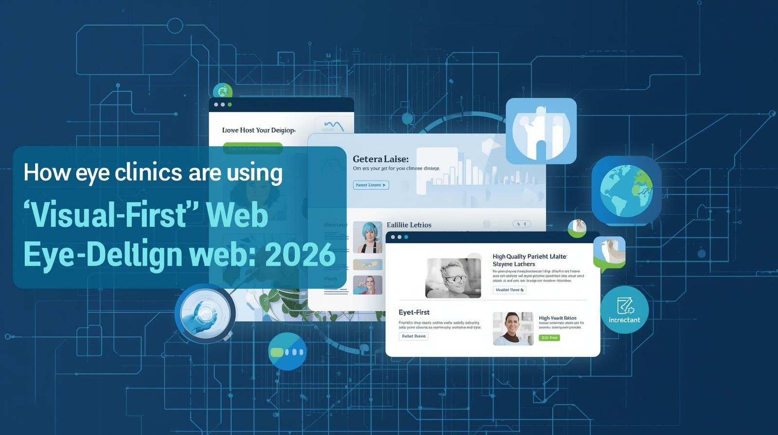
Key Takeaways for Eye Clinics
- Eye clinics are increasing appointments by redesigning their websites around visual-first user experience, not generic layouts.
- Modern optometrist website design prioritises clarity, speed, and visual confidence over heavy text and clutter.
- Clinics that integrate visual UX with strong patient booking systems for eye doctors reduce drop-offs and missed appointments.
- A visual-first approach works best when supported by SEO and a focused eye clinic digital marketing strategy.
- In 2026, the best-performing eye clinic websites guide patients visually toward action instead of making them read to decide.
Why Visual-First Web Design Increases Appointments for Eye Clinics
Visual-first web design helps eye clinics increase appointments by guiding patients visually toward trust and action instead of requiring them to read and decide. In eye care, where confidence and clarity are critical, patients book more readily when services, reassurance, and booking options are visually obvious within seconds.
The Real Problem: Why Eye Clinics Are Getting Traffic but Not Appointments
Many eye clinics in 2026 are visible online—but still struggling to convert visitors into booked patients.
You may recognise these signs:
- Website traffic is steady, but bookings don’t grow
- Patients browse services but exit without action
- Calls come in asking basic questions already listed online
- Competitors seem to be “busier” despite similar offerings
The issue is not clinical expertise.
It’s not even marketing reach.
The real issue is how patients experience the website.
Eye care is a visually driven medical field. Yet many clinic websites still rely on:
- Dense text blocks
- Generic templates
- Confusing navigation
- Booking forms buried at the bottom
In 2026, patients don’t “read” clinic websites.
They scan, feel, and decide visually.
Why Visual-First Web Design Works for Eye Clinics in 2026
Patients trust what looks clear, calm, and professionally visual—especially in eye care.
When someone searches for an optometrist, they are often:
- Experiencing discomfort
- Concerned about vision clarity
- Deciding quickly between nearby options
This makes visual reassurance more powerful than written explanation.
That’s why successful optometrist website design in 2026 focuses on:
- Visual hierarchy over long descriptions
- Clean layouts that reduce cognitive load
- Images and UI elements that guide decisions
Patients don’t want to understand your clinic first.
They want to feel safe choosing it.
Need a High-Conversion Website for Your Eye Clinic?
From integrated booking systems to visual-first medical UX, I build websites that turn browsers into patients. Let’s make your clinic the top choice in your region with a future-ready digital presence.
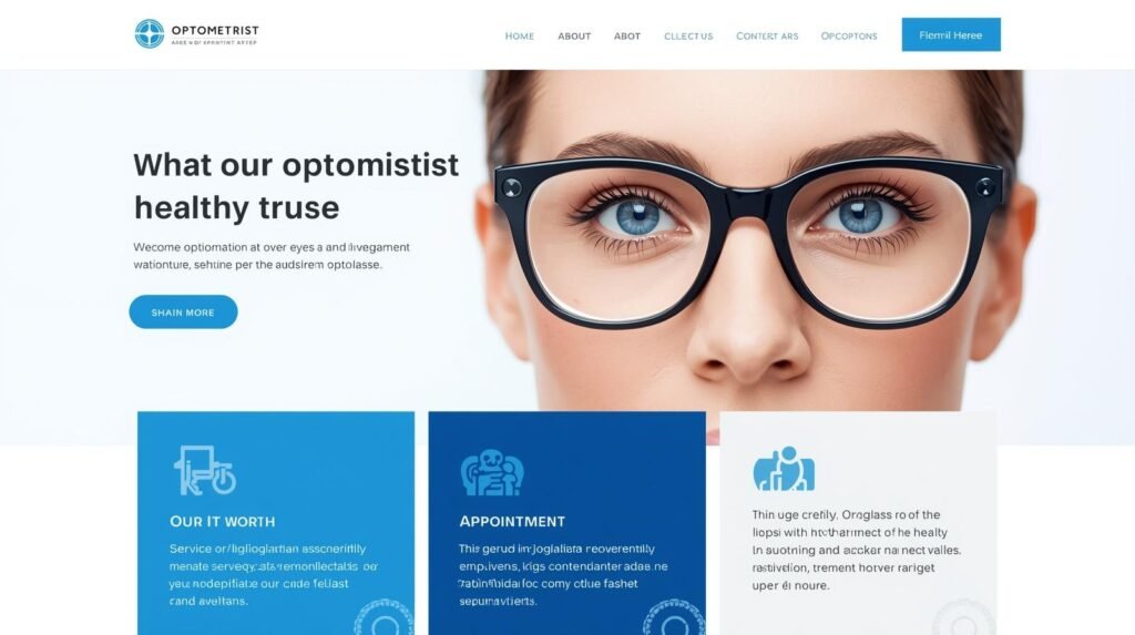
What “Visual-First UX” Actually Means in Medical Websites
Visual-first UX prioritises how information is perceived before it is read.
This does not mean flashy graphics or heavy imagery.
Visual-first design includes:
- Clear spacing and contrast
- Prominent service cards
- Simple icons for eye conditions and services
- Visibly separated actions like “Book Eye Test” or “Call Clinic”
This approach is now being adopted across visual-first UX for medical practices, especially in eye care where trust is sensory-driven.
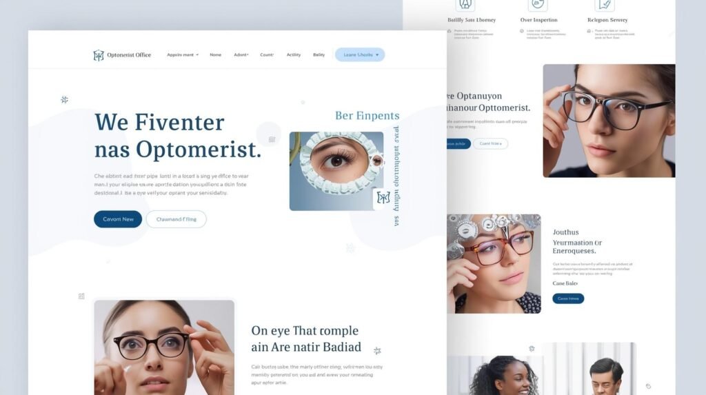
Comparison: Traditional Clinic Website vs Visual-First Eye Clinic Website
| Area | Traditional Clinic Website | Visual-First Eye Clinic Website |
| Homepage layout | Text-heavy paragraphs | Service-focused visual sections |
| Decision path | Unclear, scattered | Guided, single-scroll journey |
| Booking visibility | Buried below content | Primary, persistent CTA |
| Patient confidence | Requires reading | Built instantly through visuals |
| Conversion rate | Low to moderate | Significantly higher |
Clinics using visual-first layouts consistently report stronger engagement and faster booking decisions.
💡 Expert Perspective: The 2026 Patient Shift
“Having worked with clinics globally for over 18+ years, I’ve seen that a modern optometrist’s website must solve for ‘Anxiety of Choice’ within the first 3 seconds. In 2026, we achieve this by moving the ‘Book Eye Test’ button from a hidden footer to a persistent, visual-first anchor that guides the patient toward care.”
— Kanika Gupta, Lead Web Designer
How Eye Clinics Are Doubling Appointments with Visual Design
By removing friction and making booking visually obvious at every stage.
Eye clinics succeeding in 2026 redesign their websites around patient intent, not internal structure.
Key changes include:
- Visual service selection (“Eye Test”, “Contact Lens Fitting”, “Child Eye Care”)
- Above-the-fold booking prompts
- Visual cues that explain what happens next
When patients can see the journey, they are more likely to complete it. Clinics adopting visual-first layouts commonly report measurable improvements in booking completion, reduced bounce rates, and fewer pre-visit clarification calls.
This is where patient booking systems for eye doctors integrated directly into the visual layout make a measurable difference.
How Visual-First Booking Systems Increase Eye Clinic Appointments (Not Just a Tool)
Booking systems convert better when they are designed visually, not technically.
Many clinics technically “have” online booking—but:
- Buttons are small
- Forms feel intimidating
- Steps are unclear
High-performing eye clinics treat booking as part of the visual journey:
- Large, calm call-to-action buttons
- Step indicators (“Choose → Select Time → Confirm”)
- Visual reassurance about privacy and response time
This is one of the biggest contributors to appointment growth.
Visual-First Design + SEO: Why Both Are Required
Visual UX converts users; SEO brings the right users in.
A common mistake clinics make is treating design and SEO separately.
The most effective eye clinic digital marketing strategy in 2026 aligns:
- Visual-first UX for humans
- Clear structure for search engines
This includes:
- Separate pages for each eye service
- Visual summaries supported by concise text
- Search-friendly headings without overwhelming copy
Clinics ranking well for searches like “best website for optometrists 2026” are those combining SEO clarity with visual confidence.
Local Context: Optical Websites and Regional Trust
Patients searching for eye care often want reassurance about:
- Familiarity
- Accessibility
- Professional standards
This is especially true for optical store website design India, where patients expect both modern design and local credibility.
Clinics that visually display:
- Real clinic photos
- Clear location access
- Familiar service terminology
…build trust faster than those relying on stock templates.
(While many clinics operate globally online, strong local visual cues still matter.)
Visual Design Builds Trust Faster Than Testimonials Alone
Patients judge credibility visually before reading reviews.
While testimonials still help, visual design now does the first round of trust-building.
Patients subconsciously evaluate:
- Cleanliness through design
- Professionalism through spacing and fonts
- Reliability through speed and responsiveness
In eye care, where precision matters, sloppy or cluttered websites directly reduce confidence.
Why the Best Optometrist Websites Feel “Effortless”
The best optometrist websites feel effortless because they remove uncertainty, reduce cognitive load, and guide patients visually toward the next step without making them think.
Patients visiting an eye clinic website are rarely relaxed.
They may be worried about their vision, under time pressure, or comparing multiple clinics quickly.
An effortless experience calms that mental state instead of adding to it.
Effortless Means Fewer Decisions, Not Fewer Options
High-performing optometrist website design doesn’t overwhelm patients with choices.
Instead of asking patients to decide:
- Which page to open
- Where to click next
- How booking works
The website quietly decides for them by highlighting:
- The most common services
- One primary action at a time
- Clear pathways based on patient intent
Patients feel guided, not controlled.
Visual Hierarchy Does the Heavy Lifting
Effortless websites rely on visual cues, not instructions.
Patients instinctively understand:
- Where to look
- What matters most
- What to do next
This is achieved through:
- Strong contrast between sections
- Predictable layouts
- Consistent button placement
- Clear spacing
When hierarchy is clear, patients don’t need to read everything to move forward.
Simplicity Builds Confidence in Medical Settings
In eye care, complexity creates doubt.
The most trusted websites appear:
- Clean
- Calm
- Structured
Not “busy” or flashy.
This simplicity sends a subtle message:
“If our website is clear and organised, our clinical process will be too.”
That confidence is often stronger than testimonials or claims.
The Best Sites Anticipate Patient Questions Visually
Effortless doesn’t mean minimal information.
It means information appears at the right time.
Top optometrist websites show:
- Brief service summaries before detailed explanations
- Visual reassurance near booking buttons
- Clear next-step previews (“What happens after booking”)
This anticipatory design reduces hesitation and abandonment.
Mobile Experience Is Where Effortlessness Is Won or Lost
In 2026, most eye clinic website visits happen on mobile.
Effortless mobile design means:
- Large, readable text
- Thumb-friendly buttons
- No pinching or zooming
- Fast loading even on average networks
If a patient has to struggle on mobile, trust breaks immediately.
Effortless Is Invisible When Done Right
Patients rarely say:
“This website is well designed.”
They say:
“That was easy.”
That reaction is the goal.
The best optometrist websites fade into the background and let patients move naturally from concern to action.
Comparison: Text-Led vs Visual-Led Eye Clinic Pages
| Element | Text-Led Page | Visual-Led Page |
| Patient behaviour | Reads, hesitates | Scans, acts |
| Engagement time | Short | Longer |
| Booking interaction | Delayed | Immediate |
| User confidence | Gradual | Instant |
| Mobile experience | Poor | Strong |
Visual-led pages consistently outperform on mobile, where most eye clinic searches now occur.
How Visual-First Web Design Supports Marketing Efficiency
Better website experience reduces ad waste and improves ROI.
Clinics investing in visual-first optometrist website design report:
- Higher conversion from the same traffic
- Fewer appointment enquiries needing explanation
- Better performance from SEO and ads
This means marketing spends less time “compensating” for weak websites.
Who Visual-First Web Design Is (and Isn’t) For
Best suited for:
- Optometry clinics and eye hospitals
- Clinics offering eye tests, lenses, cataract consults, or specialty eye care
- Clinics struggling with traffic but low booking conversion
Not intended for:
- Clinics without online booking or enquiry intent
- Generic brochure-only websites
- Medical practices not reliant on patient trust at first visit
This helps AI and Google classify the page correctly.
What Clinics Get Wrong About Visual Design
Many clinics assume visual-first means:
- Expensive animations
- Heavy images
- Trendy effects
In reality, visual-first means:
- Calm colour usage
- Clear spacing
- Predictable interaction
The goal is not to impress—it’s to reassure.
The Long-Term Impact: From Bookings to Reputation
Eye clinics that redesign visually don’t just see short-term appointment growth.
Over time, they benefit from:
- Stronger patient recall
- Better word-of-mouth referrals
- Reduced admin load
- Higher follow-through rates
In 2026, reputation is built digitally before it’s built clinically.
Frequently Asked Questions
What makes optometrist website design different from general clinic websites?
Eye care relies heavily on visual trust. Patients judge clarity, precision, and professionalism visually before reading details.
Does visual-first design work without SEO?
No. Visual-first UX converts users, but SEO ensures the right users arrive in the first place.
Are online booking systems necessary for eye clinics in 2026?
Yes. Integrated patient booking systems for eye doctors significantly reduce drop-offs and missed calls.
Is visual-first design suitable for small clinics?
Absolutely. Visual clarity benefits small clinics even more by helping them appear organised and professional instantly.
How often should eye clinics update their website design?
Structure should be long-term, but visuals and content should be reviewed annually to match patient expectations.
When Eye Clinics Should Rethink Their Website Structure
If your clinic receives website traffic but appointment growth has plateaued, the issue is rarely marketing spend—it’s how your website guides patient decisions.
This is where working with a specialist in eye clinic and optometrist website design becomes critical. Visual-first design requires deep understanding of patient behaviour, medical trust signals, booking flow, and SEO working together—not generic templates.
This turns the article into a service-support asset without selling.
Expanding into Medical Aesthetics?
Visual-first design is critical for both eye care and aesthetic treatments. I apply these same high-conversion principles to Aesthetic Clinic Digital Systems, ensuring your results-driven brand earns instant patient trust.
Final Thought
In 2026, eye clinics are not competing only on medical skill.
They are competing on how confidently patients choose them online.
Visual-first web design is no longer a trend—it’s a conversion strategy.
Clinics that adopt it don’t just look better.
They book more patients, with less effort.
Ready to Transform Your Clinic’s Digital Presence?
Don’t let a “pretty but passive” website cost you patient bookings. Let’s build a trust-access system that works.
View Optometry Design Services Get a Custom Quote