Key Takeaways
- A poorly planned consulting website structure is one of the biggest hidden reasons consulting firms lose leads.
- Most visitors decide within seconds — unclear navigation and weak structure increase bounce rates.
- High-performing consulting websites use clear user flow, trust anchors, and conversion-focused layouts.
- Concepts like Information Architecture, CRO, and User Flow Mapping directly impact conversions.
- Fixing structure can significantly improve lead generation, engagement, and client trust.
Introduction
Many consulting firms invest heavily in branding, ads, and outreach – yet struggle to convert website visitors into actual business inquiries.
The problem is rarely traffic.
It’s structure.
A poorly designed consulting website structure silently kills conversions by confusing visitors, hiding key information, and failing to guide users toward action.
For consulting firms, where services are high-value and trust-driven, even small structural issues can lead to:
- lost leads
- reduced credibility
- lower engagement
In this article, we’ll break down exactly why consulting firms lose leads due to poor structure and how to fix it using modern, conversion-focused architecture strategies.
Poor website structure doesn’t just reduce conversions—it also limits how effectively AI search platforms understand and recommend your consulting business. Before exploring structural improvements, our comprehensive guide How Clients Find Consultants Through ChatGPT & AI Search explains how modern AI systems evaluate consultant websites and why information architecture has become a critical competitive advantage.
Data Point: Why Website Structure Matters
Website structure is not just a design decision it directly influences how users perceive your consulting firm and whether they choose to engage with you.
Research-backed data highlights the impact:
- 75% of users judge a company’s credibility based on its website design (Stanford Web Credibility Research) which means your structure, layout, and clarity immediately affect trust.
- 88% of users are unlikely to return after a poor website experience confusing navigation or unclear structure leads to instant drop-offs. according to UX research compiled by Baymard Institute.
- Studies show that improving website usability and structure can increase conversion rates by 30% to 400% for high-ticket B2B services Nielsen Norman Group research on UX ROI.
- Visitors typically decide whether to stay or leave within 5–8 seconds, making clear structure and messaging critical from the first interaction.
For consulting firms, this impact is even stronger.
Unlike ecommerce or low-ticket services, consulting decisions involve:
- higher investment
- longer decision cycles
- greater trust requirements
If your website structure does not clearly guide users through your services, expertise, and proof of results, potential clients will leave and choose a competitor who communicates more effectively.
In simple terms:
A well-structured website builds confidence and drives inquiries.
A poorly structured one creates confusion and costs you leads.
What is Website Structure (And Why It Matters for Consulting Firms)
Website structure refers to how your website’s pages, content, and navigation are organized to guide visitors through information in a logical and intuitive way.
For consulting firms, structure is not just about arranging pages it’s about how clearly you communicate expertise and how effectively you convert visitors into clients.
A strong consulting website structure ensures that a potential client can:
- quickly understand what you do
- identify whether you solve their problem
- see proof of your expertise
- take the next step (book a consultation or inquire)
This is achieved through well-planned Information Architecture, User Flow Mapping, and Conversion Rate Optimization (CRO).
For example, a high-performing consulting website typically follows a clear journey:
Homepage → Services → Case Studies (Trust) → Contact/Consultation
If this flow is missing or poorly structured, visitors get confused, lose trust, and leave even if your services are valuable.
In consulting, where decisions involve high investment and trust, structure plays a critical role in:
- reducing friction in decision-making
- building credibility through organized content
- guiding users toward inquiry without confusion
In simple terms:
A strong website structure acts like a sales consultant working 24/7, guiding potential clients step-by-step toward choosing your firm.
Key Terms in Consulting Site Architecture
Understanding these core concepts helps you evaluate whether your website is structured to convert visitors into clients or silently losing leads.
Service Silos
Service silos refer to organizing your offerings into clear, focused categories instead of listing everything on one page. For example, instead of a single “Services” page, you create dedicated pages for each service (e.g., Strategy Consulting, Operations Consulting, Digital Transformation). This improves clarity, SEO visibility, and makes it easier for potential clients to find exactly what they need.
Trust Anchors
Trust anchors are elements that build credibility at key decision points. These include case studies, testimonials, client logos, certifications, and measurable results. Instead of placing them on a separate page, high-performing consulting websites integrate these directly within service pages to reinforce trust when users are evaluating your expertise.
Conversion Funnels
A conversion funnel is the path a visitor follows from landing on your website to becoming a lead. In consulting, this typically looks like: Homepage → Service Page → Case Study → Contact/Consultation. A well-structured funnel reduces friction and guides users step-by-step toward inquiry.
Information Architecture (IA)
Information architecture is the strategic organization of content, pages, and navigation. It ensures users can easily understand your services, navigate the website, and find relevant information without confusion.
User Flow Mapping
User flow mapping defines how visitors move through your website. It focuses on creating a smooth journey from entry point to conversion, ensuring that each page naturally leads to the next step.
Conversion Rate Optimization (CRO)
CRO involves designing and structuring your website to increase the percentage of visitors who take action such as booking a consultation or submitting an inquiry. This includes optimizing layouts, CTAs, and content placement.
These concepts work together to create a high-performing consulting website structure that improves clarity, builds trust, and increases conversions.
Why Consulting Firms Lose Leads with Poor Website Structure
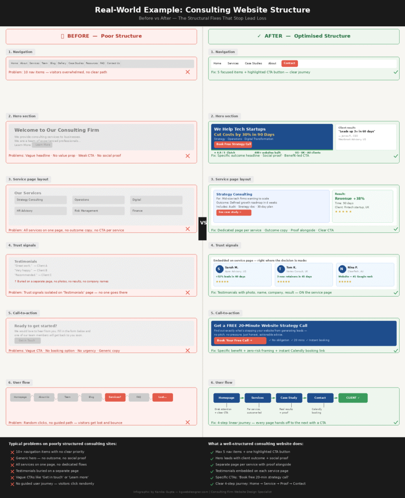
1. Confusing Navigation
If users cannot find what they need within seconds, they leave.
A strong structure follows the 3-Click Rule users should reach any key page within three clicks.
Violating this creates friction and increases bounce rate.
2. No Defined User Flow
Many consulting websites lack a clear journey.
Instead of guiding users, they overwhelm them.
A proper flow follows:
Homepage → Services → Trust → Inquiry
Without this, you create site map friction for high-ticket leads.
3. Poor Content Layout (Ignoring User Behavior)
Users don’t read they scan.
Most websites ignore:
- F-Pattern scanning (text-heavy pages)
- Z-Pattern scanning (landing pages)
This leads to confusion and drop-offs.
Understanding why clients bounce from consulting sites starts with understanding how users consume content.
4. Weak Service Page Architecture
Many firms list services without structure.
A strong page includes:
- problem
- solution
- proof
- CTA
5. Misplaced Trust Signals
In 2026, consulting leads look for proof.
Case studies and testimonials should be placed alongside services not buried.
This improves credibility instantly.
Fixing poor website structure is not just about rearranging sections it requires a complete shift toward conversion-focused design, messaging clarity, and strategic user flow.
If you want a deeper understanding of how high-performing consulting websites are structured to attract premium clients, explore this guide on professional services website design for consultants.
It breaks down the exact frameworks used to turn websites into consistent lead-generation systems.
The “Trust Anchor” Hierarchy (Advanced Insight)
High-performing consulting websites structure trust elements strategically.
Instead of placing proof deep inside the site, they position it alongside services.
This ensures that when users explore services, they simultaneously see:
- results
- credibility
- expertise
This reduces hesitation and improves conversions.
Why Clients Bounce from Consulting Websites
Visitors leave when:
- navigation is unclear
- value proposition is weak
- pages feel overwhelming
- content lacks structure
This is one of the biggest consulting firm lead loss causes.
Planning to Build or Redesign Your Corporate Website?
For consulting firms and professional service businesses, a strong website helps build credibility, attract qualified leads, and communicate expertise clearly.
Explore our Corporate Website Design Services to see how we design professional websites for consulting firms, advisors, and service-based businesses.
How High-Converting Consulting Website Structure Works
A high-performing structure is built around clarity and flow.
Clear Hierarchy
A clear hierarchy means your visitor never has to think about where to go next. In practice, this starts with a navigation menu limited to five or six items no mega-menus, no dropdown overload.
Each page title should immediately communicate what a visitor will find there, not what sounds impressive internally. Within each page, content should follow a logical weight: the most important information at the top, supporting detail below, and a clear action at the bottom.
For consulting websites specifically, this means leading with outcomes your clients care about not your firm’s history or team structure. When hierarchy is clear, visitors stay longer, explore deeper, and arrive at your contact page with confidence rather than confusion. That confidence is what converts.
Defined User Flow
A defined user flow means every page on your website has one job and it hands the visitor to the next page without friction.
For a consulting website, the ideal flow is: Homepage → Service Page → Proof (case study or testimonial) → Contact or Consultation.
The problem most consulting sites have is that they treat every page as a destination rather than a step in a journey. A visitor lands on your homepage, finds no clear pointer to your services, clicks around aimlessly, and leaves.
Mapping your user flow means auditing each page and asking: what do I want this visitor to do next, and is that next step obvious? If the answer requires more than two seconds of thought from your visitor, the flow is broken and it is costing you leads.
Conversion-Focused Layout
Your website should guide users toward inquiry.
This is how you start converting consulting traffic into inquiries.
Integrated Internal Linking
While structure is critical, avoiding common errors is equally important here are 5 website mistakes consultants make that cost them high-value clients.
The Ideal Website Structure for Consulting Firms
The most effective consulting websites share a consistent five-page structure, but what matters is not just which pages exist it is how they connect.
Your homepage should answer one question within five seconds: what do you do and who is it for? Your services section should be broken into individual, focused pages rather than one long list each page dedicated to a single service, written for the client who needs that specific outcome. Your about page should establish credibility through experience and results, not just biography.
Your case studies or portfolio page should demonstrate real-world proof positioned close to the services it validates. And your contact page should be frictionless ideally with a calendar booking option rather than a form that disappears into an inbox.
Together, these five pages form a connected journey that moves a sceptical visitor toward a confident inquiry.
How Structure Impacts Lead Generation
Structure directly impacts conversions.
A well-structured website:
- improves UX
- builds trust
- reduces friction
- increases leads
To understand this better, explore how corporate website design drives lead generation in 2026:
Step-by-Step Fix for Poor Website Structure
Step 1: Audit Using Real Data
Before making any changes, collect evidence of where your current structure is failing. Use Google Analytics to identify pages with high bounce rates and short time-on-page these are the points where visitors are losing confidence and leaving.
Tools like Microsoft Clarity or Hotjar provide heatmaps and session recordings that show exactly where users scroll, click, and stop engaging. Look specifically at your service pages: are visitors reaching your CTA, or dropping off halfway down?
This data removes guesswork and tells you precisely where the structure is broken before you spend a single hour redesigning it.
Step 2: Simplify Navigation
Most consulting websites suffer from navigation that tries to show everything at once. Reduce your main menu to a maximum of five or six items, each representing a clear category your client would actually search for.
Sub-menus are acceptable for service categories, but they should never go deeper than one level. Remove any navigation items that exist for internal reasons rather than visitor clarity award pages, team bios buried three clicks deep, or resources sections with outdated content.
The goal is that a first-time visitor should be able to identify your core service and find how to contact you within ten seconds of arriving on any page.
Step 3: Improve Page Hierarchy
Each page on your consulting website should have a single, clear purpose supported by a logical content order. Start with the outcome the visitor is looking for, follow with how you deliver it, then provide proof that you have done it before, and close with a single call-to-action.
Avoid the common mistake of leading with your firm’s history or credentials consulting clients care about their problem first, your solution second, and your background third. Restructuring pages in this order problem, solution, proof, action consistently improves engagement and reduces the drop-off rate that kills conversion on most professional services websites.
Step 4: Add Trust Anchors
Trust signals placed on a separate testimonials page are almost invisible. Consulting prospects rarely navigate to a dedicated reviews section they evaluate credibility while they are already reading about your services.
Move your most compelling evidence directly onto your service pages: a short client quote beneath the service description, a measurable result next to the relevant offering, or a recognisable client logo positioned near your primary CTA.
This placement means that at the exact moment a visitor is deciding whether to enquire, they are simultaneously seeing proof that you have delivered results for people like them. That proximity between claim and evidence is what shortens the decision cycle.
Step 5: Optimize CTAs
A weak call-to-action is one of the most common and most fixable reasons consulting websites fail to generate enquiries. Each page should have one primary CTA not three competing options and it should be specific rather than generic. “Get in touch” tells a visitor nothing.
“Book a free 20-minute strategy call” tells them exactly what will happen, how long it will take, and that it costs them nothing to start. Place your CTA both mid-page, after your proof section, and again at the bottom. On mobile, ensure the CTA button is visible without scrolling on the first screen.
These small specificity changes consistently produce measurable improvements in enquiry rates within the first two to three weeks of implementation.
Why Industry-Specific Website Design Matters
Consulting is a high-trust, high-value service and your website must reflect that from the very first interaction. A generic website structure cannot effectively communicate expertise, differentiate your firm, or guide potential clients toward making a decision.
Industry-specific design ensures your website is built around how consulting clients actually think and evaluate services. Instead of just presenting information, it focuses on:
- clearly defining services and outcomes
- positioning your expertise in a competitive market
- showcasing proof through case studies and results
- guiding users through a structured decision-making journey
It also incorporates elements specific to consulting, such as service-led navigation, trust anchors within service pages, and conversion-focused user flows.
From a technical perspective, it supports better performance through structured information architecture, local and niche SEO optimization, and strategic internal linking all of which help attract and convert the right audience.
Most importantly, a specialized approach reduces confusion and builds confidence. Visitors can quickly understand what you do, trust your expertise, and take the next step.
This is why consulting firms that invest in industry-specific website design consistently see better engagement, higher-quality leads, and stronger conversion rates compared to generic website solutions.
Consulting websites require a specialized approach.
Final Thoughts
Your consulting firm’s website is often the first and sometimes only chance you get to convince a potential client that you are worth their time and money. If that website is confusing to navigate, slow to communicate your value, or missing the trust signals that high-investment buyers need, they will leave quietly and hire someone else. Not because your services are inferior, but because your website failed to make the case.
The good news is that structural problems are entirely fixable. Clear navigation, a logical user flow, strategically placed proof, and a single strong call-to-action can transform a website that looks good into one that actually generates leads consistently, without paid ads.
If you are not sure where your website is losing visitors, let’s find out together.
Book a free 20-minute website strategy call with Kanika →
In one short call, you will get a clear picture of what your current site is doing well, where it is losing leads, and exactly what needs to change. No pitch, no pressure just a practical, honest assessment from someone who has built and redesigned over 400 websites for businesses across the US, UK, and Australia.
Frequently Asked Questions
What is consulting website structure?
Consulting website structure refers to how your pages, navigation, and content are organised to guide visitors toward taking action. A well-structured consulting website uses clear information architecture, defined user flows, and strategically placed trust signals to convert visitors into leads.
Why do consulting websites lose leads?
Consulting websites lose leads due to poor navigation, unclear value propositions, missing trust signals, and weak call-to-actions. When visitors cannot find what they need within seconds or don’t see proof of expertise, they leave for a competitor who communicates more clearly.
How can I improve my website structure?
Improve your consulting website structure by simplifying navigation to a maximum of 5–6 items, creating dedicated service pages for each offering, placing testimonials and case studies alongside service descriptions, and adding a clear call-to-action on every page.
How long does it take to fix website structure?
Fixing consulting website structure typically takes 2–4 weeks depending on the size of the site. Quick wins like improving navigation, updating CTAs, and adding trust signals can be done in days. A full information architecture redesign takes 3–6 weeks.
Looking to Build a High-Trust Corporate Website?
For consulting firms and professional services businesses, your website plays a key role in establishing credibility and generating new leads.
If you’re planning to launch a new website or redesign your current one, explore our specialized corporate website design services.
Corporate Website Design Services
Corporate Website Design
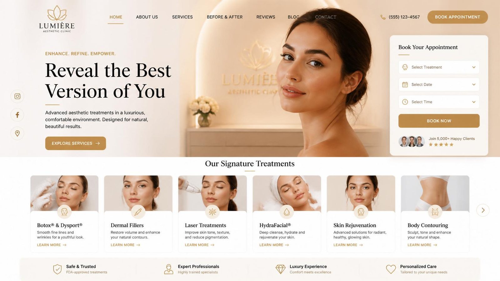
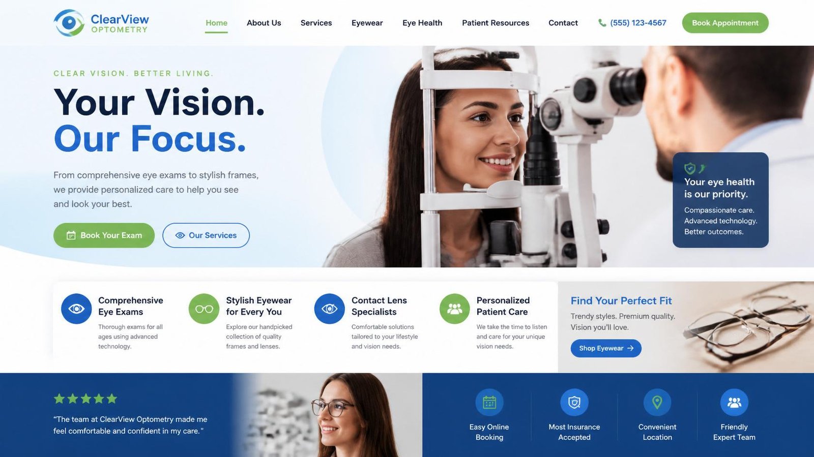
Patient-focused website design for optometrists with seamless appointment booking, mobile optimization, and trust-building user experience.
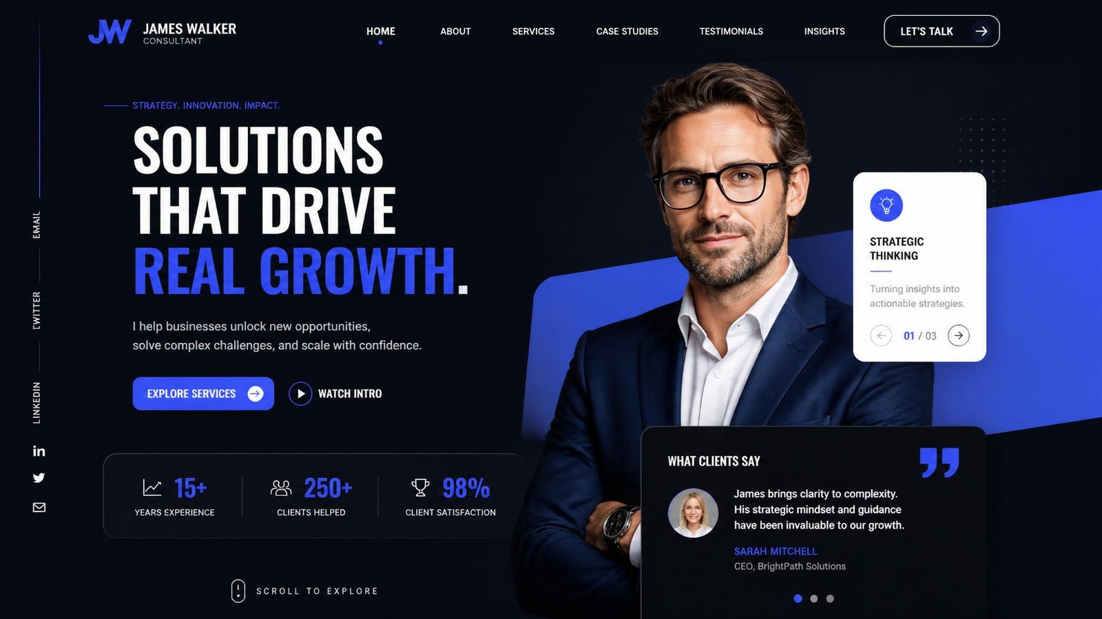
Consulting Firm Website Design
Modern, trust-focused websites for eye clinics designed to attract patients, highlight services, and increase appointment bookings.
Professional Services Website Design
Strategic website design for vision care brands that builds credibility, educates patients, and drives consistent enquiries.
Kanika Gupta is a freelance web designer specializing in ecommerce websites, optometrist websites, and corporate websites for businesses worldwide.