Quick Answer
A high-converting ecommerce homepage design is structured around clear value positioning, strategic visual hierarchy, trust signals, and frictionless navigation-designed for both human users and AI-driven discovery systems.
TL;DR
Your homepage has 3 seconds to do three things:
- Communicate what you sell
- Build trust instantly
- Guide the next action
If it fails at any one of these, users leave – and conversions drop.
Key Takeaways
- Homepage clarity directly impacts revenue
- Users scan in predictable patterns (F/Z layout)
- Trust must be visible above the fold
- Mobile UX must reduce physical effort (thumb-zone design)
- AI search requires structured, machine-readable content
- High-converting homepages guide—not overwhelm
Why Most Ecommerce Homepages Lose Sales Instantly
Your homepage has less than 3 seconds to make an impression.
Not 10 seconds. Not even 5.
Research shows users form opinions in milliseconds-and in ecommerce, that first impression determines whether they explore or exit.
A user from New York lands on your store.
A shopper in London checks your homepage during a commute.
A buyer in Sydney scrolls quickly between brands.
They’re not reading.
They’re scanning.
And if your homepage doesn’t immediately communicate clarity and trust, they leave.
This is where a professional ecommerce homepage design becomes a revenue driver-not just a design exercise.
The 2026 Shift: Designing for Humans and AI Search Engines
In 2026, your homepage is not just for users.
It’s also for AI.
Search engines like Google SGE and tools like Perplexity now interpret websites through:
- Structured data (Schema)
- Content hierarchy
- Entity relationships
This means your homepage must be:
- Human-readable (clear, engaging, structured)
- Machine-readable (schema-enabled, logically organized)
High-performing stores implement:
- Organization schema
- Product schema
- FAQ schema
This improves visibility in AI-generated search results.
Your homepage is no longer just a landing page.
It’s a data source.
The 3-Second Rule: The Golden Standard of Conversion
Before diving deeper, understand this:
If your homepage does not create clarity in 3 seconds, you lose the sale.
Users subconsciously ask:
- What is this store about?
- Is this relevant to me?
- Can I trust this brand?
If any of these remain unclear, they leave.
High-converting stores simplify aggressively.
They remove:
- Visual clutter
- Competing messages
- Unnecessary elements
Clarity is not a design preference.
It’s a conversion requirement.
Ready to Build a High-Converting Ecommerce Website?
👉 Get your top 3 conversion leaks identified.
Ecommerce homepage design: Structuring for Conversion and Clarity
A high-performing ecommerce homepage design follows a structured journey.
It is not random.
It is engineered.
The flow includes:
- Immediate value clarity
- Visual engagement
- Guided navigation
- Trust reinforcement
- Conversion triggers
When this flow aligns, users move naturally toward purchase.
When it breaks, users hesitate.
And hesitation kills conversions.
The 6 Core Elements of a High-Converting Ecommerce Homepage
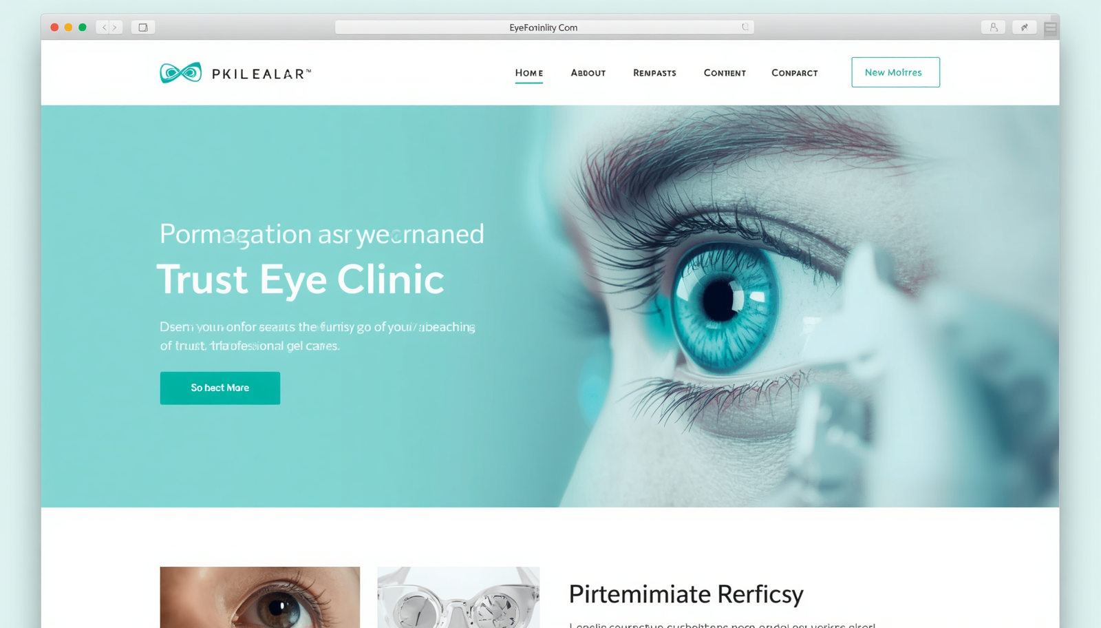
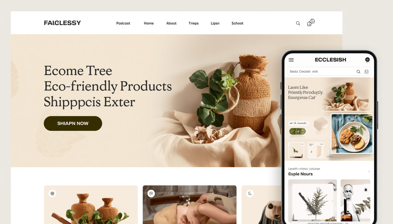
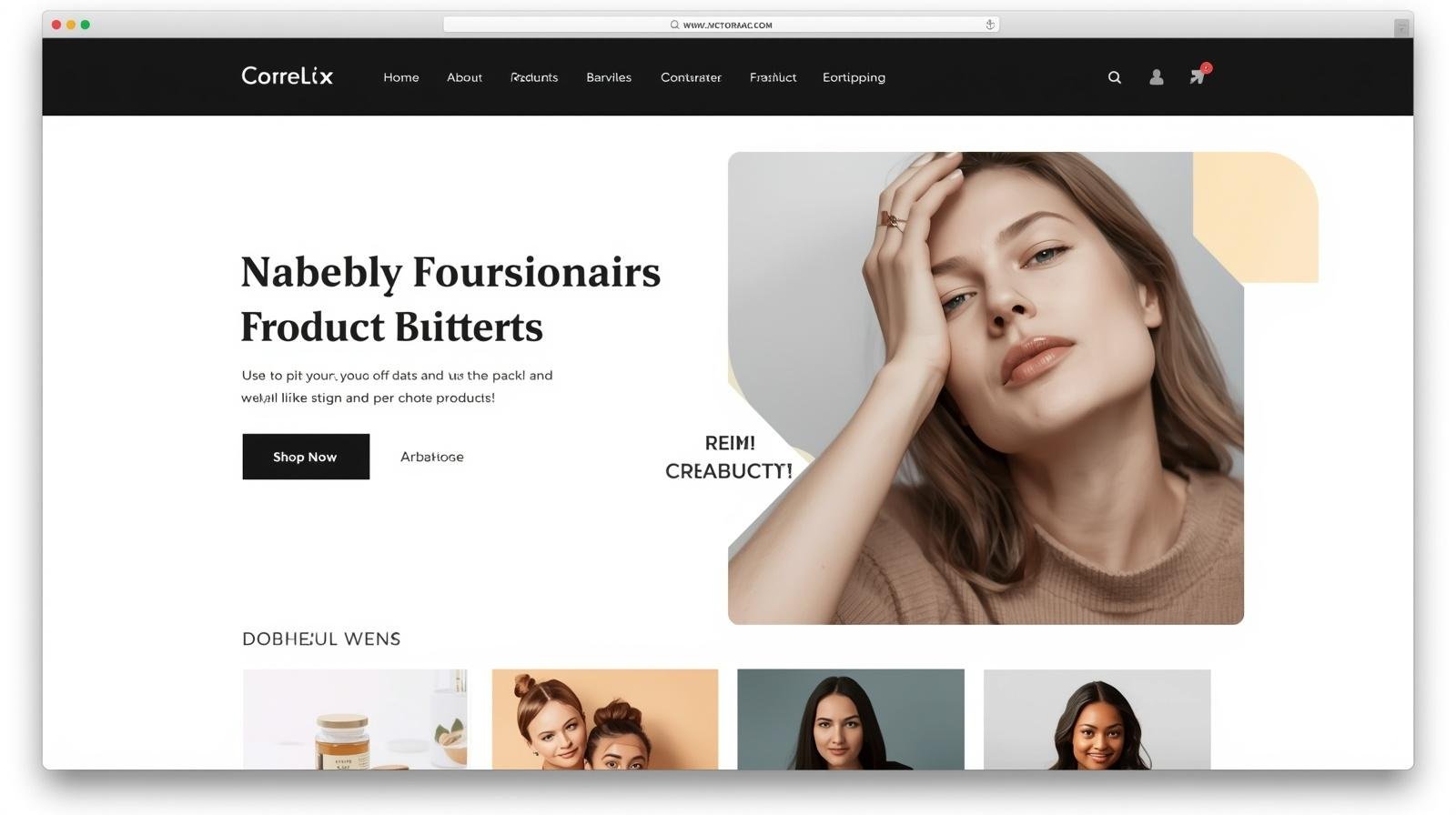
1. Above-the-Fold Clarity
Your first screen must communicate:
- What you sell
- Who it’s for
- Why it matters
Avoid vague headlines.
Use direct, outcome-focused messaging.
This is where ecommerce homepage optimization strategy begins.
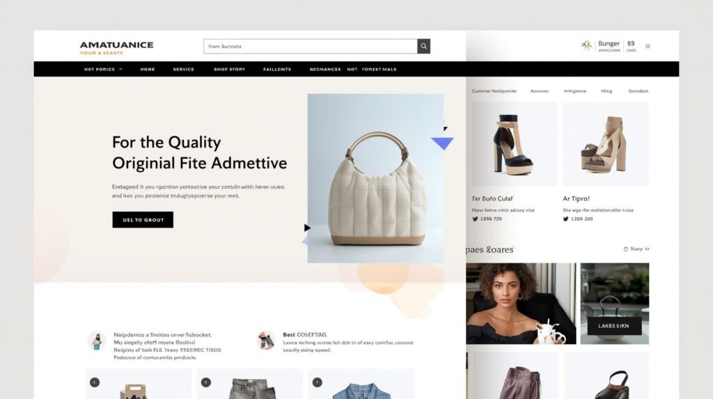
2. Visual Hierarchy Based on Human Eye Patterns
Users scan websites in predictable ways.
Most follow an F-pattern or Z-pattern:
- Top left → across → down → across
This creates a “visual path.”
High-converting stores place:
- Headlines in top-left
- CTAs in center or right
- Key visuals along scanning lines
The “sweet spot” is where attention naturally lands.
This is fundamental to ecommerce UX design best practices homepage.
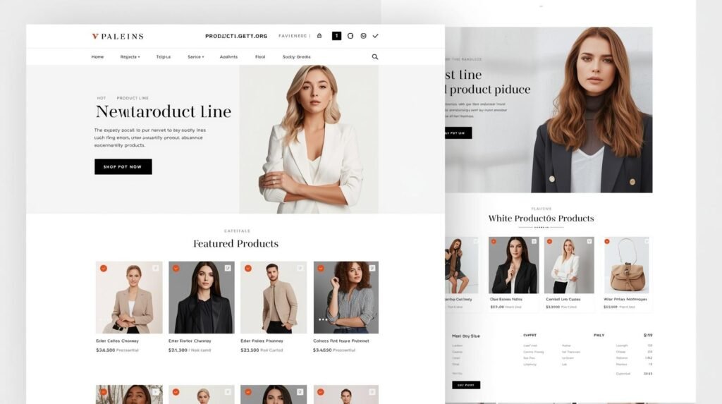
3. Strategic Category Navigation
Users don’t always know what they want.
Your homepage should guide them through:
- Key categories
- Bestsellers
- Featured collections
This supports a clear homepage layout for online store sales.
4. Trust Signals That Reduce Risk Instantly
Trust must be visible early.
This includes:
- Reviews
- Ratings
- Shipping clarity
- Return policies
Users decide quickly whether your store feels safe.
5. Conversion Triggers That Drive Action
Subtle triggers increase conversions:
- Free shipping thresholds
- Limited-time offers
- Social proof
These help improve ecommerce homepage conversion rate.
6. Mobile-First UX and Thumb-Zone Optimization
Most users browse on mobile.
But many sites still design for desktop.
High-converting mobile experiences:
- Place CTAs within the “thumb zone” (bottom third of the screen)
- Use large, tappable buttons
- Reduce scrolling friction
This is critical for ecommerce website design for conversions.
Visual Comparison: Standard vs High-Converting Homepage
| Element | Standard Homepage | High-Converting Homepage |
|---|---|---|
| Layout | Cluttered | Structured |
| Messaging | Generic | Clear |
| CTA | Hidden | Prominent |
| Trust | Minimal | Visible |
| UX | Passive | Guided |
Premium Red Flags vs Green Flags
| Red Flag | Green Flag |
|---|---|
| Rotating carousels | Static, focused hero section |
| Stock imagery | Authentic brand visuals |
| Too many CTAs | One clear primary action |
| Long navigation menus | Simplified categories |
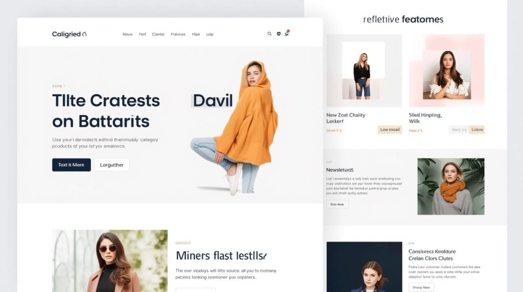
The “Anti-Hero” Trend: Why Simplicity Wins
Many brands rely on rotating banners.
But in 2026, high-performing stores are moving away from them.
Why?
- Users ignore carousels
- Messages get diluted
- Attention gets fragmented
Instead, brands use:
- One strong hero section
- One clear message
- One primary CTA
This increases clarity – and conversions.
Fashion-Specific Insight: What High-End Stores Do Differently
For premium ecommerce brands – especially fashion – the homepage experience is even more critical.
A luxury fashion brand in London we worked with had:
- High traffic
- Strong products
- Low engagement
The issue was perception.
Before:
- Generic layout
- Weak imagery
- No brand identity
After redesign:
- Editorial-style visuals
- Minimal layout
- Clear positioning
Result:
- Increased session duration
- Higher conversion rates
- Improved brand perception
The traffic didn’t change.
The experience did.

18+ Years. 500+ Websites. Zero Cookie-Cutter Stores.
I design ecommerce websites for founders in the US, UK, and Australia who are serious about revenue — not just a pretty storefront. Custom-built, conversion-focused, and delivered on time.
The Psychology Behind Homepage Conversions
Users don’t decide logically first.
They decide emotionally.
They evaluate:
- Trust
- Relevance
- Ease
If your homepage creates friction, they leave.
If it creates clarity, they explore.
Most ecommerce brands underestimate how quickly customers judge their store. Before users explore products, pricing, or collections, they form an emotional reaction to the homepage itself. Layout, spacing, imagery, trust signals, and visual clarity all influence whether a visitor continues browsing or exits immediately.
We explored this in more depth in our guide on how ecommerce website design influences buying decisions in the first 5 seconds, including the exact UX and visual triggers that impact customer trust and conversion behavior.
The Cost of a Poor Homepage
A poorly designed homepage leads to:
- Lost sales
- High bounce rates
- Wasted ad spend
You pay for traffic that doesn’t convert.
Technical SEO for Ecommerce Homepages (Schema Layer)
Most ecommerce brands think homepage performance is purely visual.
It’s not.
In 2026, your homepage is evaluated by two audiences simultaneously:
- Human users (experience, clarity, trust)
- AI systems (structure, entities, machine readability)
If your homepage is not structured for both, you lose visibility before the user even arrives.
Why Schema Matters for Ecommerce Homepages
Search engines no longer “read” websites the way humans do.
They interpret:
- Relationships between entities
- Content hierarchy
- Structured data signals
This is where Schema Markup becomes critical.
Schema allows your homepage to communicate:
- Who you are
- What you sell
- How your site is structured
Without it, your website is just another page.
With it, your website becomes a verified data source.
Core Schema Types Every Ecommerce Homepage Needs
1. Organization Schema
This defines your brand as an entity.
It includes:
- Brand name
- Logo
- Social profiles
- Contact details
This helps Google connect your website with your broader digital presence.
2. Website Schema
This enables features like:
- Sitelinks in search results
- Search box integration
It improves how your brand appears in search – especially for returning users.
3. Product & Item List Schema
Even if your homepage is not a product page, you can structure:
- Featured products
- Bestseller collections
- Category previews
This helps AI understand what you sell and can improve visibility in shopping results.
4. Breadcrumb Schema
This defines your site structure.
It helps:
- Users navigate better
- Search engines understand hierarchy
This is especially important for large ecommerce stores.
5. FAQ Schema
If your homepage includes FAQs (shipping, returns, sizing), mark them up.
This increases chances of:
- Featured snippets
- AI-generated summaries
The AI Search Advantage (2026 and Beyond)
With AI-driven search (Google SGE, Perplexity), your homepage is no longer just ranked.
It is interpreted and summarized.
Structured data helps your site:
- Appear in AI-generated answers
- Be cited as a trusted source
- Improve visibility without traditional clicks
This is where most ecommerce brands are behind.
They optimize for Google.
But not for AI.
Core Web Vitals: The Performance Layer
Schema helps machines understand your site.
But speed determines whether users stay.
Key metrics include:
- LCP (Largest Contentful Paint) – How fast your main content loads
- CLS (Cumulative Layout Shift) – Visual stability
- INP (Interaction to Next Paint) – Responsiveness
Even a 100ms delay can reduce conversions significantly.
Speed is not technical – it’s commercial.
How High-Converting Stores Combine UX + Technical SEO
The best-performing ecommerce brands don’t treat UX and SEO separately.
They align:
- Clean homepage structure
- Fast loading times
- Schema implementation
- Mobile-first UX
This creates:
- Better rankings
- Higher visibility
- Stronger conversions
The Strategic Takeaway
Your homepage is not just a design layer.
It is:
- A conversion system
- A search asset
- A data structure
When your homepage is both:
- Human-optimized (UX)
- Machine-optimized (Schema + Speed)
You gain a competitive advantage that most ecommerce brands overlook.
Conclusion: Your Homepage Is Your Revenue Engine
Your homepage is not just a design asset.
It is your conversion engine.
It determines:
- First impressions
- User behavior
- Revenue outcomes
That’s why a conversion friendly ecommerce website design directly impacts growth.
We work fully remotely with ecommerce brands across the US, UK, Australia, and Canada—creating homepages that convert traffic into revenue.
Ready to Improve Your Ecommerce Conversions?
You now know what the right investment looks like. The next step is a quick call — no pitch, no pressure. Just clarity on what your store needs and what it’ll cost to build it right.
FAQs
What makes an ecommerce homepage high-converting?
A high-converting homepage communicates value instantly, guides user flow, builds trust, and reduces friction. It aligns with how users scan and make decisions.
Why do users leave ecommerce homepages quickly?
Users leave when they feel confused or overwhelmed. Poor messaging, cluttered layouts, and weak UX are the main reasons.
How important is mobile optimization?
Mobile optimization is critical. Most users browse on mobile, and poor mobile UX directly reduces conversions.
Should I use carousels on my homepage?
No. Carousels reduce clarity and dilute messaging. A single strong hero section performs better.
Do you work with international ecommerce brands?
Yes. We work fully remotely with brands across the US, UK, Australia, and Canada, aligning each project with your market.