TL;DR
Customers don’t evaluate your store logically first.
They react.
Within seconds, your design determines whether they trust you enough to continue.
That’s the power of the best ecommerce website design services.
If your site is clear, fast, and structured, users stay.
If it’s cluttered, slow, or confusing, they leave-before even seeing your product.
Key Takeaways
- First impressions are formed within seconds and directly impact trust and conversions
- Clear messaging and visual hierarchy outperform complex, “creative” layouts
- Mobile-first design is critical, as most ecommerce traffic comes from mobile devices
- Trust signals must be visible immediately, not hidden deeper in the site
- Page speed, UX, and micro-interactions all contribute to buying decisions
- Even small design improvements can significantly increase conversion rates
The 5-Second Moment That Decides Your Revenue
A visitor lands on your website.
It could be someone in New York browsing on mobile, a London-based shopper comparing options, or a customer in Sydney clicking through from an ad.
Different markets. Same behavior.
They don’t read first.
They judge.
Within seconds, they decide:
- Is this brand credible
- Is this relevant to me
- Is it worth exploring further
If your website fails here, everything else becomes irrelevant.
This is why ecommerce website UX is not about aesthetics.
It’s about eliminating doubt instantly.

Is Your Ecommerce Website Losing Sales in the First 5 Seconds?
If visitors leave before exploring your products, your design, speed, or messaging may be costing you revenue. See how high-converting ecommerce websites are built.
What Happens in the First 5 Seconds (And Why Most Brands Lose Customers)
When users land on your homepage, they are not reading.
They are scanning patterns.
Their brain processes:
- Structure
- Layout
- Visual cues
- Clarity
This is what defines a strong first impression ecommerce website.
Most ecommerce brands make the same mistake.
They try to say too much at once.
Multiple banners. Competing messages. Too many CTAs.
The result?
Cognitive overload.
And overwhelmed users don’t explore.
They exit.
The Science Behind First Impressions (Why Design Drives Decisions)
User behavior follows predictable patterns.
The probability of a user leaving your website increases with time and complexity:
$$P_b \approx 1 – e^{-\frac{t}{C}}$$
Where:
- $t$ = time required to understand your website
- $C$ = clarity (lower clutter = higher clarity)
As complexity increases, clarity drops.
And as clarity drops, bounce probability increases.
Note: While branding may feel subjective, clarity is mathematical. Reducing visual clutter while maintaining message clarity is the foundation of conversion-focused UX.
This is where ecommerce UX design impact on sales becomes measurable.
First impressions become much easier to understand when you study successful examples. That’s why we analyzed the 15 Best Ecommerce Website Designs in 2026, identifying the design decisions that immediately build trust and encourage visitors to keep exploring.
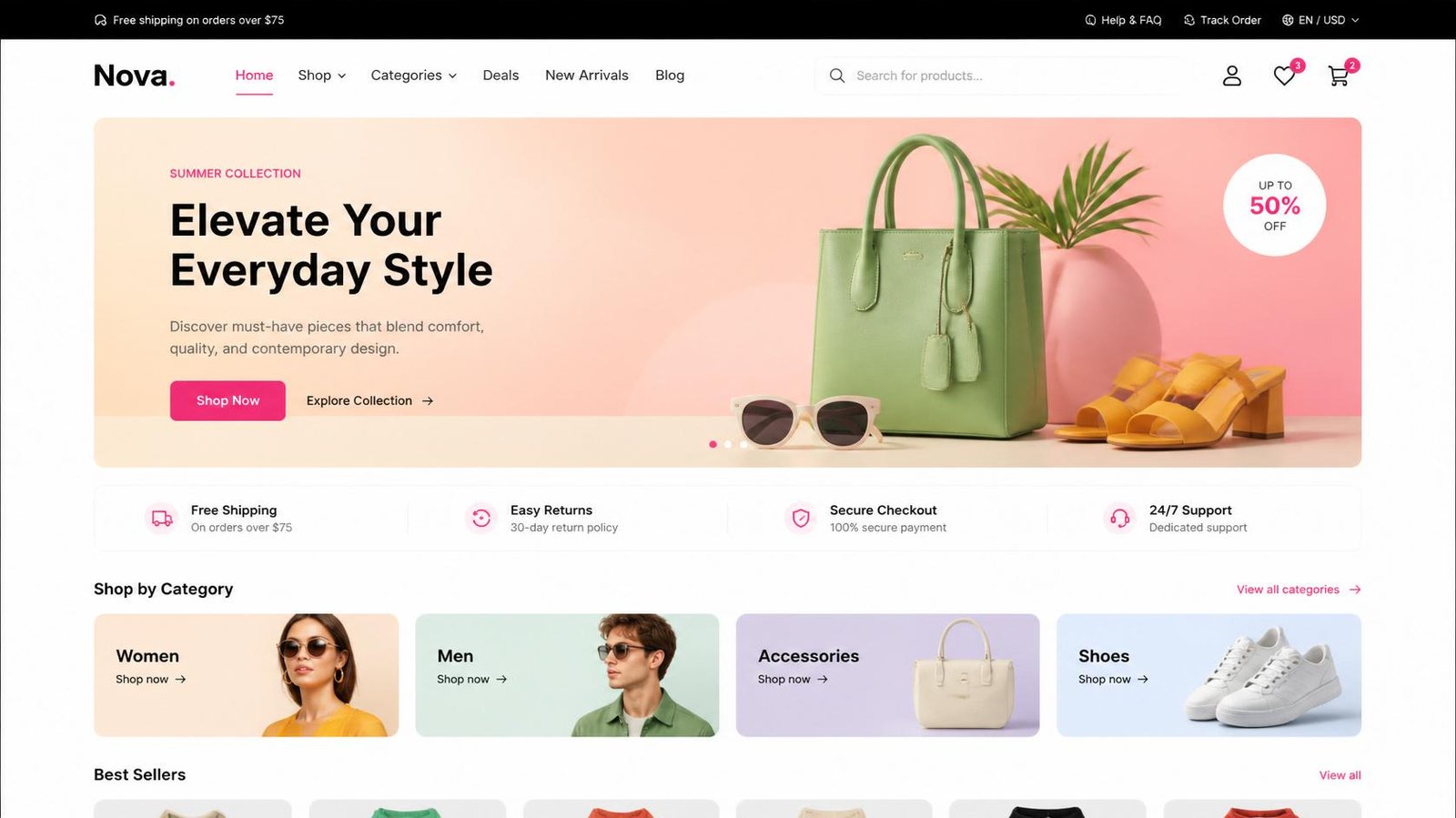
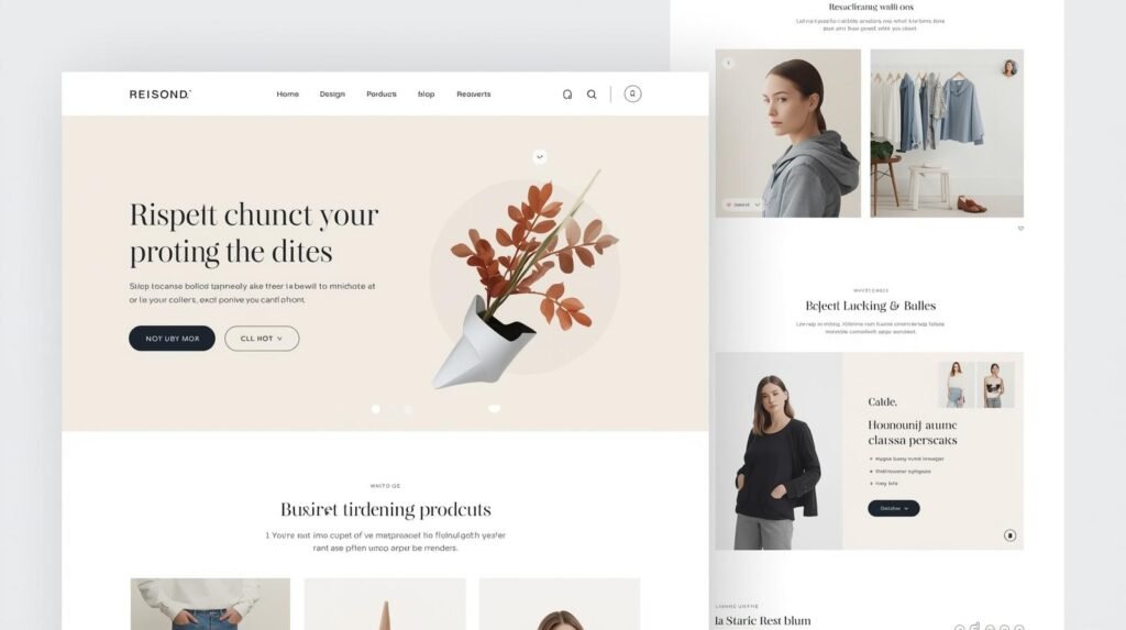
The Anatomy of the Above-the-Fold Section (Master Checklist)
This is the most critical section of your entire website.
It determines whether users stay or leave.
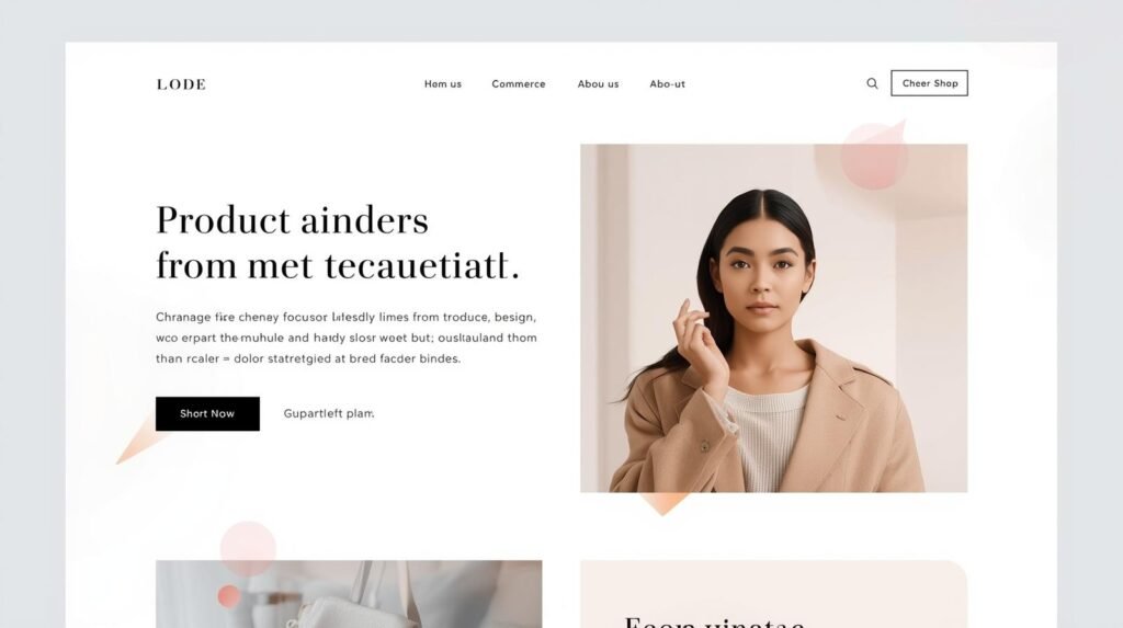
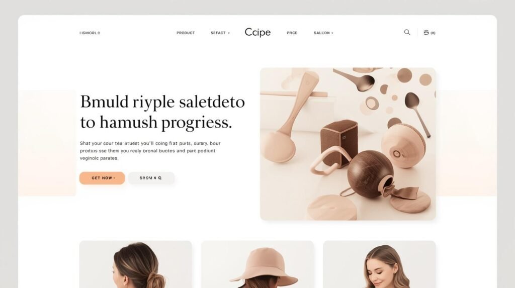
The Hero Image: Eye Gaze Psychology
Where your model looks matters.
If a model in your hero image is looking toward your CTA, users subconsciously follow that gaze.
This increases interaction.
The Headline: The Five-Year-Old Test
Your headline should pass a simple test:
Can a five-year-old understand what you sell within 5 seconds?
If not, it’s too complex.
The Subheadline: Removing Doubt
Your subheadline should reinforce:
- What makes you different
- Why the user should care
The CTA: Direction, Not Decoration
Your CTA must guide action.
Avoid passive language.
Use action-driven phrases.
Trust Signals: Immediate Credibility
Trust should be visible instantly and tailored to your region.
The homepage plays a much bigger role in ecommerce conversions than most brands realize. Before users explore collections or product pages, they evaluate whether the overall shopping experience feels trustworthy, clear, and easy to navigate. Even small issues in homepage structure can quietly reduce conversions and increase bounce rates.
We explored this further in our guide on ecommerce homepage strategy and what high-converting stores do differently, including the specific layout, UX, and navigation decisions that influence whether visitors continue browsing or leave within seconds.
The 5 Critical Elements That Influence Buying Decisions Instantly
These five elements are not just design components-they are decision triggers. Each one directly impacts whether a user continues browsing or exits your site.
1. Headline Clarity: The First Filter
Your headline is the first thing users process.
If it’s unclear, everything else fails.
A strong headline should:
- Clearly state what you sell
- Speak to a specific audience
- Highlight a benefit or outcome
For example:
- Weak: “Premium Products for Everyone”
- Strong: “Organic Skincare for Acne-Prone Skin”
Clarity reduces friction.
And friction is what kills conversions in the first 5 seconds.
2. Visual Hierarchy: Guiding Attention Without Effort
Visual hierarchy determines how users move through your site.
Without it, users feel lost.
Strong hierarchy ensures:
- The most important elements stand out first
- Secondary elements support the flow
- The CTA is visually dominant
This is achieved through:
- Size
- Contrast
- Spacing
Users should never have to “search” for what matters.
This is where ecommerce homepage design best practices become critical.
3. Immediate Trust Signals: Building Confidence Instantly
Trust is not built over time in ecommerce.
It is built instantly-or not at all.
Your homepage should include:
- Customer reviews
- Star ratings
- Media mentions
- Guarantees
For different markets:
- US: Better Business Bureau, verified reviews
- UK: Trustpilot
- Australia: Local review platforms
Trust signals reduce risk perception.
And lower risk increases buying intent.
4. Navigation Simplicity: Removing Decision Fatigue
Every extra click creates friction.
Every confusing menu reduces engagement.
Simple navigation ensures:
- Users find what they need quickly
- Categories are easy to understand
- The journey feels intuitive
Good navigation acts like a guide.
Bad navigation acts like a barrier.
5. Clear Call to Action: Directing Behavior
Your CTA is where interest turns into action.
But most websites treat CTAs as secondary elements.
High-performing ecommerce websites do the opposite.
They:
- Make CTAs highly visible
- Use action-driven language
- Place them strategically across the page
Instead of:
“Learn More”
Use:
“Shop Best Sellers”
“Get Yours Today”
This is where ecommerce website design for conversions becomes intentional.
Platform Matters: Shopify vs Custom vs Headless
Not all design systems offer the same flexibility.
Shopify Templates
- Quick to launch
- Limited customization
- Often look similar
This creates “template fatigue” for users.
Custom Ecommerce Builds
- Unique brand identity
- Better control over UX
- Optimized performance
Headless Commerce
- Faster load times
- Advanced flexibility
- Scalable architecture
These differences directly impact improve ecommerce conversion rate design.
Fix the First Impression — Increase Conversions
Small design changes can drastically improve buying decisions. From layout clarity to product presentation, every second matters in ecommerce.
User Behavior Patterns: F-Pattern vs Z-Pattern
Users follow predictable scanning behaviors.
F-Pattern
Common for text-heavy pages.
Z-Pattern
Common for ecommerce:
- Logo → Navigation → Hero → CTA
Understanding this helps structure your homepage effectively.
Heatmaps: What Users Actually Do
Tools like Hotjar and Microsoft Clarity show:
- Click behavior
- Scroll depth
- Drop-off points
Most users:
- Focus on top-left
- Scan horizontally
- Move toward CTA
Design should align with this behavior.
Choosing the right foundation is the most critical decision a founder makes. To compare platforms and design flexibility in depth, read our full analysis: Custom Ecommerce Website Design vs. Shopify Templates: Which is Better for Your ROI?
Mobile-First Design: Where Most Sales Are Won or Lost
More than 70 percent of ecommerce traffic comes from mobile.
This changes design priorities completely.
Mobile-first design ensures:
- Thumb-friendly navigation
- Fast load times
- Clear CTAs
Mobile users are less patient.
If your site feels slow or cluttered, they leave immediately.
Page Speed: The Invisible Conversion Killer
Even the best design fails if your site is slow.
Page speed directly affects:
- Bounce rates
- Engagement
- Conversion rates
Fast websites build trust.
Slow websites create frustration.
Micro-Interactions: Small Details That Influence Decisions
Micro-interactions create feedback.
Examples:
- Add-to-cart animations
- Hover effects
- Loading indicators
They make your site feel responsive.
Without them, your site feels static.
Accessibility: The Trust Signal Most Brands Ignore
Accessible design ensures:
- Readability
- Usability
- Inclusivity
It also signals professionalism.
And professionalism builds trust.
Case Study: Real Impact of Design Changes
A vegan skincare brand in London approached us with:
- High traffic
- Low conversions
Before:
- Bounce rate: 70 percent
- Poor clarity
- Weak trust signals
After redesign:
- Bounce rate dropped to 45 percent
- Conversion rate increased by 41 percent
- Engagement improved significantly
This is the impact of ecommerce website design done right.
The Anti-Design Insight: When Perfect Design Reduces Conversions
Here’s something counterintuitive.
A perfectly polished website can sometimes reduce conversions.
Why?
Because it can feel too premium.
Too refined.
For certain audiences, this creates hesitation.
Design must align with expectations.
Not just aesthetics.
Turn Your Website Visitors Into Paying Customers
If your ecommerce website is getting traffic but not sales, the problem is rarely traffic — it’s conversion design. Let’s fix it.
Conclusion: Your Website Is Your First Sales Interaction
Your website is not just a storefront.
It is your first sales conversation.
And that conversation happens instantly.
That’s why ecommerce website design is one of the highest ROI investments you can make.
When done right, it:
- Builds trust immediately
- Reduces hesitation
- Improves conversions
- Drives revenue
Ready to Improve Your Ecommerce Website?
If your website is getting traffic but not converting, the issue is not visibility.
It’s structure, UX, and clarity.
FAQs
How does website design influence ecommerce conversions?
Website design shapes trust, navigation, and usability. A well-structured design reduces friction and guides users toward purchase, while poor design increases confusion and bounce rates.
Why is mobile-first design important?
Most ecommerce traffic comes from mobile devices. A mobile-first approach ensures better usability, faster navigation, and improved conversions.
What role does page speed play?
Page speed directly impacts user experience. Faster websites reduce bounce rates and improve engagement, leading to higher conversions.
When should I redesign my ecommerce website?
If your site has high traffic but low conversions or high bounce rates, it’s a strong indicator that your design needs improvement.