
August 13, 2026

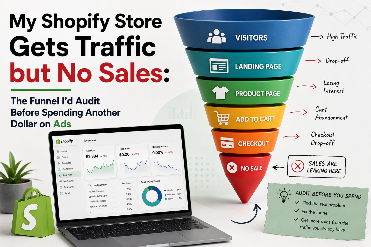
My Shopify Store Gets Traffic but No Sales: The Funnel I’d Audit Before Spending Another Dollar on Ads

Quick Answer

If your Shopify store gets traffic but few sales, I would not increase your ad budget first. I would audit the funnel from landing page to product page, cart, and checkout to identify where qualified visitors are dropping out. Ecommerce website design services can help when the problem is structural, but first separate traffic quality, product-page friction, trust gaps, cart abandonment, and checkout problems so you do not spend more money driving visitors into a broken funnel.

TL;DR: What I Would Check First

Table of Contents

  1. Why Is My Shopify Store Getting Traffic but No Sales?
  2. Problem 1: Is the Traffic Actually Reaching the Right Products?
  3. Problem 2: Does the Landing Page Match the Ad and Search Intent?
  4. Problem 3: Is the Product Page Giving Shoppers Enough Reason to Buy?
  5. Problem 4: Is the Landing Page Sending Ad Clicks to the Wrong Place?
  6. Problem 5: Are Trust Gaps Killing Purchase Intent?
  7. Problem 6: Is Cart Abandonment Hiding a Pricing or Shipping Problem?
  8. Problem 7: Is Your Shopify Checkout Creating Unnecessary Friction?
  9. Problem 8: Are Mobile UX Problems Destroying Your Conversion Rate?
  10. Problem 9: Are You Buying More Traffic Before Fixing the Funnel?
  11. Why Most Businesses Get This Wrong
  12. What This Means For Your Business
  13. Expert Insight from Kanika Gupta
  14. Example Scenario
  15. Example From Our Experience
  16. What Should You Fix First?
  17. When Does Professional Help Make Sense?
  18. Final Thoughts
  19. FAQs

Why Is My Shopify Store Getting Traffic but No Sales?

The first question is not “How do I get more traffic?” but “Where does the buying journey break?” A store can have healthy visitor numbers while still producing weak revenue if shoppers arrive with the wrong intent, land on generic pages, fail to understand the product, hesitate over trust or pricing, or encounter friction before payment.

Shopify defines online store conversion as the percentage of website visitors who make a purchase, and its own guidance emphasizes analyzing conversion alongside other store metrics rather than treating traffic as the complete picture.

That distinction matters financially. Suppose a store receives 20,000 visits per month and converts 0.8% of them. That produces 160 orders. If the same traffic eventually converts at 1.2%, the store produces 240 orders without purchasing another visitor.

That is a 50% increase in orders from the same traffic volume.

The commercial question is therefore whether your store has a traffic problem, a conversion problem, or both.

A practical diagnostic framework

What you see in analyticsMost likely area to investigateWhat I would check first
Traffic is lowSEO, PPC, targetingSearch intent, campaigns, keywords, audiences
Traffic is high but product views are weakLanding-page relevanceAd-to-page match, navigation, merchandising
Product views are strong but add-to-cart is weakProduct-page conversionValue proposition, images, price, reviews, CTA
Add-to-cart is healthy but checkout starts are weakCart experienceShipping, costs, promotions, urgency, trust
Checkout starts are strong but purchases are weakCheckout frictionPayment, form fields, errors, account requirements
Mobile traffic is strong but mobile sales are weakMobile UXSpeed, layout, sticky CTA, form usability
Everything looks reasonable but sales remain weakMeasurement or offer problemTracking, pricing, product-market fit, attribution

This is why I would resist the common reaction of immediately increasing PPC spend.

Baymard’s research currently reports a global average documented cart abandonment rate of 70.22%, based on 50 different studies. Its research also makes an important distinction: some abandonment comes from normal browsing behavior, while other abandonment is associated with fixable issues such as unexpected costs, forced account creation, trust concerns, and complicated checkout processes.

A high abandonment rate does not automatically mean your checkout is broken. It means you need to identify which part of the abandonment is commercially controllable.

What Are the First Three Problems I Would Investigate?

The first three checks should establish whether you have a traffic-quality problem, landing-page problem, or product-page conversion problem. These are upstream issues, so fixing them before obsessing over checkout can prevent you from optimizing the wrong part of the funnel.

At KG Web Designer, we approach ecommerce problems by looking at the entire buyer journey rather than treating the homepage, product page, checkout, SEO, and advertising as separate projects.

This is also where ecommerce website design services should be viewed differently from simply “getting a new website.” The goal is to identify whether the existing structure is preventing commercially valuable traffic from becoming customers.

Is Your Ecommerce Website Turning Visitors Into Customers?

A great-looking store is only the beginning. Your website needs to build trust, remove buying friction, and guide shoppers toward checkout. Let’s identify what may be costing you sales.

Find Your Conversion Gaps

👉 Get your top 3 conversion leaks identified.

1. Is the Traffic Actually Reaching the Right Products?

The first problem I would investigate is whether your traffic is arriving with an intent that your store can satisfy quickly. High visitor numbers are not particularly valuable if shoppers are landing on generic pages, irrelevant collections, discontinued products, or pages that require too much navigation before they find what the advertisement or search result promised.

This is especially important for paid traffic.

If someone searches for a specific product, clicks an ad describing that product, and lands on a generic collection or homepage, you have introduced friction before the buyer has even evaluated the product.

Google’s own Ads guidance recommends matching the landing page closely with the ad and keywords, noting that users are more likely to leave when they do not immediately find what they expected.

What I would inspect

I would compare:

  1. Search query or ad
  2. Ad headline and offer
  3. Landing page
  4. Product or collection shown
  5. Call to action
  6. Actual product availability
  7. Device used
  8. Conversion rate by campaign and landing page

The important question is not simply:

“How many people clicked?”

It is:

“Did the people who clicked arrive somewhere that made the next buying decision obvious?”

For example, imagine you are selling premium skincare.

An advertisement says:

“Vitamin C Serum for Brighter-Looking Skin”

But the visitor lands on the homepage containing a large brand image, multiple product categories, an email popup, promotional banners, and several navigation options.

The shopper now has to work to find the product they already expressed interest in.

That is not necessarily a traffic problem.

It is a funnel relevance problem.

What this means financially

If you are paying $2 per click and receive 10,000 clicks, you have already spent $20,000 on traffic.

If the landing experience causes even a portion of qualified visitors to leave before evaluating the intended product, increasing the budget simply increases the number of people entering the same inefficient journey.

This is why I would segment performance by landing page, campaign, device, product category, and customer intent before recommending additional advertising spend.

What If My Traffic Is Good but My Store Still Does Not Sell?

Good traffic does not guarantee sales because traffic quality and conversion readiness are different measurements. A visitor searching for product information, comparing prices, looking for inspiration, or casually browsing behaves differently from someone who already knows what they want and is ready to purchase.

That distinction should shape the page they see.

For example, a high-intent product search may deserve a direct product page. A broader category search may deserve a collection page. A discovery-oriented social campaign may need more education and trust-building before presenting the purchase decision.

The mistake is sending all three audiences through the same generic experience.

Ecommerce / Fashion diagnostic framework for Shopify traffic no sales

A simple traffic-quality diagnostic

Traffic behaviorWhat it may indicateWhat I would investigate
High bounce rate immediately after landingPoor relevance or weak first impressionLanding-page message and intent match
High engagement but few product viewsNavigation or merchandising problemCategory structure and internal links
Strong product views but low add-to-cartProduct-page issueOffer, value, proof, price, CTA
Strong add-to-cart but weak checkout completionCheckout/cart issueCosts, shipping, payment, friction
Strong desktop sales but weak mobile salesMobile experience problemMobile UX and technical performance
Strong traffic from one campaign but poor revenueTraffic quality issueSearch terms, audience, landing page

This is why I would not use one blended “conversion rate” to diagnose the entire business.

You need to know where the conversion rate changes.

If you are seeing the broader pattern of visitors arriving but not taking commercially valuable action, the same diagnostic principle applies beyond ecommerce. I explain that broader problem in my guide on website gets traffic but no enquiries, which looks at the relationship between traffic, relevance, trust, conversion paths, and lead generation.

2. Does the Landing Page Match the Ad and Search Intent?

The second problem is message mismatch between the traffic source and the page where shoppers arrive. If the advertisement promises a specific product, price, benefit, promotion, or category but the landing page forces the visitor to search for that information, the store creates unnecessary friction at the most expensive point in the funnel.

Google explicitly recommends that landing pages closely match the ad and keywords and that the landing page CTA should align with the action promoted in the advertisement.

This matters because paid traffic already carries an acquisition cost.

The landing page therefore has a responsibility that a normal homepage does not.

I would check these five matches

1. Message match

Does the headline on the page reinforce what the shopper clicked?

2. Product match

Is the advertised product immediately visible?

3. Offer match

If the ad says “20% off,” does the landing experience clearly explain the offer?

4. Audience match

Does the page speak to the customer segment the campaign targets?

5. Action match

Is the next action obvious?

If an ad says:

“Shop Linen Dresses Under $150”

the landing page should not make the shopper hunt through the entire catalog.

It should immediately establish that they are in the right place.

The three-second test I use

When reviewing a paid-traffic landing page, I ask:

Can someone who clicked the advertisement understand within a few seconds that they are in the right place?

If the answer is no, I would fix that before increasing spend.

That does not necessarily mean rebuilding the entire website.

Sometimes the solution is a better landing page.

Sometimes it is a stronger headline.

Sometimes it is a more relevant product collection.

Sometimes the campaign itself is attracting the wrong search intent.

The diagnosis matters more than the redesign.

Expert Insight from Kanika Gupta

Founder, KG Web Designer

“A successful ecommerce website should do more than look polished. It should make every buying decision feel simple and confident. Clear product information, strong trust signals, intuitive navigation, transparent pricing, and a frictionless checkout experience all work together to reduce hesitation. When customers can quickly understand what you offer and why they should buy from you, your website has a much better chance of turning traffic into revenue.”

What Does a Strong Landing Page Need to Communicate?

A strong ecommerce landing page should answer four questions quickly:

For higher-consideration products, there is usually a fifth:

That fifth question is where many Shopify stores become generic.

A technically attractive store can still struggle because the product presentation sounds interchangeable with dozens of competitors.

At KG Web Designer, one of the things I look for during ecommerce audits is whether the website is communicating a distinctive reason to buy or simply displaying products.

Those are not the same thing.

3. Is the Product Page Giving Shoppers Enough Reason to Buy?

The third problem is often where traffic becomes a revenue problem: the product page gets visitors, but the page does not give them enough confidence to add the product to their cart.

A product page is not simply a digital product catalog. It is the place where the shopper evaluates value, risk, suitability, quality, price, proof, delivery expectations, and the next action.

If those questions remain unanswered, the visitor may leave even when the product itself is a good fit.

What I would audit on the product page

Product-page elementQuestion I would ask
Product nameIs it immediately clear what the product is?
Main imageDoes the first image communicate the product accurately?
Product benefitsCan the shopper understand the practical value quickly?
PriceIs pricing clear without unnecessary effort?
VariantsIs choosing size, color, quantity, or configuration easy?
ReviewsIs there credible customer proof near the buying decision?
ShippingCan shoppers understand when and how the product arrives?
ReturnsCan they understand their risk before buying?
CTAIs Add to Cart visually obvious and easy to use?
Product informationAre important objections answered before checkout?

Baymard’s research is particularly relevant here because its checkout research shows that shoppers abandon for reasons that extend beyond the final payment screen, including unexpected costs, delivery concerns, trust issues, account requirements, and checkout complexity.

In other words, the product page and cart need to prepare the buyer for the transaction.

What Product-Page Problems Should I Fix Before Redesigning the Store?

I would first fix information gaps that prevent the shopper from making a confident decision. A complete redesign should come later if the existing structure itself is preventing those improvements or if multiple templates, navigation systems, and conversion paths are fundamentally weak.

For a product page, I would prioritize:

  1. Clear product value proposition
  2. Strong primary product imagery
  3. Useful secondary images or video
  4. Clear pricing
  5. Obvious purchase CTA
  6. Variant selection that is easy to understand
  7. Shipping information
  8. Return information
  9. Customer reviews or credible proof
  10. Answers to the most important product objections

This is where product page conversion becomes more than a design issue.

It is a sales issue.

If shoppers repeatedly visit a product but do not add it to their cart, I want to know what uncertainty is stopping them.

If you are considering a larger rebuild rather than isolated funnel fixes, my page covering ecommerce website design services explains the broader website design scope and where custom ecommerce structure can become commercially useful.

One Important Warning Before You Spend More on Ads

Do not interpret every low-sales Shopify store as a website-design problem.

A store can have an excellent website and still struggle because the product is poorly positioned, the pricing is uncompetitive, the offer is weak, the advertising targets the wrong audience, or the traffic has low purchase intent.

That is why the correct sequence is:

Traffic quality → Landing-page relevance → Product-page confidence → Cart → Checkout → Purchase

Only after identifying the weakest stage should you decide whether the appropriate investment is PPC, SEO, CRO, product-page improvement, or a broader redesign.

What I Would Do If This Were My Store

If this were my website, I would not increase the ad budget until I could explain exactly where qualified visitors were dropping out.

I would first compare:

Then I would fix the largest commercially meaningful leak before buying more traffic.

That approach protects the advertising budget because you are improving the economics of the traffic you already paid for.

4. Are Your Product Pages Giving Shoppers Enough Reasons to Buy?

A product page that gets visitors but fails to move them toward the cart usually has a persuasion problem, not simply a traffic problem. The shopper needs to understand what the product is, why it is worth buying, what makes it different, what it costs, when it will arrive, and what happens if it does not work for them.

For Shopify stores, I would inspect the product page before touching the ad budget. A high-intent visitor should not have to hunt for the information needed to make a purchase decision.

The first things I would inspect are:

This is where product page conversion becomes important. A visitor who has reached a product page is considerably closer to a purchase than someone browsing a homepage, so small areas of uncertainty can have a disproportionate effect on revenue.

Google’s own guidance for landing pages emphasizes relevance, useful information, clear calls to action, mobile usability, and making important information easy to find.

What should a strong Shopify product page answer?

Shopper questionWhat the page should communicate
What is this?Clear product name and description
Why should I buy it?Specific benefits and differentiators
How much is it?Clear price and applicable offer
Can I trust the product?Reviews, proof, policies and transparent information
Will it fit my needs?Specifications, sizing, ingredients, dimensions or compatibility
When will I receive it?Delivery expectations
What if I change my mind?Clear returns and refund information
How do I buy it?Obvious and friction-free add-to-cart action

One of the most common ecommerce mistakes I see is treating the product page as a catalog entry rather than a sales page.

A technically complete product description can still be commercially weak.

If the shopper has to leave the page to understand shipping, compare specifications, find reviews, or determine whether the product is right for them, the store is creating unnecessary friction at exactly the point where purchase intent is strongest.

5. Is Your Mobile Shopping Experience Quietly Losing Sales?

Your mobile experience can be the problem even when the desktop version of the store looks polished. Google specifically recommends checking mobile optimization, speed, navigation, and ease of completing the desired action because many customers access landing pages from mobile devices.

This matters particularly for Shopify stores running paid advertising. A shopper can click an ad, arrive on a product page, scroll through several sections, select a variant, and then encounter a poorly positioned purchase button, intrusive popup, difficult navigation, or a checkout experience that is uncomfortable on a small screen.

That is not an SEO problem.

It is not necessarily an advertising problem either.

It is a customer journey problem.

If this were my website, I would test the complete purchase journey on an actual phone before increasing ad spend. I would not limit the test to whether the homepage “looks responsive.”

I would start from the ad click and go all the way through checkout.

The mobile test I would run

  1. Open the exact landing page used by the campaign.
  2. Read the headline without zooming.
  3. Find the product price.
  4. Review the product images.
  5. Select a variant.
  6. Find the add-to-cart button.
  7. Add the product to the cart.
  8. Review shipping information.
  9. Start checkout.
  10. Complete the purchase using the available payment method.
  11. Repeat the process on another device if possible.

The important question is not:

“Does the website work on mobile?”

The better question is:

“How much effort does a mobile shopper have to make before they can buy?”

That distinction matters.

A store can technically pass a responsive design test while still creating enough friction to lose commercially valuable visitors.

Google also notes that landing pages should make it easy for users to perform the desired action and should not force them to hunt for information.

Ecommerce / Fashion buyer journey for Shopify traffic no sales

6. Is Cart Abandonment Actually a Checkout Problem?

Not every abandoned cart means your checkout is broken, but a consistently high abandonment rate deserves investigation. Baymard’s current research places average ecommerce cart abandonment at approximately 70.22% across the studies it tracks, while also emphasizing that some abandonment is unavoidable because shoppers browse, compare prices, or are not ready to purchase.

That distinction is important.

You should not look at a 70% abandonment figure and conclude that your store has failed. Instead, you need to identify where and why shoppers are leaving.

Baymard’s research found that 17% of online shoppers had abandoned an order because the checkout process was too complicated, while its testing also identifies excessive fields and difficult checkout interactions as recurring usability problems.

For a Shopify store, I would therefore separate abandonment into at least three groups:

BehaviorLikely issueWhat I would investigate
Product viewed but no cart activityProduct-page persuasionOffer, proof, price, UX
Product added but checkout never startedCart frictionShipping, discounts, uncertainty
Checkout started but purchase not completedCheckout frictionFields, payment, errors, trust
Purchase attempted but payment failsTechnical issuePayment gateway, errors, device
High mobile abandonmentMobile UXSpeed, buttons, forms, layout
High abandonment after shipping appearsCost/expectation mismatchShipping transparency

This is where cart abandonment needs to be analyzed as a funnel rather than a single metric.

For example, suppose your Shopify store receives 10,000 visitors.

If 500 add a product to the cart, 300 begin checkout, and 100 complete the purchase, the problem is not simply “we need more traffic.”

You already have evidence that some visitors want the product.

The question becomes why 400 people who added something to the cart did not become customers.

That is a much more valuable question to answer before spending another dollar on acquisition.

🔍
Recommended Reading

Is AI Search Changing How Your Website Gets Found?

AI Overviews and generative search are changing how people discover information online. Learn why some pages continue earning visibility while others lose clicks—and what you can do to make your content more useful, authoritative, and citation-worthy.

Discover the AI Search Rewrite Framework →

What should you check before blaming the checkout?

I would look at:

Baymard’s research also shows that checkout usability remains a significant opportunity across leading ecommerce sites, with its current benchmark finding that most sites have substantial room for improvement.

What this means financially

Suppose a store generates 300 checkout starts every month and converts 20% of them into orders.

That produces 60 orders.

If improvements to checkout and purchase friction eventually move the conversion rate to 25%, the same 300 checkout starts would produce 75 orders.

That is 15 additional orders without buying additional traffic.

The actual financial outcome depends on average order value, margin, customer acquisition cost, product category, and other factors. The point is that conversion work can sometimes create additional revenue from demand the store has already paid to acquire.

This is why I would not automatically respond to weak sales by increasing advertising spend.

A practical Shopify funnel diagnosis

StageQuestionIf performance is weak
Ad/search visitAre visitors relevant?Review targeting and traffic quality
Landing pageDoes the page match intent?Improve relevance and messaging
Product pageIs the product convincing?Improve proof, information and UX
Add to cartIs the offer compelling?Review price, variants and trust
Checkout startIs the cart clear?Remove uncertainty and friction
PaymentCan the customer complete the order?Check errors and payment options
PurchaseIs conversion tracked correctly?Audit analytics and attribution

This is the point where ecommerce conversion optimization becomes more valuable than simply generating another batch of visitors.

What I Would Check Before Spending More on Ads

The fastest way to waste an ecommerce advertising budget is to treat every sales problem as a traffic problem.

Before increasing spend, I would answer these questions:

1. Are the visitors actually relevant?

If most paid visitors have weak buying intent, the problem may be campaign targeting, keyword selection, creative, audience quality, or offer positioning.

2. Are visitors reaching the right page?

Google recommends matching the landing page closely with the ad and keyword so visitors immediately find what they expected after clicking.

3. Are product pages removing purchase objections?

If visitors reach products but rarely add them to the cart, investigate the product experience before assuming more traffic is required.

4. Are carts becoming checkouts?

If cart creation is healthy but checkout starts are weak, investigate shipping, pricing, promotions, cart UX, and purchase uncertainty.

5. Are checkouts becoming purchases?

If customers begin checkout but frequently disappear, investigate forms, payment methods, errors, delivery costs, returns information, and mobile usability.

That diagnosis gives you a much clearer answer than simply looking at overall website conversion rate.

If your store receives visitors but the broader issue is that those visitors are not turning into inquiries, purchases, or other meaningful actions, the same funnel diagnosis applies beyond ecommerce. The broader guide on website gets traffic but no enquiries explains how to distinguish a traffic problem from a conversion problem.

The important thing is to diagnose the broken stage before deciding whether the solution is SEO, paid traffic, CRO, UX work, or a larger website redesign.

Expert Insight from Kanika Gupta

A store owner will often show me a traffic graph and a sales graph and ask why the second one is not following the first.

My first reaction is usually not to look at traffic.

I want to know what the visitors did after arriving.

Did they view a product? Did they interact with variants? Did they add anything to the cart? Did they begin checkout? Did they encounter an error? Did they leave after seeing shipping costs?

Those questions tell me considerably more than total sessions.

At KG Web Designer, we have found that ecommerce performance becomes much easier to diagnose when the customer journey is broken into measurable stages rather than treated as one overall conversion rate.

A store does not necessarily need more visitors when it already has evidence of purchase intent. Sometimes it needs to stop leaking the visitors it has already paid to acquire.

If your Shopify store is already receiving meaningful traffic but sales are not keeping pace, the next step should be a funnel diagnosis rather than automatically increasing your advertising budget.

KG Web Designer can evaluate the relationship between your landing pages, product pages, mobile experience, cart, checkout, trust signals, and conversion path to identify where commercially valuable shoppers are being lost.

If your store has traffic but the revenue is not following, start by finding the leak.

What should you fix first?

My priority order would be:

  1. Traffic quality
  2. Ad-to-landing-page relevance
  3. Product-page persuasion
  4. Mobile shopping experience
  5. Cart friction
  6. Checkout usability
  7. Payment and technical issues
  8. Trust and risk reduction
  9. Analytics and conversion tracking

Do not reverse this order simply because redesigning the homepage feels more visible.

The highest-impact problem is not always the most obvious one.

For example, if paid traffic is relevant and product pages are generating strong add-to-cart activity, spending heavily on homepage design could produce little commercial improvement. Conversely, if visitors are leaving immediately because the landing page does not match the ad promise, redesigning checkout will not solve the real problem.

That is why I prefer a funnel-first diagnosis.

Kanika Gupta - Ecommerce Website Designer

18+ Years of Experience. 500+ Websites. Built for Ecommerce Growth.

I create custom ecommerce websites for founders in the US, UK, and Australia who want more than an attractive online store. Every website is designed around usability, buyer confidence, and conversions — with a focus on helping your business grow.

7. Are You Losing Buyers Because the Store Does Not Build Enough Trust?

Trust is often the missing layer when a store gets product views and even adds products to carts but struggles to turn those actions into purchases. Shoppers are being asked to exchange money and personal information with a business they may have discovered for the first time, so the website needs to answer the risks in their mind before they reach the payment stage.

This is particularly important for newer brands, higher-ticket products, skincare, supplements, fashion, electronics, and products where quality or suitability is difficult to judge from a screen.

A shopper may silently be asking:

If your website does not answer those questions, the shopper has to make a risk decision without enough evidence.

Ecommerce / Fashion trust and conversion factors for Shopify traffic no sales

What trust signals should an ecommerce store show?

Trust areaWhat shoppers need
ReviewsGenuine customer feedback relevant to the product
ReturnsClear and easy-to-find return policy
ShippingDelivery expectations and costs
Product proofDetailed photography, specifications and demonstrations
Company informationClear business identity and customer support
PaymentRecognizable and trustworthy payment options
GuaranteesOnly when the guarantee is genuinely offered
Customer supportA visible way to get help
Social proofAppropriate customer or expert validation
PoliciesClear privacy, terms and refund information

The important point is that trust should not be concentrated on one page.

A five-star review widget on the homepage cannot compensate for unclear returns information on the product page.

Similarly, a polished website cannot overcome a checkout that suddenly introduces unexpected costs.

Why does trust affect revenue?

Because ecommerce removes much of the reassurance available in a physical store.

A shopper cannot hold the product, speak directly with a salesperson, inspect the packaging, or immediately ask whether the product is right for them.

Your website therefore has to perform part of that reassurance function.

This is where ecommerce UX becomes broader than visual design. Good UX reduces uncertainty as well as clicks.

A visually attractive store can still have weak UX if the shopper has to work too hard to understand the product, assess risk, compare options, or determine what happens after payment.

8. Are Your Ads and Analytics Telling You the Truth?

Your advertising decisions are only as good as the data underneath them. If purchase tracking is incomplete, duplicate events are being recorded, or important stages of the funnel are not being measured, you can end up increasing or decreasing ad spend based on an inaccurate picture of what shoppers are actually doing.

This is one of the first areas I would investigate when a store owner says, “The ads are getting traffic, but sales do not make sense.”

Before changing the website, I would establish whether the numbers agree across the major systems.

What should you compare?

Data pointWhat to verify
SessionsIs traffic being recorded correctly?
Product viewsAre product interactions tracked?
Add to cartAre cart events firing consistently?
Checkout startedAre checkout events being captured?
PurchasesDoes reported purchase volume match actual orders?
RevenueDoes analytics revenue reconcile with the store?
Ad platform conversionsAre purchases attributed correctly?
DeviceAre mobile and desktop behaving differently?
Landing pageWhich pages generate valuable sessions?
ProductWhich products attract and convert demand?

Do not assume that the advertising platform’s reported conversion numbers automatically represent the complete commercial picture.

The numbers should be reconciled against the store’s actual orders and revenue.

What if traffic is high but online store sales remain weak?

Then I would break the problem into four questions:

Traffic: Are the visitors commercially relevant?

Intent: Are they reaching the right products?

Experience: Can they understand and trust the offer?

Transaction: Can they complete the purchase without unnecessary friction?

This prevents a common mistake: changing several parts of the website at the same time without knowing which problem was responsible for the original underperformance.

For example, if a store changes its ad targeting, homepage, product-page layout, pricing, popup strategy, checkout flow, and email sequence simultaneously, the resulting data becomes difficult to interpret.

A disciplined CRO process isolates the biggest leaks first.

9. Should You Redesign the Whole Store or Fix the Funnel?

You should redesign the whole store only when the underlying structure, user journey, content system, or technical limitations are preventing targeted improvements from producing a better customer experience. If the store is fundamentally sound, focused conversion work can often be a more rational first step.

I would use this decision framework:

SituationPriorityRecommended action
Poor-quality trafficLowFix targeting and acquisition
Good traffic, weak landing-page engagementHighImprove landing pages
Strong product views, weak add-to-cartHighImprove product pages and offer presentation
Strong add-to-cart, weak checkout startsHighInvestigate cart and purchase friction
Strong checkout starts, weak purchasesVery highAudit checkout and payment experience
Mobile significantly underperformsVery highAudit mobile UX
Tracking is unreliableCriticalFix analytics before major decisions
Multiple UX problems across the storeHighConsider strategic redesign
Strong funnel but low demandMediumFocus on acquisition
Store performs well but has isolated issuesMediumRun targeted CRO tests

This is where Shopify CRO should be approached as a business discipline rather than a collection of button-color experiments.

The objective is not to make the website “look better.”

The objective is to remove the obstacles between qualified demand and completed purchase.

Why Most Businesses Get This Wrong

Most ecommerce businesses get this wrong because they look at the easiest metric to understand: traffic.

Traffic feels tangible. A dashboard showing 50,000 monthly visitors appears impressive, while a checkout-stage problem is much harder to see.

The result is often predictable:

Sales fall → owner increases ad spend → traffic increases → more people encounter the same conversion problem → acquisition costs rise → frustration increases.

That is not growth.

It is scaling the leak.

Another common mistake is redesigning the homepage because it is the most visible part of the website.

But if 80% of your paid visitors are landing directly on product pages, a beautiful homepage may have very little influence on the immediate purchase decision.

The page that deserves attention is the page where the buyer is making the decision.

Expert Insight From Kanika Gupta

Founder, KG Web Designer | Ecommerce SEO & AI Strategy Consultant

“A successful ecommerce migration should be measured by what improves—not simply by how different the new website looks. The best migrations preserve valuable search visibility, protect customer journeys, improve site performance, and make purchasing easier. When SEO, user experience, and technology are planned together, businesses can move to a better platform without sacrificing the growth they have already built.”

What Should You Fix First?

The first priority should be the highest-value point of friction that can be supported by your data.

I would generally work through the funnel in this order:

Step 1: Verify the data

Make sure sessions, add-to-cart events, checkout starts, purchases, and revenue are being tracked correctly.

Without reliable data, you are diagnosing with incomplete information.

Step 2: Check traffic quality

Determine whether your advertising and organic visitors actually match the product, price point, geography, and buying intent.

More visitors do not automatically mean more customers.

Step 3: Audit landing pages

Check whether the page immediately delivers what the advertisement, search result, social post, or email promised.

A mismatch creates friction before the shopper even evaluates the product.

Step 4: Audit product pages

Look at product information, imagery, reviews, pricing, benefits, shipping, returns, variants, FAQs, and calls to action.

The product page should help the shopper make a decision without forcing them to search elsewhere.

Step 5: Audit cart and checkout

Look for unexpected costs, unnecessary steps, confusing fields, payment problems, mobile friction, and missing reassurance.

Baymard’s research currently reports a global average cart abandonment rate of about 70.19%, while also noting that a substantial portion of abandonment is natural browsing behavior rather than something a website can completely eliminate.

Step 6: Only then decide whether you need a redesign

A redesign should be the consequence of diagnosis, not the starting assumption.

If several critical stages are affected by outdated architecture, poor mobile UX, weak content structure, inconsistent templates, or technical limitations, a strategic redesign may make more sense than repeatedly patching individual pages.

Example Scenario

Imagine a Shopify fashion store spending $8,000 a month on paid advertising.

The store receives substantial traffic and product pages receive healthy visits. The owner assumes the advertising needs more budget because competitors appear to be getting more sales.

An audit shows something different.

Visitors are reaching the correct products. Product engagement is healthy. Add-to-cart activity is also meaningful.

The larger drop happens after shoppers begin the purchase process.

Further investigation finds that delivery information is not sufficiently visible before checkout, the mobile cart experience requires unnecessary interaction, and the checkout experience creates uncertainty around the final order total.

In this situation, increasing advertising spend would simply introduce more shoppers to the same friction.

The commercially sensible decision is to improve the purchase journey first and then reassess acquisition performance.

That is the distinction between buying more traffic and getting more value from existing traffic.

Example From Our Experience

At KG Web Designer, we frequently approach ecommerce projects by looking for the point where visitor intent stops translating into action rather than assuming the entire website is underperforming.

A typical anonymized audit pattern looks like this:

Problem: The store has healthy traffic and strong product interest, but the owner sees fewer purchases than expected.

Diagnosis: The issue is not isolated to one button or one page. Product information, trust signals, mobile interactions, and the path into checkout collectively create friction.

Solution: Instead of immediately rebuilding everything, the customer journey is mapped from acquisition through purchase. The highest-friction pages and interactions are prioritized first.

Outcome: The business gets a clearer understanding of where its existing demand is being lost and which improvements deserve investment.

I deliberately do not attach an invented percentage increase to this example. Ecommerce performance varies substantially by product category, price, traffic source, brand maturity, margins, and customer intent.

A credible website audit should distinguish observed evidence from assumptions rather than manufacture a convenient success number.

Where Does Professional Ecommerce Help Make Sense?

Professional help becomes commercially sensible when you can identify that the store has meaningful demand but cannot determine why that demand is failing to convert, or when multiple parts of the customer journey require coordinated improvement.

This is especially relevant when:

For a business at this stage, the right question is not simply, “Who can redesign my Shopify store?”

It is:

“Who can identify why my existing traffic is not producing enough commercial value, and then fix the right parts of the customer journey?”

That distinction can save a significant amount of unnecessary development and advertising spend.

If you decide that incremental CRO improvements are no longer enough and a strategic redesign is the better investment, our guide on ecommerce website design cost in 2026 breaks down the factors that affect pricing, scope, and expected outcomes. It can help you evaluate proposals with confidence and avoid comparing agencies on price alone.

Ecommerce / Fashion decision matrix for Shopify traffic no sales

A Practical Decision Matrix

If you see thisMost likely area to investigateFirst action
Low-quality visitorsAcquisitionReview targeting
Good traffic, weak engagementLanding pageImprove message match
Strong product views, weak cartsProduct experienceAudit product pages
Strong carts, weak checkout startsCart UXAudit cart
Strong checkout starts, weak purchasesCheckoutAudit payment journey
Strong desktop, weak mobileMobile UXTest complete mobile journey
Orders differ from analyticsTrackingReconcile data
Problems across most pagesSite architectureConsider redesign
Strong conversion, insufficient trafficAcquisitionScale qualified traffic
Traffic and conversion both weakStrategyDiagnose entire funnel

A decision matrix like this is more useful than a blanket recommendation to “do more SEO” or “redesign the website.”

Ecommerce Design

If the diagnosis shows that the store’s structure, templates, mobile experience, or shopping journey require broader work, Ecommerce website design services can address the website as a complete conversion system rather than treating each page as an isolated design task.

The important distinction is that the redesign should be based on the funnel diagnosis, customer behavior, product requirements, and business goals rather than simply replacing the existing theme.

Before deciding that your Shopify store needs a complete redesign, it is worth benchmarking the experience against ecommerce stores that handle discovery, product evaluation, trust, and purchasing particularly well. Our analysis of 15 of the best ecommerce website designs in 2026 looks at patterns across fashion, beauty, electronics, and direct-to-consumer brands. The goal is not to copy their visual styles, but to identify the UX and conversion principles your store may be missing.

How Much Should You Invest in Fixing the Store?

The right investment depends on the size of the revenue opportunity and the depth of the problem, not simply the number of pages in the store.

A focused product-page or checkout improvement may require a relatively small intervention. A store with structural UX problems, poor mobile architecture, fragmented templates, weak content, and technical limitations may justify a larger redesign.

The decision should therefore be based on questions such as:

That gives you a business case instead of a design quote in isolation.

And if the primary issue is that shoppers are not being guided clearly through the page, the guide on visual hierarchy in ecommerce design explains how layout and information priority can influence the path toward purchase.

Final Thoughts

A Shopify store that gets traffic but does not generate enough sales does not automatically need more traffic.

It needs a diagnosis.

Start by separating acquisition from conversion. Then identify whether the largest problem occurs between the ad and landing page, landing page and product, product and cart, cart and checkout, or checkout and payment.

Baymard’s ongoing research demonstrates why checkout deserves particular attention: its current benchmark reports that 65% of the ecommerce sites it evaluates have mediocre or worse checkout UX, while its research indicates that checkout design can represent a meaningful conversion opportunity.

My approach at KG Web Designer is straightforward:

Do not spend more money sending shoppers into a funnel you have not diagnosed.

Fix the highest-value leak first.

Then measure.

Then scale what works.

If your store is getting traffic but the sales are not following, this is the point where a conversion-focused ecommerce review can help you determine whether you need better traffic, better UX, better product pages, better checkout, or a complete website strategy.

If this were my store, I would audit the funnel before increasing the advertising budget.

Author Insight

Kanika Gupta, Founder, KG Web Designer

My strongest ecommerce recommendation is simple: never confuse more visitors with a healthier business.

A store can have impressive traffic numbers and still have a weak commercial engine.

The better question is always where qualified intent is being lost.

That is the difference between designing an ecommerce website that looks successful and building one that is structured to support actual business growth.

Not Sure What Your Ecommerce Website Needs?

Let’s spend 30 minutes looking at your website, identifying the biggest conversion opportunities, and discussing what could help turn more visitors into customers.

Book Your Free 30-Minute Call →

Frequently Asked Questions

Should I increase my Shopify ad budget if my store gets traffic but few sales?

Not before diagnosing the conversion funnel. If the traffic is relevant but visitors are dropping between product view, add-to-cart, checkout, and purchase, increasing ad spend can simply increase the number of people encountering the same problem. First identify the largest funnel leak, fix it, and then reassess whether additional traffic is commercially justified.

How do I know whether my Shopify store has a conversion problem?

Look at the complete funnel rather than only the overall conversion rate. Compare traffic quality, product views, add-to-cart activity, checkout starts, purchases, and revenue. If qualified visitors are reaching products but very few progress toward purchase, investigate product-page persuasion, trust, mobile UX, cart friction, checkout usability, and payment issues.

Is cart abandonment always caused by poor website design?

No. Cart abandonment is partly normal shopping behavior. Baymard’s 2025 research found that 42% of US online shoppers surveyed had abandoned a cart because they were just browsing or were not ready to buy. However, Baymard also finds that checkout usability problems can cause abandonment, so businesses should separate natural abandonment from friction they can realistically improve.

Should I redesign my Shopify store or optimize the existing website?

Optimize first when the store has a sound structure and the problem is concentrated in identifiable parts of the funnel. Consider a redesign when problems are widespread across mobile UX, information architecture, templates, product discovery, performance, content, or checkout-related interactions. A redesign should follow diagnosis rather than replace diagnosis.

What should I fix first on an ecommerce website that gets traffic but no sales?

Start with measurement and traffic quality, then examine landing-page relevance, product-page conversion, mobile UX, cart behavior, checkout, payment issues, and trust signals. The highest-priority fix is the stage where commercially relevant visitors are dropping at the greatest rate.

How much can better checkout UX improve ecommerce conversion?

There is no universal percentage that applies to every store. Baymard reports that its research indicates an average large-scale ecommerce site could potentially achieve a 35% conversion-rate increase through checkout usability improvements, but that is a research-based potential estimate, not a guaranteed result for an individual Shopify store.

Do I need CRO or a complete ecommerce redesign?

You need CRO when the store has a fundamentally usable structure but measurable friction is preventing more visitors from progressing through the funnel. A redesign becomes more appropriate when the underlying architecture or experience makes targeted optimization difficult. The right choice depends on evidence from analytics, user behavior, technical constraints, and business goals.

Ready to Find the Leak?

If your Shopify store is generating traffic but the revenue is not matching the opportunity, do not start by buying another batch of visitors.

Start with the funnel.

KG Web Designer can help identify where shoppers are dropping out and whether the right solution is conversion optimization, UX improvement, product-page restructuring, checkout work, or a broader ecommerce redesign.

Request a conversion-focused website review