
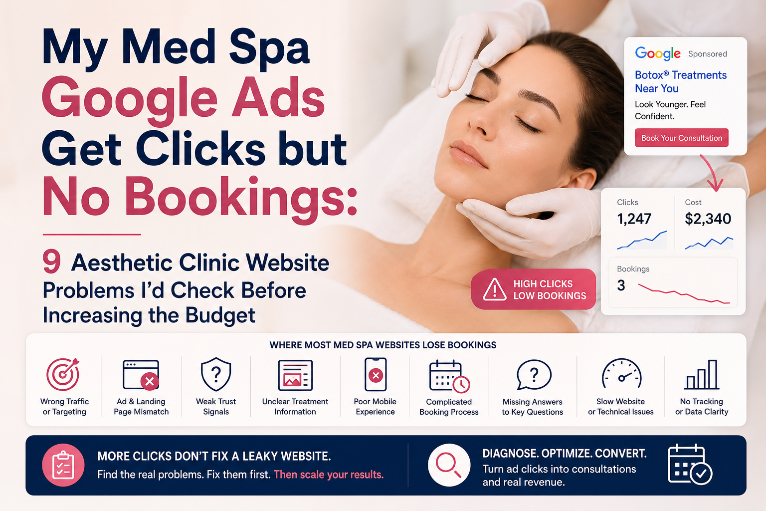
If your med spa Google Ads are generating clicks but few bookings, I would not increase the budget until I know where the conversion journey is breaking. Check search intent, ad-to-page relevance, treatment-page clarity, trust signals, mobile UX, calls to action, booking friction, and conversion tracking first. Aesthetic clinic website design services can help when the underlying problem is structural, but a redesign is not the answer if the campaign is simply attracting the wrong visitors.
The first job is not to generate more clicks. It is to determine whether the clicks you already paid for are reaching a website capable of converting them.
Ask:
Are qualified people clicking the ads and then failing to book, or are the ads attracting people who were never likely to book in the first place?
Those are two completely different problems.
If the second problem exists, rebuilding the website may not solve it. If the first problem exists, increasing the PPC budget can simply increase the amount of money being lost at the website level.
The first thing I would investigate is traffic quality, because a website cannot convert visitors who have the wrong intent.
A med spa may advertise a treatment while attracting searches from people looking for prices, general information, DIY advice, employment opportunities, training courses, or services the clinic does not actually provide. Those visitors can click, browse, and leave without booking even when the website itself is perfectly functional.
Google’s current documentation makes the same distinction from an advertising-quality perspective. Quality Score is a diagnostic tool based on expected click-through rate, ad relevance, and landing-page experience. Google specifically recommends using those components to identify whether the opportunity lies in the ads, keywords, or landing page.
That means the first audit should not start with colors, fonts, animations, or a new homepage.
It should start with the search term → ad → landing page → booking sequence.
| What you see in Google Ads | What it may indicate | What I would inspect first |
|---|---|---|
| Low impressions | Targeting, budget, demand, or competition issue | Campaign setup and search demand |
| Impressions but few clicks | Ad/message problem | Keywords, ad copy, offer |
| Many clicks but short visits | Intent or landing-page mismatch | Search terms and landing page |
| Good engagement but few bookings | Conversion problem | Trust, CTA, offer, booking flow |
| Strong treatment-page visits but no action | Decision friction | Proof, FAQs, pricing expectations, CTA |
| Bookings begin but are abandoned | Booking friction | Scheduling form and mobile flow |
| Bookings occur but are poor quality | Targeting or positioning problem | Search terms and qualification |
Standalone insight: More paid traffic does not automatically solve a conversion problem. If the existing traffic is relevant but the website is losing visitors, increasing the budget can scale the leakage rather than the bookings.
Premium treatments need a website that communicates expertise, trust, and value before a patient ever contacts your clinic. A strategic aesthetic clinic website can help attract better-fit patients and turn more visits into consultation enquiries.
Explore Aesthetic Clinic Website Design →The correct answer depends on where the patient journey is breaking, not on which marketing channel you happen to be spending the most money on.
| Problem | Likely priority | Why |
|---|---|---|
| Wrong searches triggering ads | PPC | More traffic will not fix poor intent |
| Relevant searches but weak ad relevance | PPC | The message needs better alignment |
| Relevant clicks but wrong landing page | CRO / website | The visitor is not seeing what the ad promised |
| Good traffic but weak trust | CRO / website | The patient needs more confidence before acting |
| Strong pages but difficult booking process | CRO | Friction is occurring at the point of action |
| Poor mobile experience | Website / CRO | Mobile visitors may struggle to evaluate or book |
| Weak organic visibility | SEO | More qualified search demand may be needed |
| Outdated site structure across treatments | Website redesign | The problem is broader than one landing page |
| No reliable conversion tracking | Analytics first | You cannot diagnose what you cannot measure |
Google recommends matching landing pages closely to the ad and keywords and making the landing page reflect the action promised by the ad. It also notes that users are more likely to leave when they cannot quickly find what they expected after clicking.
That distinction matters commercially.
If someone searches for a specific treatment and the ad promises that treatment, sending them to a generic homepage forces the visitor to repeat the research process. Every extra decision creates another opportunity for the visitor to leave.

The most important website problems are usually not dramatic technical failures. They are small points of friction that collectively make a visitor less certain about taking the next step.
At KG Web Designer, I would look at the complete journey rather than reviewing the homepage in isolation. A med spa website has to answer several questions quickly: What treatment is this? Is this clinic credible? Is this treatment appropriate for me? What happens next? Can I book without unnecessary effort?
The nine problems below are therefore best treated as a diagnostic framework, not a checklist for automatically ordering a redesign.
A landing page should make the visitor feel that they have arrived at exactly the place the advertisement promised.
This is one of the first things I would check because Google itself recommends that the landing page closely match the ad and keywords. Its guidance also emphasizes matching the landing-page call to action with the action communicated in the ad.
For example, imagine a visitor searches:
“Botox consultation near me”
The ad promotes Botox consultations, but the click opens the clinic’s homepage with a large lifestyle photograph, a generic headline, navigation for ten different treatments, and no obvious consultation path.
Nothing is technically broken.
But the visitor has been given another research task.
Standalone insight: A paid landing page should reduce the amount of decision-making required after the click, not send the visitor back into a general website navigation journey.
This is also where med spa consultations should be treated as a specific conversion journey rather than simply another website contact form.
If the visitor has already expressed treatment-level intent through the search, the landing page should acknowledge that intent immediately.
A treatment landing page should answer the visitor’s most important questions before asking for a booking.
That means the page needs more than a treatment name and a “Book Now” button. A prospective patient may want to understand who performs the treatment, what the treatment is designed to address, what the consultation involves, what questions they should ask, what preparation may be required, and what makes the clinic credible.
This is where treatment page UX becomes commercially important.
The objective is not to overwhelm visitors with medical or cosmetic information. It is to remove uncertainty at the moments when uncertainty is most likely to stop the booking.
The exact content will vary by treatment and jurisdiction, and claims about outcomes should be handled carefully. For a clinic website, credibility comes from accurate information and transparent expectations, not exaggerated promises.
This is one reason I would not judge a med spa website solely by its visual appearance. A beautiful page can still perform poorly if the information architecture does not support the patient’s decision.
“When patients are considering a premium treatment, the website has to do more than display prices. It needs to explain the treatment, communicate its value, answer common concerns, and build trust. Clinics that provide this clarity give patients a stronger reason to enquire based on value—not simply price.”
Trust is often the hidden variable between a click and a booking.
A visitor who already knows the clinic may need very little reassurance. A new visitor arriving from a paid advertisement has no established relationship with the business. The website therefore has to answer the question behind the booking decision:
“Why should I trust this clinic with my treatment?”
That trust may come from practitioner information, qualifications, clinic imagery, transparent treatment information, relevant reviews where appropriate, clear contact details, professional presentation, policies, and consistent branding.
The important point is that these signals should appear where the patient needs them, not be buried on an About page.
Google’s people-first content guidance also emphasizes original information, clear expertise, trustworthiness, first-hand experience, and making it clear who created the content.
That matters particularly for health-related businesses because the website is not simply selling a commodity. It is helping someone decide whether they feel comfortable taking a treatment-related next step.
Before you increase your Google Ads budget, open your campaign’s top-performing search terms and follow each one through the entire journey.
Search → Ad → Landing Page → Treatment Information → Trust → CTA → Booking
If you cannot explain why a qualified visitor should move from one stage to the next, the problem deserves investigation before additional traffic is purchased.
At this stage, I would also compare the website against the broader principle of a website gets traffic but no enquiries. The issue may not be lack of visibility at all. It may be that the website is receiving attention without creating enough confidence or momentum for the visitor to act.
The first thing I would check is whether the clicks are coming from people who are genuinely looking for the treatments you offer. A high click-through rate does not necessarily mean high-intent traffic.
The second check is message consistency. If the ad promotes a specific treatment, result, location, or consultation, the landing page should immediately confirm that same promise rather than forcing visitors to search through the website.
The third issue is usually trust. Prospective patients may need to see treatment information, practitioner credentials, realistic expectations, safety information, reviews, before-and-after evidence where appropriate, and clear answers to common concerns before they are comfortable booking.
Yes, and this is one of the first problems I would investigate when a med spa is paying for clicks but not seeing bookings.
Google itself emphasizes that landing page relevance and usefulness are part of Google Ads’ Quality Score, and recommends matching the landing page closely with the ad and keyword intent.
A common mistake is sending every paid visitor to the homepage.
For example, an ad for “Botox consultation near me” should not necessarily send someone to a generic homepage containing every treatment, location, promotion, and team member. The visitor has already told you what they want. Your landing page should immediately confirm that they are in the right place.
A stronger structure would be:
| Ad intent | Recommended landing page | Primary CTA |
|---|---|---|
| Botox | Botox treatment page | Book a Botox consultation |
| Dermal fillers | Filler treatment page | Schedule a consultation |
| Acne treatment | Acne treatment page | Request an appointment |
| Laser treatment | Specific laser page | Book a consultation |
| General aesthetic clinic | Dedicated consultation landing page | Book consultation |
This is particularly important for treatment page UX because paid visitors often arrive with a very specific treatment or concern already in mind.
At KG Web Designer, I would inspect the complete path rather than reviewing the landing page in isolation:
Search query → Ad → Landing page → Treatment information → Trust → CTA → Booking system
If one step breaks the expectation created by the previous step, the campaign can generate clicks without producing enough appointments.
Usually, the problem is not that the website lacks trust signals. It is that the signals appear too late, are too generic, or are disconnected from the treatment the visitor is considering.
Aesthetic patients are making a personal decision involving appearance, money, safety, and expectations. They need more than a polished photograph and a “Book Now” button.
They may want to know:
A strong clinic website answers these questions before the visitor has to search elsewhere.
Extractable fact: A booking CTA is more persuasive when the page has already reduced the visitor’s uncertainty about the treatment, practitioner, clinic, and next step.
This is where patient trust becomes a conversion issue rather than simply a branding issue.
Your trust signals should appear at several points in the journey:
Above the fold
Practitioner credibility, treatment relevance, location, and a clear next action.
Within the treatment page
Treatment explanation, suitability, process, expected results, safety information, and practitioner association.
Near the CTA
Reviews, credentials, consultation expectations, location, and a clear explanation of what happens next.
On the booking page
Simple scheduling instructions, available appointment information, contact options, and reassurance about what information is required.
This approach also supports the broader authority strategy discussed in our guide on how AI search evaluates aesthetic clinics. AI systems and patients have different ways of processing information, but both benefit from clear evidence of expertise, consistent clinic information, and well-structured treatment content.
“A high-converting clinic website is not necessarily the most visually impressive one. It is the one that gives patients enough confidence to take the next step. Clear treatment information, genuine expertise, patient-focused content, and strong trust signals can make the difference between a website that gets visitors and one that generates consultations.”
Yes, and this is one of the easiest problems to overlook because the website itself may appear to be working perfectly.
A visitor can be convinced by the advertisement, landing page, treatment information, reviews, and practitioner credentials, then abandon the process when the booking experience becomes complicated.
Look at the booking journey from the perspective of someone using a phone.
If the visitor has to:
you have introduced friction at the most commercially important moment.
Baymard’s extensive usability research consistently demonstrates that form complexity and unclear field requirements can create significant usability problems, particularly on mobile. While its research focuses on ecommerce rather than medical appointments, the underlying form-usability principles are directly relevant when evaluating appointment forms.
For a med spa, I would specifically test:
| Booking element | What I would check |
|---|---|
| CTA | Is “Book Consultation” immediately visible? |
| Mobile experience | Can the entire process be completed comfortably on a phone? |
| Form length | Are only necessary details requested? |
| Appointment types | Are treatment options understandable? |
| Availability | Can the visitor easily see available times? |
| Errors | Are validation messages obvious and useful? |
| Confirmation | Does the user know the booking succeeded? |
| Follow-up | Does the clinic have a clear next-step process? |
One particularly important distinction is between interest and commitment.
Someone clicking an ad has expressed interest.
Someone completing a booking has demonstrated commercial intent.
Your website should make that transition as easy as possible.
No, and I would not recommend treating every paid visitor as though they have identical intent.
A person searching “Botox near me” is different from someone searching “best treatment for acne scars.” Someone searching for a specific procedure may already understand the treatment, while another visitor may still be researching options.
The landing experience should reflect that difference.

A useful framework is:
| Visitor intent | What the page should emphasize |
|---|---|
| Treatment-specific | Procedure details and suitability |
| Problem-specific | Education and treatment options |
| Brand-specific | Practitioner and clinic credibility |
| Location-specific | Location, accessibility, and local trust |
| Consultation-specific | Consultation process and booking |
| Price-sensitive | Value, expectations, and pricing context |
This is also why increasing the advertising budget too early can make the problem worse.
If a campaign currently generates 500 clicks and the website struggles to convert those visitors, buying 1,000 clicks simply gives you more of the same problem.
The first question should be:
“Where does the visitor stop?”
Not:
“How can we buy more visitors?”
The priority should be determined by where the funnel is failing, not by which marketing service is easiest to purchase.
I would use this sequence:
1. Verify traffic quality
Are people searching for the treatments and services you actually want to sell?
2. Verify landing-page relevance
Does the page immediately match the search query and advertisement?
3. Verify trust
Can the visitor understand who provides the treatment and why they should consider the clinic?
4. Verify offer clarity
Is the visitor clear about what happens during the consultation and what they should do next?
5. Verify booking UX
Can someone complete the appointment process quickly on a mobile device?
6. Only then increase traffic
Once the conversion path is functioning properly, additional qualified traffic has a much better chance of producing commercial value.
This is also where med spa lead generation should be evaluated differently from simply measuring clicks, impressions, and cost per click.
The commercial metric is not:
“How many people clicked?”
It is closer to:
“How many qualified prospective patients entered the funnel, completed the intended action, and ultimately became valuable patients?”
Imagine a med spa running Google Ads for a high-value injectable treatment.
The campaign receives consistent impressions and clicks. The advertising dashboard looks healthy, but appointment bookings remain disappointing.
The owner assumes the answer is to increase the budget.
I would inspect the landing page first.
Suppose the advertisement promises a consultation for the specific treatment, but the visitor lands on a generic page containing 20 different procedures. The visitor then has to find the treatment, understand whether they are suitable, identify the practitioner, locate reviews, and eventually discover the booking button.
The advertising campaign may not be the fundamental problem.
The website journey is asking the visitor to do too much work.
A dedicated landing page could instead establish:
Treatment → suitability → practitioner → evidence → expectations → consultation → booking
That is a much stronger commercial journey.
The biggest mistake is making a major marketing decision before identifying the actual failure point.
Avoid these five reactions:
More traffic does not fix a weak conversion path.
A complete redesign may be unnecessary if only one treatment landing page or booking step is causing the problem.
Organic search visibility and paid advertising are different acquisition channels. If qualified Google Ads visitors reach the website but fail to book, the first investigation should include landing-page relevance and conversion UX.
The goal is not simply to make an aesthetic website look more premium. The treatment pages, proof, calls to action, navigation and booking journey all need to work together. Understanding why some aesthetic clinic websites convert better provides a useful framework for evaluating where visitors may be dropping out.
A homepage is usually an introduction to the clinic, not the ideal destination for every treatment-specific advertisement.
Clicks indicate interest in the advertisement. They do not prove that the website successfully converted that interest into a consultation.
Google specifically recommends examining connected metrics such as ad relevance, landing-page experience, conversion rate, and engagement rather than treating Quality Score or clicks as the complete performance picture.
Most med spas get this wrong because advertising and website strategy are often treated as separate projects.
The PPC specialist focuses on generating clicks.
The website designer focuses on appearance.
The SEO specialist focuses on rankings.
The booking software handles appointments.
But the patient experiences none of those departments separately.
They experience one continuous journey.
Search → Advertisement → Website → Treatment → Trust → Consultation → Booking
If any part of that journey contradicts the previous step, conversion can suffer.
This is why a beautiful website can still produce disappointing results from paid traffic.
It may have excellent photography, sophisticated typography, animations, and strong branding, but those features do not automatically answer the questions a prospective patient has before booking.
The better approach is to design the website around the decision the visitor is trying to make.
For aesthetic practices, that usually means reducing uncertainty before asking for commitment.

It means your Google Ads budget should not be evaluated independently from your website.
A $5,000 advertising budget can be difficult to justify if the website consistently loses qualified visitors before they book. Conversely, a well-structured website can make the same acquisition investment more productive because more of the traffic has a clear path toward consultation.
At KG Web Designer, I look at this as a message-to-booking alignment problem.
The ad makes a promise.
The landing page must continue that promise.
The treatment page must substantiate it.
The trust signals must support it.
The CTA must make the next step obvious.
The booking system must complete the journey without unnecessary friction.
If those elements work together, paid traffic becomes much easier to evaluate commercially.
My strongest recommendation is simple: do not increase the advertising budget until you know exactly where the existing traffic is being lost.
If this were my website, I would personally go through the entire journey as a first-time patient before changing the campaign.
I would search the exact keyword, click the advertisement, inspect the landing page on my phone, read the treatment information, look for practitioner credentials, review the booking CTA, and attempt to schedule an appointment.
I would also test the process with someone who has never seen the website.
If that person hesitates at the same point repeatedly, you have found a much more useful diagnostic signal than another increase in ad spend.
At KG Web Designer, this is the type of thinking I bring to conversion-focused website projects. The question is not simply whether the website looks premium. The question is whether the website removes enough uncertainty for the right visitor to take the next commercial step.
Your website is often the first experience a potential patient has with your brand. Make sure it communicates expertise, premium care, trust, and value while making it easy for the right patients to take the next step.
Problem: Aesthetic and skincare businesses can have strong visual branding but still leave important information fragmented across treatment pages, practitioner information, trust sections, and consultation pathways.
Solution: In projects such as Taruj, the approach was not treated as a cosmetic redesign alone. The work focused on information architecture, clearer user journeys, stronger content hierarchy, treatment-focused information, and improved presentation of trust signals. The published case study provides the project context and design approach.
Outcome: The key lesson was that a clinic website becomes more useful when treatment information, expertise, trust, and next actions are connected rather than presented as isolated sections.
You can see the approach in the Taruj skincare website redesign case study.
This is also why I would not approach every underperforming med spa campaign with the same solution. Sometimes the campaign is the problem. Sometimes the landing page is the problem. Sometimes the booking journey is the problem. The correct answer comes from diagnosis.
Professional help makes sense when the problem crosses multiple parts of the patient acquisition journey and internal teams cannot confidently identify the bottleneck.
You should consider a strategic website review if:
For clinics at this stage, aesthetic clinic website design services should not be treated as simply a visual redesign package.
The objective should be to align advertising intent, landing pages, treatment information, trust, UX, and booking behavior.
That distinction matters when you are evaluating agencies or designers. Ask them to explain how they would diagnose the conversion problem, not simply how they would make the website look better.
If your med spa is already paying for Google Ads but the website is not turning enough of those clicks into consultations, the next step should be diagnosis rather than more traffic.
KG Web Designer can review the relationship between your advertising message, landing pages, treatment content, trust signals, mobile UX, and booking journey to identify where the conversion path is breaking.
Instead of increasing your ad budget blindly, identify what is stopping qualified visitors from booking.
Request a Website Strategy Review
The correct investment depends on the evidence.
| What you are seeing | Most likely priority | What to investigate |
|---|---|---|
| Few impressions | SEO / PPC | Search demand, targeting, keywords |
| Many irrelevant clicks | PPC | Search terms and targeting |
| Relevant clicks, weak engagement | CRO / landing page | Message match and page relevance |
| Strong engagement, few bookings | CRO / redesign | Trust, CTA, treatment content, booking UX |
| Strong organic visibility, weak conversions | CRO / website | Conversion journey |
| Weak local visibility | Local SEO | Google Business Profile and local signals |
| Strong website, weak ad relevance | PPC | Campaign structure and messaging |
| Strong traffic and conversion, low volume | SEO / PPC | Qualified traffic acquisition |
| Poor mobile experience | CRO / redesign | Mobile navigation and booking |
| Broken booking process | UX / development | Scheduling workflow |
This is the decision framework I would use before approving a larger marketing budget. If the diagnosis points toward a website redesign rather than an isolated campaign problem, the investment should be evaluated against the clinic’s treatment range, booking requirements, content needs and conversion goals. A detailed aesthetic clinic website design cost guide can help frame that decision before committing to a project.
Getting clicks without bookings does not automatically mean your Google Ads campaign is failing.
It means the complete acquisition journey needs to be examined.
Start with traffic quality. Then check ad-to-page relevance, treatment-page clarity, trust, mobile experience, CTA visibility, and booking friction. Only after those elements are working should you decide whether additional PPC, SEO, CRO, or a broader redesign is justified.
The goal is not simply to generate more visitors.
The goal is to turn the right visitors into qualified consultations.
For a med spa competing in markets such as New York, London, Sydney, Toronto, Singapore, or Dubai, that distinction can determine whether additional marketing spend becomes growth or simply produces a larger volume of unconverted clicks.
If your website is already receiving paid traffic and you want to know whether the problem is advertising, landing-page strategy, conversion UX, or the website itself, request a conversion-focused website assessment rather than increasing the budget first.
“Aesthetic patients are not simply looking for the lowest price. They want confidence in the practitioner, treatment quality, safety, and expected outcomes. Your website should communicate that value before asking visitors to make a booking decision. When patients understand why your clinic is different, price becomes part of the conversation—not the entire conversation.”
A strong aesthetic clinic website should guide visitors from initial interest to informed action. Our article Why Some Aesthetic Clinic Websites Convert Better (and How to Structure Yours) explores how treatment pages, trust signals, patient journeys, and conversion-focused website structure can work together to generate more qualified consultation enquiries.

Google Ads clicks without bookings usually indicate a problem somewhere after the click. Common causes include irrelevant traffic, weak ad-to-landing-page alignment, insufficient treatment information, limited trust signals, unclear calls to action, poor mobile UX, or a complicated booking process. Review the entire journey before assuming that increasing ad spend will solve the problem.
No, not automatically. First determine whether existing visitors are qualified and whether the website gives them a clear path to booking. If relevant visitors are reaching the correct treatment page but abandoning before scheduling, improving the landing page, trust signals, CTA, or booking UX may be more valuable than purchasing additional traffic.
A treatment-specific advertisement should generally lead to a highly relevant landing page rather than a generic homepage. Google recommends aligning landing-page content with the user’s search and the advertisement. For example, an ad for a specific injectable treatment should take visitors directly to information about that treatment and its consultation pathway.
Look at the problem location. If relevant people cannot find your business, investigate SEO and local search. If qualified visitors arrive but do not engage or book, investigate conversion UX and website structure. If both visibility and conversion are weak, a coordinated SEO and website strategy may be appropriate.
A strong landing page should match the advertisement, explain the relevant treatment or concern, establish practitioner and clinic credibility, address important patient questions, provide appropriate trust signals, explain the consultation process, and make the booking action obvious. The page should also work comfortably on mobile because many paid visitors will encounter it on a phone.
Mobile UX can be critical because appointment decisions often happen during short browsing sessions rather than deliberate desktop research. Forms, buttons, navigation, and scheduling interfaces need to remain easy to understand and operate on a small screen. Usability research consistently shows that mobile form design can create friction when fields, labels, and interactions are unnecessarily complicated.
Not necessarily. A full redesign should follow diagnosis rather than replace it. If the problem is isolated to a few landing pages, treatment pages, calls to action, or the booking system, targeted conversion improvements may be enough. A broader redesign makes more sense when the website has structural problems across messaging, UX, content, trust, mobile experience, and conversion pathways.