
July 20, 2026

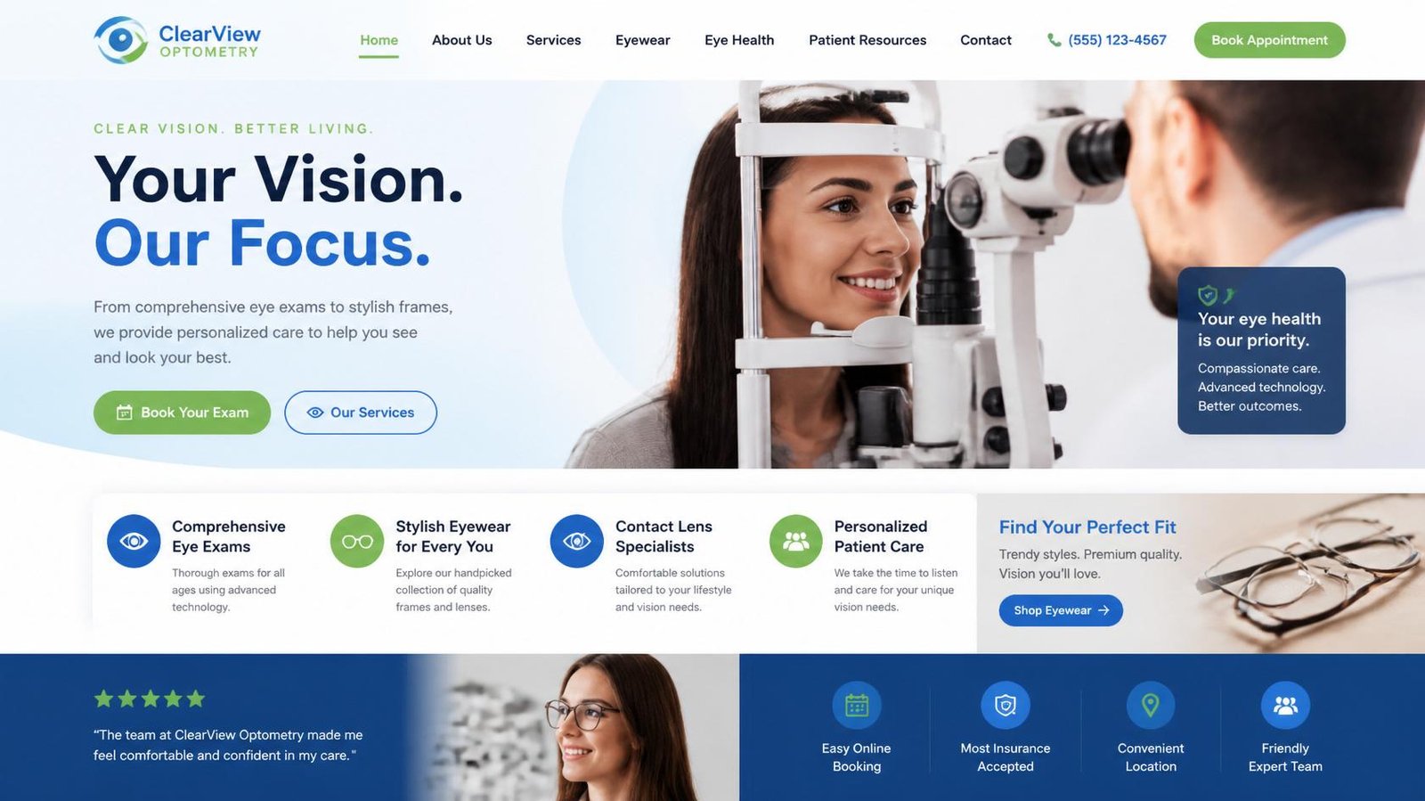
12 Best Optometry Website Design Examples in 2026: We Analyzed Leading Clinics Across the US, UK & Australia

Quick Answer

The best optometry website design examples in 2026 share one characteristic: they make it incredibly easy for patients to trust the practice and book an appointment. After analyzing leading optometry providers, eye hospitals, and vision care brands across the United States, United Kingdom, Australia, and Europe, we found that the highest-performing websites consistently prioritize patient experience, mobile usability, clear trust signals, and friction-free online booking over flashy visual effects.

TL;DR

Buyer Intent

Buyer JourneyDetails
Buyer StageConsideration → Decision
Who This Article Is ForPractice owners, clinic managers, and healthcare decision-makers planning a new website or redesign
Primary QuestionsWhich websites perform best? What makes patients trust them? Which design elements increase appointment requests?
Common ConcernsHiring the wrong agency, poor ROI, outdated technology, losing Google rankings
Proof Buyers NeedReal website examples, healthcare expertise, strategic analysis, and a proven design process

How We Evaluated These Websites

Rather than selecting websites based on appearance alone, we reviewed each example using the same patient-focused evaluation framework. Our goal was to identify design decisions that improve usability, strengthen trust, and support business growth.

We evaluated websites across six areas that directly influence whether a visitor becomes a patient.

Evaluation AreaWhy It Matters
First ImpressionPatients often decide whether to stay or leave within the first few seconds.
Appointment BookingSimple scheduling reduces friction and encourages more completed bookings.
Mobile ExperienceMost patients begin searching for eye care providers on mobile devices.
Trust & CredibilityDoctor profiles, reviews, certifications, and clear contact information increase confidence.
Navigation & Information ArchitecturePatients should quickly find services, insurance details, and clinic locations.
Accessibility & PerformanceFast-loading, accessible websites create a better experience for every visitor.

Our observations are based on publicly accessible website features, healthcare UX best practices, and established usability guidance from organizations such as Baymard Institute and Google’s web performance documentation.

Audit Summary of the 12 Websites

Before looking at each website individually, here’s a high-level comparison of the design patterns we observed.

WebsiteBooking ExperienceTrust SignalsMobile UXEducational ContentOverall Impression
Warby ParkerExcellentExcellentExcellentGoodExcellent
MyEyeDr.ExcellentExcellentExcellentExcellentExcellent
Vision SourceVery GoodExcellentVery GoodExcellentExcellent
SpecsaversExcellentExcellentExcellentVery GoodExcellent
Bailey NelsonVery GoodVery GoodExcellentGoodVery Good
Jimmy FairlyVery GoodGoodExcellentGoodVery Good
LensCraftersExcellentVery GoodExcellentGoodExcellent
Cleveland Clinic Cole Eye InstituteExcellentOutstandingVery GoodOutstandingExcellent
Bascom Palmer Eye InstituteVery GoodOutstandingVery GoodOutstandingExcellent
Wills Eye HospitalVery GoodOutstandingVery GoodOutstandingExcellent
NVISION Eye CentersExcellentExcellentExcellentVery GoodExcellent
EyeCare PartnersVery GoodExcellentVery GoodGoodVery Good

This comparison isn’t intended to rank one organization above another. Instead, it highlights the strengths that modern optometry practices can learn from when planning a website redesign.

Are Patients Leaving Your Eye Clinic Website Without Booking?

If your website isn’t converting visitors into appointments, the problem is usually trust, clarity, and booking flow. Discover how a conversion-focused optometrist website can increase patient enquiries.

Why Do Some Optometry Websites Generate More Patient Bookings?

The answer is surprisingly simple: successful websites remove uncertainty.

Patients aren’t looking for award-winning animations or complicated interactions. They’re trying to answer practical questions:

The websites that answer these questions quickly are far more likely to convert visitors into patients.

One consistent observation from our review is that leading eye care organizations prioritize clarity over creativity. Navigation is intuitive, appointment booking is always visible, and important information is never hidden behind multiple clicks.

Expert Insight from Kanika Gupta

“When we audit healthcare websites, we rarely find that poor visual design is the biggest problem. More often, clinics lose potential patients because the website creates unnecessary hesitation. Visitors can’t immediately find the right service, insurance information is buried, appointment buttons are difficult to locate, or the site simply doesn’t build enough confidence. Great healthcare websites reduce uncertainty before they ask patients to take action.”

Kanika Gupta
Founder, KG Web Designer

Original Observation from KG Web Designer

Based on our reviews of healthcare and eye clinic websites, practices often invest heavily in branding while overlooking patient decision-making. The highest-performing websites consistently make booking appointments, understanding services, and evaluating provider credibility effortless. These practical improvements typically have a greater impact on patient acquisition than visual redesigns alone.

Why This Matters for Practice Growth

A modern website is no longer just a marketing asset. For many practices, it’s the first interaction a prospective patient has with the clinic, and that first impression directly influences whether an appointment is booked.

At KG Web Designer, we specialize in creating conversion-focused websites for healthcare practices, professional service firms, manufacturers, and growing businesses. Our approach combines user experience, SEO, accessibility, and strategic messaging to help businesses attract more qualified inquiries instead of simply generating website traffic.

In the sections ahead, we’ll examine each website individually, highlighting what it does exceptionally well, where there’s room for improvement, and the practical lessons independent optometry practices can apply to build a stronger online presence.

Which Optometry Website Design Stand out in 2026?

The best websites don’t simply look professional. They make patients feel confident enough to schedule an appointment. During our review, we noticed that leading practices consistently simplify navigation, highlight trust signals, and remove friction from the booking process. Below are four websites that set a high standard for modern optometry and eye care websites.

1. Warby Parker (United States)

Image

Warby Parker has built one of the strongest digital experiences in the vision care industry by combining ecommerce with professional eye care services. The transition between shopping for eyewear and booking an eye exam feels seamless, helping visitors accomplish their goals without confusion.

What They Do Well

Room for Improvement

Because the website serves both retail customers and patients, the homepage occasionally presents multiple competing actions. Visitors looking exclusively for eye care services may need an extra moment to distinguish between shopping and clinical appointments.

Business Lesson

Patients appreciate simplicity. Independent practices should ensure that booking an appointment is always more prominent than secondary content or promotional offers.

2. MyEyeDr. (United States)

MyEyeDr. demonstrates how a multi-location healthcare provider can create a consistent and reassuring online experience. The website focuses on helping visitors quickly locate nearby practices, understand accepted insurance plans, and schedule appointments.

What They Do Well

Room for Improvement

Some pages contain a significant amount of content, which can make scanning slightly more difficult on mobile devices. Shorter content blocks and stronger visual hierarchy could improve readability even further.

Business Lesson

Reducing uncertainty increases conversions. Making insurance acceptance, office locations, and appointment availability easy to find helps patients make faster decisions.

3. Vision Source (United States)

Vision Source supports a large network of independent optometrists, and its website reflects that mission exceptionally well. Instead of overwhelming visitors with promotional messaging, the experience focuses on helping patients connect with trusted local providers.

What They Do Well

Room for Improvement

The homepage introduces multiple navigation paths for different visitor types. A more prominent primary call-to-action could help first-time visitors immediately identify the next step.

Business Lesson

Patients value convenience. If someone can locate a nearby provider within seconds, they’re significantly more likely to continue the booking journey.

4. Specsavers (United Kingdom & Australia)

Image

Specsavers serves millions of customers across the UK, Australia, New Zealand, and several European markets. Its website demonstrates how large healthcare brands can maintain consistency while supporting multiple regions, services, and retail offerings.

What They Do Well

Room for Improvement

The homepage promotes several services, offers, and products simultaneously. While appropriate for a large retail brand, smaller independent practices should avoid competing messages and keep appointment booking as the primary focus.

Business Lesson

Large organizations prove that consistency builds trust. Independent clinics don’t need enterprise-sized budgets, but they do need clear messaging, intuitive navigation, and a patient-first booking experience.

Turn Patient Trust Into More Appointments

Patients don’t just compare clinics — they compare clarity, professionalism, and ease of booking. A well-designed eye clinic website builds confidence before they even call.

Original Observation from KG Web Designer

One pattern became obvious during our review: the strongest websites don’t ask visitors to “learn more” repeatedly. Instead, they answer the patient’s biggest questions immediately-Who will treat me? What services are available? Can I book online? Where is the clinic? The fewer unanswered questions a patient has, the more likely they are to schedule an appointment.

Example From Our Experience

At KG Web Designer, we’ve reviewed healthcare websites where clinics invested in modern visuals but still struggled to generate online appointments. The common issue wasn’t design quality-it was decision friction. Appointment buttons were difficult to find, insurance details were buried, and service pages answered too few patient questions.

If your website receives traffic but appointment requests remain inconsistent, our guide on Why Patients Leave Eye Clinic Websites Without Booking explains the most common reasons prospective patients abandon healthcare websites before scheduling an appointment.

5. Bailey Nelson (Australia & Canada)

Image

Bailey Nelson has established itself as a premium eyewear and optometry brand across Australia, New Zealand, and Canada. Its website reflects a clean, contemporary aesthetic while making eye care services easy to discover alongside its retail offerings.

What They Do Well

Room for Improvement

The website leans heavily toward showcasing eyewear collections, which may occasionally overshadow clinical services. Independent optometry practices should ensure healthcare services remain the primary focus rather than secondary to retail products.

Business Lesson

Premium design should reinforce trust, not distract from it. A clean visual identity combined with straightforward booking creates a professional first impression without overwhelming visitors.

6. Jimmy Fairly (France)

Image

Jimmy Fairly demonstrates how modern European brands blend lifestyle branding with excellent user experience. Although primarily known for eyewear, the website offers valuable lessons in simplicity, typography, and visual storytelling.

What They Do Well

Room for Improvement

Visitors specifically searching for eye examinations or clinical services may need additional navigation before finding relevant information. Healthcare-focused practices should make patient services more prominent than lifestyle messaging.

Business Lesson

Beautiful design attracts attention, but clarity earns trust. Patients should never have to search for essential information such as appointments, services, or provider details.

7. LensCrafters (United States & Canada)

Image

LensCrafters has successfully integrated ecommerce and professional eye care into one cohesive digital experience. Visitors can browse eyewear, locate nearby stores, verify services, and schedule eye exams without feeling like they’re switching between different websites.

What They Do Well

Room for Improvement

Because the website serves multiple customer journeys, promotional offers occasionally compete with healthcare messaging. Independent clinics can benefit from maintaining a more singular focus on patient acquisition.

Business Lesson

Every page should guide visitors toward their primary objective. Reducing competing calls to action often improves conversion rates for healthcare websites.

8. Cleveland Clinic Cole Eye Institute (United States)

Image

Cleveland Clinic’s Cole Eye Institute demonstrates how complex healthcare information can be presented in a structured, patient-friendly way. Rather than relying on promotional messaging, the website builds confidence through expertise, physician profiles, educational resources, and intuitive navigation.

What They Do Well

Room for Improvement

The breadth of available information can feel overwhelming for first-time visitors. A more personalized patient journey based on common eye conditions could make navigation even easier for users unfamiliar with medical terminology.

Business Lesson

Authority is built through education and transparency. Patients are more likely to book appointments when they clearly understand available treatments, physician expertise, and what to expect during their visit.

Expert Insight from Kanika Gupta

“One misconception we often encounter is that independent clinics can’t compete with large healthcare organizations online. In reality, patients aren’t comparing marketing budgets-they’re comparing experiences. A smaller practice with intuitive navigation, authentic trust signals, and a seamless booking process can often deliver a stronger user experience than a much larger institution with a more complex website.”
Kanika Gupta, Founder, KG Web Designer

The Successful Websites

Large healthcare organizations like Cleveland Clinic and Specsavers have dedicated digital teams and substantial resources, but independent practices don’t need enterprise-level budgets to create the same level of patient confidence. The principles behind these successful websites-clear navigation, visible trust signals, educational content, and friction-free appointment booking-can be implemented by practices of any size.

At KG Web Designer, we provide optometry website design services that combine user experience, SEO, accessibility, and conversion strategy to help clinics attract more qualified appointment requests and build lasting patient trust.

9. Bascom Palmer Eye Institute (United States)

Image

Bascom Palmer Eye Institute has earned an international reputation for ophthalmology, and its website reflects that expertise through a patient-centered information architecture. Rather than relying on marketing-heavy messaging, the site emphasizes education, physician expertise, and clear treatment pathways.

What They Do Well

Room for Improvement

Patients seeking routine eye care may initially encounter highly specialized medical content before finding general services. Independent practices should organize information based on patient intent rather than medical complexity.

Business Lesson

Patients trust practices that educate them. Well-structured service pages and physician profiles build confidence long before an appointment request is submitted.

10. Wills Eye Hospital (United States)

Image

Wills Eye Hospital demonstrates how a long-established healthcare institution can maintain authority while delivering an accessible digital experience. The website successfully balances clinical information, research, education, and patient services.

What They Do Well

Room for Improvement

The homepage contains numerous navigation choices that may feel overwhelming for first-time visitors. Simplifying primary patient journeys could further improve usability.

Business Lesson

More information doesn’t always create better experiences. Guiding visitors toward the most common actions often improves conversion rates.

11. NVISION Eye Centers (United States)

Image

NVISION Eye Centers focuses heavily on conversion while maintaining patient trust. Its website demonstrates how healthcare providers can encourage consultations without appearing overly promotional.

What They Do Well

Room for Improvement

Some service pages include several conversion elements competing for attention. Simplifying calls to action around a single next step could improve clarity.

Business Lesson

Effective healthcare marketing is about reducing patient hesitation rather than increasing sales pressure. Clear messaging supported by educational content creates more confident decision-making.

12. EyeCare Partners (United States)

EyeCare Partners operates an extensive network of eye care practices, making its website an excellent example of managing multiple brands while maintaining consistency. Visitors can quickly locate providers, learn about services, and access relevant patient information.

What They Do Well

Room for Improvement

Because the organization represents numerous practices, some patient journeys require additional clicks before reaching individual clinic information. Smaller practices have an advantage because they can create a more direct and personalized experience.

Business Lesson

Independent clinics don’t need to imitate large healthcare networks. Instead, they should leverage their ability to provide a simpler, more personal digital experience.

What Do the Best Websites Have in Common?

Although these 12 organizations differ in size, geography, and specialties, the same design principles appeared consistently throughout our review.

8 Features Every High-Performing Optometry Website Shares

  1. A clear appointment booking button visible above the fold.
  2. Mobile-first navigation that works effortlessly on every device.
  3. Comprehensive doctor profiles that establish credibility.
  4. Service pages written for patients rather than medical professionals.
  5. Educational resources that answer common eye care questions.
  6. Strong trust signals including reviews, certifications, and affiliations.
  7. Fast-loading pages with simple navigation.
  8. Consistent branding that reinforces professionalism.

These aren’t simply design trends. They improve patient confidence, reduce abandonment, and encourage more appointment requests.

Original Observation from KG Web Designer

After reviewing these websites, one insight became clear: the highest-performing practices don’t ask patients to search for answers. They anticipate questions before they’re asked. Whether it’s insurance information, physician expertise, clinic locations, or appointment availability, successful websites present the right information at the right moment. That proactive approach builds trust and reduces decision friction.

Example Scenario

Imagine two independent optometry practices serving the same city.

The first website has attractive visuals but hides appointment booking beneath several menu layers, offers limited service information, and provides little reassurance about the doctors.

The second website immediately introduces the optometrists, explains available treatments in plain language, highlights accepted insurance, answers common patient questions, and keeps online scheduling visible throughout the website.

Even if both practices provide outstanding clinical care, the second website is far more likely to convert visitors into patients because it removes uncertainty at every stage of the decision-making process.

Why Most Optometry Practices Get This Wrong

Many clinics believe that redesigning their homepage is enough to improve patient acquisition. In reality, patients evaluate the entire digital experience-from the speed of the website to how easily they can find services, understand treatment options, and schedule appointments.

Some of the most common issues we encounter during website reviews include:

Choosing the right platform is equally important. If you’re deciding between a website builder and a custom solution, our comparison of Wix vs Squarespace vs Custom Websites for Optometrist Website Design explains the long-term differences in SEO, scalability, performance, and flexibility.

What This Means for Your Practice

Studying successful websites is valuable, but copying their design isn’t the goal. The real opportunity lies in understanding why these websites perform well and adapting those principles to your own practice.

Whether it’s a global brand like Specsavers or a respected institution like Wills Eye Hospital, every successful website shares the same objective: making it easy for patients to trust the practice and take the next step.

At KG Web Designer, we’ve found that practices investing in strategic planning before visual design consistently achieve better long-term results. A successful ophthalmology website design or optometry website isn’t measured by how modern it looks. It’s measured by how effectively it turns visitors into booked appointments.

If you’re planning a redesign, ask yourself these questions:

If the answer to several of these questions is “no,” your website is likely creating unnecessary friction that affects patient acquisition.

Example From Our Experience

One independent eye care practice approached KG Web Designer after investing in a visually appealing website that wasn’t generating consistent appointment requests. The homepage looked modern, but visitors struggled to locate services, doctor information, and the online booking option.

Instead of starting with a complete redesign, we first reviewed the patient journey and identified several usability issues. We simplified the navigation, improved service page structure, made appointment booking consistently visible, and strengthened trust signals throughout the website.

The result wasn’t just a cleaner website. It created a smoother decision-making experience that better aligned with what prospective patients expected when choosing an eye care provider.

One lesson we repeatedly see is that improving usability often delivers greater business value than introducing more animations, visual effects, or complex layouts.

Final Thoughts

The best optometry website design examples aren’t successful because they’re visually impressive, they’re successful because they make patient decisions easier.

Across all twelve websites we reviewed, one principle remained consistent: trust is built through clarity, not complexity. Patients want to understand your services, meet your doctors, verify practical information, and schedule an appointment without unnecessary obstacles.

That’s why the most effective websites focus on usability before aesthetics.

At KG Web Designer, we help healthcare providers build websites that combine thoughtful strategy, exceptional user experience, SEO, accessibility, and conversion optimization. Whether you’re launching a new practice or redesigning an existing website, our goal is to create a digital experience that supports sustainable patient growth-not just a beautiful homepage.

If you’re ready to build a website that works as hard as your practice does, we’d love to discuss your goals.

Ready to Get More Patient Bookings From Your Website?

If your current website is not converting visitors into appointments, it’s time to fix the experience. I help optometrists and eye clinics build websites that drive real patient enquiries.

We work with healthcare practices across the United States, United Kingdom, Australia, Canada, Singapore, and the UAE through a fully remote, collaborative design process.

Frequently Asked Questions

What makes a successful optometry website in 2026?

A successful optometry website combines clear navigation, mobile-first design, visible appointment booking, authentic trust signals, and educational content that answers patient questions. The goal is to reduce uncertainty and make scheduling an appointment as straightforward as possible.

How much should an optometry website cost?

Pricing depends on the number of locations, custom functionality, integrations, content requirements, and SEO strategy. Rather than focusing only on upfront cost, practice owners should evaluate long-term value, scalability, and the website’s ability to generate new patient inquiries.

Why is mobile-first design so important?

Most prospective patients begin researching healthcare providers on their phones. A responsive website with fast loading times and intuitive navigation creates a better user experience while also supporting search engine visibility.

Should my website include online appointment booking?

Yes. Online booking has become an expected feature for modern healthcare websites. Patients increasingly prefer scheduling appointments at their convenience instead of calling during office hours. Making booking accessible from every major page reduces friction and improves conversions.

How often should an optometry practice redesign its website?

Most practices should review their website every three to five years. However, declining appointment requests, outdated technology, poor mobile performance, or changing business goals may justify a redesign sooner.

What’s the difference between a website builder and a custom website?

Website builders can be suitable for smaller practices with simple requirements. However, clinics planning long-term growth often benefit from custom optometry website development, which provides greater flexibility, stronger SEO capabilities, improved performance, and easier integration with third-party systems.

Can a better website actually increase patient bookings?

A website alone won’t grow a practice, but it plays a significant role in the patient acquisition process. Reducing friction, improving trust, and simplifying appointment scheduling help more visitors become patients instead of leaving to compare other clinics.