Customers don’t read product pages, they scan them.
To convert, your page must deliver:
If any of these are missing, users hesitate and hesitation kills conversions.
A high-converting ecommerce product page design is structured to guide users through four key stages: clarity, trust, validation, and action. When customers instantly understand the product, see proof it works, feel reassured about risk, and can purchase without friction, conversions increase significantly.
Your product page has 0.05 seconds to make an impression.
That’s faster than a blink.
In that micro-moment, your layout is doing the talking your sales team can’t.
A customer in New York compares you with three competitors.
A London shopper scrolls quickly looking for proof.
A Sydney buyer checks your page on mobile during a commute.
They don’t analyze your page.
They scan it.
And within seconds, they decide:
If your page doesn’t answer these instantly, they leave.
That’s why ecommerce product page design is not about visuals-it’s about structuring decisions.

If visitors leave before exploring your products, your design, speed, or messaging may be costing you revenue. See how high-converting ecommerce websites are built.
Most brands invest heavily in homepage design.
But conversions don’t happen there.
They happen on product pages.
Your product page is where:
This is where ecommerce website design for higher sales becomes measurable.
A weak product page wastes traffic.
A strong one multiplies revenue.
A high-performing ecommerce product page design is not created through visual preference-it is engineered through decision psychology.
Every element on the page must serve a purpose.
When a customer lands on your product page, they are not reading-they are scanning for signals. Signals that tell them: “This is right for me” or “Keep looking.”
That’s why structure matters more than design aesthetics.
A conversion-focused layout follows a predictable behavioral flow:
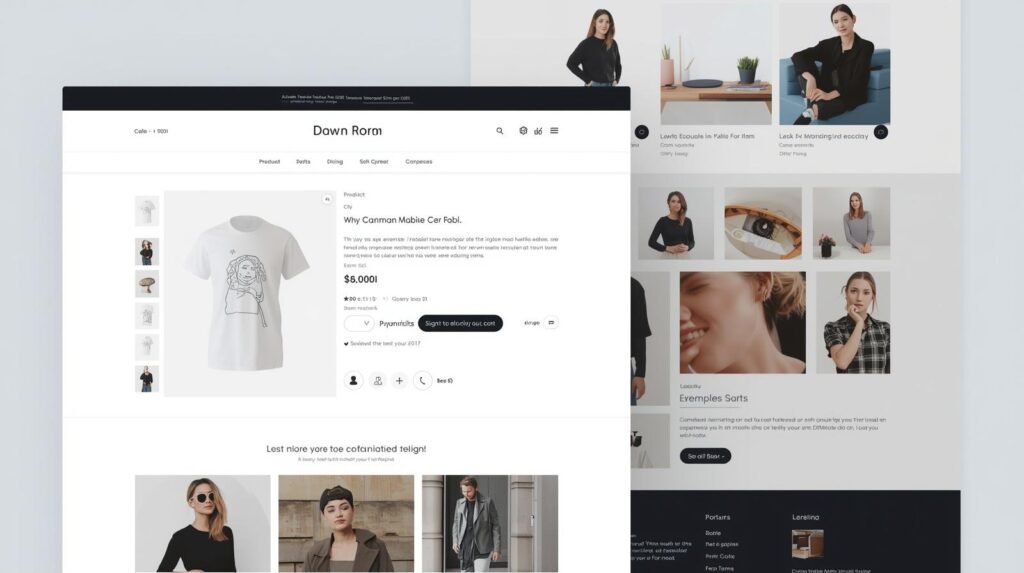
1. Immediate clarity (Above-the-fold)
Within the first few seconds, users must understand exactly what the product is, who it’s for, and why it matters. This includes a strong headline, clear product imagery, and a visible price point.
2. Visual validation (Images + video)
Once interest is established, users look for proof through visuals. This is where high-quality images, lifestyle shots, and short-form product videos reduce uncertainty.
3. Trust reinforcement (Social proof + guarantees)
Before committing, users actively search for reassurance. Reviews, ratings, testimonials, and return policies must be positioned strategically-not hidden below.
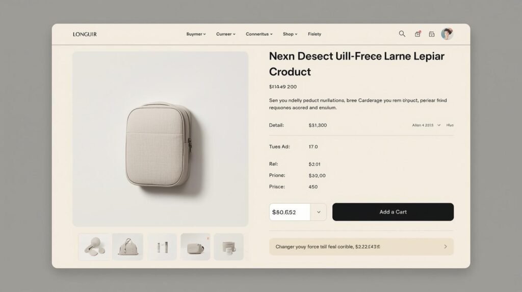
4. Frictionless action (CTA + purchase flow)
Finally, the transition from interest to action must feel effortless. The “Buy Now” button, payment options, and checkout cues should be immediate and intuitive.
In my experience designing 400+ websites, the biggest mistake brands make is treating product pages as informational pages instead of decision environments.
The brands that convert consistently are the ones that structure their pages around how customers actually decide-not how brands want to present.
Customers don’t buy because of features.
They buy when uncertainty disappears.
This includes:
This is where high-converting product page design becomes critical.
The goal is simple:
Remove doubt faster than competitors.
But here’s the part most brands underestimate those decisions don’t take minutes, they happen in seconds. In fact, customers often decide whether to stay or leave before they even scroll.
We’ve broken this down in detail in our analysis of how ecommerce website design influences buying decisions in the first 5 seconds, including the exact visual and structural triggers that determine whether a visitor engages or exits.
The first screen must answer:
This is where product page layout for conversions plays a critical role.
If users need to scroll to understand, you’ve already lost them.
Images alone are no longer enough.
In 2026, high-performing product pages include:
Expert Insight:
According to recent UX studies, users spend significantly more time on product pages that include video compared to static-only layouts.
Video reduces uncertainty.
It shows real usage.
It builds trust faster than text ever can.
Price is not the problem.
Unclear value is.
Your page must:
Customers are not asking “Is this expensive?”
They’re asking “Is this worth it?”
Trust is visual and immediate.
High-performing pages include:
Without proof, users hesitate.
The CTA is not just a button.
It’s a decision trigger.
This is where buy now button optimization ecommerce becomes critical.
But here’s what most brands miss:
The space around the button matters just as much.
High-converting pages include reassurance directly near the CTA:
For UK and AU markets, adding:
reduces friction significantly.
Conversion doesn’t happen because of the button.
It happens because hesitation is removed.
Descriptions should not describe.
They should sell.
Strong descriptions:
Clarity builds confidence.
Most ecommerce traffic is mobile.
But here’s what’s often ignored:
Accessibility.
A truly high-performing page must follow product page UX design best practices, including:
Accessibility is not just compliance-it’s conversion.
An inclusive design builds trust.
Small design changes can drastically improve buying decisions. From layout clarity to product presentation, every second matters in ecommerce.
| Element | Weak Page | High-Converting Page | Why It Works |
|---|---|---|---|
| Messaging | Generic | Clear | Reduces confusion |
| Images | Static | Interactive | Builds trust |
| Trust | Hidden | Visible | Reduces risk |
| CTA | Isolated | Supported | Removes hesitation |
| UX | Complex | Guided | Improves flow |
Design cannot perform if speed fails.
Conversion rate follows a simple formula:
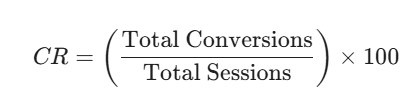
Even small delays impact this.
For every 100ms delay, conversions can drop significantly.
High-performing pages optimize:
Speed builds trust.
Slow pages kill intent.
A premium organic skincare brand in London approached us with:
The issue wasn’t the product.
It was the page experience.
Before:
After redesign:
Within 60 days:
This is the impact of ecommerce conversion-focused website design.
Conversion is not just visual.
It’s behavioral.
Every scroll, click, and pause matters.
We’ve explored how UX impacts buying behavior and conversion performance in ecommerce environments:
Micro-interactions increase engagement.
This includes:
They provide feedback.
They reassure users.
They keep attention.
Friction kills conversions.
Common issues include:
High-performing pages simplify everything.
Clarity increases confidence.
A weak product page doesn’t just reduce sales.
It wastes acquisition spend.
You get:
A strong product page multiplies results.
If your ecommerce website is getting traffic but not sales, the problem is rarely traffic — it’s conversion design. Let’s fix it.
Your product page is not just content.
It is your most important sales system.
It works 24/7.
It influences every buying decision.
That’s why ecommerce product page design is critical for growth.
Brands that scale are not always the ones with better products.
They are the ones that:
If your product pages are getting traffic but not converting, the issue is not visibility.
It is structure, trust, and user experience.
Available across US, UK & AU time zones · Fully remote · No commitment required
“We redesigned our product pages and saw a measurable increase in qualified sales within weeks. The difference wasn’t design-it was clarity and structure.”
— Founder, Skincare Brand (London)
A high-converting product page clearly communicates value, builds trust through proof, and removes friction. It answers key questions instantly and guides users toward purchase without hesitation.
Product page design influences how users perceive value and trust. A well-structured page improves clarity, reduces hesitation, and increases the likelihood of purchase.
Key reassurance elements should be placed near the CTA, including free shipping, secure checkout, return policies, and payment options. These reduce last-second hesitation.
Most users browse and shop on mobile. A mobile-first design ensures better usability, faster navigation, and higher conversions.
If your product pages have strong traffic but low conversions, unclear messaging, or poor mobile performance, it is time to redesign.