In 2026, trust is the real currency for CA firms online. Prospects don’t only compare fees or locations — they compare confidence. A client visiting a CA firm’s website is usually carrying one of two emotions: urgency (a deadline is near) or uncertainty (they don’t want a costly compliance mistake).
That’s why CA website design is no longer just about looking “professional.” Your website must communicate reliability, clarity, and process — fast. If it doesn’t, high-quality prospects will quietly move on to the next firm that feels easier to trust.
This blog explains what CA firms must include on their website to win trust in 2026 — with practical examples, a checklist, and a comparison between template vs custom sites. You’ll also find ready-to-use tables and downloadable graphics.
A few years ago, a CA firm could rely mostly on referrals and a basic web presence. Today, even referrals validate you online before they call. Decision-making has changed:
The website has become the first audit of your firm.
A strong chartered accountant website reduces perceived risk. A weak one increases it — even if your actual work quality is excellent.
The trust pillars every CA website must cover
Think of trust like a structure. When prospects visit, they subconsciously assess:
If any pillar is missing, hesitation grows — and hesitation kills conversions.
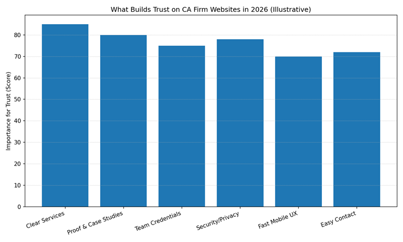
This chart visualises the most important trust drivers (illustrative scoring based on typical buyer behaviour): clear services, proof/case studies, team credentials, security/privacy, fast mobile UX, and easy contact.
Most CA firm websites have a “Services” page with bullet points. That’s not enough in 2026.
A high-trust CA website design requires dedicated service pages so visitors can validate relevance quickly.
What “clear service pages” must include
For each major service (example: GST, ITR, Audit, ROC, TDS, Advisory), create a page that covers:
Why this builds trust
Because clients don’t want to “talk to understand.” They want to understand enough to talk.
This is where accounting firm website design often fails — it assumes clients will call for details. High-value clients don’t. They compare websites first.
Clients hesitate when they don’t know what will happen next.
A strong CA website should clearly answer:
Best practice: show the process in 4–6 steps
Example flow:
This isn’t “marketing.” It’s risk reduction.
Your About page should not be a life story. It should be a trust page.
Must-have credibility elements
Why this matters for chartered accountant websites
Clients evaluate CAs like they evaluate legal and medical professionals: they look for competence signals. If your website hides people behind generic copy, trust drops.
Testimonials are helpful, but in 2026 the format matters.
High-trust proof formats
Example mini case structure:
Even 3–5 mini cases can dramatically increase trust.
CA work involves sensitive data. Your website must show that you take privacy seriously.
Must-have security trust elements
Clients may not read your privacy policy, but they notice its presence.
Many CA websites are difficult on mobile:
A modern CA website design must be mobile-first.
Mobile conversion essentials
If a user struggles for 15 seconds, you’ll lose them.
Clients trust firms that educate clearly.
Add a “Resources” section with:
This strengthens authority and supports AI engines without turning your site into generic content.
Your website should reflect the prestige and trust of your CA firm. I design high-authority, secure, and lead-focused platforms that help accounting professionals win high-value corporate clients.
Many CA firms ask: Do we really need custom work?
The honest answer: not always. But the moment you want high-quality, higher-ticket, or business clients — custom structure helps trust.
Comparison Table: Template vs Custom CA Website Design
| Factor | Template Website | Custom CA Website Design |
| First impression | Can look good | Can look premium + specific |
| Messaging | Generic | Tailored to your client type |
| Service clarity | Often shallow | Dedicated service + industry pages |
| Trust flow | Weak proof placement | Proof + process embedded where needed |
| SEO scaling | Limited | Strong foundation for topical authority |
| Conversions | Leads may be mixed quality | Better lead qualification |
In 2026, a CA firm’s homepage is not meant to explain everything.
Its job is to reduce uncertainty quickly and guide the visitor to the right next step.
Most homepage failures happen because firms try to:
This creates overload — not confidence.
A high-converting CA homepage focuses on clarity, not completeness.
The headline is the most important trust signal on your homepage.
It should immediately answer:
Avoid vague claims like:
Instead, use specific positioning:
Why this works:
Clarity beats cleverness every time.
2. Short “What We Do” Snapshot (Not Full Services)
After the headline, add a high-level service snapshot — not details.
Limit it to:
Each should link to a dedicated service page:
This keeps the homepage clean while allowing deeper exploration.
Trust improves when visitors feel:
“I know where to click next.”
3. Immediate Credibility Signals
Before asking for contact, show why you’re credible.
Effective homepage credibility includes:
This is not about boasting.
It’s about removing doubt early.
If credibility appears too late, visitors disengage before reaching it.
4. Simple Process Overview (Risk Reduction)
One of the most overlooked homepage elements for CA firms is process clarity.
Add a short “How we work” section with 4–5 steps:
This does three things:
When clients understand the process, they’re more willing to start it.
5. Trust Proof (Small, Real, Contextual)
Your homepage doesn’t need every testimonial you have.
It needs:
For example:
“Handled our GST reconciliation and notices professionally. Clear communication throughout.”
This feels far more trustworthy than long, generic praise.
Avoid stock photos or exaggerated claims.
6. Clear Contact Options (Without Pressure)
A high-converting homepage makes contact easy — not urgent.
Best practice in 2026:
Add a line like:
“We’ll review your requirement and share next steps clearly.”
This reduces anxiety and increases form completions.
7. Compliance & Security Signals (Footer Matters)
Many CA firms ignore the footer — but prospects don’t.
Your footer should include:
These are quiet trust signals, especially for new visitors. Similarly, for healthcare providers, trust is built through HIPAA-compliant patient booking systems that prioritize data privacy.
8. What NOT to Put on the Homepage
To keep it high-converting, avoid:
The homepage is a guide, not a brochure.
Homepage Conversion Checklist (Quick Scan)
Before publishing, ask:
If yes, your homepage is doing its job.
Most CA firm websites don’t fail because they look unprofessional.
They fail because they introduce small moments of doubt — and doubt is costly in a profession built on accuracy, compliance, and risk management. That’s why many accounting firms invest in specialized corporate website design services to build credibility with clients, investors, and regulatory stakeholders.
In 2026, prospects don’t analyse these issues consciously. They sense them — and quietly move on.
Below are the most damaging CA website mistakes and why they hurt conversions.
One of the most common mistakes is using language that could apply to any CA firm.
Phrases like:
…sound safe, but say nothing.
Why this hurts trust
Clients visiting a CA website want clarity, not comfort phrases. Generic copy makes it harder to:
When your website sounds like everyone else’s, it signals low strategic effort — even if that isn’t true. Just as I did for Arlington VA Immediate Care (USA), professional firms must balance aesthetic appeal with functional trust signals to stand out in a crowded market.
Many CA firm websites list services on one page as bullet points.
In 2026, this is a serious trust gap.
Why service depth matters
Clients want to validate relevance before contacting you. Without dedicated service pages:
Each core service (GST, ITR, Audit, ROC, TDS, Advisory) deserves its own page with clarity, FAQs, and process explanation.
Some CA firms try to place everything on the homepage:
Why this fails
The homepage is not meant to educate completely. It is meant to:
Information overload increases friction and reduces engagement.
In many cases, the CA firm website looks acceptable on desktop — but breaks down on mobile.
Common issues:
Why this is a deal-breaker
Many prospects check CA websites during urgency moments — on their phones. A poor mobile experience instantly reduces confidence, especially for compliance-related work.
A slow or broken mobile site suggests operational inefficiency.
One of the most overlooked trust elements on CA websites is process clarity.
Websites often jump from “Contact Us” straight to a form — without explaining what comes next.
Why this creates hesitation
Clients worry about:
When the process isn’t explained, starting feels risky.
A simple 4–6 step process overview can dramatically improve enquiry quality.
Some CA websites either:
Why this matters
Clients want reassurance — not marketing hype.
Effective trust proof includes:
Hiding proof or making it feel artificial increases doubt instead of reducing it.
Many CA firm websites avoid showing real people.
They rely on:
Why this reduces credibility
Accounting is a relationship-driven profession. Clients want to know:
Showing real team members (even briefly) improves trust significantly.
For a profession built on compliance, missing compliance signals are damaging.
Common omissions:
Why this contradicts trust
Clients trust CAs with sensitive financial information. If your website doesn’t reflect care around data, it raises subconscious red flags.
These signals don’t convert — but their absence prevents conversion.
Some CA firms build a website and never revisit it.
Over time:
Why this matters in 2026
A static website suggests stagnant thinking — even if your actual practice has grown.
Regular refinement communicates professionalism and relevance.
Finally, many CA websites create pressure unintentionally:
Why this backfires
Clients don’t want to feel sold. They want to feel supported.
A calm, clear, low-pressure contact experience converts better for professional services.
Quick Scan: CA Website Mistake Checklist
If you answer “yes” to several of these, trust is likely leaking:
Each “yes” is a conversion risk.
Clear service pages and a transparent process. When clients understand what you do and what happens next, trust increases quickly.
If you can’t show exact pricing, show “starting from” ranges or what pricing depends on. Lack of any pricing context can create uncertainty.
Yes. Proof reduces perceived risk. Even small case examples help clients feel safer.
For many Indian clients, yes — but set expectations (business hours, response time) to avoid confusion.
Review service pages quarterly and update resources around major compliance seasons. Even small updates signal relevance.
In 2026, ranking is about “Topical Authority” and E-E-A-T. Google and AI engines prioritize sites that show real-world experience. For my clients, I focus on building high-conversion trust signals and mobile-first infrastructure that answers specific client pain points directly.
Beyond HIPAA and security compliance, international patients look for visual trust. This includes clear doctor profiles, patient-first UX, and secure booking systems. I have successfully implemented these standards for clinics globally, including Arlington VA Immediate Care (USA) and Medidermic (Australia).
Yes. While templates look “clean,” they often lack the deep structural “Trust Pillars” (Process, Security, and Authority) required for high-stakes industries. A custom design allows for specific lead-qualification funnels that typically increase high-value conversions by over 30%.
Clients choose CA firms based on trust — and trust is now built online before conversation. A high-performing chartered accountant website design doesn’t overwhelm visitors with claims. It builds confidence through clarity, proof, process, and safety.
If your website does those four things well, you don’t need aggressive marketing. You simply become easier to trust.
While Kanika is based in Ghaziabad (Delhi NCR), she works with clients across India and internationally.
The principles of winning trust for financial firms are identical to those required for high-stakes industries like healthcare. I apply these same 2026 credibility frameworks when designing for medical practices globally, including projects for Arlington VA Immediate Care (USA) and Medidermic (Australia).
Explore Medical Web Design Services